Cause and Effect Keynote Diagrams: Clarify Complex Connections


Type: Keynote Diagrams template
Category: Process
Sources Available: .key
Product ID: KD00030
Template incl.: 13 editable slides
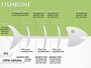
In a world flooded with data, making sense of influences and outcomes can feel overwhelming. Our Cause and Effect Keynote Diagrams template steps in as your visual ally, transforming intricate causal links into straightforward illustrations. Tailored for analysts, educators, and managers, this tool excels in breaking down factors that drive results. With 13 editable slides, you can depict everything from problem roots to solution paths, using formats like fishbone or tree structures. Compatible with Keynote on Mac and iPad, it fits right into your creative process, allowing quick adjustments for any topic. Think of a quality control specialist mapping defects in manufacturing - these diagrams highlight contributing elements clearly. Or an instructor explaining environmental impacts, where arrows guide viewers through chains of events. The template's clean design ensures your insights land with impact, fostering deeper understanding in meetings or lectures.
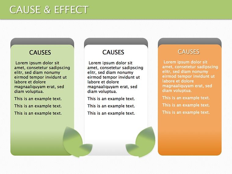
Essential Features That Drive Insight
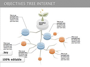
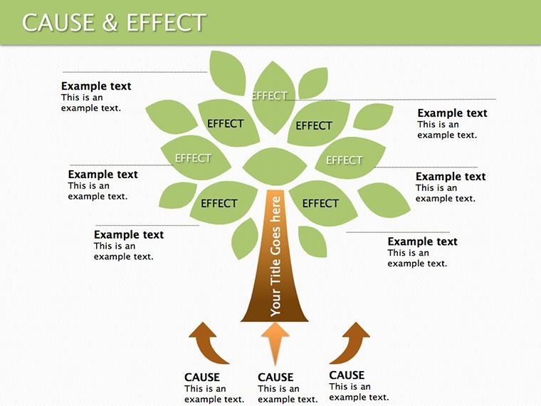
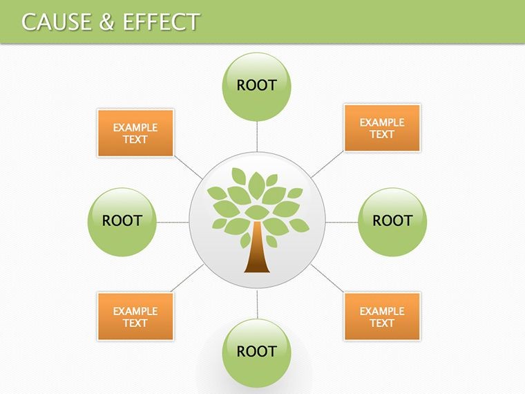
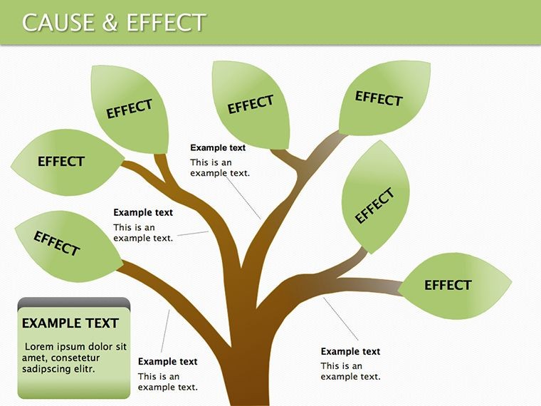
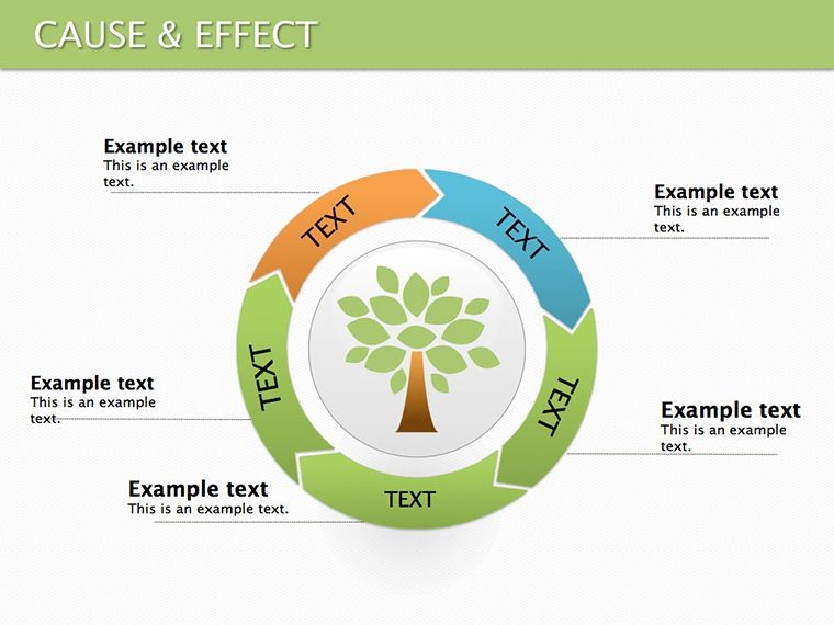
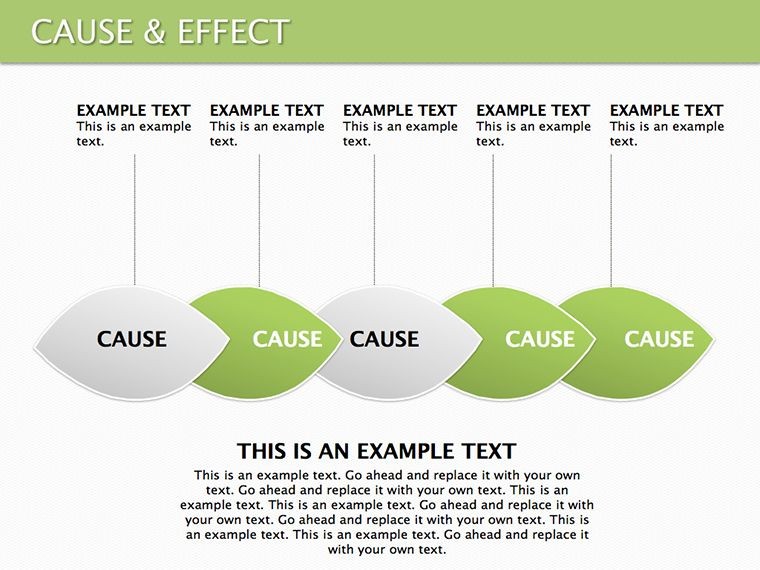
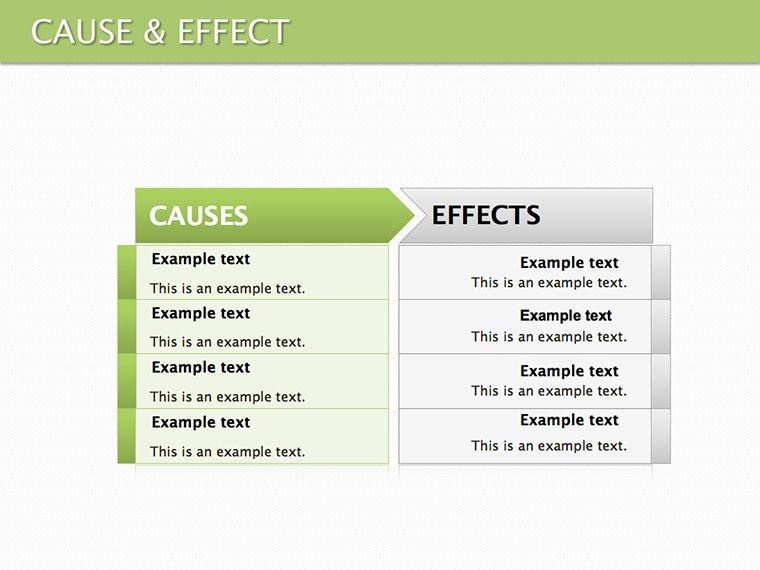
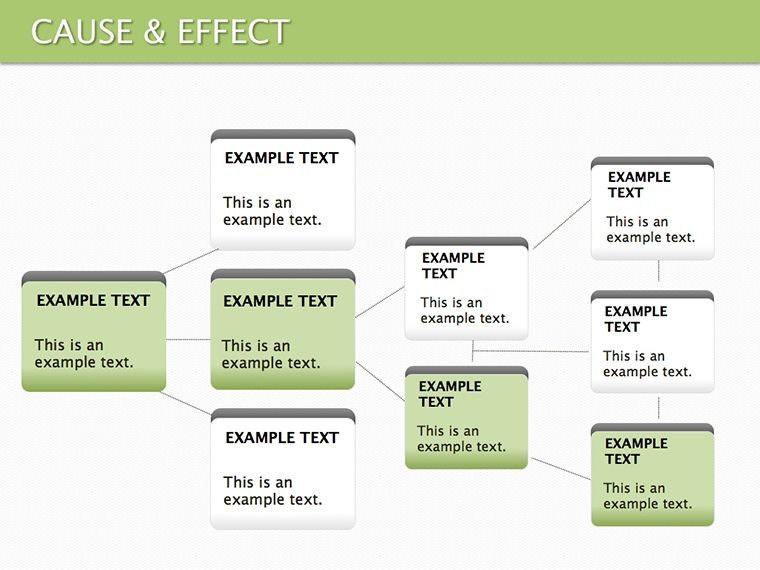
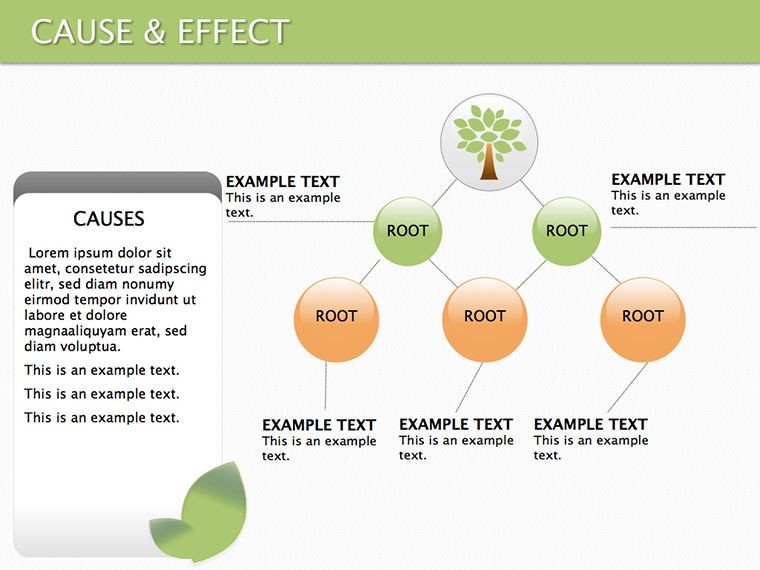
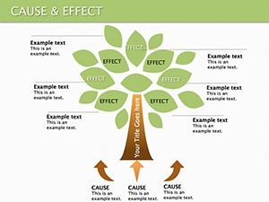
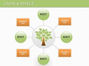
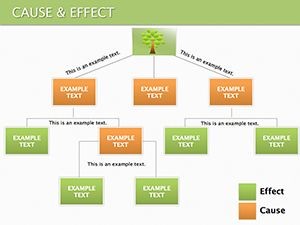
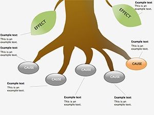
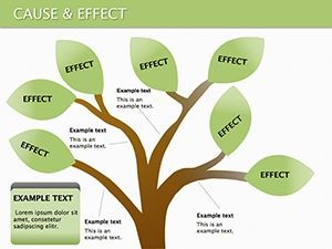
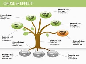
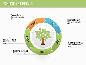
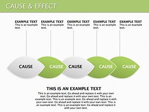
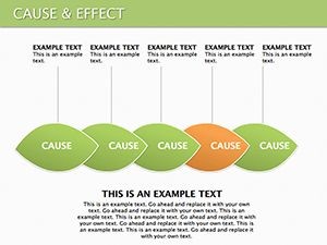
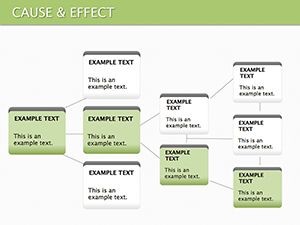
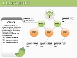
This template boasts a variety of diagram types, each crafted to suit different analytical needs. Fishbone diagrams excel at categorizing causes, with branches for major factors like methods or materials. Tree diagrams branch out for hierarchical views, showing how primary causes lead to secondary effects. Flowcharts provide sequential paths, ideal for process audits. Every slide is fully editable - alter node shapes, arrow directions, or text labels to fit your narrative. Colors can be tweaked to highlight urgency, such as bold hues for critical issues. The vector-based elements maintain sharpness at any zoom level, perfect for detailed discussions. Drawing from proven visualization techniques, it helps users like business consultants pinpoint inefficiencies in operations.
Versatile Use Cases for Real-World Scenarios
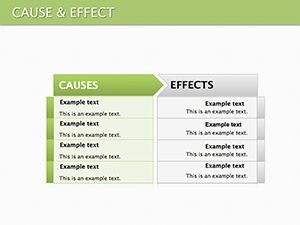
Analysts in healthcare might use these diagrams to trace patient outcomes back to treatment variables, aiding in protocol refinements. In marketing, teams can map campaign effects on sales, identifying what drives conversions. Educators find value in teaching scientific methods, where students visualize hypotheses and results. For a project manager, a flowchart could outline risk factors in a launch, preventing oversights. The template adapts to group brainstorming, where collaborative edits reveal shared insights. Even in policy development, it structures debates on social issues, clarifying how policies influence communities. By addressing the challenge of abstract concepts, it turns discussions into actionable plans.
Step-by-Step Customization for Effective Diagrams
- Launch Keynote and open the template file.
- Choose a diagram style that aligns with your analysis, like fishbone for root causes.
- Label causes and effects by editing text boxes directly.
- Modify arrows to indicate strength or direction of relationships.
- Apply color coding to differentiate categories or priorities.
- Export or present to share your clarified insights.
A risk assessor following this might create a diagram that swiftly communicates threats to stakeholders.
Building Stronger Narratives Through Visuals
Incorporate supporting elements like icons for variables or notes for explanations, enriching your diagrams without clutter. This approach aids in scenarios requiring evidence, such as audit reports. Compared to plain text, these visuals reduce misinterpretation, promoting consensus. Users in training sessions note higher engagement, as audiences follow along more easily. The design principles echo those in effective data storytelling, ensuring your points persuade rather than confuse.
Advantages Over Basic Keynote Tools
While Keynote's shapes offer basics, this template provides specialized structures ready for cause-effect analysis, saving setup time. Generic tools might lack branching logic, but here, pre-configured layouts handle complexity. Free options often miss polish, whereas this includes thematic consistency for professional appeal.
Expert Tips for Diagram Mastery
- Start broad: Identify main causes before diving into details.
- Validate links: Ensure arrows reflect true relationships.
- Balance elements: Avoid overcrowding by prioritizing key factors.
- Iterate: Refine based on feedback for accuracy.
- Combine types: Use flowcharts with fishbones for comprehensive views.
An educator applying these could craft lessons that spark critical thinking among students.
Transform how you present connections - download this template today for sharper insights.
Frequently Asked Questions
What Keynote versions support this?
It works with recent Keynote versions on Mac and iOS devices.
Can I add my own icons?
Yes, import and integrate custom icons easily.
Are the diagrams printable?
Absolutely, export to PDF for high-quality prints.
How editable are the arrows?
Fully; change style, color, and direction as needed.
Suitable for team collaboration?
Yes, share via iCloud for joint editing.
Any animation options?
Included builds allow sequential reveals.