Business Process Keynote Diagrams: Visualize Workflows Effortlessly


Imagine standing in front of your team, unveiling a crystal-clear map of how your company's operations flow from raw inputs to customer-delighting outputs. No more fumbling with clunky software or starting from scratch - our Business Process Keynote Diagrams template hands you nine ready-to-edit slides that turn abstract strategies into tangible roadmaps. Tailored for business analysts, project managers, and operations leads who juggle multiple moving parts, this template isn't just about pretty visuals; it's about sparking those "aha" moments that drive decisions and boost efficiency.
Whether you're dissecting a supply chain overhaul or outlining a new product launch, these diagrams help you highlight key actions, transformations, and value-adding steps without overwhelming your audience. Picture a slide where resources cascade through stages in a sleek 3D cube sequence - editable colors, labels, and arrows let you tweak it to match your brand in minutes. We've designed it for Keynote users on Mac, ensuring seamless integration with your existing workflow. And because every process tells a story, this template empowers you to narrate yours with confidence, making stakeholder buy-in feel effortless.
Unlock the Power of Structured Process Mapping
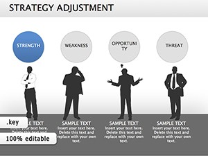
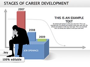
At its core, this template revolves around illustrating how inputs evolve into valuable outputs, a fundamental in any business operation. Start with the foundational process flow slide: it features a horizontal timeline dotted with icons representing stages like ideation, execution, and review. Drag and drop to reorder, or swap icons for ones that fit your industry - think gears for manufacturing or lightbulbs for creative agencies. This isn't rigid; it's flexible, allowing you to layer in details like decision points or feedback loops with simple text boxes.
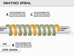
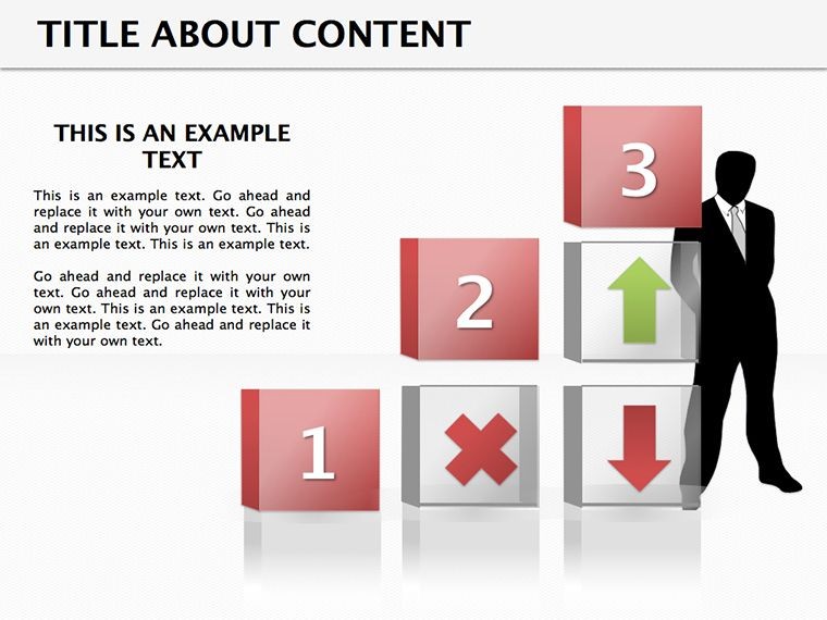
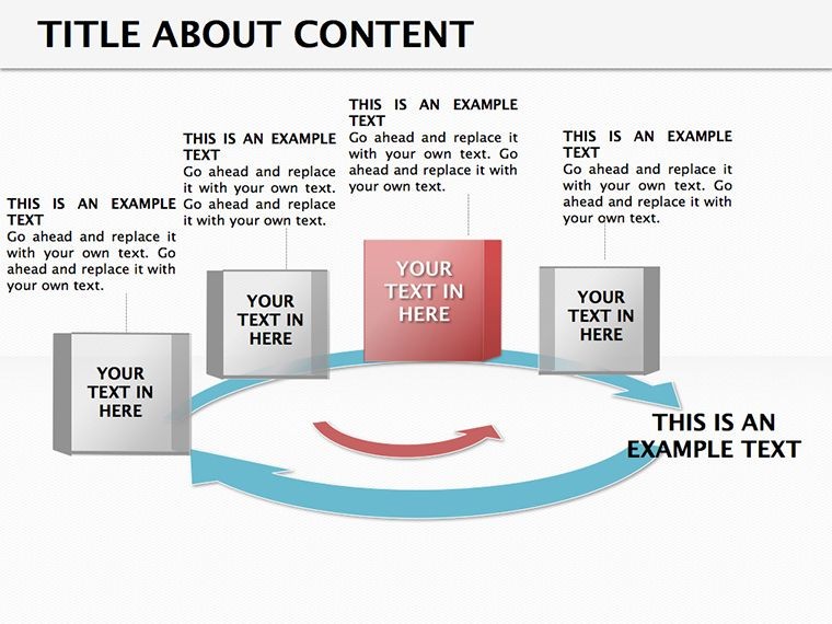
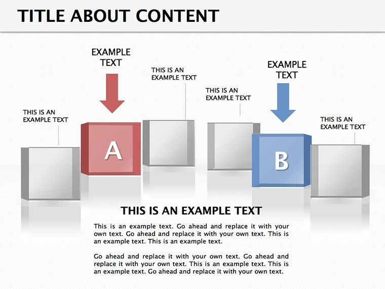
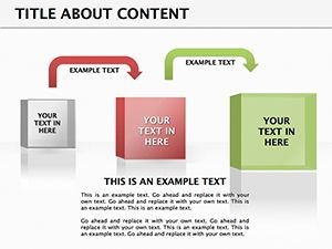
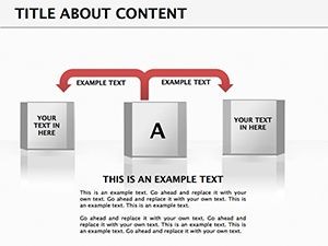
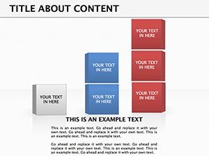
Diving deeper, the 3D elements add depth without complexity. One standout slide uses interlocking cubes to depict interconnected processes, where each cube can hold metrics like time estimates or resource needs. Resize them to emphasize bottlenecks, or animate transitions to show progression - perfect for dynamic presentations. We've kept the design clean, with sans-serif fonts and neutral palettes that adapt to light or dark modes, ensuring your message shines through.
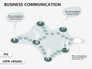
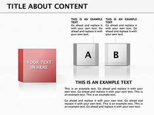
- Slide 1: Input-Output Overview – A bird's-eye view funnel that funnels resources into results, ideal for executive summaries.
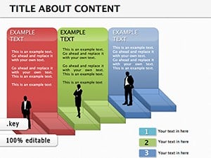
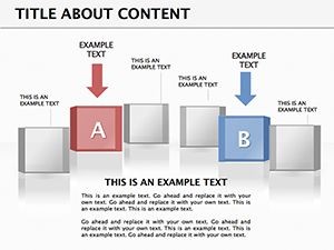
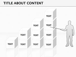
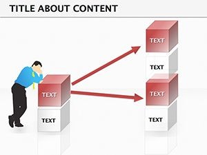
- Slide 2-4: Sequential Action Chains – Linear arrows connecting steps, with customizable milestones for tracking progress.
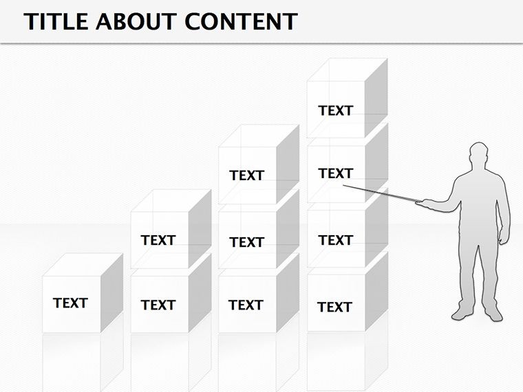
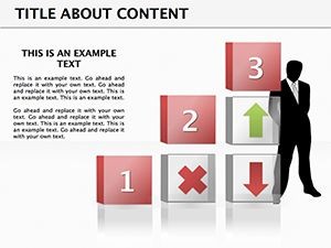
- Slide 5-7: 3D Cube Breakdowns – Multi-dimensional views for layered processes, great for tech implementations.
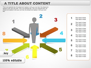
- Slide 8-9: Value Transformation Maps – Radial diagrams showing impact, helping quantify ROI in pitches.
Compatibility is key here - fully optimized for Keynote 2016 and later, with vector-based elements that scale flawlessly on any display. No pixelation, no headaches.
Real-World Applications: From Boardrooms to Breakouts
Consider a logistics firm refining their delivery pipeline. Using the cube slide, the ops director slots in stages from warehouse pickup to last-mile drop-off, color-coding delays in red for instant visibility. During the meeting, animations reveal how tweaks at one stage ripple through the chain, turning data dumps into engaging discussions. Or take a marketing team mapping campaign funnels: the radial map slide lets them plot touchpoints from awareness to conversion, inserting real metrics to forecast uplift.
For smaller teams, the sequential chains shine in agile sprints. A product owner might use one slide to outline user story flows, assigning colors to priorities - green for must-haves, amber for nice-to-haves. It's not just visual; it's strategic, helping align cross-functional groups without endless emails. And for consultants? These diagrams become your secret weapon in client workshops, where a quick edit mid-session demonstrates adaptability and expertise.
- Prep Your Data: Gather your process steps and key metrics - keep it to 5-7 for digestibility.
- Import to Keynote: Open the template, duplicate a slide, and populate with your info using the built-in placeholders.
- Customize Visually: Adjust colors via the format panel, add shadows for 3D pop, or link to external sheets for live updates.
- Animate for Impact: Set build orders so elements appear step-by-step, mimicking the process itself.
- Present with Poise: Rehearse transitions to guide your narrative, pausing at pain points to invite questions.
This workflow cuts prep time dramatically, letting you focus on insights over ink. Compared to vanilla Keynote shapes, which demand manual alignment and styling, our pre-built layouts save the tedium, delivering pro-level polish with amateur effort.
Why This Template Stands Out in Your Toolkit
Beyond the slides, it's the thoughtful details that elevate it. Themed icons - pipelines, gears, and checkmarks - reside in a dedicated library slide, ready for drag-and-drop. No hunting through stock libraries; everything's cohesive. We've also baked in accessibility tweaks, like high-contrast options for color-blind viewers, ensuring inclusivity without extra work.
Think of it as your process whisperer: it decodes complexity into conversations. A startup founder once shared how swapping basic flowcharts for these 3D views turned a skeptical investor pitch into a funded round, the visuals bridging the gap between vision and viability. That's the magic - turning diagrams into dialogue starters.
Ready to map your next breakthrough? Grab this template today and watch your processes come alive on screen.
Frequently Asked Questions
What makes these diagrams editable in Keynote?
All elements, from arrows to text boxes, are fully vector-based, so you can resize, recolor, and reposition without quality loss.
Are animations included?
Yes, basic build-ins are pre-set, but you can customize or add more via Keynote's animate tab for tailored effects.
Can I use this for non-business processes?
Absolutely - adapt it for event planning, recipe flows, or educational timelines with ease.
What's the file format?
It's a .key file, compatible with Mac Keynote versions from 2016 onward.
How many customization options are there?
With 9 slides and modular components, you have endless combos for unique process stories.