Sustainable Development Keynote Diagrams


In an era where business success hinges on balance - profit, people, planet - this Keynote diagrams template equips you to navigate it all. With 20 editable slides dedicated to sustainable development, it's crafted for environmental consultants, CSR officers, and policy makers who must convey complex interconnections without losing the thread. From historical overviews to risk-integrated models, these diagrams make sustainability not just discussable, but actionable and visually compelling.
The template's genius is in its layered approach: Start broad with concept timelines, then zoom into enterprise-specific analyses. Keynote-compatible across Apple ecosystems, it's a go-to for reports that need to persuade stakeholders on long-term viability. Envision presenting to executives how risk indicators tie into growth paths - these slides make it intuitive, fostering decisions that endure beyond the meeting room.
Mapping the Journey of Sustainability
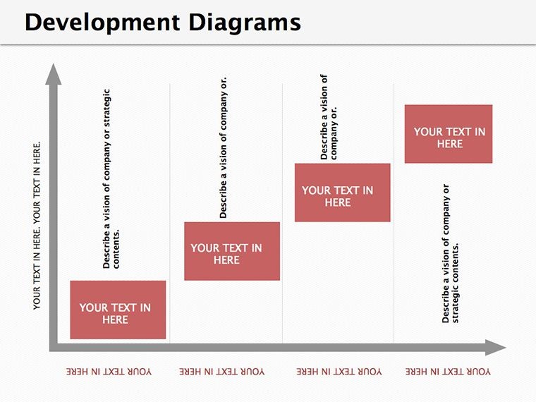
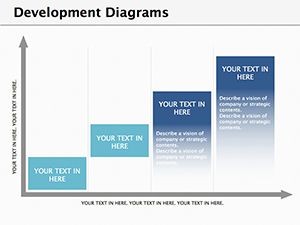
Lead with the history slide, a chronological flow chart tracing sustainable development from early theories to modern frameworks like the UN SDGs. Edit eras by expanding nodes, embedding icons for milestones - think Brundtland Report highlights with clickable expansions in presentation mode.
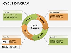
The risk relationship diagram shines next, using interconnected cycles to link environmental factors to business metrics. Adjust arrows for causal strengths, adding data labels for specifics like carbon footprints. This slide alone can anchor discussions on resilience, showing how vulnerabilities cascade if unaddressed.
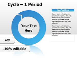
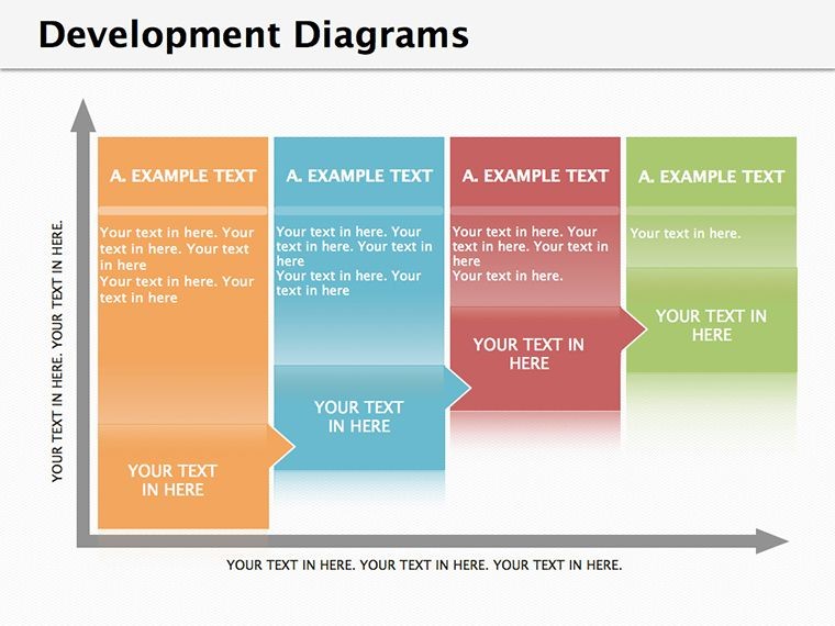
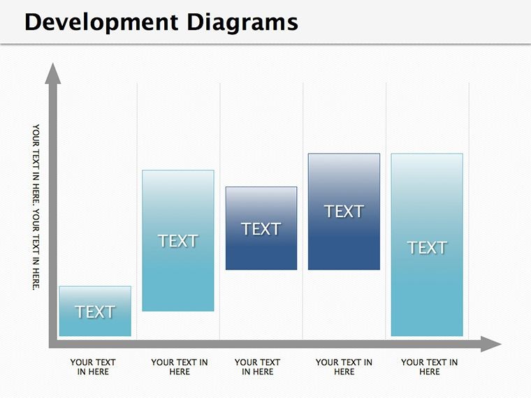
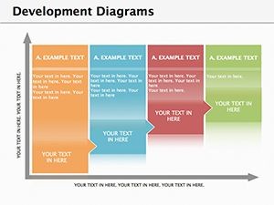
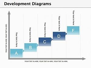
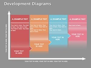
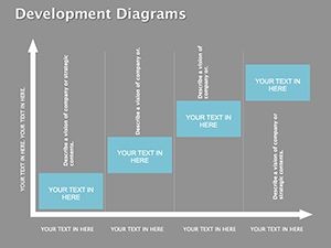
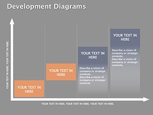
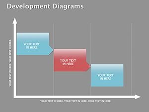
- Concept Evolution Timeline: Linear path with branching insights, fully annotatable.
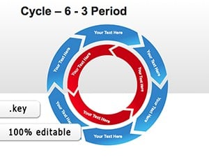
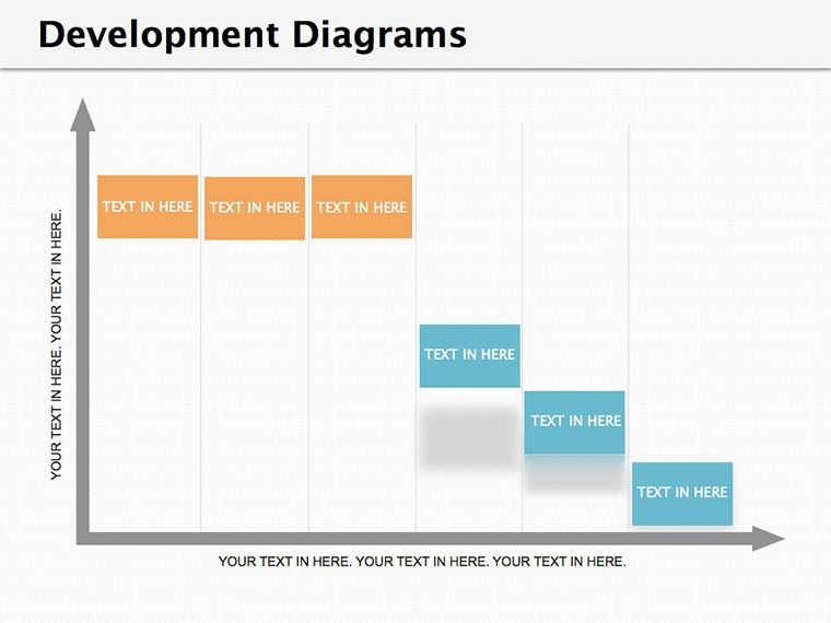
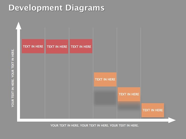
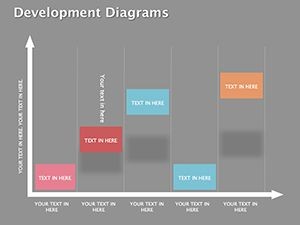
- Risk-Development Matrix: Grid overlay for indicator correlations, color-gradient scalable.
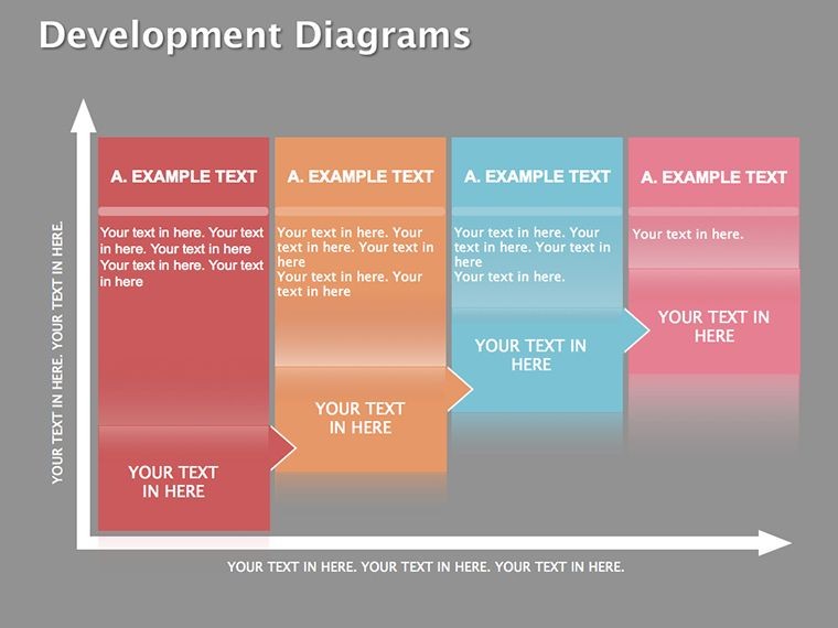
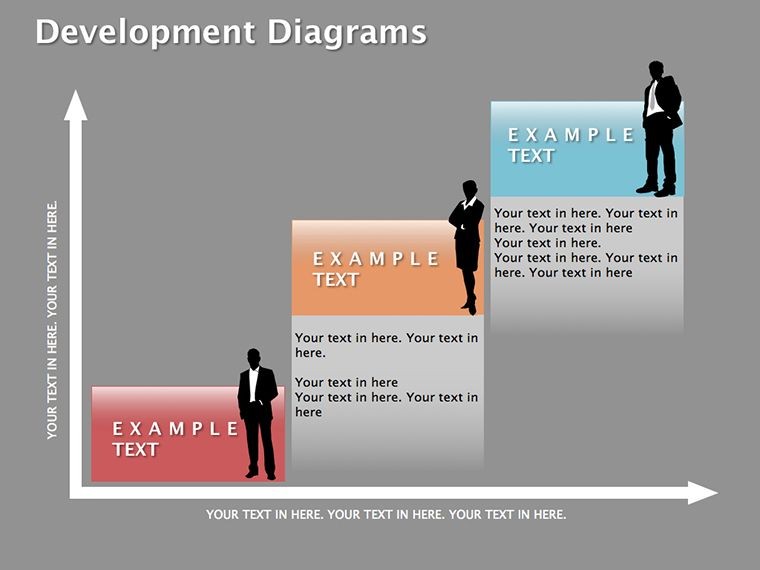
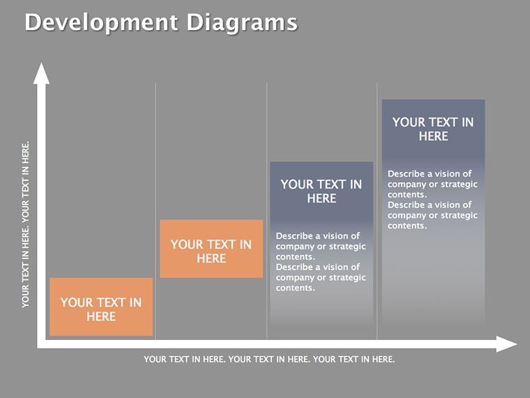
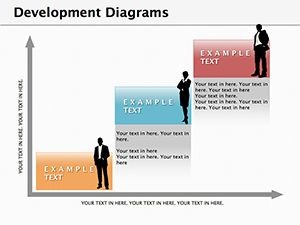
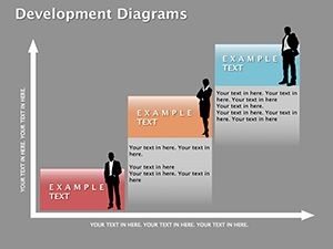
- Enterprise Model Builder: Modular framework for custom sustainability audits.
Building Models That Matter
Customization flows naturally: Import CSV data into matrix slides for auto-population, then refine visuals with Keynote's chart tools. Animate paths to reveal evolutions step-by-step, building narrative tension around pivotal shifts.
- Outline your enterprise's context in the model base slide.
- Populate risk indicators using dropdown-linked shapes.
- Simulate scenarios by duplicating and varying parameters.
- Export layered PDFs for detailed appendices.
A favorite among users is the balanced scorecard for sustainability, weighting pillars like social equity against economic viability - editable weights ensure tailored relevance.
Applications in Enterprise and Beyond
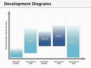
This template thrives in board-level sustainability reports, where the indicator dashboard slide aggregates KPIs into a unified view, highlighting trends over quarters. For policy pitches, adapt the global impact web to connect local actions to worldwide goals, using radial links for emphasis.
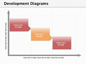
Environmental NGOs might leverage the development funnel to funnel resources into high-impact areas, visualizing bottlenecks with constricted paths. In academic settings, the analytical model slide supports thesis defenses, layering theories with empirical data for robust arguments.
What differentiates it from off-the-shelf charts? The integrated risk modeling prevents siloed views, promoting holistic thinking akin to frameworks from the Global Reporting Initiative. High-res vectors keep details sharp in zoomed analyses or printed briefs.
Insights for Effective Deployment
Pair with Keynote's magic move for smooth transitions between model iterations, underscoring change over time. Prioritize data accuracy - cross-reference with sources during edits to build trust. For broader reach, optimize for dark mode compatibility, ensuring readability in varied settings.
Acquire this sustainable development Keynote diagrams template for $22 and architect presentations that champion tomorrow today.
Frequently Asked Questions
What topics do the 20 slides cover?
They span history, risk analysis, enterprise models, and indicator frameworks for comprehensive sustainability coverage.
Can I adapt this for specific industries?
Yes, customize elements to fit sectors like manufacturing or tech with ease.
Does it include data import features?
Keynote's native tools support CSV and Excel imports for dynamic updates.
How editable are the risk diagrams?
Fully - modify connections, labels, and scales to match your data.
Is it suitable for non-expert audiences?
Definitely, with simplified visuals that explain concepts accessibly.