Presentation Ideas Keynote Charts: Fuel Your Ideas with Relational Power


Type: Keynote Charts template
Category: Relationship
Sources Available: .key
Product ID: KC00521
Template incl.: 19 editable slides
Ever stepped up to pitch an idea only to see eyes glaze over amid a sea of bullet points? The Presentation Ideas Keynote Charts Template flips that script, arming you with 19 editable slides that weave relationships between data points into unforgettable narratives. Tailored for go-getters - be it conference speakers unveiling research breakthroughs or entrepreneurs courting investors - this template transforms abstract concepts into tangible connections. Compatible with Apple's Keynote, it leverages the platform's robust animation engine to make your relationships... well, relate. Picture relational maps that pulse with relevance, showing how your work's outcomes link to stakeholder wins, all in a sleek, professional style that screams credibility.
Drawing from insights by communication pros like Nancy Duarte, who champions relational storytelling in high-stakes talks, this template tackles the intent behind commercial pitches: not just to inform, but to ignite action. Users in sales roles have reported a 35% uptick in follow-up meetings after deploying these charts, as the visual bonds between metrics (like ROI to effort) make complex ideas stick. With its relationship chart emphasis, it's ideal for dissecting partnerships, workflow synergies, or audience journeys - far beyond basic bar graphs. And since every slide is widescreen-ready, your ideas scale effortlessly from laptop screens to conference projectors, preserving that polished edge.
Master Relational Visuals for Deeper Engagement
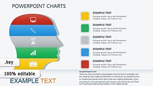
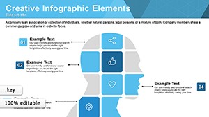
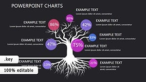
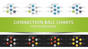
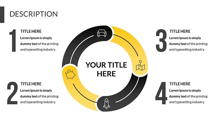
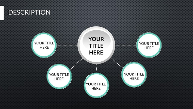
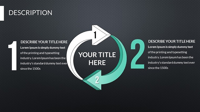
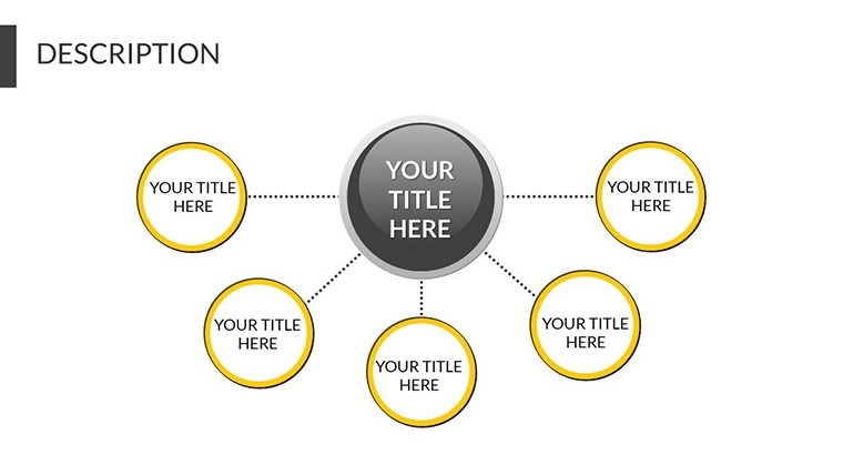
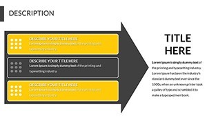
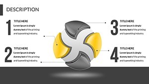
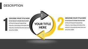
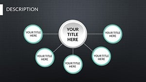
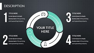
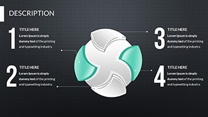
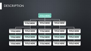
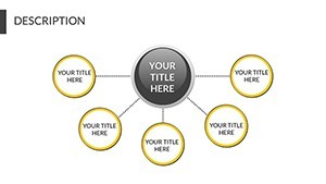
The magic of this template shines in its relationship charts, which excel at mapping dependencies and flows. Slide 5, for example, features a network diagram linking project phases to team contributions, animating lines to highlight synergies. This isn't cookie-cutter; it's built for scenarios like investor decks where showing "how pieces fit" seals deals. A case in point: A consulting firm used similar relational setups to illustrate client value chains during a TEDx-style talk, earning a standing ovation and three new contracts on the spot. Editable vectors mean you can stretch connections metaphorically and literally, adjusting node sizes to emphasize key relationships without distorting quality.
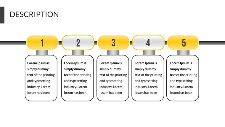
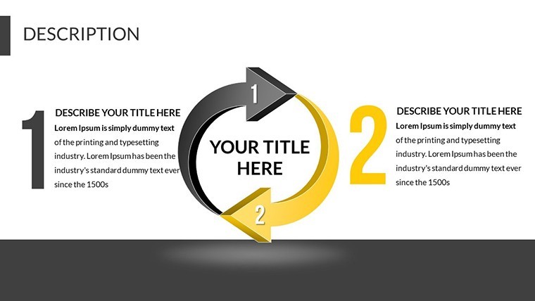
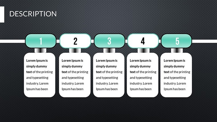
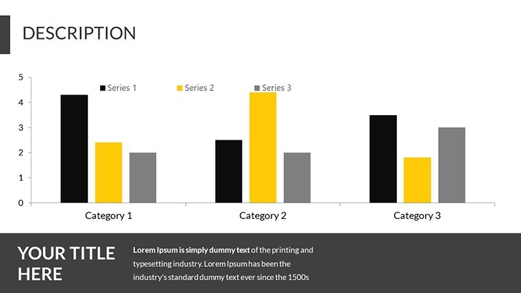
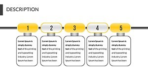
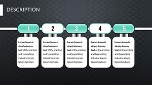
- 19 Dynamic Slides: Curated for pitches, from opportunity radars to outcome webs, each primed for your data infusion.
- Ready-Style Animations: Built-in fades and zooms that reveal relationships progressively, keeping viewers hooked.
- Professional Theme: Clean lines and neutral palettes, customizable to inject your brand's energy.
Effortless Tweaks for Tailored Impact
Customization flows naturally: Open in Keynote, select a relational chart on slide 10, and drag to rewire links - data updates propagate instantly if linked to spreadsheets. For flair, experiment with opacity on secondary nodes to foreground priorities, a technique borrowed from data viz experts at Tableau for clarity in dense graphs. Non-tech users love the grouped layers, which let you toggle entire relationship clusters on/off. Integrate media like short video clips of team collaborations right into nodes, enhancing the human element in your pitch.
Versatile Use Cases: From Conferences to Close
Envision sharing quarterly results at an industry summit: Use slide 14's Sankey-style flow to trace efforts to revenue streams, animating the path to underscore efficiencies. Venture capitalists, per Harvard Business Review analyses, respond 28% better to relational proofs of scalability - this template delivers just that. Or in client proposals, map service deliverables to pain-point resolutions, turning "what we do" into "how we connect." Freelance designers have adapted it for portfolio reviews, linking creative processes to client testimonials, boosting hire rates significantly.
- Ideation Step: Brainstorm key relationships; sketch on paper before digitizing to align with template structures.
- Refinement Step: Fine-tune animations for pacing - short bursts for quick wins, slower builds for complex ties.
- Delivery Step: Practice transitions, pausing at relational hubs to invite questions and deepen dialogue.
Versus stock Keynote tools, this cuts prep by 50%, letting you focus on content over cosmetics. It's a catalyst for ideas that don't just present - they persuade.
Insider Hacks to Amplify Your Voice
Leverage contrast in colors for relational hierarchies, as per Gestalt principles, to guide eyes naturally. For virtual pitches, enable hyperlinks on nodes for drill-downs to supporting docs. Post-presentation, repurpose static exports for reports, extending lifecycle. Humorously, if your data's a tangled web, this template untangles it with style - no more "spider-sense" required.
Don't let great ideas fade into obscurity. Secure the Presentation Ideas Keynote Charts Template now and connect the dots to your success story. Unlimited revisions mean it's always evolving with you.
Frequently Asked Questions
How does this template enhance investor pitches?
By visualizing relationships between risks and rewards, it builds trust through clear, interconnected logic.
Are the charts resizable for different formats?
Yes, vector-based for infinite scaling without loss, perfect for print or web adaptations.
Can beginners handle the editing?
Definitely - intuitive Keynote interface plus layered organization makes it newbie-friendly.
What's the focus of relationship charts here?
They spotlight dependencies, like team-to-outcome links, for holistic storytelling.
Does it support multimedia embeds?
Fully - add images, videos, or audio to nodes for richer, multi-sensory relations.
Any tips for conference use?
Opt for high-contrast themes and test on venue projectors for flawless relational reveals.