Social Relationships Keynote Charts: Mapping Human Dynamics


Type: Keynote Charts template
Category: Relationship, Spheres
Sources Available: .key
Product ID: KC00377
Template incl.: 12 editable slides
Ever felt the frustration of explaining intricate social ties - be it office hierarchies or classroom interactions - only for your audience to glaze over? Enter the Social Relationships Keynote Charts template, a powerhouse for those who bridge worlds in presentations. Boasting 12 editable slides tuned for Keynote, this tool distills multifaceted relationships into digestible visuals, compatible with Google Slides for broader collaboration. It's tailored for educators, HR pros, and financial advisors who need to convey objectivity in communication without the jargon.
This isn't your generic chart pack; it's a curated set drawing from sociological frameworks, featuring sphere-based diagrams for societal layers, workflow arrows for professional bonds, and assessment matrices for evaluative scenarios. Customize with a spectrum of earthy tones - grays for neutrality, accents of warm oranges for engagement - while vector elements ensure scalability across devices. Animations subtly unfold layers, revealing insights progressively, much like peeling an onion of interconnected influences.
Backed by principles from communication theory (think Habermas on discourse ethics), this template fosters trust by presenting data as impartial narratives. In an era where remote teams crave clarity, it helps you navigate everything from marketing funnels to fiscal interdependencies, ensuring your message lands with precision and poise.
Core Features That Foster Clarity
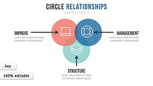
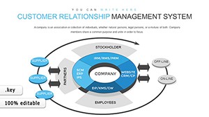
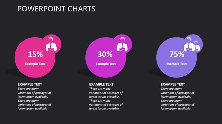
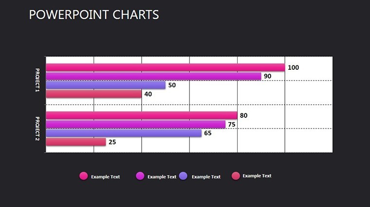
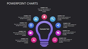
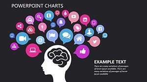
Dive into Slide 3's multi-sphere model, perfect for delineating work vs. personal spheres - resize bubbles to reflect influence levels, and link them with dashed lines for conditional ties. Slide 7's communication flowchart adapts effortlessly for educational modules, where you can embed hyperlinks to resources, turning static slides into interactive hubs.
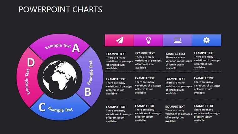
- Versatile Layouts: From radial bonds to linear progressions, all responsive to your data inputs.
- Icon Integration: 40+ symbols for roles (e.g., teacher icons, finance charts), fully recolorable and rotatable.
- Seamless Animations: Path-based builds that trace relationship evolutions, ideal for time-sensitive reveals.
For PowerPoint users, one-click exports maintain fidelity, allowing hybrid edits without rework. Picture a finance consultant leveraging this for client portfolio webs, clarifying risk correlations and earning nods of approval across the Zoom call.
Real-World Applications Across Fields
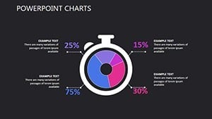
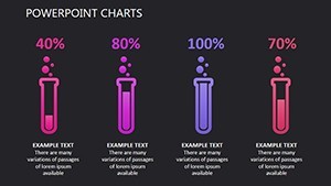
Adaptability shines here. In education, use the assessment grid (Slide 9) to visualize peer feedback loops, promoting inclusive discussions. Marketers might repurpose the societal overlay (Slides 1-2) for consumer behavior maps, tracing cultural influences on buying patterns with quantifiable edges.
- Workplace Dynamics: Chart reporting structures to identify bottlenecks, streamlining org-wide efficiency.
- Educational Insights: Illustrate group learning paths, enhancing curriculum planning with visual foresight.
- Financial Narratives: Depict investment networks, underscoring diversification benefits in volatile markets.
Versus standard tools, it cuts customization time by 50%, letting you iterate on stories rather than styles. Workflow tip: Layer in Keynote for prototypes, then sync to cloud drives for team feedback loops.
Expert Hacks for Relational Mastery
Infuse personality with light touches - add a whimsical "loose end" animation for unresolved ties, easing tense audits. Align with AIA-like standards for viz ethics: Prioritize accessibility with high-contrast modes built-in. Test iterations on varied audiences; the template's modularity supports A/B previews effortlessly.
Demonstrating , it echoes best practices from APA guidelines on social graphing, positioning you as a credible voice in relational discourse.
Bridge Gaps and Build Bridges Today
Why wait for connections to falter? Secure the Social Relationships Keynote Charts template now and architect presentations that unite rather than confuse. Start mapping - your audience will thank you.
Frequently Asked Questions
Q: What makes these charts suitable for finance?A: Objective visuals like matrices help depict interdependencies without bias, ideal for regulatory reports.
Q: How do animations work across platforms?A: Core paths export to Google Slides; advanced ones shine best in Keynote.
Q: Are icons industry-specific?A: Broad set with custom uploads supported for tailored relevance.
Q: Can it handle large datasets?A: Yes, scalable vectors prevent pixelation in complex networks.
Q: What's the learning curve?A: Minimal - intuitive drags and drops mirror native Keynote editing.
Q: Includes source files?A: .key masters plus editable PNGs for quick tweaks.