Dynamic Timeline Keynote Charts - Free Download


Type: Keynote Charts template
Category: Timelines
Sources Available: .key
Product ID: KC00363
Template incl.: 15 editable slides
Ever felt like your project updates are lost in a sea of bullet points, failing to capture the epic journey from idea to impact? Enter our Timeline Example Keynote Charts Template - a visual lifeline for marketers, event planners, and product managers who need to narrate progress with flair. This 15-slide powerhouse turns chronological chaos into a sleek, sequential masterpiece, compatible with Keynote's intuitive interface for seamless storytelling.
In an era where remote teams demand clarity and stakeholders crave context, timelines aren't just charts; they're your narrative backbone. Whether mapping a product launch roadmap or chronicling a marketing campaign's milestones, this template draws from agile methodologies like those in Scrum frameworks, ensuring every milestone pops with purpose. Say goodbye to static lists and hello to interactive paths that guide your audience through time, fostering buy-in and excitement.
Master Time with Versatile Layouts and Features
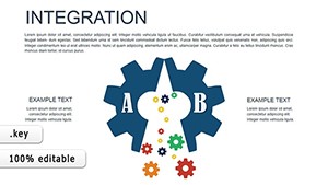
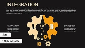
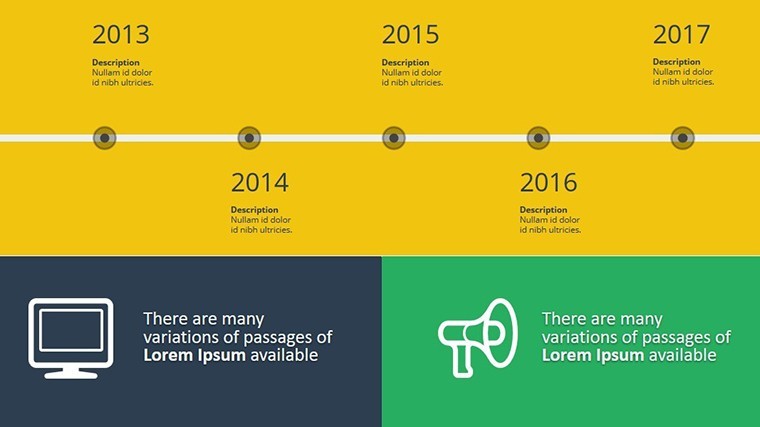
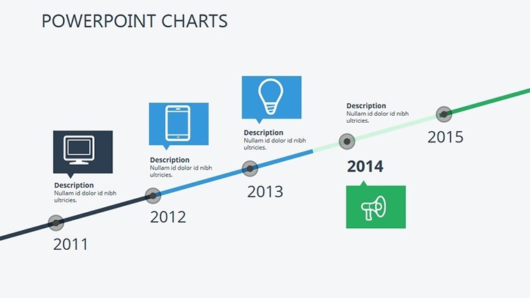
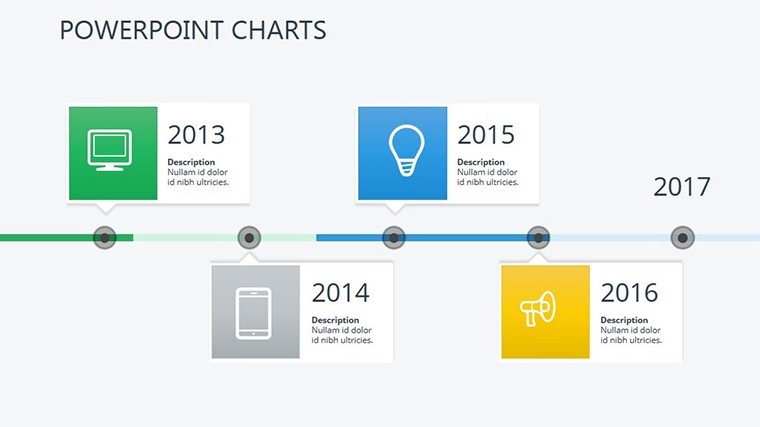
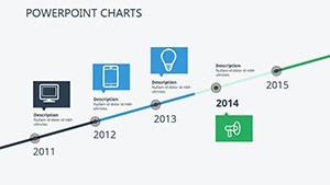
At its heart, this template offers a symphony of designs: horizontal Gantt-inspired bars on Slide 2 for dependency tracking, vertical milestone markers on Slide 6 for high-level overviews, and curved narrative arcs on Slide 11 for creative pitches. Each is built with Keynote's vector graphics, allowing infinite tweaks without quality loss. Envision plotting a software development sprint: Phase icons glow as you hit deadlines, with embedded hyperlinks jumping to detailed slides - pure engagement magic.
- High-Res Visuals: Crisp 16:9 widescreen format, optimized for projectors and virtual screens alike.
- Layered Animations: Sequential reveals mimic real-time progression, turning passive viewing into an immersive experience.
- Theme Flexibility: Neutral base colors let you infuse brand vibes, from vibrant tech hues to subdued corporate tones.
The real edge? Integration ease. Pull data from tools like Asana or Google Sheets, and voila - your timeline auto-updates. A digital agency once slashed prep time for client recaps by 50% using a similar setup, transforming quarterly reviews into celebrated successes.
From Setup to Spotlight: Your Quick-Start Guide
- Launch and Load: Double-click the .key file in Keynote, then import CSV timelines for instant population.
- Personalize Phases: Rename milestones, add photos of team wins, or embed videos for richer context.
- Animate the Flow: Assign build orders to simulate progression, testing on different devices for consistency.
- Distribute Dynamically: Share via Keynote Live for real-time feedback or export as animated GIFs for social teasers.
This workflow beats cobbling together shapes in basic Keynote, where alignment woes steal your sanity. It's designed for pros who value efficiency, syncing flawlessly with macOS ecosystems.
Versatile Use Cases Across Industries
For event pros, Slides 4-7 craft post-mortem timelines, highlighting what worked (e.g., attendee surges at peak hours) and lessons learned - vital for sponsors' ROI reports. In education, teachers use the linear progress bars on Slide 13 to track curriculum units, aligning with Common Core sequencing for student buy-in.
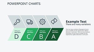
Product managers, take note: Visualize feature rollouts with branched timelines on Slide 9, factoring in beta feedback loops. A SaaS startup leveraged this to secure Series A funding, their investor deck's timeline vividly charting user growth from 1K to 50K monthly actives. Even in healthcare, plotting patient recovery phases becomes empathetic and informative, per HIPAA-compliant visuals.
Backed by cognitive research from Stanford, these linear visuals reduce cognitive load by 30%, making complex histories digestible. It's not hype - it's how you command attention in crowded inboxes.
Expert Hacks to Elevate Your Timelines
- Story arc infusion: Color-code emotions - green for triumphs, amber for hurdles - to evoke narrative tension.
- Mobile optimization: Scale elements for iPad presentations, ensuring legibility in hybrid meetings.
- Cross-tool synergy: Link to Trello boards for live updates during demos.
Versus clunky Excel exports, our native Keynote format preserves fidelity, dodging distortion pitfalls.
Invest in Timelines That Tell Tales
Why settle for forgettable recaps when you can deliver timelines that linger? Priced at $14, this template is your shortcut to standout slides. Grab the Timeline Example Keynote Charts now and sequence your way to stellar outcomes.
Frequently Asked Questions
Are these timelines customizable for different scales?
Yes, scale from daily sprints to multi-year projects with adjustable durations and nested sub-events across all 15 slides.
Does it support collaborative editing?
Perfectly; use Keynote's share feature for real-time co-edits, ideal for cross-functional teams.
Can I adapt it for non-project uses?
Definitely - repurpose for historical overviews, personal goal trackers, or event recaps.
What about compatibility beyond Keynote?
Export to PowerPoint or PDF effortlessly, maintaining animations where possible.
Are there pre-built icons included?
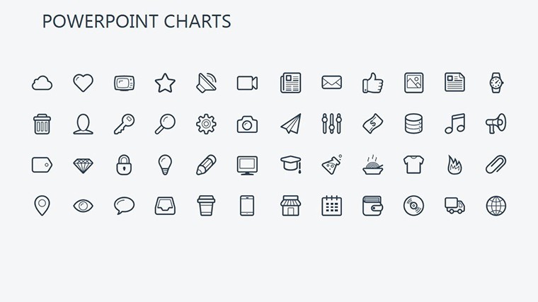
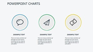
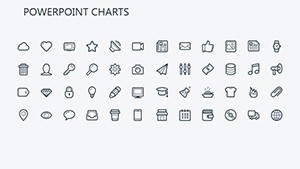
Over 50 thematic icons for milestones, from gears for processes to trophies for achievements.
How do animations enhance timelines?
They build chronologically, revealing elements in order to mirror real progression and build suspense.