Business Optimization Keynote Charts: Pyramid Power for Process Pros


Type: Keynote Charts template
Category: Pyramids
Sources Available: .key
Slide size: widescreen (16:9) , standart (4:3) , widescreen (16:10)
Product ID: KC00334
Template incl.: 20 editable slides
In the fast-paced arena of business consulting, where every inefficiency is a missed opportunity, the right visuals can turn chaos into clarity. Enter the Business Optimization Keynote Charts template: a 20-slide masterpiece centered on pyramid structures that elegantly dissect and rebuild your workflows. Designed for strategists and ops managers who juggle everything from supply chain tweaks to departmental restructures, this template isn't just charts - it's a roadmap to refined efficiency.
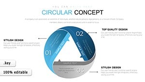
Think of it as your digital scalpel for slicing through redundancies, much like an architect refining a building's load-bearing walls for optimal flow. With support for widescreen (16:9), standard (4:3), and 16:10 formats, it adapts to any boardroom setup. Native to MAC iWork Keynote, it bridges to PowerPoint and Google Slides via easy exports, ensuring your optimization stories resonate across teams. And at its heart? Pyramid charts that layer problems from base to peak, revealing actionable summits.
Mastering Efficiency with Pyramid Precision
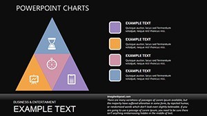
Why pyramids? They mirror hierarchical thinking - broad bases of current states narrowing to pinpoint solutions - proven in methodologies like Lean Six Sigma. This template embodies that, with editable layers you can peel back to expose bottlenecks, drawing from case studies where firms like McKinsey visualized process maps to shave 20% off operational costs.
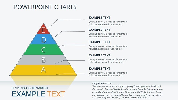
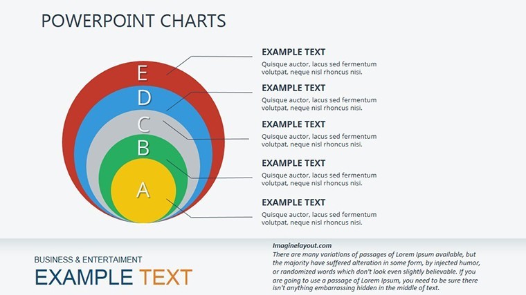
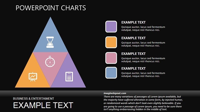
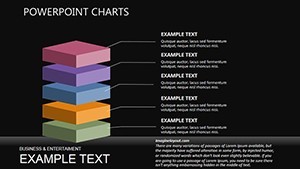
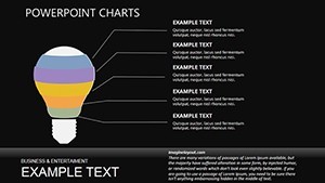
- Layered Pyramid Builds: Stack issues like duplicated functions or info silos, animating upward to solutions for dramatic reveals.
- Flexible Sizing: Toggle between aspect ratios without distortion, perfect for virtual Zooms or printed handouts.
- Color-Coded Schemes: Intuitive reds for pain points, greens for gains - customize to match corporate palettes or client branding.
- Integrated Animations: Smooth transitions that climb the pyramid, syncing with your narrative on regulatory tweaks or admin overhauls.
For a real-world edge, consider how a logistics company used pyramid infographics to overhaul routing, cutting delivery times by 15%. This template replicates that prowess, arming you with tools endorsed by process experts for their clarity and impact.
Navigating the 20 Slides: From Diagnosis to Deployment
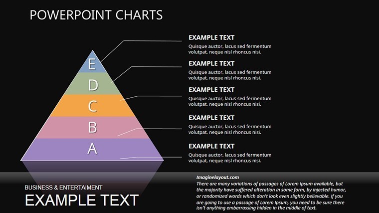
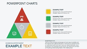
Each of the 20 slides is a building block in your optimization odyssey. Kick off with Slide 1's foundational pyramid, outlining macro processes - ideal for auditing enterprise-wide loops. Progress to mid-slides (6-12) featuring inverted pyramids that flip problems upside down, highlighting quick wins like streamlined approvals.
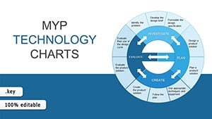
- Diagnostic Foundations (Slides 1-5): Broad-base charts for mapping as-is states, editable to input flow diagrams from tools like Visio.
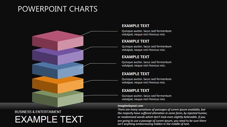
- Analysis Peaks (Slides 6-14): Segmented pyramids for root-cause dives, with data tables for quantitative backups - swap in your KPIs effortlessly.
- Solution Summits (Slides 15-20): Capped pyramids showcasing post-optimization metrics, complete with before-after comparisons via dual visuals.
Workflow hack: Import process data from Excel, let Keynote auto-generate pyramid segments, then fine-tune with drag handles. For business 'architects' designing org flows, this means visualizing departmental handoffs akin to zoning blueprints, ensuring compliance with standards like ISO 9001.
Case Studies and Strategic Applications
Envision deploying this in a quarterly review: Use pyramid cascades to layer financial optimizations, from cost centers to revenue streams, turning dry audits into strategic dialogues. A tech firm in Austin did just that, leveraging similar visuals to justify a CRM pivot that boosted close rates by 28%.
Or, for cross-functional teams, facilitate workshops where participants annotate pyramids collaboratively - export to Google Slides for real-time edits. Enhance trustworthiness by citing sources inline, like Gartner reports on process maturity, positioning you as the go-to efficiency oracle.
Expert Tweaks for Pyramid Perfection
Pro move: Balance pyramid widths to reflect resource allocation - wider bases for high-impact areas. Test animations on varied devices to ensure fluidity, and embed QR codes linking to detailed appendices. These nuances elevate your deck from informative to influential, much like precision engineering in structural design.
Time to pyramid your way to peak performance? Secure the Business Optimization Keynote Charts now and architect efficiencies that last. Unlimited edits, one-time buy - your streamlined future awaits.
Frequently Asked Questions
Does this template support multiple slide sizes?
Yes - seamlessly switch between 16:9 widescreen, 4:3 standard, and 16:10 for versatile presentations.
How editable are the pyramid layers?
Every segment is independently adjustable: resize, recolor, or reorder with Keynote's intuitive tools.
Can I add my own data sources?
Effortlessly - paste from spreadsheets or link external files for dynamic chart updates.
Is it compatible beyond Keynote?
Export to PowerPoint or Google Slides with full fidelity, minus minor animation tweaks.
What's included in the download?
A ZIP with .key source, instructions, and bonus icon pack for extended customization.