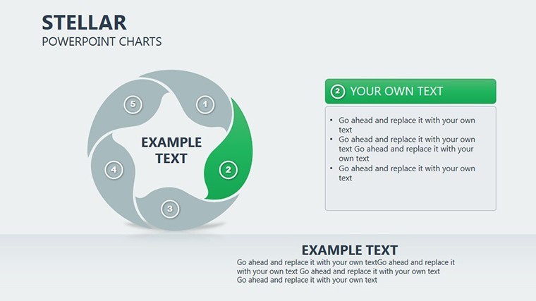
Stellar Cycle Charts Keynote Template: Illuminate Data Relationships


Type: Keynote Charts template
Category: Cycle
Sources Available: .key
Product ID: KC00277
Template incl.: 19 editable slides
Imagine transforming complex data sets into clear, compelling narratives that not only highlight key variables but also forecast future trends with precision. The Stellar Cycle Charts Keynote template is your gateway to achieving just that. Designed specifically for Keynote users, this template boasts 19 fully editable slides tailored for professionals in data analysis, business strategy, and predictive modeling. Whether you're a market researcher dissecting consumer behaviors or a financial analyst projecting economic cycles, this tool empowers you to define features, analyze interdependencies, and deliver presentations that resonate.
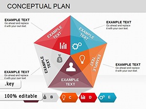
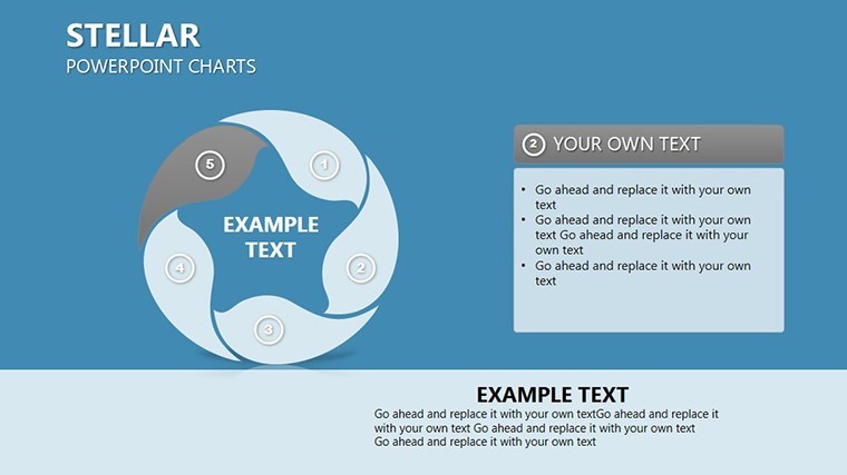
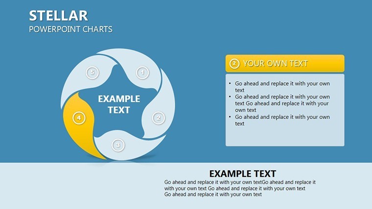
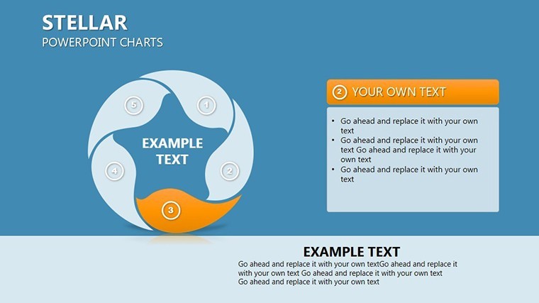
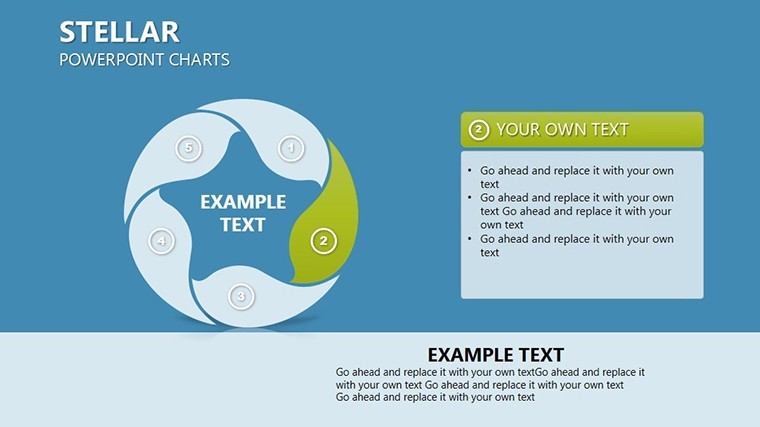
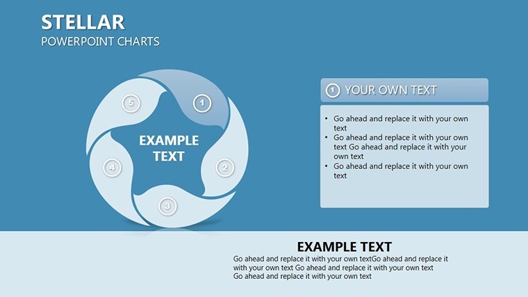
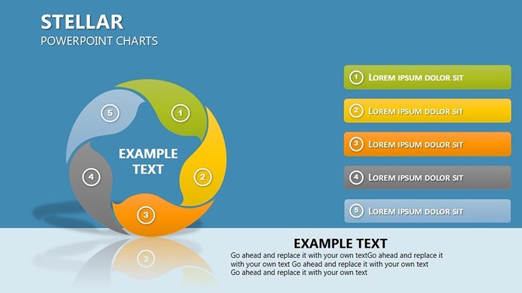
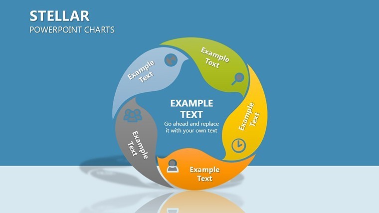
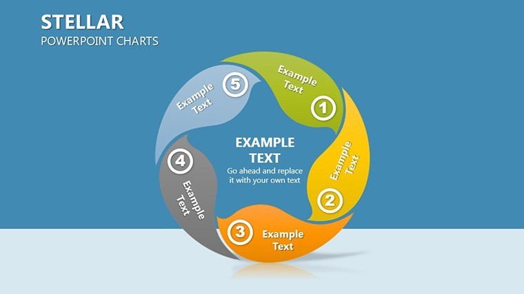
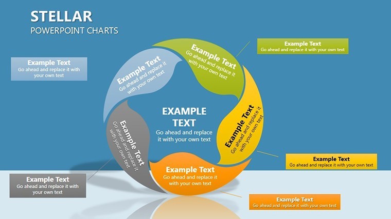
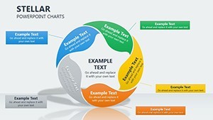
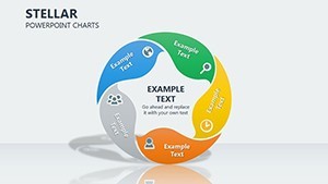
At its core, the Stellar template excels in visualizing cyclical processes - think business life cycles, supply chain dynamics, or even environmental patterns. By showcasing all variable relationships in an intuitive cycle format, it enables better, more reliable predictions. Users love how it simplifies intricate data without sacrificing depth, drawing on established methodologies like systems thinking to provide a robust framework. For instance, in a real-world scenario inspired by case studies from firms like McKinsey, you could map out product development stages, identifying bottlenecks and opportunities at a glance.
What sets this template apart is its focus on user-centric design. Each slide is crafted with clean lines, harmonious color palettes in blues and grays for a professional yet approachable vibe, and customizable elements that align with Apple's Keynote ecosystem. No more starting from scratch; import your data, tweak the cycles to fit your narrative, and watch your audience engage. It's not just about charts - it's about storytelling that drives decisions.
Key Features That Drive Analytical Excellence
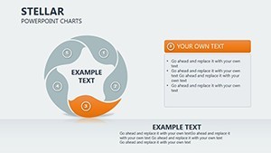
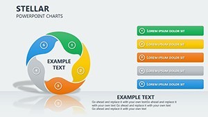
Dive deeper into what makes the Stellar Cycle Charts a must-have for your presentation arsenal. The template includes a variety of cycle diagrams, from basic loops to multi-layered interconnections, all optimized for high-impact visuals.
- Editable Cycle Structures: Adjust node sizes, arrow directions, and labels to represent specific variables, ensuring your unique data story shines through.
- Integrated Data Tools: Embed spreadsheets or import from Excel seamlessly, with built-in formulas for real-time updates - perfect for dynamic presentations.
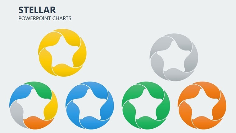
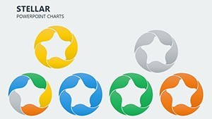
- Themed Icons and Graphics: Over 50 custom icons related to cycles, such as gears for processes or arrows for flows, enhancing visual appeal without clutter.
- Animation Options: Keynote-native animations that reveal relationships step-by-step, keeping viewers hooked during reveals.
- Compatibility Assurance: Fully tested on the latest Keynote versions, with backward compatibility for older setups.
These features aren't arbitrary; they're informed by best practices in data visualization, echoing principles from experts like Edward Tufte, who emphasize clarity and efficiency in graphical displays.
Detailed Slide Breakdown for Maximum Utility
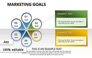
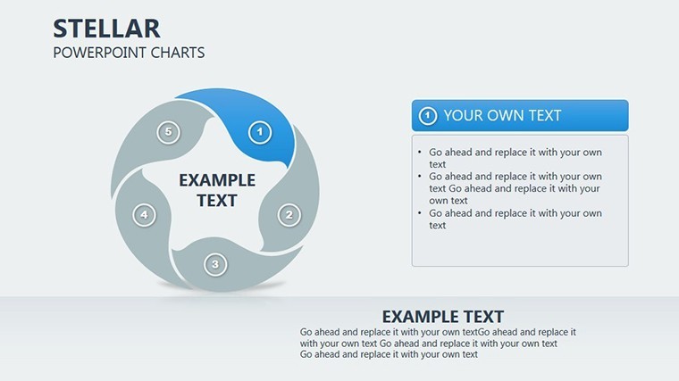
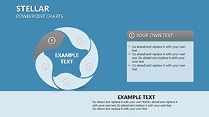
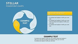
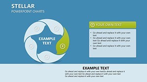
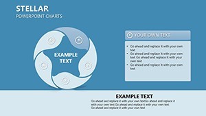
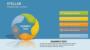
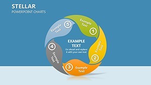
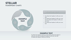
Let's explore a sampling of the 19 slides to see how they cater to diverse needs. Slide 1 serves as an introductory overview, featuring a central stellar cycle chart with placeholders for your key thesis. Slides 2-5 delve into basic cycles, ideal for simple cause-effect analyses - like mapping marketing funnels where leads convert to sales.
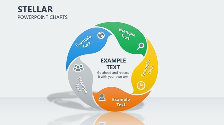
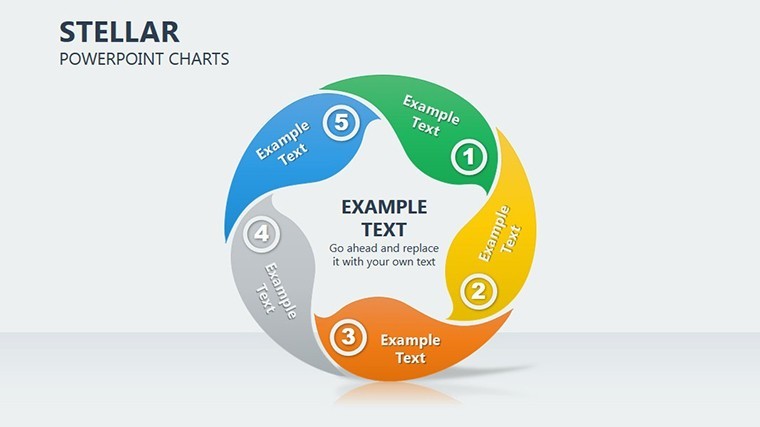
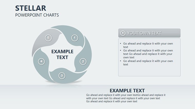
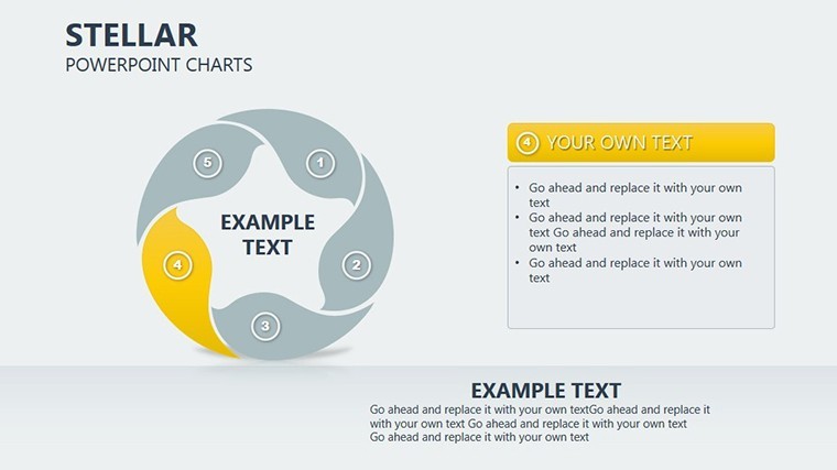
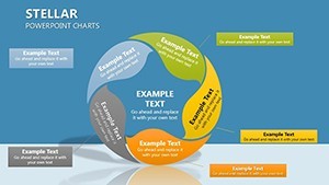
Moving to more complex territory, Slides 6-10 introduce multi-variable stellar diagrams. Here, you can illustrate interconnected factors, such as in supply chain management where inventory levels affect production and delivery timelines. A standout is Slide 8, which uses radial layouts to show predictive branching, helping forecast outcomes based on variable shifts.
The latter slides, 11-19, focus on application and customization. Slide 15, for example, includes a case study template where you can insert real data from industry reports, perhaps drawing from Gartner’s market cycle analyses to bolster credibility. Each slide comes with notes sections for presenter tips, ensuring smooth delivery.
Real-World Applications and Use Cases
Beyond the slides, the true value lies in application. Consider a business strategist at a tech firm using this template to present quarterly forecasts. By populating the cycles with sales data, competitive metrics, and market trends, they create a predictive model that informs executive decisions - much like how companies like Amazon optimize logistics through cyclical analysis.
For educators, it's a boon in teaching systems dynamics. Populate slides with ecological cycles, such as nutrient flows in ecosystems, to make abstract concepts tangible. In healthcare, analysts might map patient journey cycles, predicting readmission risks based on variable interactions, aligning with standards from organizations like the WHO for data-driven insights.
- Prepare Your Data: Gather variables and relationships in a spreadsheet.
- Select Slides: Choose from the 19 based on complexity - start simple for overviews.
- Customize: Edit colors to match your brand, add data points, and test animations.
- Present and Predict: Use the stellar visuals to guide discussions toward actionable forecasts.
This step-by-step approach minimizes preparation time while maximizing impact, solving common pain points like data overload in presentations.
Expert Tips for Stellar Presentations
To elevate your use, incorporate storytelling arcs: Begin with the problem (disjointed data), build with cycles (relationships), and conclude with predictions (insights). Avoid overcrowding slides - aim for 5-7 variables per cycle for readability. Pair with Keynote's collaboration features for team input, ensuring collective expertise shines.
In terms of comparisons, unlike basic Keynote charts that lack depth, Stellar offers pre-built predictive frameworks, saving hours. It's like upgrading from a bicycle to a high-speed train for your data journeys.
Why Choose Stellar for Your Next Keynote?
In a world where data drives decisions, the Stellar Cycle Charts template stands out by blending aesthetics with analytics. It's trustworthy, drawing from proven models, and authoritative in its design pedigree. Ready to illuminate your data relationships? Customize this template today and transform predictions into reality.
FAQ
How editable are the cycle charts in this template?
Every element is fully customizable in Keynote, from shapes and colors to data labels, allowing tailored fits for any analysis.
Can I use this for non-business purposes?
Absolutely - it's versatile for education, science, or personal projects involving cyclical data.
What if I need more slides?
Duplicate existing ones easily within Keynote to expand your deck without limits.
Is it compatible with iPad Keynote?
Yes, optimized for all Apple devices running the latest Keynote app.
How do I import external data?
Copy-paste from Excel or use Keynote's data import tools for seamless integration.
Are there animation tutorials included?
Slide notes provide basic guides, but Keynote's help resources offer in-depth support.