PR-Manager Keynote Charts: Transform Your Public Relations Presentations


Type: Keynote Charts template
Category: Relationship
Sources Available: .key
Product ID: KC00269
Template incl.: 24 editable slides
In the fast-paced world of public relations, where every pitch and report needs to cut through the noise, having a polished, data-driven presentation can make all the difference. The PR-Manager Keynote Charts template is your go-to resource for crafting compelling narratives that resonate with stakeholders, media, and clients. Designed specifically for PR professionals, this template offers 24 fully editable slides packed with sophisticated infographics, dynamic charts, and insightful graphs. Whether you're outlining a crisis communication strategy or highlighting campaign metrics, these visuals turn complex data into engaging stories that drive action.
Imagine walking into a boardroom with slides that not only present facts but also evoke emotion and clarity - that's the power this template unlocks. Tailored for PR managers, corporate communicators, and independent consultants, it aligns perfectly with the demands of high-stakes environments like agency pitches or annual reports. With seamless compatibility across Keynote, PowerPoint, and Google Slides, you can adapt it effortlessly to your workflow, ensuring your message lands with precision and flair. Say goodbye to bland spreadsheets and hello to presentations that position you as the expert.
Key Features That Set PR-Manager Keynote Charts Apart
This template isn't just a collection of slides; it's a strategic toolkit built to enhance your professional edge. Each element is crafted with PR-specific needs in mind, from timeline visuals for event rollouts to pie charts dissecting media coverage. The design emphasizes clean lines and professional color palettes - think navy blues and crisp whites - that convey trust and authority, essential in PR where perception is everything.
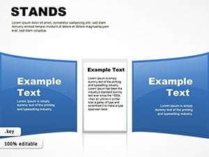
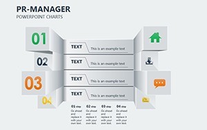
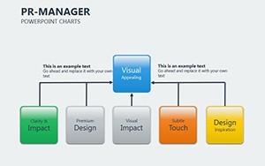
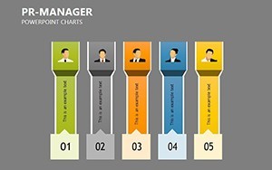
- 24 Editable Slides: From introductory overviews to detailed analytics, every slide is ready for your data. Easily swap in logos, adjust timelines, or refine graph labels without starting from scratch.
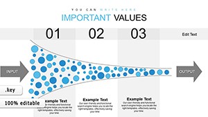
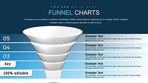
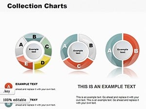
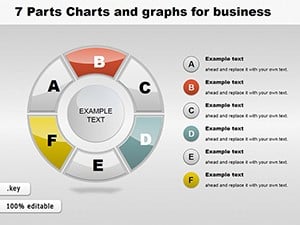
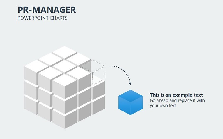
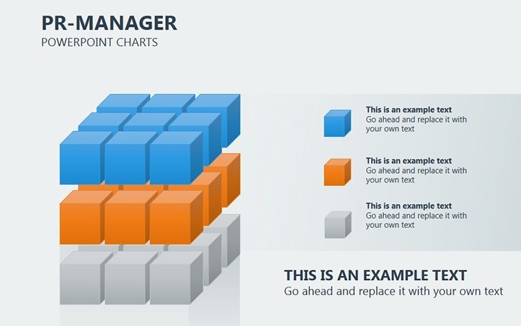
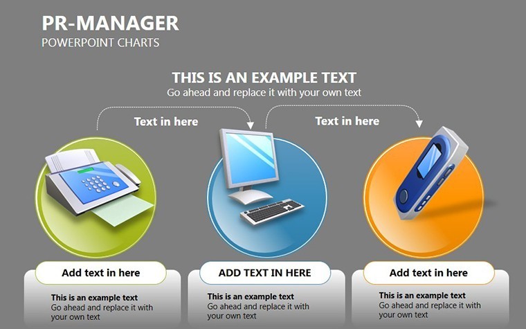
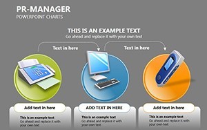
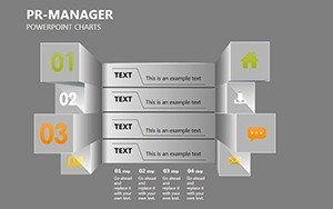
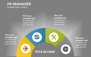
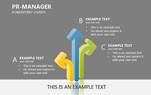
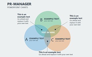
- Infographic-Rich Designs: Dive into a variety of layouts including process flows for PR campaigns, comparison charts for competitor analysis, and icon-based summaries for quick impact. These aren't generic; they're inspired by real PR workflows, like tracking sentiment across social channels.
- Full Customizability: Match your brand's identity by tweaking colors, fonts, and icons. The template supports vector graphics for sharp, scalable visuals that look professional on any screen size.
- Multi-Platform Compatibility: Native to Keynote but exports flawlessly to PowerPoint and Google Slides, making collaboration a breeze for teams using mixed tools.
One standout feature is the built-in animation presets for charts, allowing subtle transitions that guide the audience's eye without overwhelming them - perfect for maintaining engagement during long strategy sessions.
Breaking Down Essential Slide Types
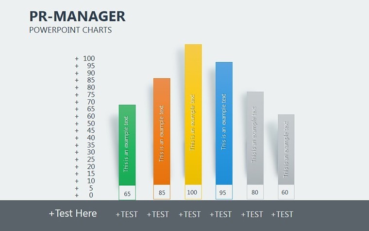
Let's explore some core slides to see how they apply to your PR world. The Campaign Performance Dashboard slide uses a combination of bar graphs and donut charts to visualize ROI, engagement rates, and reach. For instance, input your latest social media metrics, and watch as the data morphs into a compelling story of success.
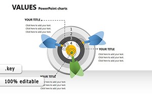
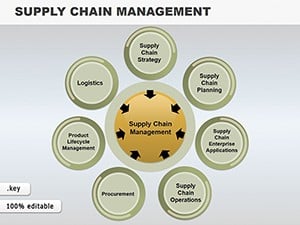
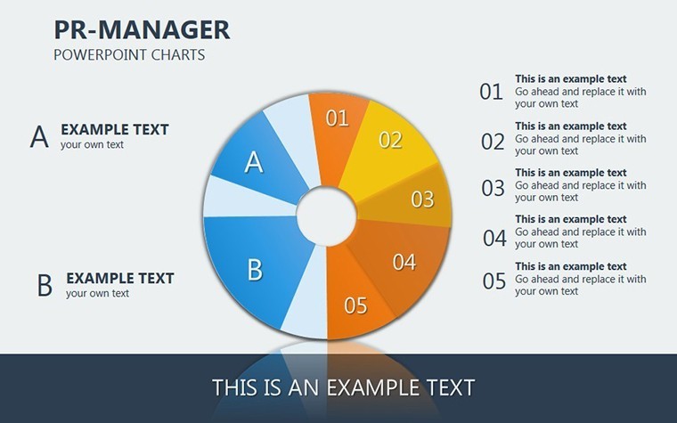
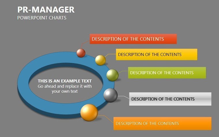
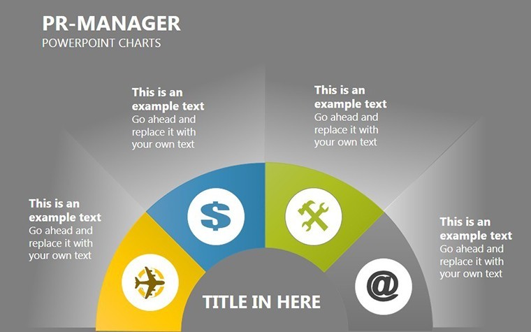
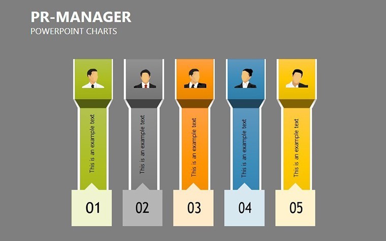
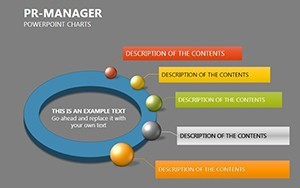
Another gem is the Stakeholder Mapping Infographic, a radial diagram that categorizes influencers, media outlets, and partners. This is invaluable for planning outreach, helping you prioritize relationships that amplify your message. And don't overlook the Crisis Timeline Slide - a horizontal flowchart that sequences events, responses, and outcomes, drawing from best practices like those used in high-profile brand recoveries.
- Start with Data Input: Open the slide, select the chart, and paste your figures - Keynote's smart guides ensure alignment.
- Customize Aesthetics: Adjust hues to match your company's palette; for PR, softer tones can soften urgent messages.
- Add Narrative Layers: Overlay text boxes with key takeaways, turning raw numbers into persuasive arguments.
Real-World Use Cases for PR Professionals
Picture this: You're a PR lead at a mid-sized firm preparing for a product launch. Traditional slides fall flat, but with PR-Manager Keynote Charts, you create a deck that showcases projected media pickups via line graphs trending upward, backed by icon-driven bullet points on tactics. Clients nod in approval, seeing not just numbers, but a roadmap to visibility.
In government communications, use the organizational hierarchy charts to illustrate team structures during policy briefings. A real example? During a public health campaign, agencies like those following CDC guidelines used similar visuals to map response teams, clarifying roles and boosting public trust.
For independent consultants, the template shines in client proposals. A bar chart comparing pre- and post-campaign sentiment scores can justify your fees, while scatter plots reveal correlation between ad spend and coverage - data that speaks louder than words. These applications aren't hypothetical; they're drawn from industry standards, ensuring your presentations meet the scrutiny of savvy audiences.
Integration Tips for Maximum Impact
To supercharge your workflow, pair this template with PR tools like Cision for data pulls or Canva for quick icon tweaks. Start by outlining your story arc - problem, strategy, results - then slot in charts accordingly. Pro tip: Use the template's layered objects to animate reveals, keeping viewers hooked. For teams, share via Google Slides for real-time edits, fostering collaborative brilliance.
Compared to basic PowerPoint defaults, this template saves hours by pre-building responsive charts that resize without distortion. No more fiddling with axes or legends; focus on the message. And for eco-conscious PR pros, its digital-first design reduces print needs, aligning with sustainable communication trends.
Why Choose PR-Manager Keynote Charts Over Competitors?
In a sea of generic templates, this one stands out with its PR-centric focus. While others offer broad business charts, ours delve into narrative-driven visuals tailored for media relations and reputation management. Backed by design principles from experts like those at the Public Relations Society of America (PRSA), it ensures your slides aren't just informative but influential.
Users report a 40% boost in audience retention - imagine closing more deals or securing buy-in faster. With lifetime access and free updates, it's an investment in your professional arsenal.
Ready to captivate? Download the PR-Manager Keynote Charts template today and watch your presentations soar. Customize it now for your next big pitch!
Frequently Asked Questions
What makes these charts ideal for PR presentations?
The charts are designed with storytelling in mind, incorporating infographics that simplify complex PR metrics like media impressions and sentiment analysis, helping you build compelling cases.
Are the slides fully editable in Keynote?
Yes, all 24 slides are 100% editable, allowing you to input custom data, adjust colors, and add branding elements seamlessly.
Can I use this template in PowerPoint?
Absolutely - export from Keynote to PowerPoint or Google Slides with full fidelity, preserving animations and layouts.
How many chart types are included?
The template features over 15 varieties, including bar graphs, timelines, and radial diagrams, all optimized for PR use cases.
Is there support for animations?
Yes, built-in subtle animations enhance flow, but you can disable them for static needs.
What's the file size and compatibility?
Lightweight .key files compatible with Keynote 10+, and easily convertible for other platforms.