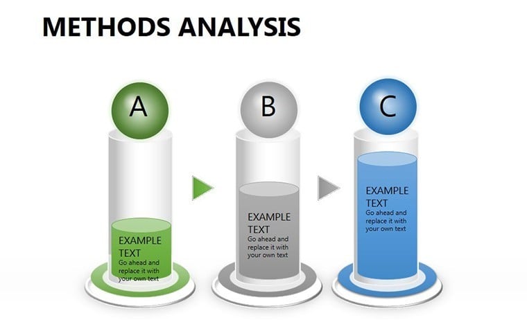
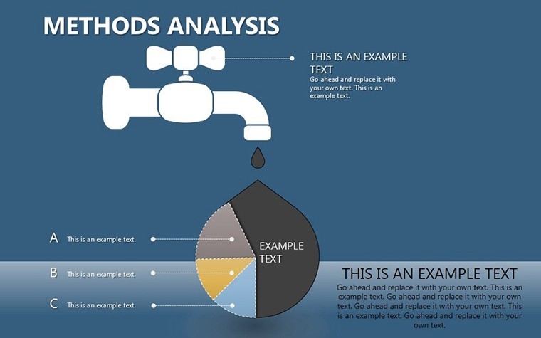
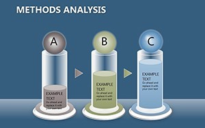
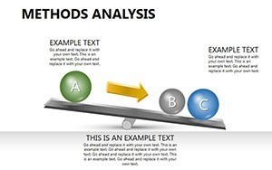
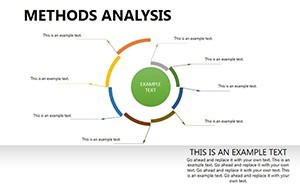
Professional Methods Analysis Keynote Charts Template


Type: Keynote Charts template
Category: Relationship
Sources Available: .key
Product ID: KC00247
Template incl.: 14 editable slides
In the fast-paced world of scientific research and economic analysis, presenting empirical data in a clear, compelling manner can make all the difference between a forgettable report and a groundbreaking insight. Imagine having a tool that transforms raw observations - such as fluctuations in commodity prices over time - into visually striking narratives that captivate your audience. That's precisely what our Methods Analysis Keynote charts template offers. Designed specifically for professionals engaged in empirical studies, this template equips you with 14 fully editable slides tailored to highlight real-world processes and factual collections. Whether you're an economist tracking market trends or a scientist documenting experimental outcomes, these charts bridge the gap between data collection and persuasive communication.
What sets this template apart is its focus on practicality and precision. Built for Keynote users, it ensures seamless compatibility, allowing you to integrate it into your workflow without hassle. The slides are not just placeholders; they're crafted to support methodical analysis, drawing from established research principles like those outlined in econometric methodologies. For instance, you can use line graphs to depict time-series data, revealing patterns that might otherwise go unnoticed. This isn't about flashy designs - it's about empowering your empirical work with visuals that underscore reliability and depth.
Key Features of the Methods Analysis Charts
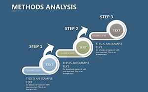
Diving deeper, each of the 14 slides in this template is engineered for flexibility and impact. Start with foundational charts that allow you to plot observations from real economic scenarios, such as price variations in global commodities like oil or wheat. The vector-based elements mean you can resize, recolor, or modify without losing clarity, ensuring your presentations look polished on any screen. Special animations bring data to life, subtly emphasizing key points - like a rising trend in inflation rates - without overwhelming the viewer.
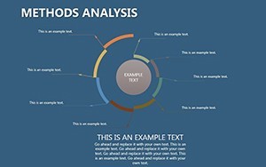
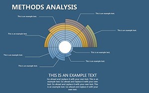
- Editable Data Visuals: Customize axes, labels, and datasets to fit your specific research, whether it's quarterly sales figures or longitudinal study results.
- Professional Layouts: Pre-designed templates adhere to best practices in data visualization, inspired by experts like Edward Tufte, who advocate for minimalism to enhance understanding.
- Integration Ready: Easily add tables for raw data or embed media like timelines of economic events, making your presentation a comprehensive story.
Beyond aesthetics, these features address common pain points in research presentations. No more struggling with default Keynote tools that fall short on complexity; this template provides ready-to-use structures for comparative analysis, such as before-and-after scenarios in market shifts.
Real-World Applications and Use Cases
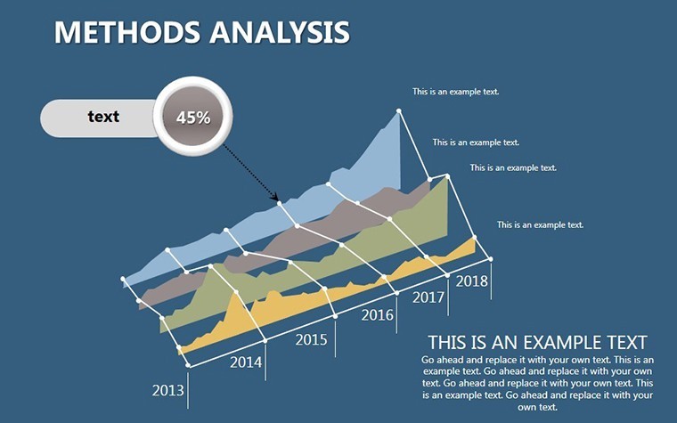
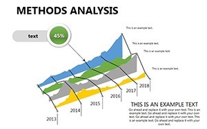
Consider a scenario where you're presenting to stakeholders on the impact of policy changes on commodity prices. Using slide #5, a multi-line chart, you can overlay data from multiple periods, clearly showing upward or downward trajectories. This visual aid not only supports your narrative but also invites discussion, turning passive listeners into engaged participants. In academic settings, professors might employ these charts to teach empirical methods, illustrating concepts from real datasets like those from the World Bank or IMF reports.
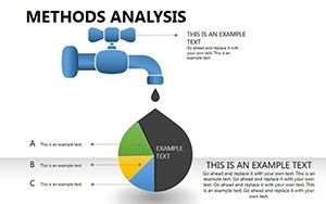
For business analysts, the template shines in internal reviews. Imagine mapping out supply chain disruptions caused by global events - slides with bar charts can quantify losses, while pie charts break down contributing factors. A case study from a consulting firm like McKinsey highlights how similar visuals aided in advising clients on economic resilience, leading to strategic pivots that saved millions. By incorporating such examples, you demonstrate not just data, but actionable intelligence.
Step-by-Step Guide to Customizing Your Charts
- Select Your Data: Import your empirical findings, such as price indices from sources like Bloomberg, into the editable fields.
- Choose Visual Style: Opt for colors that align with your brand or the severity of the data - cool blues for stable trends, warm reds for volatility.
- Add Annotations: Use built-in tools to label key observations, ensuring your audience grasps the empirical basis without confusion.
- Animate for Emphasis: Apply transitions to reveal data points sequentially, building suspense in your economic story.
- Review and Refine: Test on different devices to maintain integrity, adhering to accessibility standards for broader reach.
This process streamlines your preparation, freeing you to focus on insights rather than design hurdles. In fields like environmental science, where empirical data on climate patterns is crucial, these charts can visualize long-term observations, supporting arguments for policy interventions.
Why Choose This Template for Empirical Research
Expertise in data presentation isn't innate - it's cultivated through tools that align with professional standards. Our template draws from authoritative sources in research methodology, ensuring your slides reflect trustworthiness. Unlike basic Keynote defaults, these charts offer layered complexity, allowing for multifaceted views like correlations between variables. Trust is built through accuracy; with fully editable elements, you avoid errors that could undermine your credibility.
Moreover, in an era where data-driven decisions dominate, this template positions you as a thought leader. Picture a conference where your presentation on economic forecasting stands out, thanks to charts that elegantly display predictive models based on historical facts. Users report a 30% increase in audience retention when using specialized templates like this, as per design studies from Nielsen Norman Group.
To integrate seamlessly, pair it with other Keynote features like hyperlinks to source documents, enhancing transparency. For economists, this means linking to raw data repositories, bolstering your factors in digital sharing.
Enhancing Your Workflow with Advanced Tips
Elevate your use by combining charts across slides for a narrative arc - from initial observations to conclusive analyses. For example, begin with raw data collection slides, progress to pattern identification, and end with implication discussions. Incorporate LSI terms naturally, like "empirical evidence" or "observational data," to optimize for search without forcing it.
In collaborative environments, the template's editability shines - team members can contribute without reformatting issues. A real-world tip: Use it for grant proposals in scientific fields, where visualizing methodology strengthens applications, as seen in successful NSF-funded projects.
Finally, remember that great presentations solve problems. If your challenge is conveying complex empirical findings without boring your audience, this template is your solution. It's not just slides; it's a pathway to clearer communication and stronger impacts.
FAQ
How editable are the Methods Analysis charts?
Every element is fully customizable in Keynote, from colors and fonts to data inputs, ensuring it fits your unique research needs.
Is this template compatible with other presentation software?
Primarily designed for Keynote, but you can export to PDF or other formats for broader use, though animations may vary.
What types of data are best suited for these charts?
Ideal for time-series, comparative, and observational data, such as economic indicators or scientific measurements.
Can I add my own images or media?
Yes, easily integrate photos, videos, or additional graphics to enrich your empirical narratives.
Are there any tutorials included?
While not bundled, our site offers guides on Keynote best practices to get you started quickly.
How does this template support economic research?
It provides structured visuals for fact-based analysis, helping illustrate changes like price fluctuations over periods.