Ishikawa Fishbone Keynote Charts: Diagram Your Path to Problem-Solving


Type: Keynote Charts template
Category: Business Models
Sources Available: .key
Product ID: KC00237
Template incl.: 19 editable slides
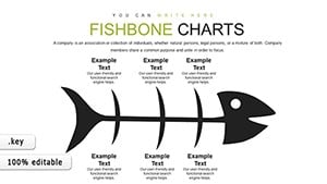
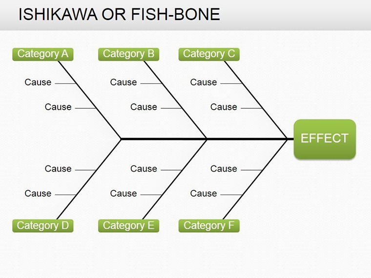
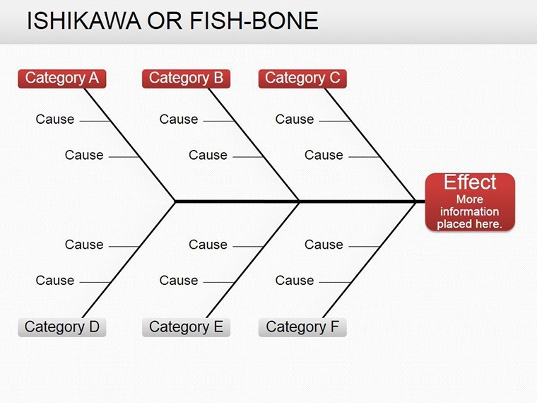
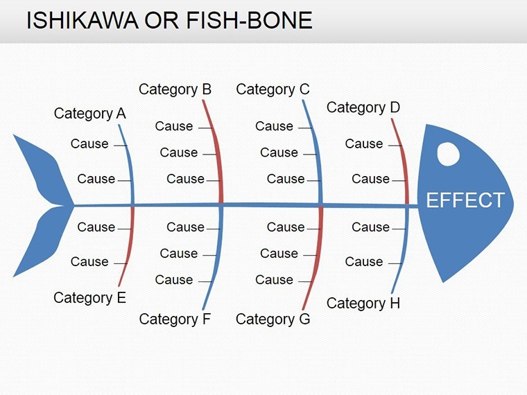
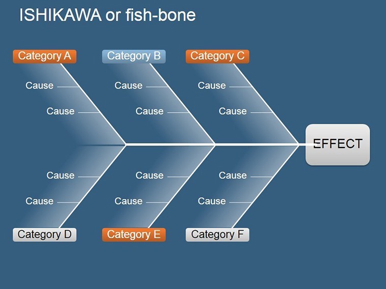
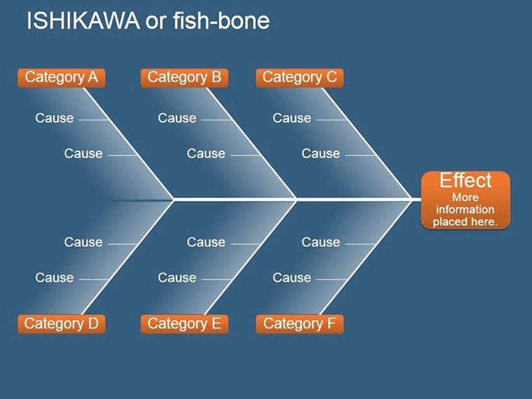
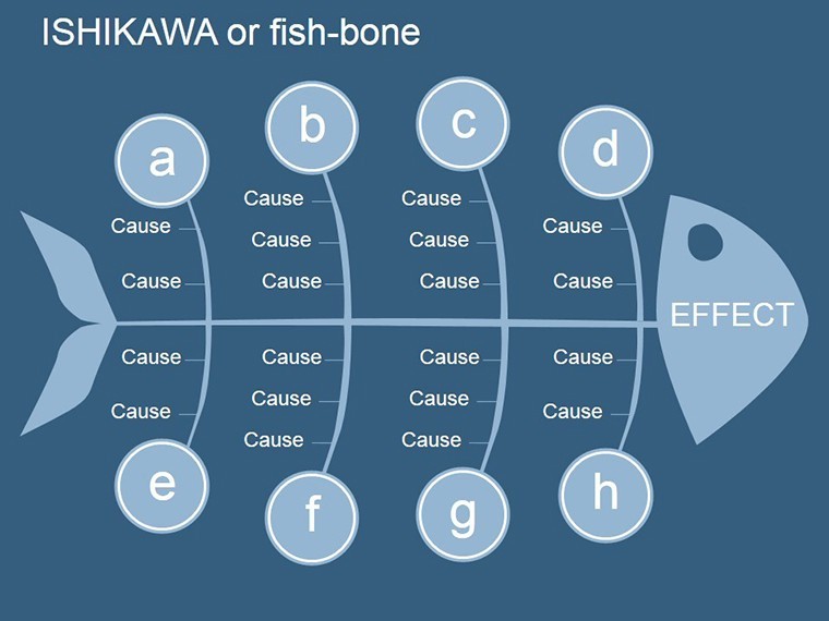
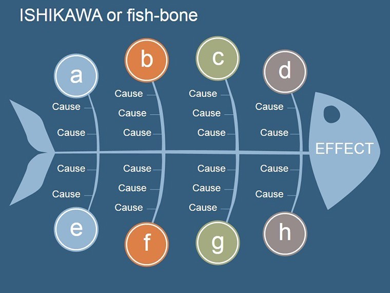
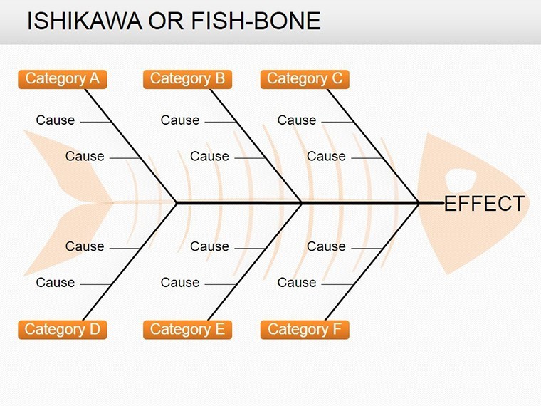
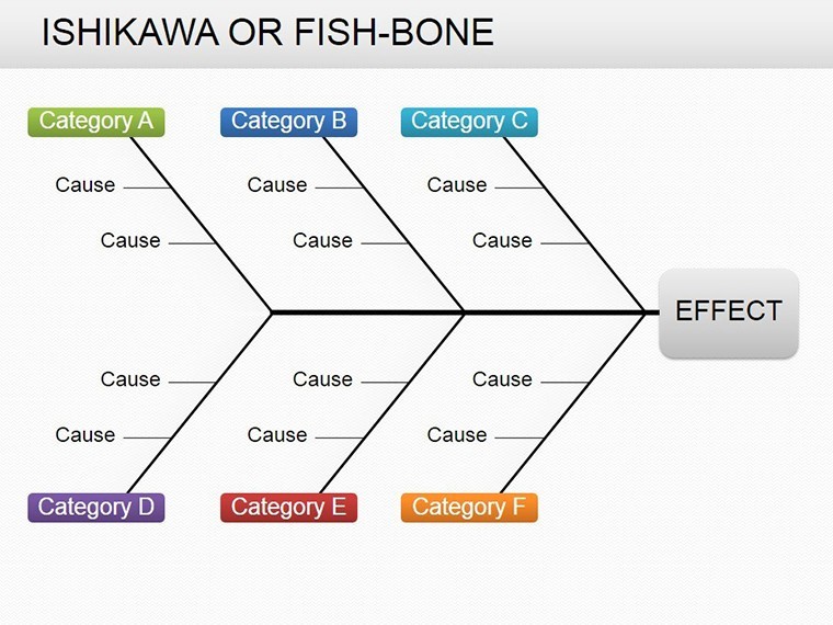
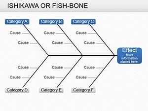
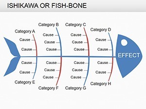
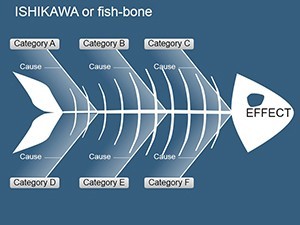
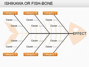
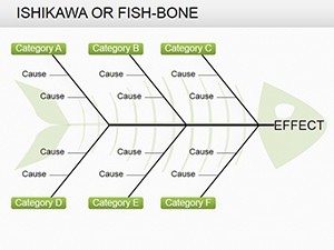
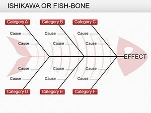
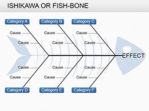
In the realm of business analysis, uncovering root causes isn't just analysis - it's the key to innovation and efficiency. The Ishikawa Fishbone Keynote Charts template brings this to life with 19 editable slides inspired by the renowned cause-and-effect diagram, originally developed by Kaoru Ishikawa for quality management. Tailored for managers, consultants, and process engineers, this template helps dissect problems in manufacturing, services, or strategy, turning chaotic factors into structured visuals that guide actionable solutions.
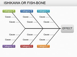
Why does this matter? Traditional lists fall short; the fishbone structure - with its "head" for the effect and "bones" for causes - reveals interconnections across categories like people, methods, materials, and environment. Optimized for Keynote, these slides feature drag-and-drop editability, allowing you to input real data while maintaining a clean, professional aesthetic. It's more than a tool; it's a methodology embedded in design, aligning with Six Sigma principles for measurable improvements.
Core Features for Effective Root Cause Analysis
Designed with precision, the template empowers users to build comprehensive diagrams without starting from scratch. Standout elements include:
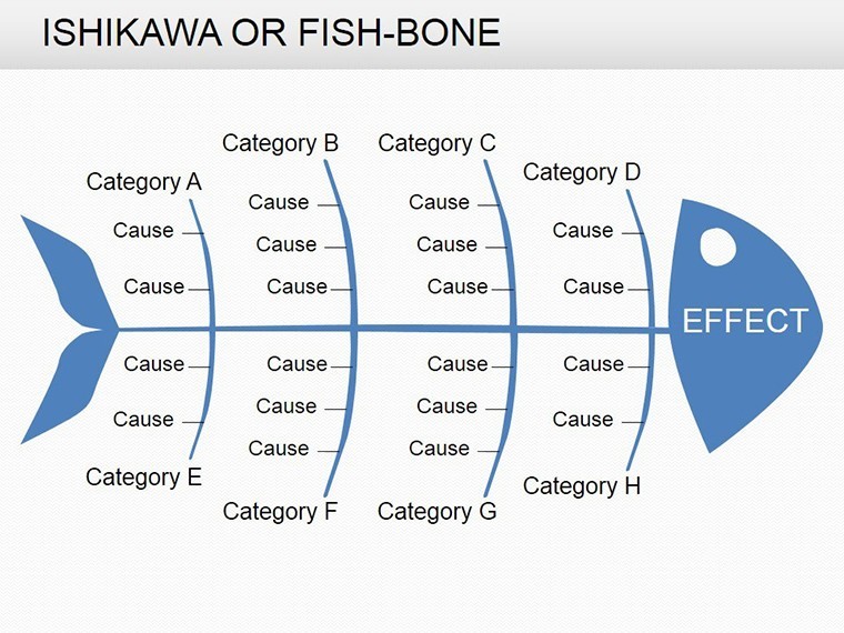
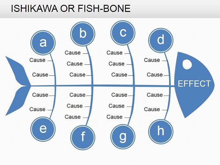
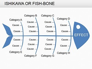
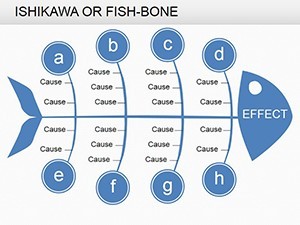
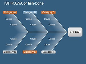
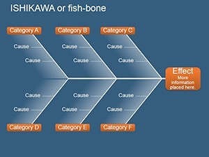
- Modular Fishbone Layouts: Scalable spines for 4-8 cause categories, perfect for comprehensive audits.
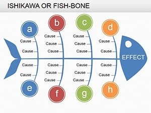
- Integrated Factor Icons: Symbols for common influencers (e.g., gears for machines, figures for manpower), customizable for industry specifics.
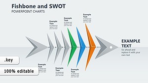
- Dynamic Highlighting: Color-coded bones to prioritize high-impact causes, with Keynote transitions for phased reveals.
- Summary Integration: Trailing slides for action plans, linking back to diagram insights.
These draw from Ishikawa's own teachings, emphasizing team collaboration in problem identification, as seen in lean manufacturing case studies from the Journal of Operations Management.
Navigating the Slides: From Identification to Resolution
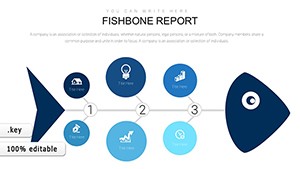
Begin with foundational slides (1-5): Basic fishbone templates for quick setups, like troubleshooting production delays. Input your problem statement in the head, then branch out causes - slide 4's multi-level bones allow sub-factors for deeper dives.
Mid-section (slides 8-13) introduces variations, such as horizontal fishbones for timeline-based issues or 3D renders for visual pop. For a service example, use slide 11 to map customer complaints, categorizing under policy, process, and people.
Conclude with slides 16-19: Synthesis charts that aggregate findings into prevention strategies, complete with KPI trackers. Animate the bones to "grow" causes, building tension toward solutions.
Targeted Use Cases: Applying Fishbones in Action
Picture a project manager facing scope creep: Deploy the template to trace delays back to resource allocation "bones," informing better planning - a technique validated in PMI reports. In healthcare, quality teams use it for error analysis, preventing recurrence as per Joint Commission standards.
Consultants love it for client workshops; one firm reported resolving 25% more issues post-implementation by visualizing causal chains. For startups, it's ideal for product development roadblocks, framing pivots around data-driven insights.
Expert Tips: Enhancing Your Analysis Workflow
Populate with team input via shared Keynote files, using hyperlinks to evidence docs. Limit categories to avoid overload, per cognitive design rules. For exports to reports, PDF-friendly vectors preserve clarity. Advanced: Overlay quantitative data with sparklines on bones for hybrid qual-quant views.
Integrate with tools like MindMeister for brainstorming, then refine in Keynote for polished delivery.
Elevate Beyond Basic Diagramming
What separates this from free online generators? Native Keynote integration means no compatibility hiccups, plus unlimited revisions. Users appreciate the focus: "Transformed our root cause meetings from tedious to transformative," says an operations lead.
It's an investment in foresight - prevent problems before they escalate. Secure your Ishikawa Fishbone Keynote Charts today and diagram success. Edit, analyze, and advance with confidence.
Frequently Asked Questions
What is an Ishikawa Fishbone diagram used for?
It's a tool for identifying root causes of problems by categorizing factors visually.
Are the diagrams fully customizable?
Yes - edit categories, add sub-causes, and adjust styles to fit your analysis.
How does it help in business models?
By clarifying factor influences, it supports process optimization and risk mitigation.
Can I animate the fishbone elements?
Keynote's tools enable smooth builds, revealing causes step-by-step.
Is it suitable for non-manufacturing industries?
Absolutely - adaptable for services, IT, or healthcare problem-solving.
What file type is provided?
.key format, with editable sources for Keynote users.