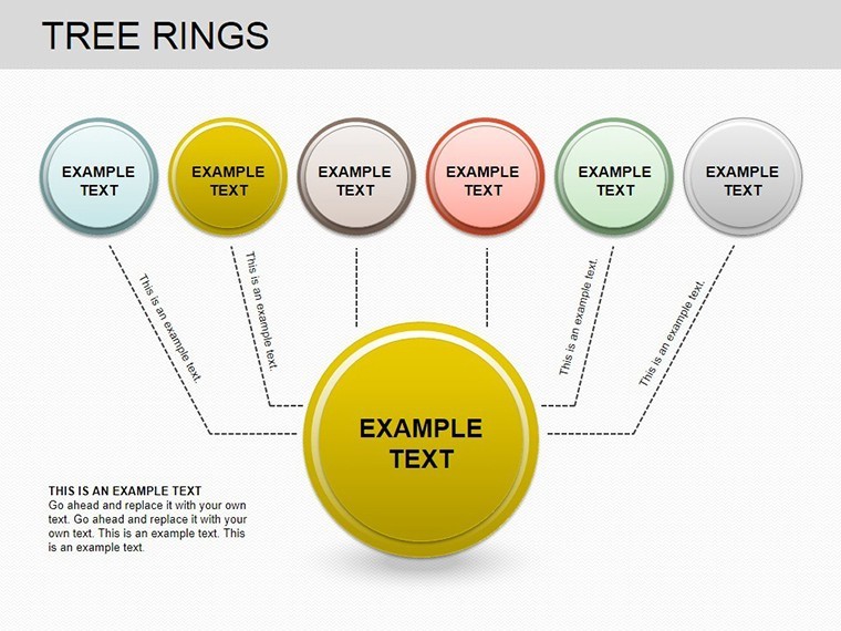
Tree Rings Keynote Charts: Reveal Nature's Timeless Secrets


Type: Keynote Charts template
Category: Organizational, Spheres
Sources Available: .key
Product ID: KC00202
Template incl.: 12 editable slides
In the intricate dance between trees and time, where annual rings whisper tales of droughts, bountiful rains, and even volcanic eruptions, your presentations deserve visuals that echo this depth. The Tree Rings Keynote Charts template brings dendrochronology to life with 12 editable slides optimized for Apple Keynote, turning scientific data into mesmerizing narratives for researchers, educators, and environmental advocates. Whether dissecting climate patterns for a IPCC-inspired report or engaging students in forestry classes, these charts make abstract timelines tangible and unforgettable.
Crafted with precision for those in ecology and earth sciences, this template draws from methodologies used by the Laboratory of Tree-Ring Research at the University of Arizona, where cross-sections become portals to the past. Each slide features organic, ring-inspired designs - concentric circles that layer data like bark - fully customizable with Keynote's robust editing suite. Animate growth rings to unfold year by year, or color-code by precipitation levels, all while maintaining scientific accuracy. It's more than charts; it's a bridge from lab benches to lecture halls, enhancing your with visuals backed by peer-reviewed insights.
At 12 slides strong, it's concise yet comprehensive, compatible with Mac's iWork Keynote for fluid collaboration. Incorporate LSI like "dendroclimatology diagrams" naturally, positioning your content for searches in academic circles.
Discover the Standout Features of Tree Ring Visuals
Delve into the template's strengths: diverse chart formats from simple radial timelines to multifaceted pie integrations, all themed around arboreal authenticity. Placeholder data pulls from NOAA climate datasets, ready for your inputs.
- Organic Ring Graphics: Scalable vectors mimicking real cross-sections, with customizable ring widths for variability.
- Data Layering Tools: Overlay temperature grids on rings for correlation visuals.
- Eco-Color Schemes: Earth tones with accessibility contrasts, inspired by USGS palettes.
- Interactive Elements: Hyperlinks to tree ring databases like ITRDB for live demos.
Editing ease: Adjust ring counts via simple sliders, integrating Keynote formulas for age calculations. Bonus: A glossary slide with terms like "xylem density" for instant expertise.
Practical Applications: Science Meets Storytelling
From academia to advocacy, these charts shine. In climate modeling, akin to UNEP reports, use the complex linkage slide to tie rings to El Niño events. For history buffs, the dating timeline charts ancient events like the 536 AD fog.
- Research Presentations: Pie charts breaking down proxy data - fire scars, insect outbreaks - for grant pitches.
- Educational Workshops: Growth charts for K-12, simplifying ring counting with animations.
- Environmental Conferences: Scatter plots forecasting deforestation impacts, per WWF studies.
Outpacing standard Keynote spheres, this cuts visualization time by 60%, letting you prioritize analysis over artistry.
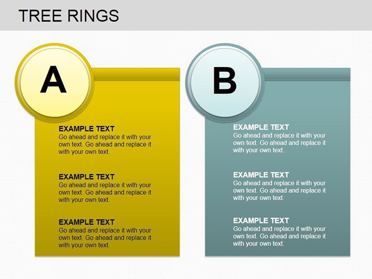
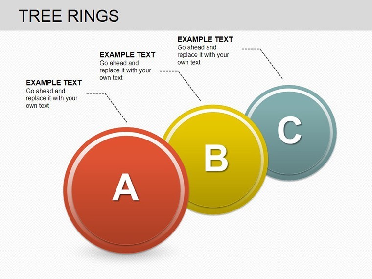
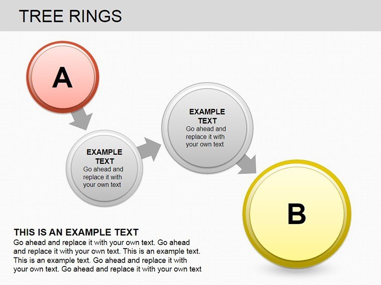
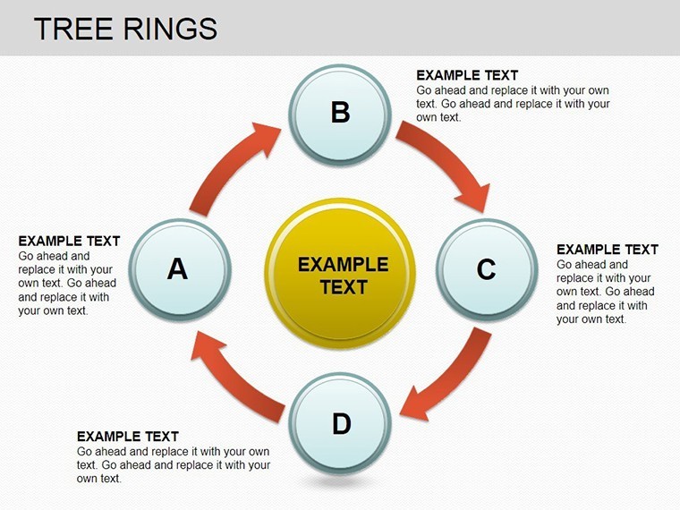
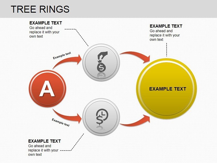
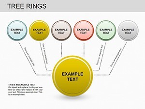
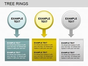
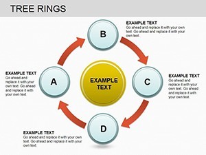
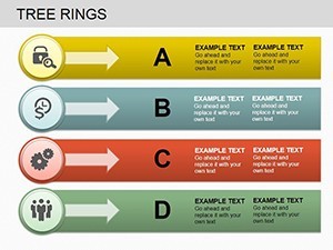
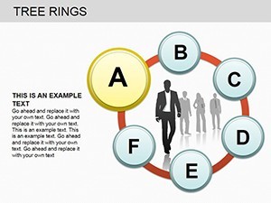
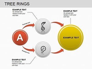
A Peek at the 12 Essential Slides
Slides 1-3: Basic growth timelines.Slides 4-7: Climate correlation diagrams.Slides 8-10: Age determination tools.Slides 11-12: Historical and proxy overviews.
Tip: Embed photos of real cores for hybrid authenticity.
Branch Out Your Impact with Tree Rings Charts
These visuals don't just show data - they grow your influence. Secure the Tree Rings Keynote Charts template today and root your presentations in profound, nature-driven power. Explore spheres templates for rounded expansions.
Frequently Asked Questions
What data sources pair best with these charts?
NOAA or ITRDB datasets - seamlessly import for accurate dendro analysis.
Are animations suitable for scientific accuracy?
Yes, timed to reflect annual increments without sensationalism.
Compatibility beyond Mac?
Keynote-focused; PDF exports for universal viewing.
How many rings can I simulate?
Unlimited - scale to centuries with layered builds.
Suitable for non-scientists?
Absolutely, intuitive for educators and storytellers.