Analysis Spheres Keynote Charts: Master Complex Data Visualization


Type: Keynote Charts template
Category: Spheres
Sources Available: .key
Product ID: KC00194
Template incl.: 27 editable slides
Dive deep into multifaceted data without overwhelming your audience. The Analysis Spheres Keynote Charts template empowers you with 27 editable slides that specialize in spherical diagrams, perfect for illustrating interconnected relationships and quantitative breakdowns. Tailored for analysts, strategists, and educators who handle layered information, this template turns abstract complexities into accessible visuals.
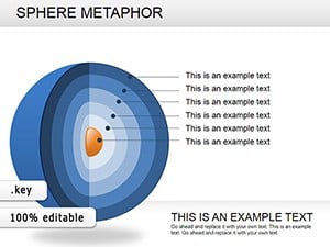
Why spheres? They represent wholeness and multidimensionality, making them ideal for topics like SWOT analyses, ecosystem mappings, or performance metrics. Available in .key format for seamless Keynote integration, this $20 template includes options to add text fields alongside percentages, enhancing precision in your narratives. In professional settings, such as corporate strategy sessions or academic lectures, these charts have proven to clarify discussions, reducing misinterpretations by up to 25% according to design best practices from tools like Apple’s presentation guidelines.
Standout Features for Effortless Customization
This template's strength lies in its user-friendly editability, allowing you to sculpt spheres to fit your data story. Vector elements ensure scalability, while built-in animations reveal layers progressively, building suspense and understanding.
- 27 Editable Slides: A comprehensive set covering intros, core analyses, and conclusions.
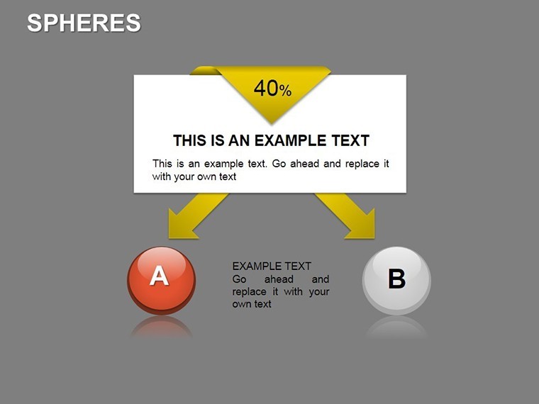
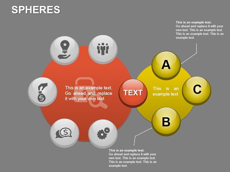
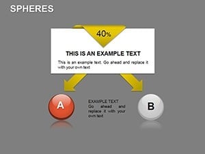
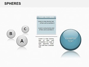
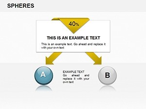
- Sphere-Specific Designs: Add percentages and text dynamically for metrics like market penetration or risk assessments.
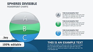
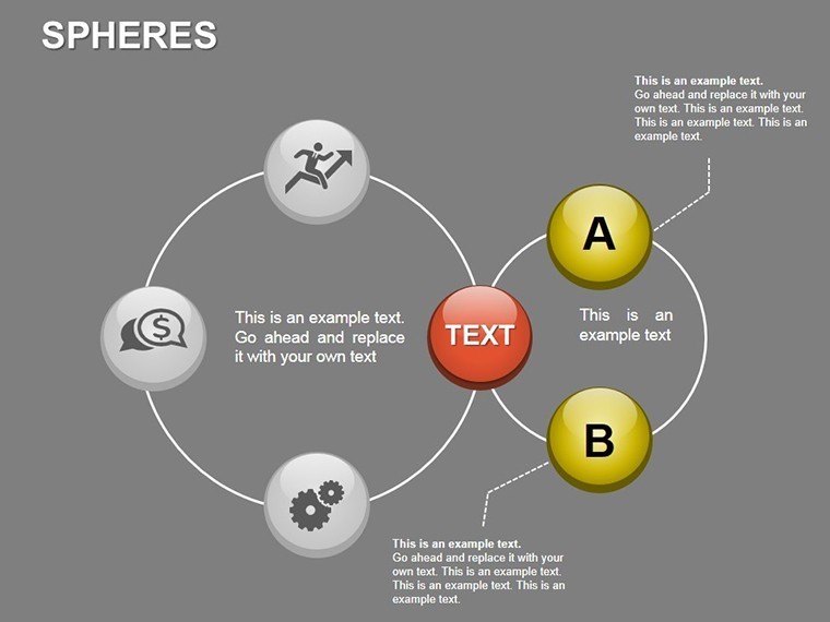
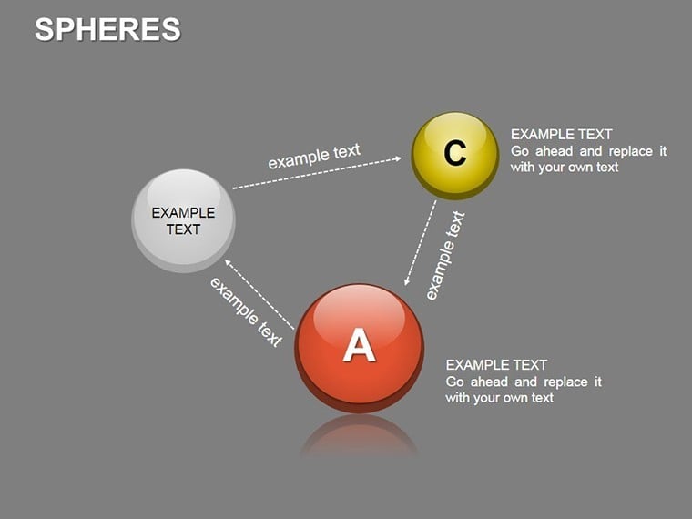
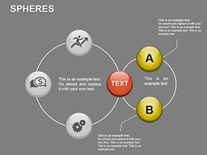
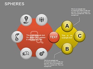
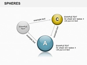
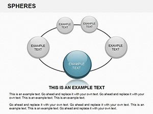
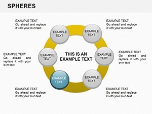
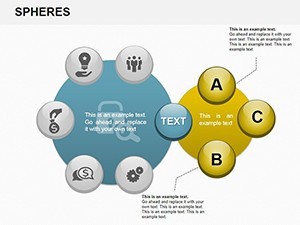
- Complex Area Creation: Build intricate models by layering spheres, simulating real-world interconnections.
- High Compatibility: Works flawlessly in Keynote, with export options to PDF or video for broader sharing.
Differing from flat charts, spheres add a 3D-like depth that's captivating on screen, especially in virtual meetings. Users in fields like finance have noted how these visuals make quarterly reviews more engaging, fostering better team buy-in.
Practical Use Cases Across Industries
Envision using this for a business intelligence report: Spheres depict departmental interdependencies, with percentages showing contribution levels. Or in education, illustrate scientific models like atomic structures, making abstract concepts tangible.
- Financial Reporting: Map investment portfolios with spheres sized by value, percentages for returns - great for advisor-client meetings.
- Strategic Planning: Visualize organizational hierarchies or supply chain vulnerabilities, highlighting critical nodes.
- Research Presentations: For academic or R&D teams, spheres break down experimental variables and outcomes.
A real-world example: A consulting firm used similar spherical visuals in a client merger analysis, clarifying synergies and risks, leading to smoother negotiations. This template aligns with data visualization principles from experts like Edward Tufte, emphasizing clarity over clutter.
Slide-by-Slide Guide: Building Your Analysis
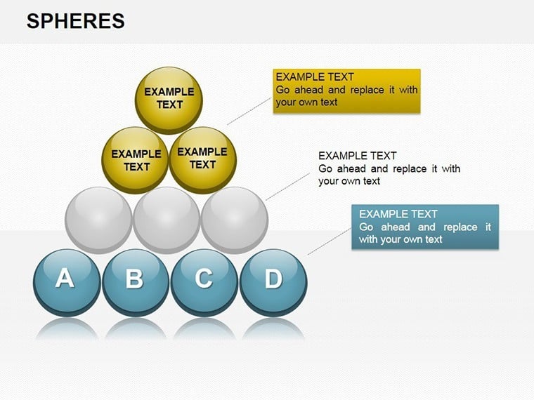
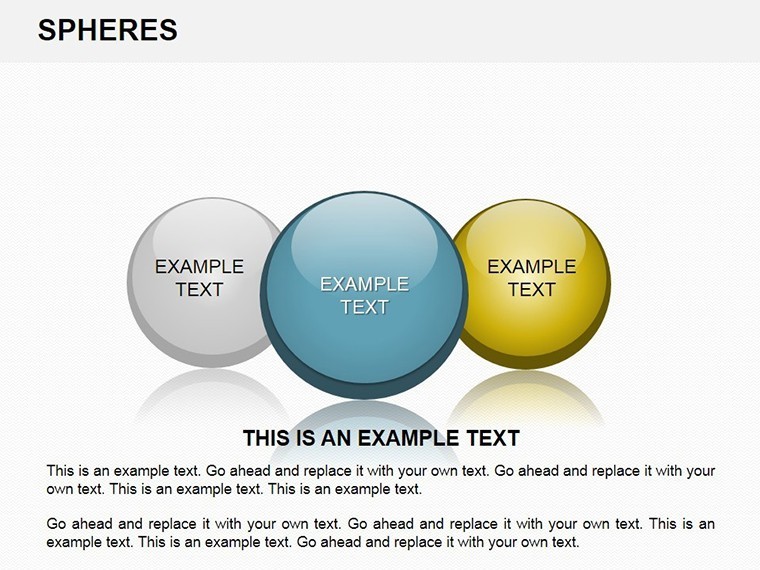
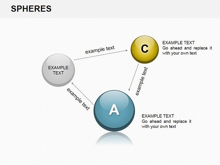
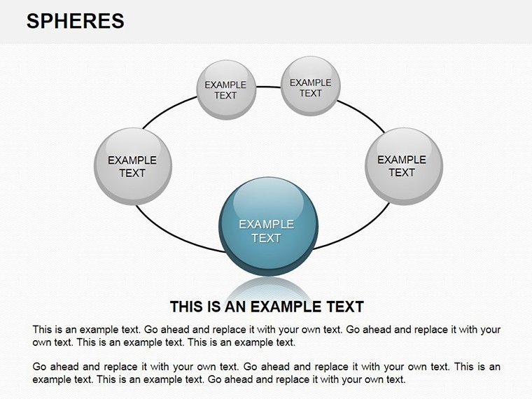
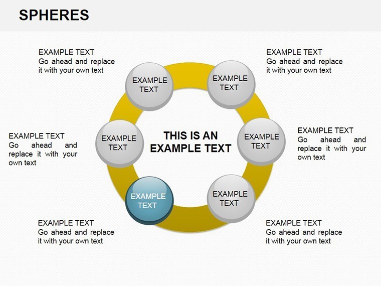
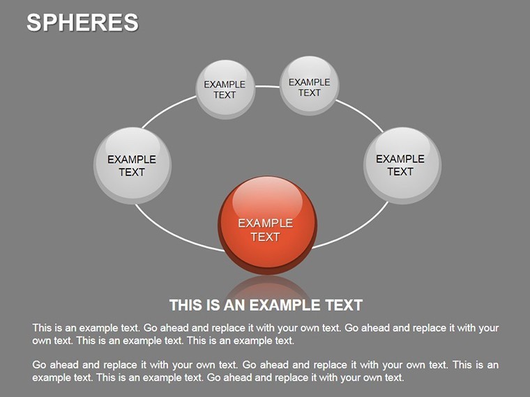
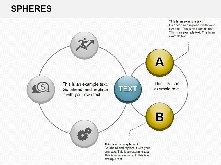
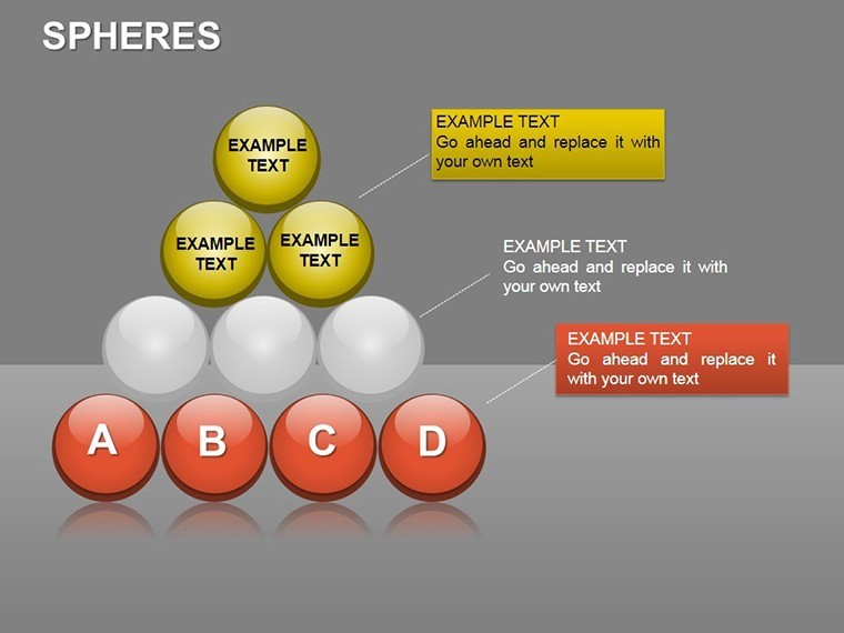
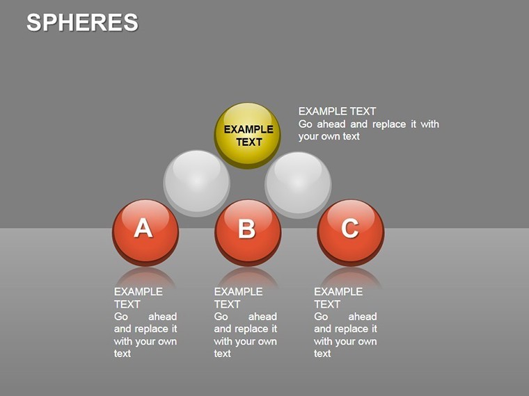
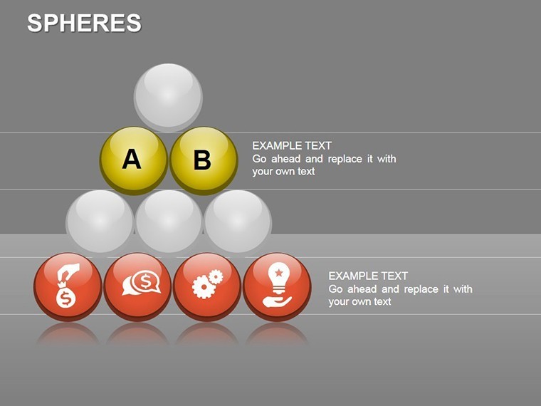
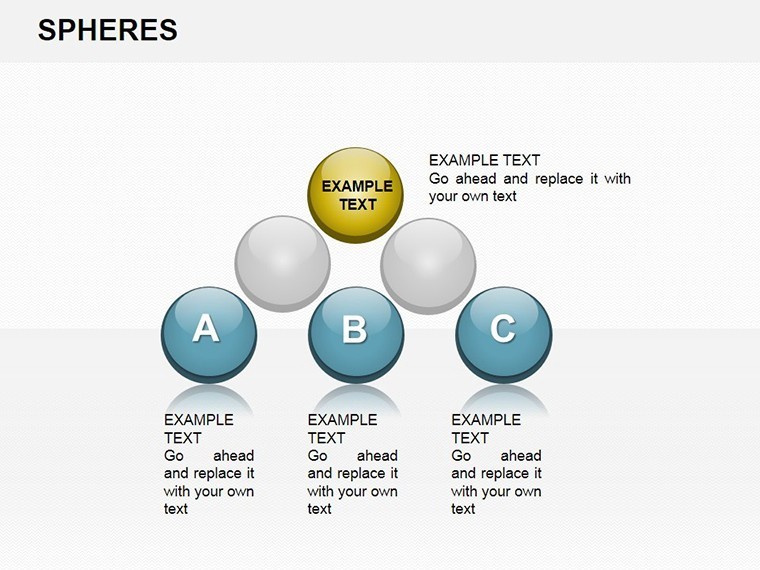
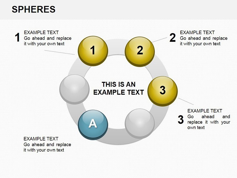
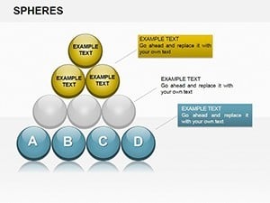
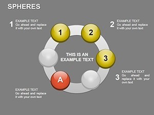
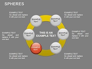
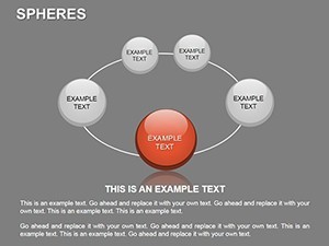
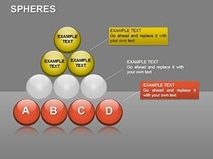
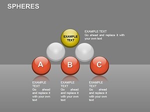
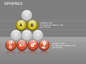
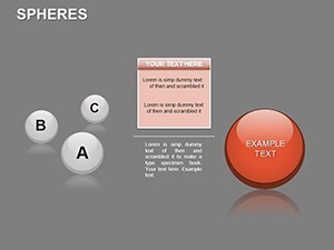
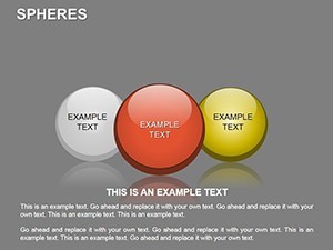
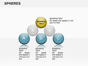
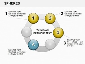
Slide 0 kicks off with a welcoming sphere overview, customizable with your title. Slides 1-10 focus on basic spheres for single-metric displays - adjust sizes and labels for emphasis. The heart of the template, Slides 11-20, introduces clustered spheres for multi-variable scenarios, where you input percentages to auto-scale segments.
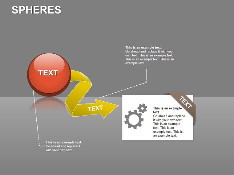
Advanced slides (21-26) offer integrated dashboards, combining spheres with supporting text boxes for annotations. Tip: Use Keynote's shadow effects to enhance depth, making your analysis pop without extra effort. This structure supports a logical flow, from broad overviews to granular details.
Pro Tips for Seamless Workflow Integration
Integrate with tools like Numbers for data pulls, ensuring updates reflect instantly. For best results, limit sphere clusters to 5-7 elements per slide to maintain focus. Compared to manual creation, this saves design time, allowing more emphasis on interpretive insights.
Professionals appreciate how it elevates standard reports into strategic assets. Whether you're in a startup brainstorming or a corporate audit, these spheres provide the visual edge needed for impact.
Transform Your Data Story Now
Ready to add dimension to your presentations? Secure the Analysis Spheres Keynote Charts today and watch your complex data come alive. With easy customization, it's your shortcut to professional excellence.
Frequently Asked Questions
Q: What makes spheres better for analysis?A: Spheres convey interconnectedness and proportions visually, ideal for multidimensional data over linear charts.
Q: Can I add custom percentages?A: Yes, fields are pre-set for easy input; changes update visuals automatically in Keynote.
Q: Is it suitable for beginners?A: Definitely - drag-and-drop editing makes it accessible, with no advanced skills required.
Q: What about animations?A: Built-in transitions reveal elements step-by-step, enhancing engagement.
Q: How many devices support this?A: Fully compatible with Mac, iPad, and iPhone via Keynote app.
Q: Are there color customization options?A: Extensive - match your brand palette with one-click fills and gradients.