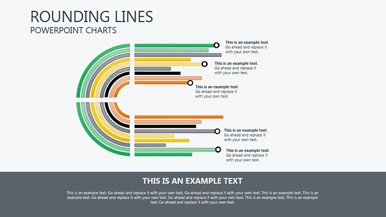
Dynamic Rounding Lines Keynote Charts: Weaving Architectural Timelines with Grace


Type: Keynote Charts template
Category: Timelines
Sources Available: .key
Product ID: KC00106
Template incl.: 6 editable slides
In the intricate dance of architectural design, where timelines twist like vines up a trellis, clarity is your greatest ally. Enter our Rounding Lines Keynote Charts template: a sleek set of 6 editable slides crafted for visionaries - architects, landscape designers, and project coordinators - who crave to illustrate data interconnections without the clutter. Picture this: You're unveiling a multi-phase park restoration to a municipal board, and instead of flat arrows, your slides feature elegantly curved lines that loop and link milestones, evoking the organic flow of your green spaces. This isn't mere visualization; it's narrative architecture in motion, compatible exclusively with Mac's iWork Keynote for that buttery-smooth editing experience.
Inspired by the fluid geometries of parametric design (think Zaha Hadid's undulating forms), this template empowers you to highlight relationships - between site surveys and structural bids, or permitting hurdles and sustainability goals - with a sophistication that captivates. Firms tackling adaptive reuse projects have leveraged such connected charts to shave weeks off approval cycles by making interdependencies pop. With just a few clicks, you're not just presenting; you're persuading, proving why your vision deserves the green light.
Curves in Command: Standout Features for Timeline Mastery
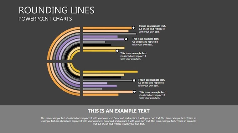
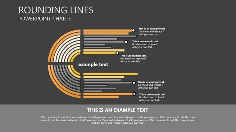
What sets this template apart is its laser-focus on connectivity, turning abstract timelines into tangible threads. Each of the 6 slides boasts full-color variations, from serene pastels for conceptual phases to vibrant accents for critical paths, all fully editable to echo your project's palette. Vector icons - think compass roses for orientations or gears for integrations - snap into place, while included PNG overlays add texture without bloating file sizes.
- Twisted Elegance: Proprietary rounding lines that bend intuitively, perfect for depicting phased escalations in high-rise constructions or branching paths in master planning.
- Animation Alchemy: Built-in Keynote effects that animate connections sequentially, revealing how a foundation pour cascades into facade framing - like watching your model come alive.
- Versatile Sizing: Options for 16:9 widescreen drama, 4:3 classic restraint, or 16:10 balanced poise, ensuring your charts fit any venue from studio screens to conference projectors.
Editing? Effortless. Reshape lines with Bezier precision, swap data points via simple tables, and infuse photos of site mocks for a hybrid digital-physical feel. It's designed for the Mac ecosystem, so no cross-platform woes when your team dives in collaboratively.
Slide Spotlight: Navigating the Twists of Project Narratives
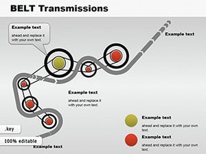
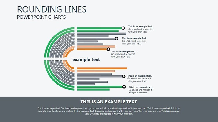
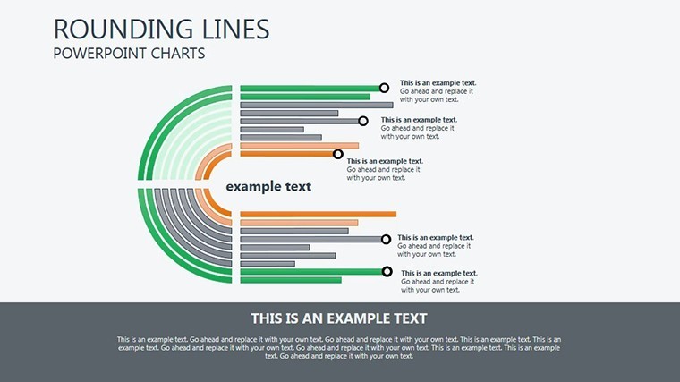
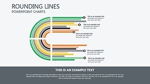
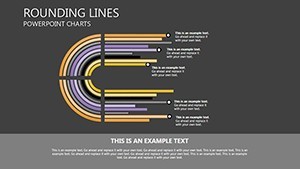
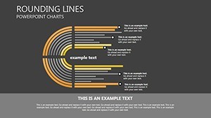
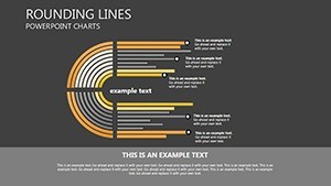
Slide 0 introduces a foundational rounded line chart, ideal for overarching project arcs - curve from inception to inauguration, with nodes bulging to denote budget swells. By Slide 2, complexity builds: Intersecting lines map subcontractor overlaps in a hospital expansion, color-coded for risk zones like HVAC delays.
Slide 4 dives into relational depths, using looped twists to show feedback cycles in community input sessions for public realm designs. The capstone, Slide 5, synthesizes it all in a grand timeline weave, animating from left to right as if unspooling your blueprint's story. Each demands mere moments to tailor, freeing you for the creative heavy lifting.
From Concept to Completion: Architectural Use Cases That Connect
This template thrives in the pressure cooker of architectural deadlines. In RFP responses, deploy the rounding lines to link sustainability benchmarks with cost projections, making your net-zero tower proposal irresistible to eco-conscious developers. For internal reviews, animate parameter connections to troubleshoot phasing snags in a transit hub redesign, turning potential pitfalls into proactive pivots.
Real talk from the field: A Boston firm applied similar twisted timelines to a harborwalk initiative, visually threading pedestrian flows with tidal data - resulting in a 25% faster buy-in from planners. Or scale it to education: Lecture on urban evolution with branching lines tracing zoning evolutions, engaging students like a choose-your-own-adventure in city shaping.
- Bid-Building Bridges: Connect vendor quotes to delivery dates, highlighting synergies that underscore your efficiency claims.
- Stakeholder Syncs: Use intersections to visualize input integrations, fostering trust in participatory design processes.
- Report-Ready Flows: Export animated GIFs for progress updates, keeping remote clients looped in without full deck shares.
Versus basic line charts, these roundings add narrative nuance - no straightjacket rigidity, just fluid storytelling that mirrors life's - and architecture's - curves.
Designer's Toolkit: Tips to Twist Your Timelines into Triumphs
Pro move: Anchor lines to real metrics from tools like Revit exports for data-driven authenticity. Vary line weights to emphasize priorities - thicker for capex, finer for opex. And for drama, sync animations to your narration pace, building tension around crunch points like bid deadlines.
In a nod to timeless design, remember Gehry's Bilbao - its twists weren't accidental; they connected form to function. Your charts can do the same, linking data dots into destinations.
Time to entwine your ideas? Grab the Rounding Lines Keynote Charts now and let your timelines tell tales that turn heads. Pair it with our cycle templates for looped logic.
Frequently Asked Questions
What makes the rounding lines unique for architectural timelines?
They mimic organic flows, like site contours, allowing curved connections that reveal interdependencies far better than rigid straights.
Are animations customizable in Keynote?
Yes - tweak timing, easing, and triggers to match your speaking rhythm, enhancing engagement without overwhelming.
Can I add custom icons beyond the included vectors?
Effortlessly; import SVGs or PNGs, and the template's layers accommodate seamless blending.
Does it work with Google Slides via export?
While Keynote-native, export to PDF preserves visuals, though animations may need reapplication.
How many color variations are pre-set?
Six core schemes, expandable infinitely through Keynote's tools for brand-aligned versatility.
Ideal for small vs. large projects?
Scalable for both - condense for boutique renos or expand for megastructures.