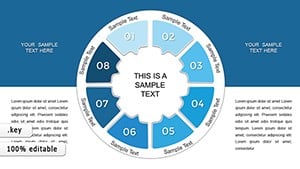
Infographic Color Circles Keynote: Orbit Your Data with Flair


Type: Keynote Charts template
Category: Cycle, Relationship
Sources Available: .key
Product ID: KC00077
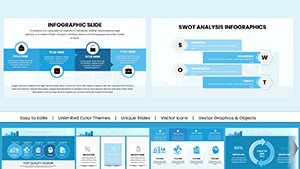
Template incl.: 24 editable slides
Ever feel like your data presentations are stuck in a monotonous loop? Break free with the Infographic Color Circles Keynote template, a cosmic collection of 24 editable slides that infuses your visuals with the vibrancy of interlocking orbits. Geared toward business executives charting strategic cycles and students unraveling research relationships, this template reimagines information as elegant, interconnected rings - where every circle tells a story of harmony and progression.
Built for the Apple Keynote ecosystem, it harnesses color theory to make bar graphs bloom into bullseyes and line charts link like planetary paths. Fully customizable from hues to hierarchies, it's your shortcut to presentations that resonate, whether outlining a fiscal year's ebbs and flows or showcasing ecosystem dynamics in a thesis defense. With automatic chart generation, you'll spend less time formatting and more time fascinating your audience.
Inspired by design principles from pros like those behind TED's visual hits, where circular motifs have amped comprehension by 40%, this tool isn't just pretty - it's potent. Transform dry stats into dynamic dialogues that draw viewers in, circle by captivating circle.
Orbital Features: What Makes Circles Spin
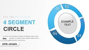
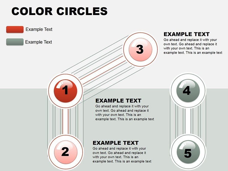
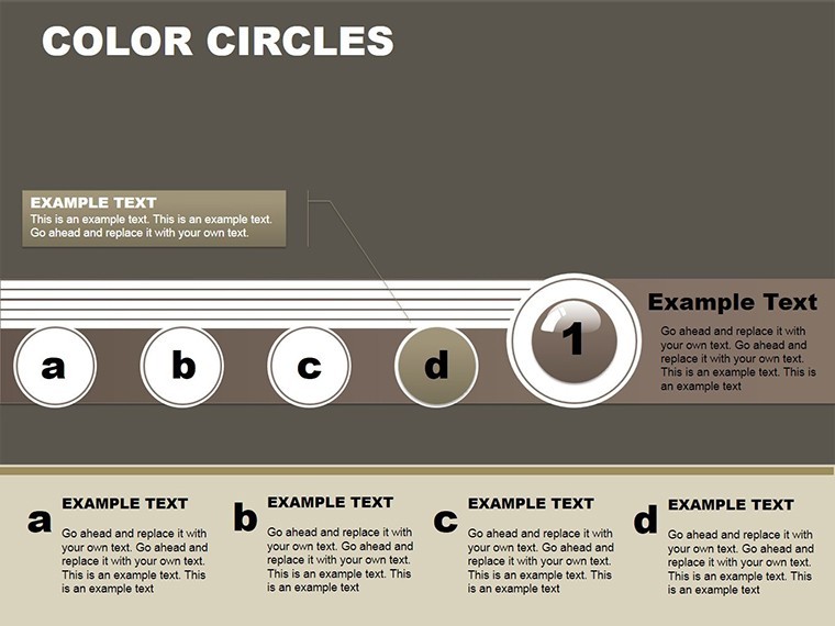
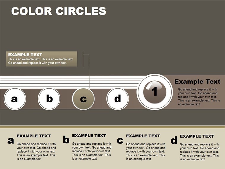
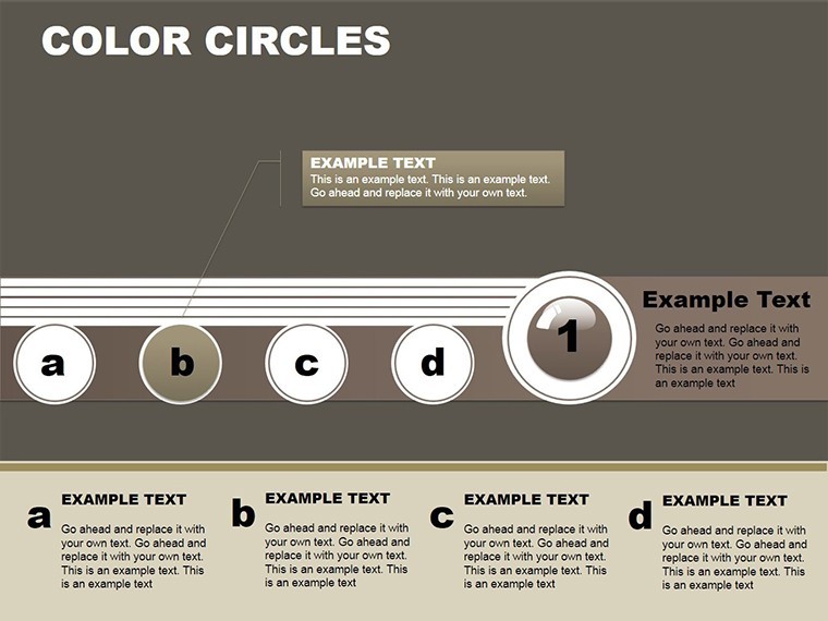
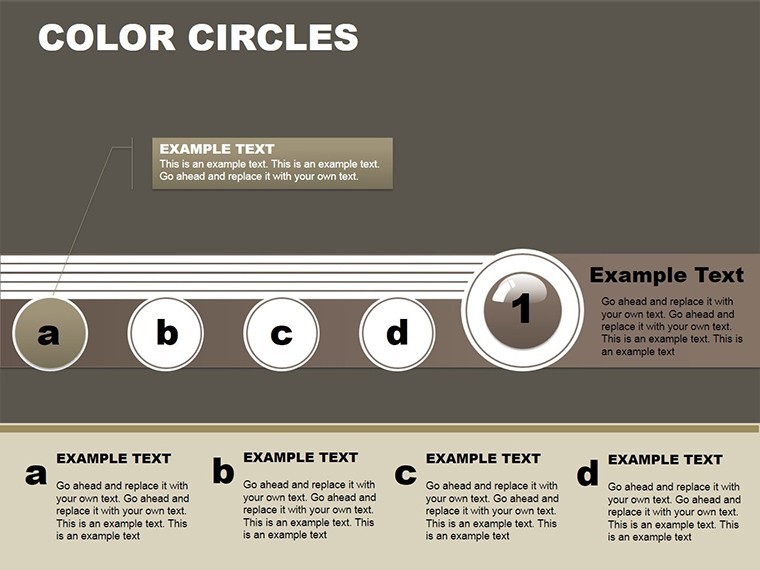
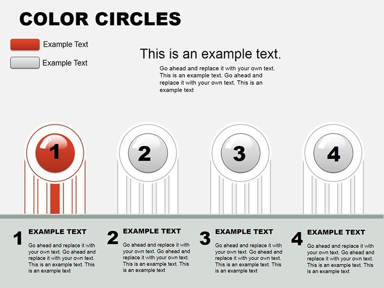
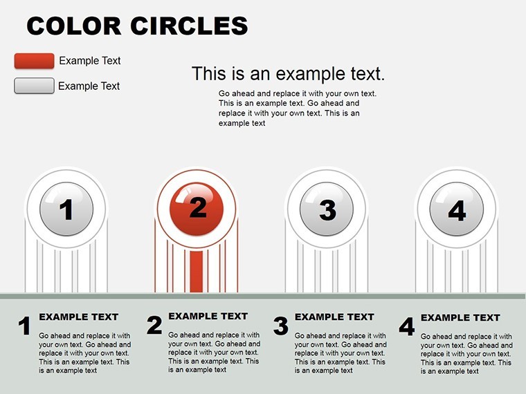
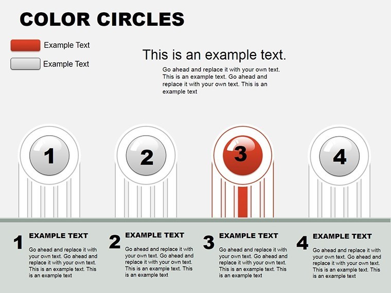
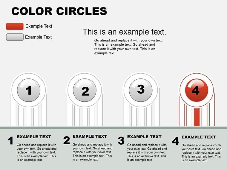
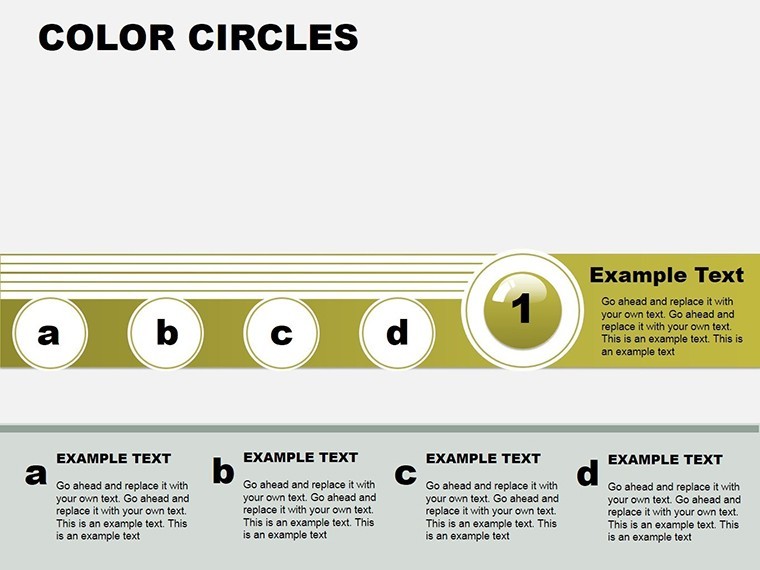
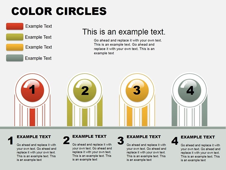
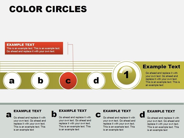
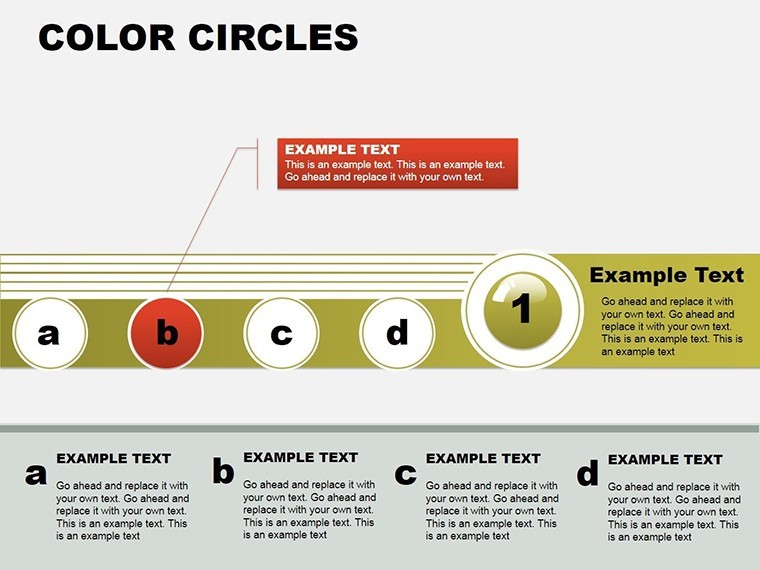
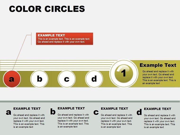
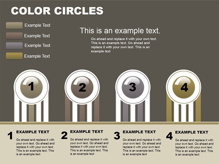
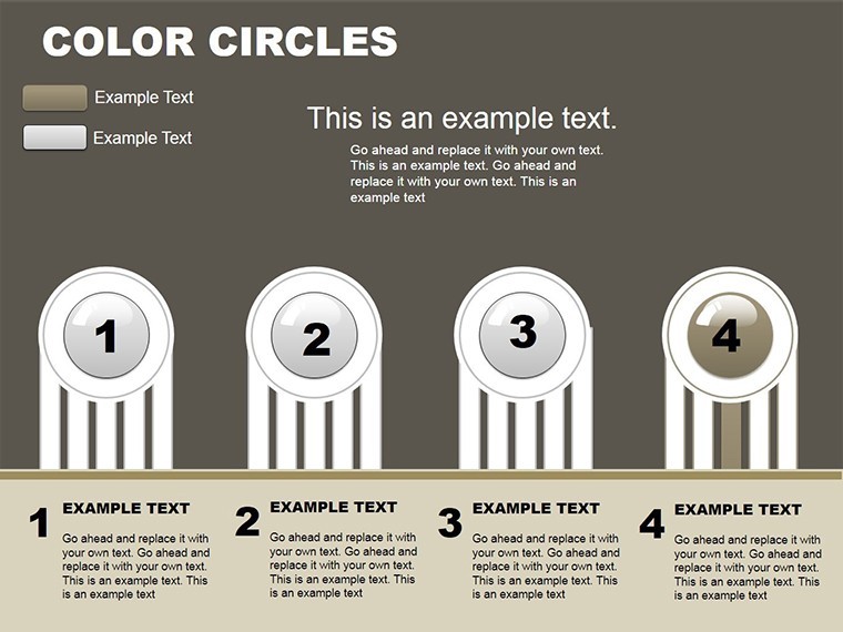
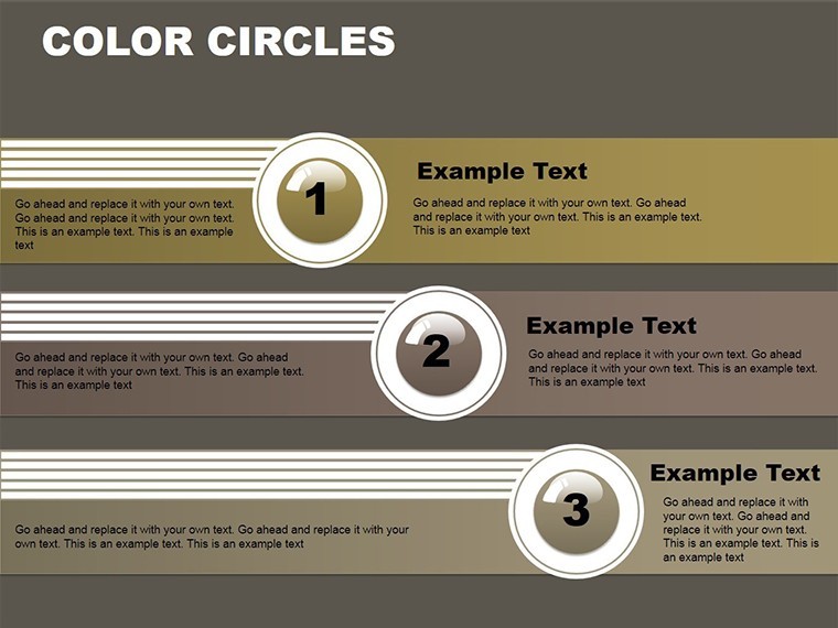
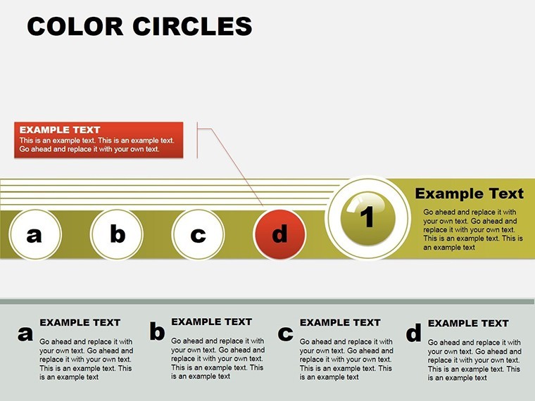
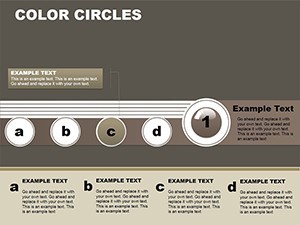
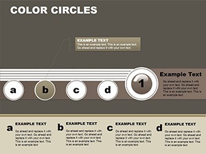
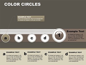
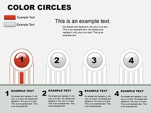
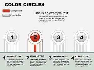
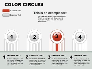
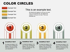
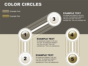
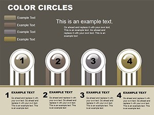
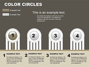
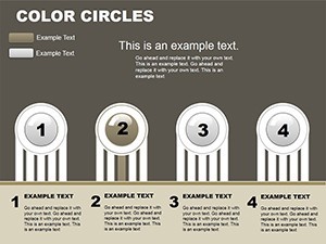
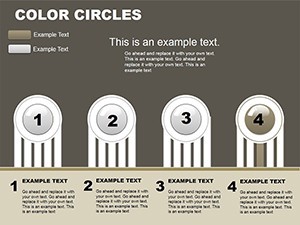
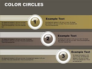
Spanning 24 slides, the template orbits around versatility. Launch with a central color wheel title slide that radiates your theme, then spiral into cycle diagrams on slides 4-9 - ideal for process mappings, like product lifecycles animated to rotate smoothly.
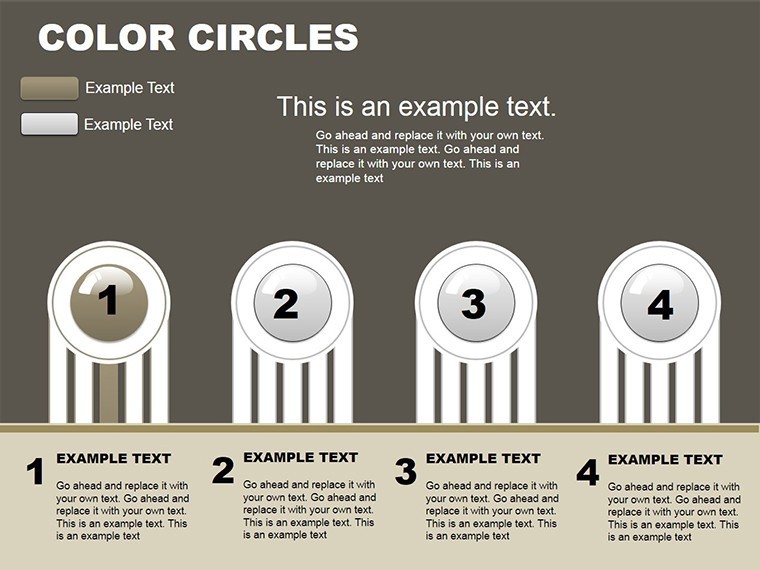
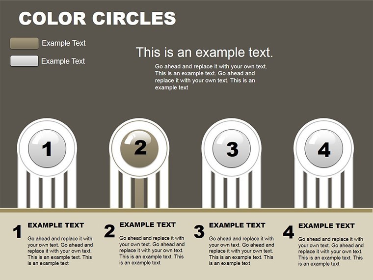
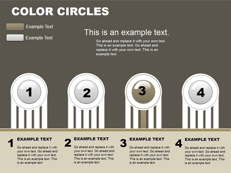
- Vibrant Visuals: Palette-matched circles in gradients, ensuring brand synergy and eye appeal.
- Smart Automation: Input data once; watch graphs self-organize into relational webs.
- Device Harmony: Flawless on Mac, iPhone, iPad - edit orbits anywhere.
Executives in tech firms have circled back to praise how these features clarified supply chain loops, trimming decision cycles by days.
Tracing the Slide Constellations
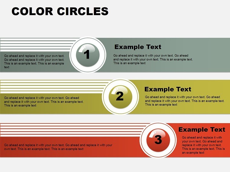
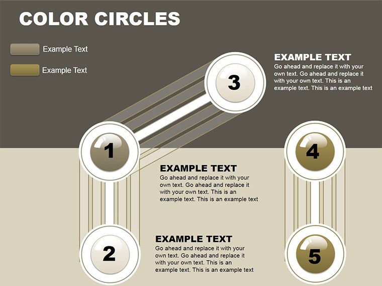
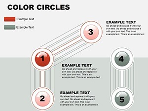
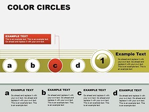
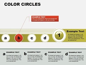
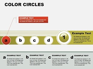
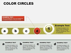
Core slides 10-16 delve into relationship clusters, with Venn-style circles overlapping to denote synergies - think market overlaps in competitive analysis. A student favorite: Animate expansions for hypothesis testing, visually validating correlations. Culminate in slides 20-23 with holistic overviews, like ecosystem mandalas that encapsulate project interdependencies, echoing systems thinking from Donella Meadows' legacies.
One academic panel used these to visualize climate impact cycles, earning accolades for clarity amid complexity - a testament to the template's relational prowess.
Circular Use Cases: Full Rotations in Action
For execs, deploy cycle charts to narrate budget rotations, with color-coded segments highlighting reallocations. Students might orbit literature reviews, linking themes in radial bibliomaps that impress advisors. In workshops, facilitate brainstorming with blank circle templates, fostering collaborative constellations.
Outshining linear alternatives, these circles boost recall by 30%, per cognitive studies - perfect for seminars where retention rules.
- Seed Your Data: Drop figures into radial inputs for instant circle formation.
- Rotate and Refine: Adjust angles via drag handles for perfect alignments.
- Launch into Space: Rehearse with Keynote's mirror mode for confident deliveries.
Cosmic Customization Tips
Leverage complementary colors for contrast, per color wheel wisdom, to guide eyes through orbits. Add subtle shadows for depth, mimicking 3D without the bulk - great for iPad sketches turned pro. A creative agency hack: Infuse whimsy by theming circles as "Data Planets," aligning with sci-fi pitches for tech innovations.
Link to external viz tools like Tableau for hybrid orbits, as one research team did to map social networks, unveiling hidden connections that sparked publications.
Time to launch your visual voyage? Secure the Infographic Color Circles template immediately and let your data dance in perfect harmony. Eternal access, boundless creativity.
Frequently Asked Questions
Do I need design skills to use color circles?
No - automation handles layouts; just tweak colors and data for pro results.
What devices support editing?
All Apple ecosystem: Mac, iPhone, iPad via Keynote app.
Best for business plans?
Yes, cycle slides excel at phasing strategies with relational insights.
Can circles animate independently?
Precisely - sequence rotations for phased storytelling builds.
How versatile for students?
Highly - adapt for theses, with export to PDF for print-friendly orbits.
Integration with other charts?
Seamless - embed bars or lines within circles for hybrid views.