Network Charts Keynote Template - Fully Editable with Dynamic Animations | Instant Download | ImagineLayout


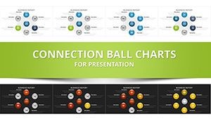


Download the Connected Balls Keynote network charts template featuring 25 vector slides with dynamic animations and media layers. Build engaging presentations that link ideas through editable spheres and bezier connections. Perfect for sales demos and strategy sessions - instant .key access included.
What's Included
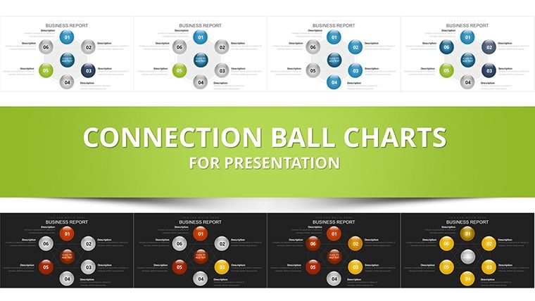
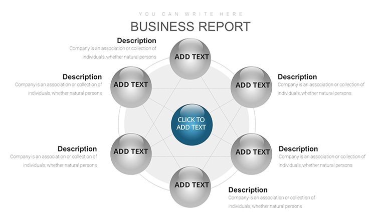
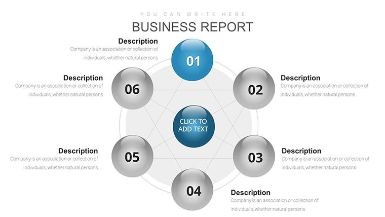
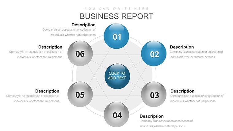
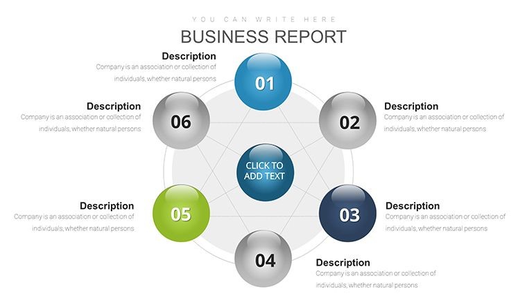
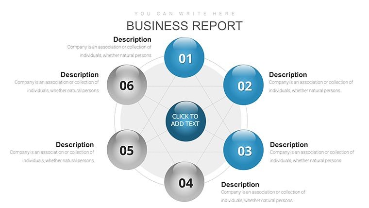
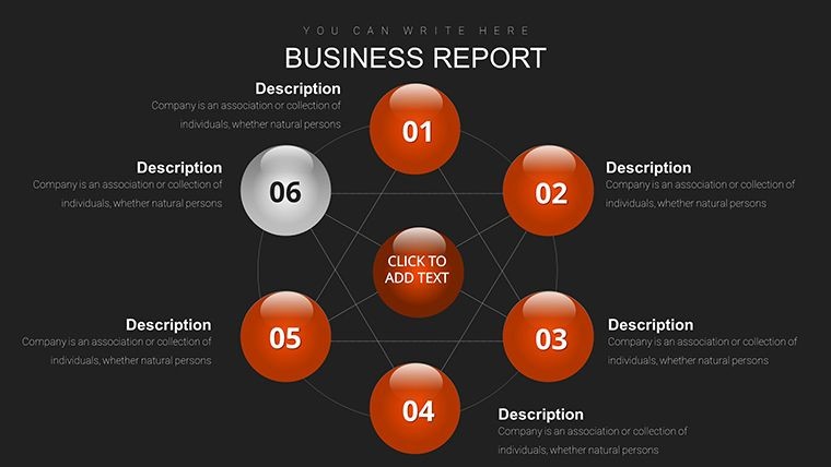
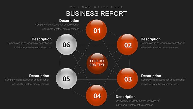
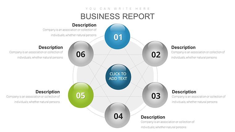
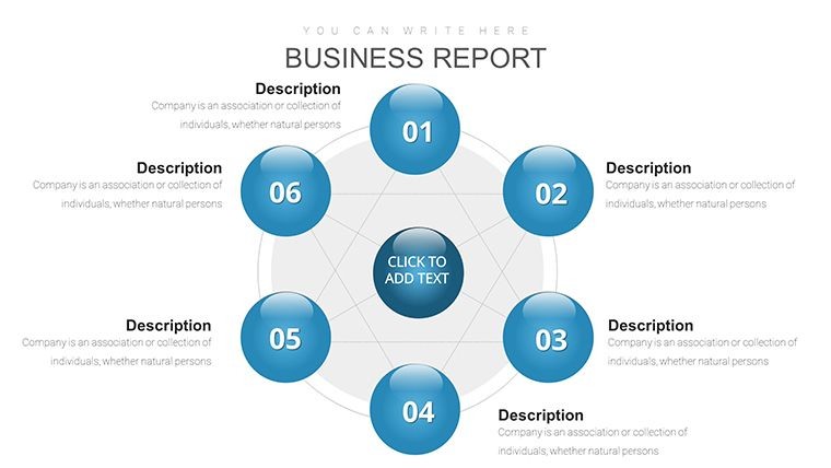
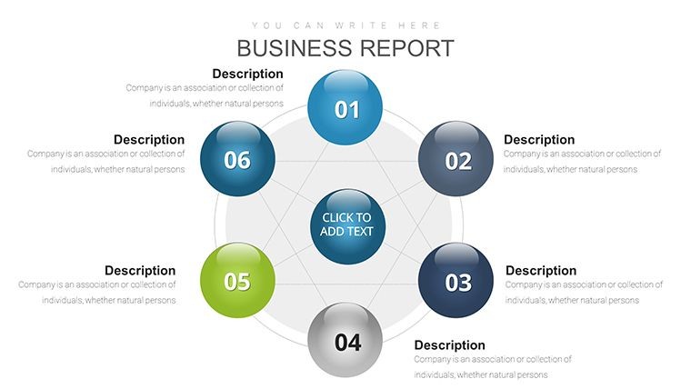
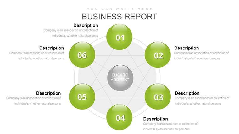
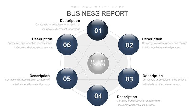
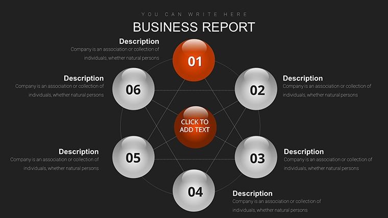
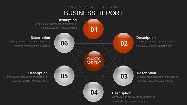
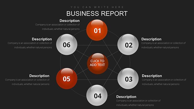
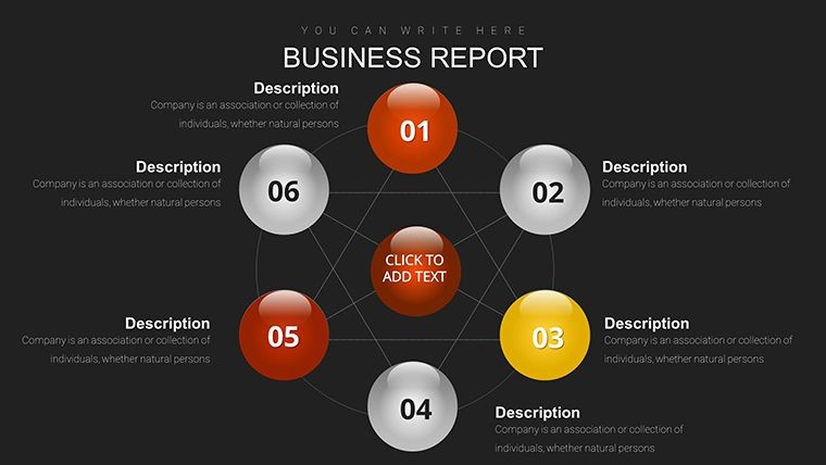
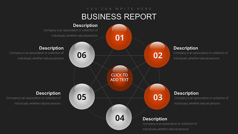
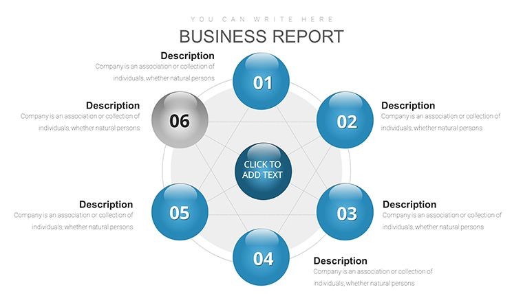
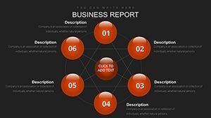
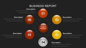
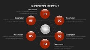
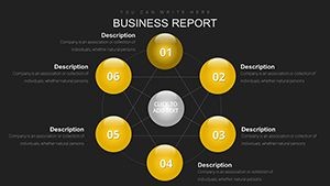
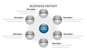
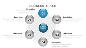
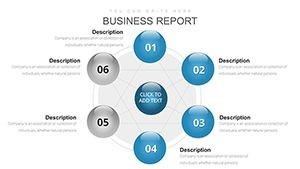
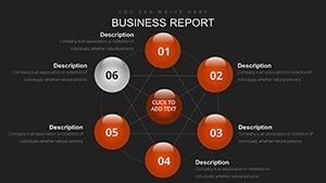
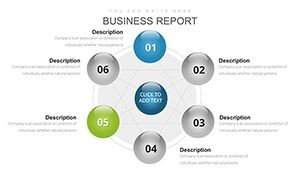
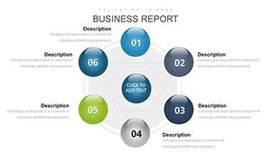
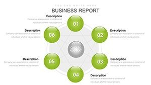
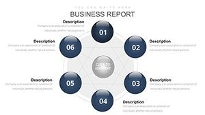
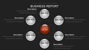
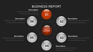
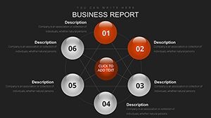
The download provides a single .key file containing 25 fully editable slides organized into three progression stages: Slides 1-8 Singleton Starts with isolated spheres Slides 9-17 Cluster Cores with multi-ball hubs and Slides 18-25 Network Nuggets with full interconnected meshes. Every slide includes vector spheres connection lines text placeholders and media layers. The file supports 16:9 widescreen by default and can be resized to 4:3. Gradient fills shadow depths and line styles are pre-applied yet fully modifiable.
Slide Organization
This structured grouping lets you build presentations that start simple then expand into complex networks without losing visual consistency. Each stage contains multiple layout variations so you can choose the exact configuration needed for your narrative.
Key Features
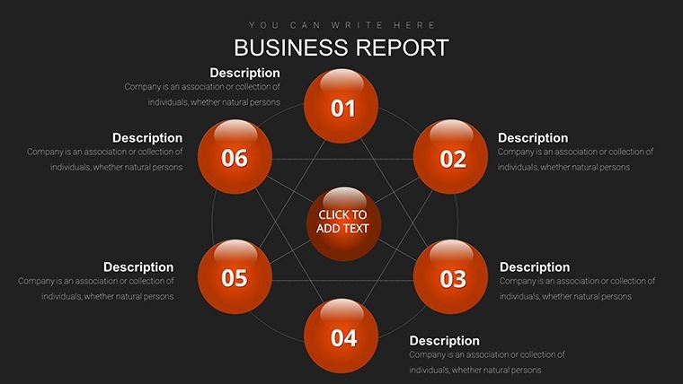
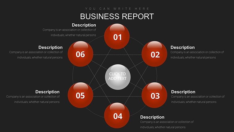
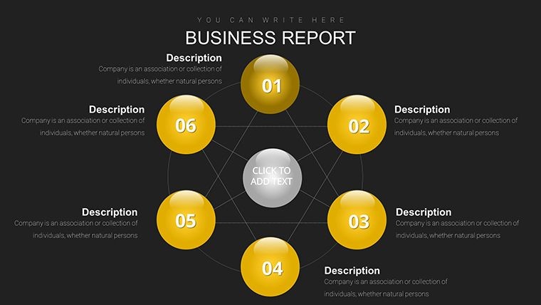
Vector ball networks allow precise scaling of spheres and links while dynamic animations bring connections to life with bounce-ins and path traces. Media-ready layers accept photos videos or icons inside spheres. Bezier curves let you reshape every link. Data tables can be embedded for granular details and auto-sync with imported Sheets content. Group selection enables batch animation of entire clusters.
Core Capabilities
| Feature | Details |
|---|---|
| Slide Count | 25 editable slides in 3 stages |
| File Format | Native .key Keynote file |
| Animations | Bounce-ins path traces batch controls |
| Media Layers | Photos videos icons inside spheres |
| Vector Precision | Scalable spheres and bezier links |
| Data Integration | Tables and Sheets auto-sync |
These features combine to deliver professional network visualizations that stand out in any presentation.
Professional Use Cases
A regional sales director at a logistics firm used Slide 10's product suites ball cluster to map feature relationships during an expansion pitch to the board. The connected spheres clearly showed how distribution hubs linked to benefits resulting in immediate approval of the Southeast Asia plan. Similarly a UX consultant referenced Slide 14's API integration cluster and Slide 20's experience timeline in a client workshop. The animated path traces made relational intelligence concepts tangible leading to a signed contract within the same week.
More Examples
Tech sales managers regularly employ the full network slides to demonstrate market ecosystems or skill graphs. The visual linking turns abstract theories into concrete stories that accelerate decision making.
How to Customize
After downloading open the .key file in Keynote. Select spheres to change gradients or shadows via the format panel. Drag bezier endpoints or use handles to reshape links. Add media by dragging files onto the ready layers. For data import paste from Sheets into embedded tables which auto-update linked text. Resequence animations in the build order panel or apply batch changes to grouped clusters. Export as PDF or video with music cues if desired. The complete customization workflow takes under twenty minutes from first open to final export.
Detailed Workflow
Start by duplicating the stage you need then edit only the required nodes. This approach ensures design decisions remain consistent while allowing rapid personalization.
Why Choose This Template
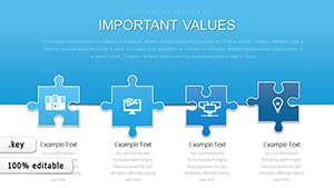
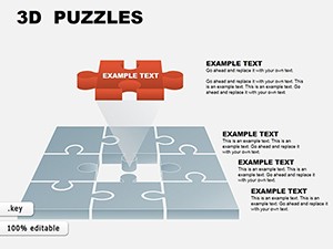
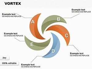
Creating dynamic network diagrams manually demands extensive time aligning objects drawing curves and adding animations that often break on resize. This template supplies 25 pre-built stages with vector precision and ready animations so your focus stays on content strategy. The media layers and data table support eliminate extra steps while gradient fills and shadows deliver immediate polish. Users consistently report finishing complex relationship slides four times faster than from scratch with noticeably higher audience engagement. Unlike puzzle or vortex templates on the site this one specifically targets connected narratives through sphere progression and relational animations.
Download now to transform disconnected data points into compelling visual stories.
Is this Keynote template compatible with the latest version of Keynote?
Yes the template is fully optimized for the current Keynote release and opens instantly on macOS Ventura or later. All vector elements animations and media layers function as intended. It also remains backward compatible with Keynote 10 and above. No plugins or external assets are required. Simply download open and begin editing immediately regardless of your exact Keynote version.
How do I edit the connected balls and links in the template?
Click any sphere to access fill gradient and shadow controls in the format panel. To adjust links select the line then drag bezier handles or endpoints to new positions. Group select spheres for batch color or size changes. Media is added by dragging files onto the designated layers. Animation builds are reordered in the inspector. These native Keynote tools let you fully reconfigure entire networks in moments without leaving the application.
What licensing options are included with the download?
The license permits unlimited commercial use in client presentations internal reports and paid webinars. You may modify and export the slides freely. Resale of the original template file is prohibited. This commercial rights structure supports both freelancers and enterprise teams while protecting the design integrity. No attribution is required in your final work.
Can I import my own data or media into the spheres?
Yes drag any image video or icon directly onto media-ready sphere layers for automatic masking. Paste data from Sheets into embedded tables which sync with nearby text labels. Custom metrics replace placeholders instantly. Bezier links remain connected during resizing. This import flexibility turns the 25 slides into bespoke visuals tailored to your exact datasets or branding guidelines.
How does this template differ from other chart templates on the site?
Unlike puzzle or vortex options this template uses a three-stage connected balls progression with explicit singleton cluster and network groupings. It includes dynamic animations and media layers absent in many related products. The emphasis on relational intelligence and experience timelines sets it apart from gantt or cycle charts. The 25 slides deliver targeted network storytelling rather than generic diagrams.
Is there a refund policy if I am not satisfied?
Yes we offer a 30-day money-back guarantee on all template purchases. If the file does not meet your needs simply contact support with your order details for a full refund. The policy covers download issues or compatibility concerns. This risk-free approach lets you test the 25 slides in your actual Keynote environment before committing.