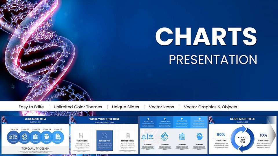
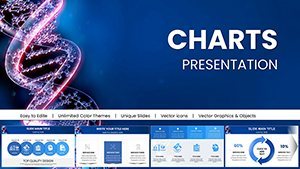
Medicine DNA Genome Keynote Charts: Empower Genomic Narratives


Type: Keynote Charts template
Category: Medicine - Pharma
Sources Available: .key
Product ID: KC01016
Template incl.: 58 editable slides
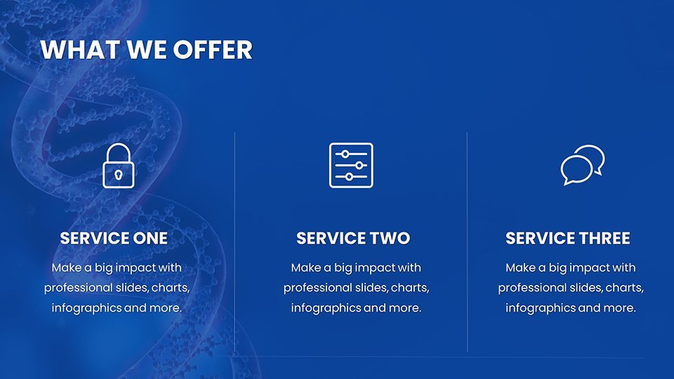
The frontier of genomic medicine holds promise for personalized healthcare, and our Medicine DNA Genome Keynote Charts Template is your key to unlocking its potential in presentations. Tailored for researchers decoding genetic sequences or educators teaching heredity, this 58-slide masterpiece features editable charts that visualize complex DNA structures, gene expressions, and therapeutic pathways. Compatible with Apple Keynote, it offers a scientific aesthetic with helix-inspired designs, ensuring your slides convey authority and innovation.
Recall breakthroughs like the Human Genome Project; our template echoes that precision, allowing you to present CRISPR edits via process diagrams or mutation impacts through Venn charts. Backed by standards from organizations like the American Society of Human Genetics (ASHG), it builds trust, helping you communicate advancements that could revolutionize treatments for diseases like cancer or rare disorders.
Scientific Foundations: Essential Features for Genomics
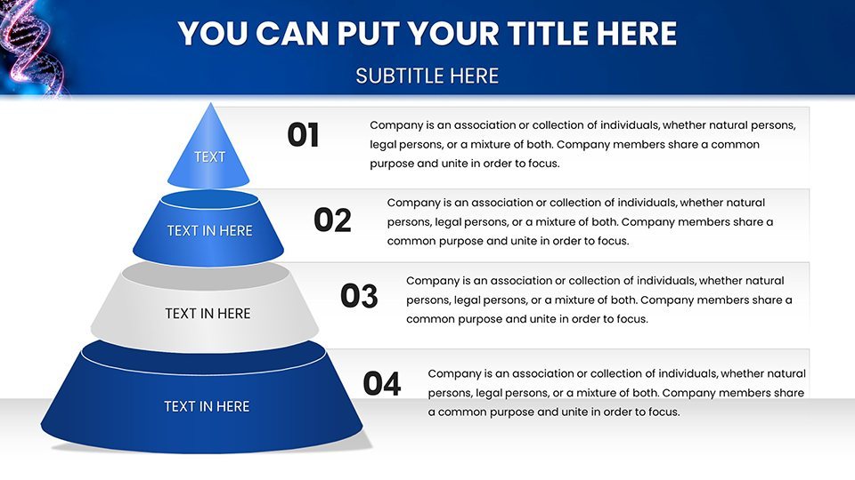
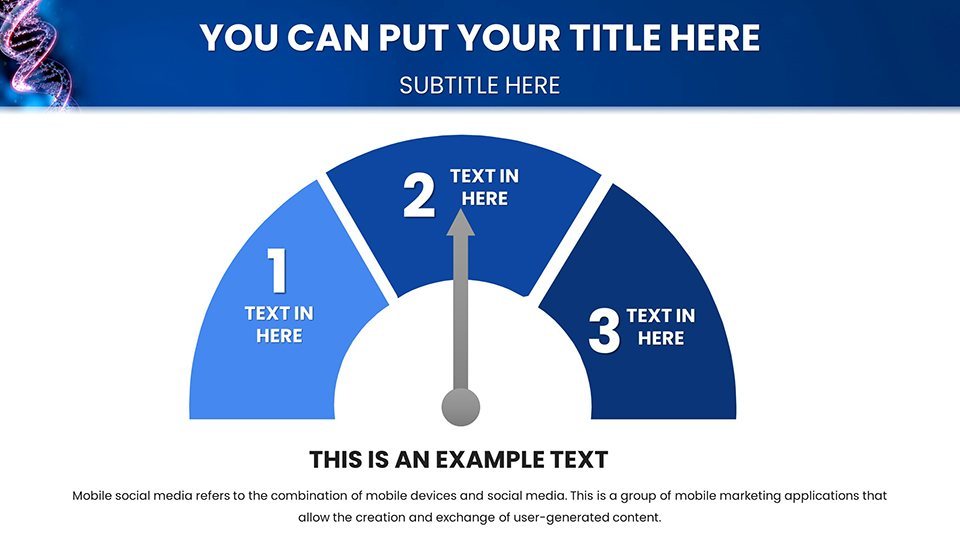
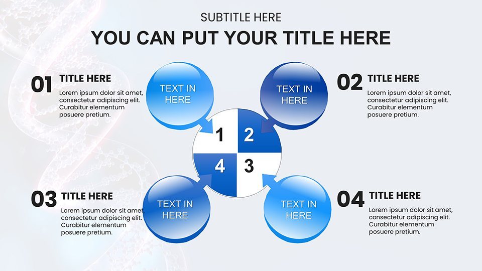
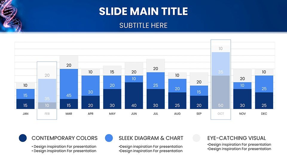
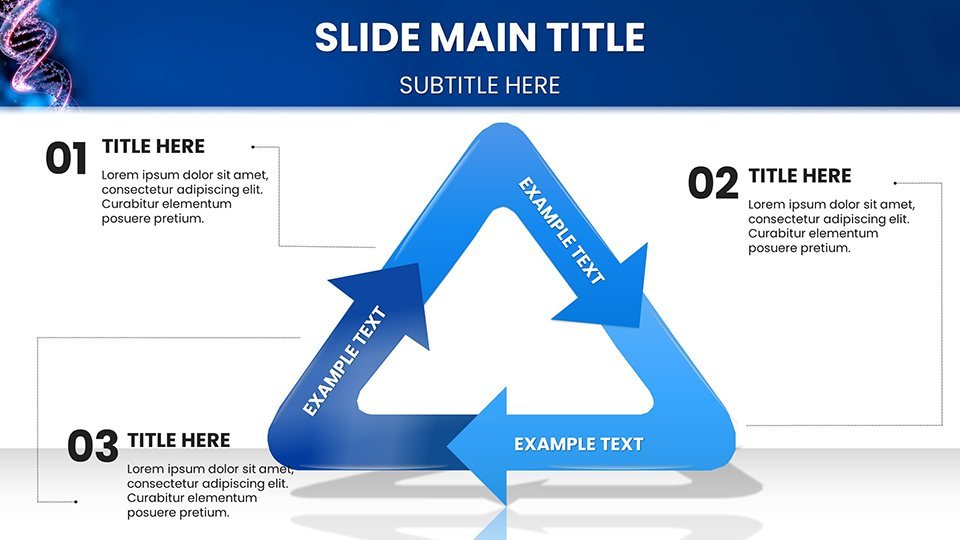
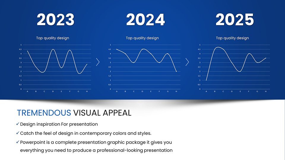
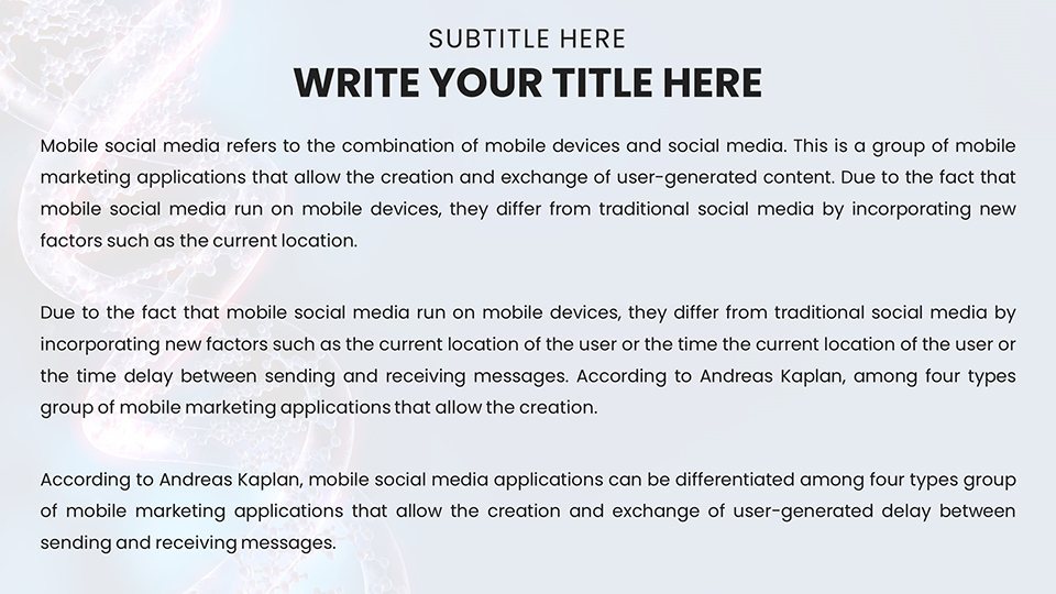
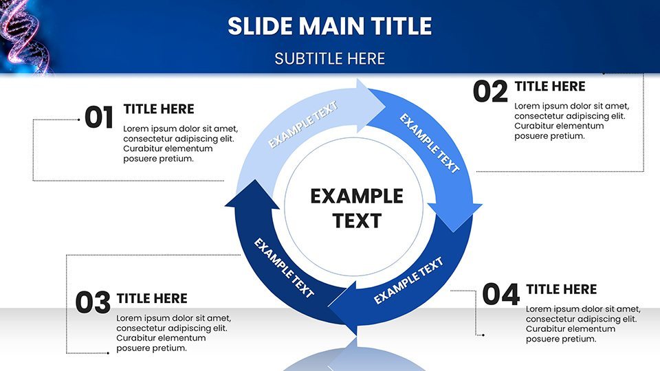
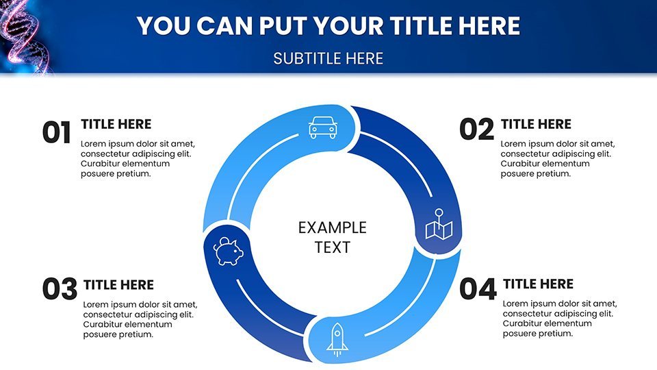
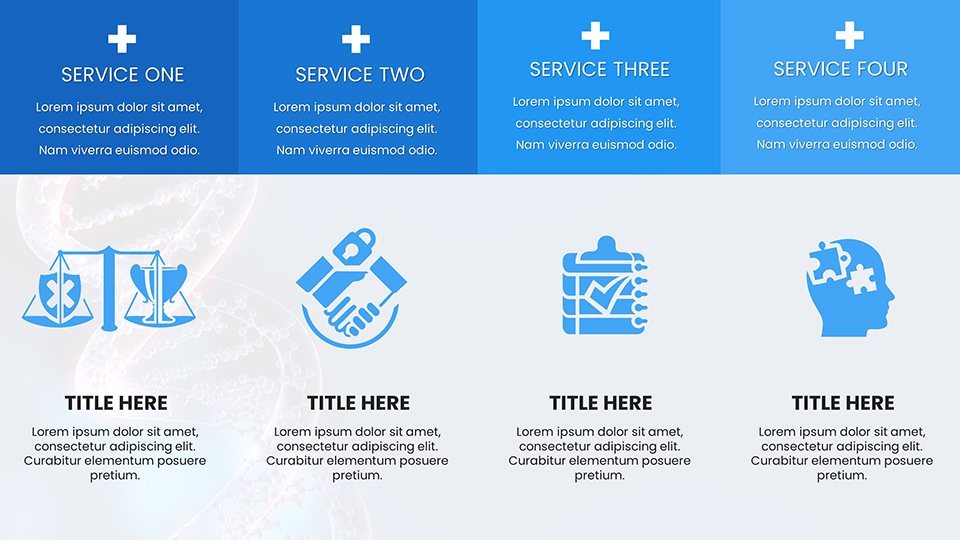
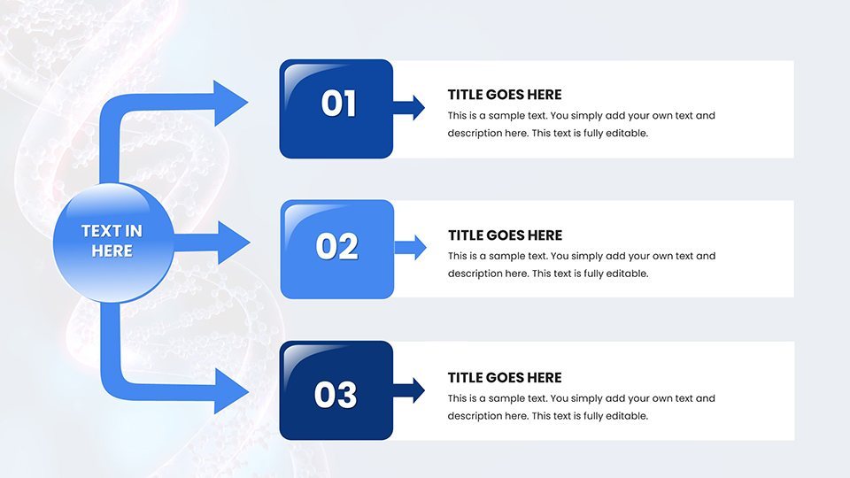
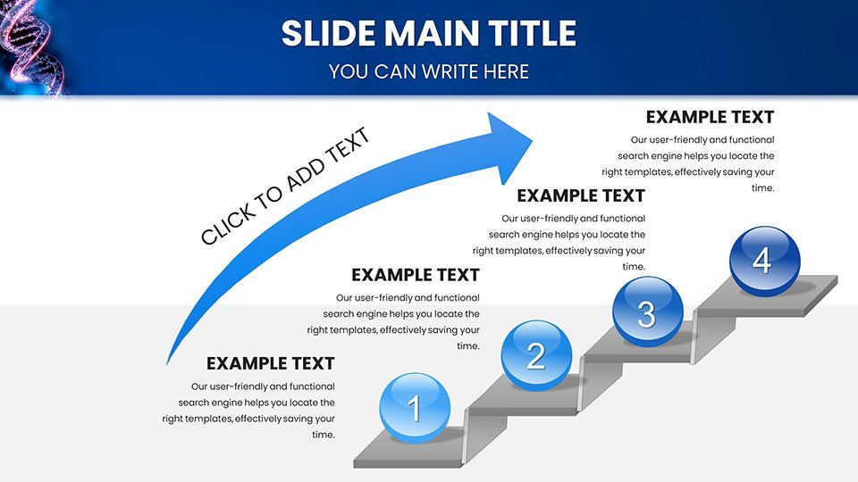
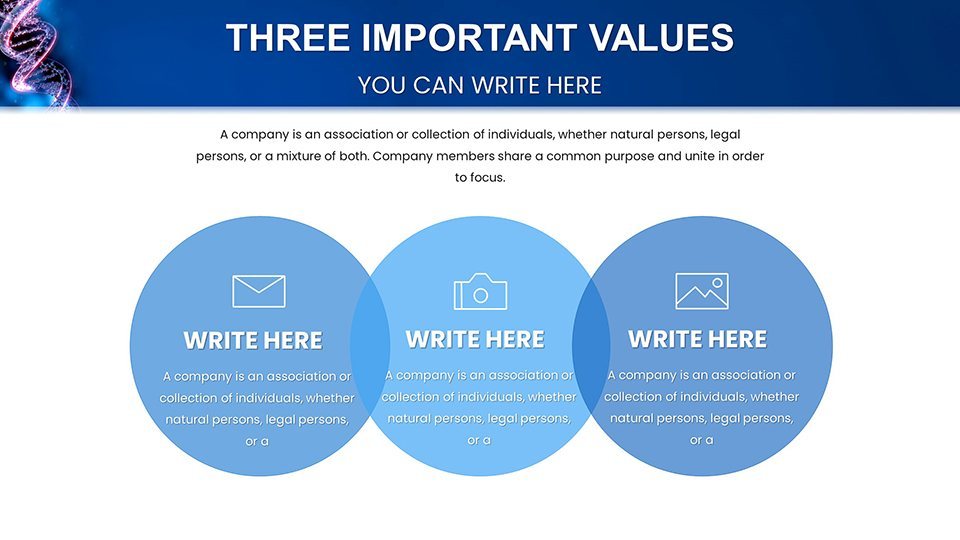
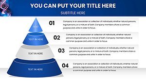
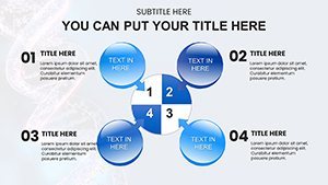
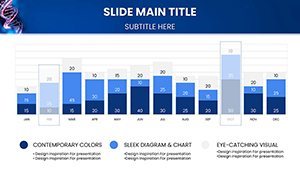
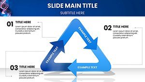
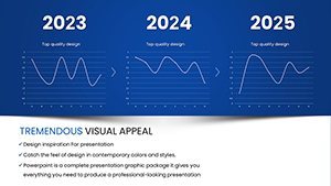
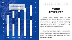
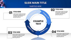
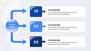
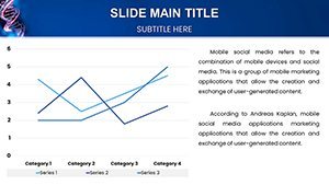
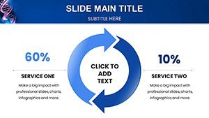
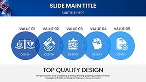
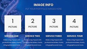
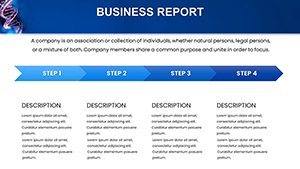
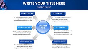
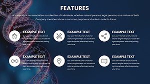
Central to the template are customizable charts: pedigree trees for inheritance patterns, heat maps for gene expression data, and bar graphs for allele frequencies. Themed with molecular motifs like double helices and base pairs, slides maintain a cohesive look. Full editability lets you adjust scales, labels, and colors to match research palettes.
High-resolution visuals support detailed annotations, while the structure includes intro slides on DNA basics and advanced sections for pharmacogenomics. With expert curation, it simplifies conveying intricate data, much like tools used in publications from Nature Genetics.
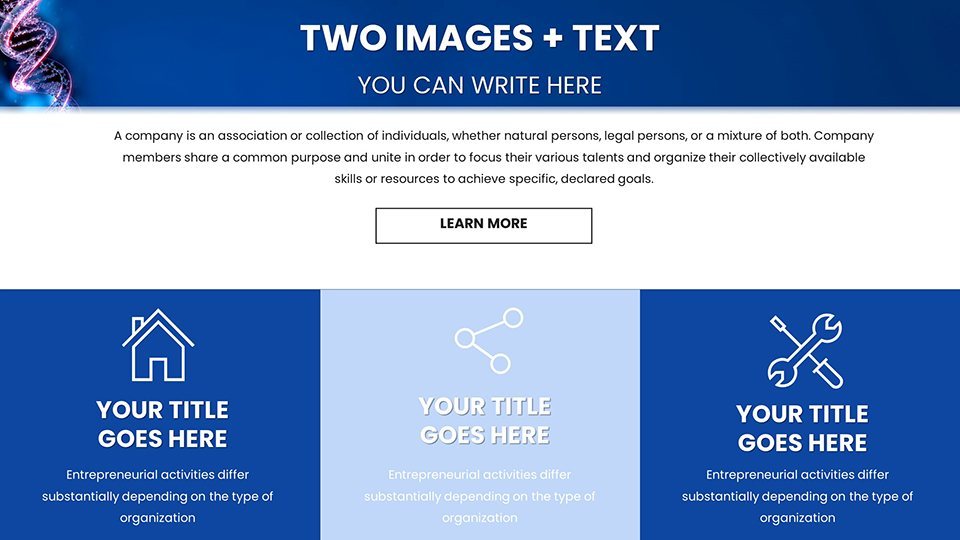
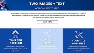
Targeted Applications: From Labs to Lecture Halls
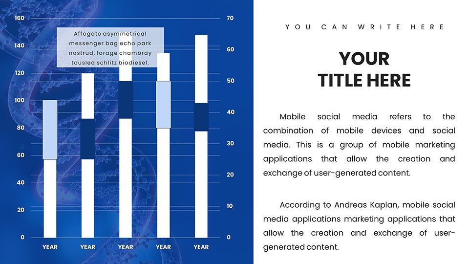
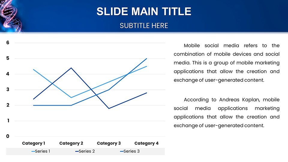
Researchers can use Sankey diagrams to illustrate metabolic pathways, mirroring studies in personalized medicine. Medical pros might employ line charts for tracking therapy responses, as in oncology trials. Educators benefit from interactive elements teaching Mendelian genetics, enhancing retention per educational research from journals like Cell.
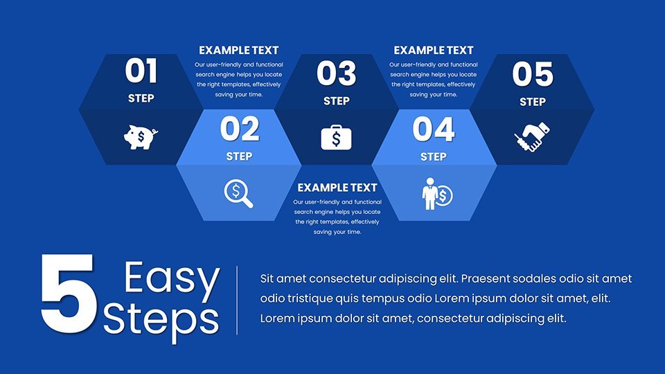
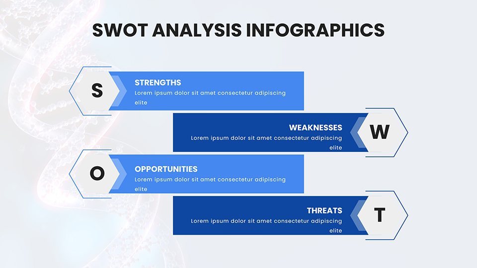
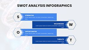
Students preparing seminars could leverage cluster charts for population genetics, while biotech firms pitch innovations with SWOT infographics. The template's versatility aids in grant proposals, where clear visuals secure funding, as evidenced by successful NIH applications.
Precision Customization: Strategies for Genomic Edits
Open in Keynote and modify via the chart tools - input sequencing data for instant updates. Tip: Use gradients for depth in 3D models of chromosomes, adhering to visualization guidelines from bioinformatics experts. Unlike standard templates, this one avoids oversimplification, preserving scientific integrity.
Integrate from databases like PubMed for citations, or embed molecular animations. For collaborations, version control in iCloud keeps teams synced, crucial in multi-author research environments.
Advancing Knowledge: Integrations and Best Practices
Add hyperlinks to genome browsers like UCSC for depth, or notes for ethical discussions on gene editing. Users in pharma have used it for FDA submissions, with pie charts breaking down trial demographics. It addresses challenges like data complexity, promoting clarity that accelerates discovery.
With 49 ratings attesting to its value, it's a staple for those at the cutting edge of medicine.
Distinct Advantage: Tailored for Genomic Excellence
Generic tools fall short in specificity; this template delivers medical-grade precision, elevating your work above the norm.
Embark on Discovery: Download Your Genome Template
Join the genomic revolution - download now and lead with insightful presentations that inspire progress.
Frequently Asked Questions
What types of genomic charts are featured?
Includes pedigrees, heat maps, and more, all editable for scientific accuracy.
Is it suitable for beginner researchers?
Yes, intuitive design makes it accessible while supporting advanced needs.
Can I incorporate real genetic data?
Certainly, import from spreadsheets for precise visualizations.
What if I need help with complex edits?
Support team offers guidance on customization and best practices.
Are ethical guidelines included?
Slides prompt discussions, aligning with ASHG standards.