Transform Data into Decisions with the Manager Chart Keynote Template


Type: Keynote Charts template
Category: Relationship
Sources Available: .key
Product ID: KC00926
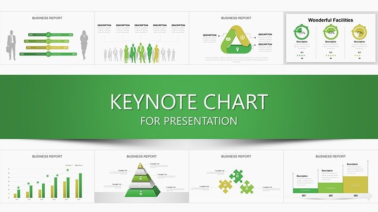
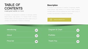
Template incl.: 36 editable slides
Imagine stepping into a boardroom where your data doesn't just speak - it commands attention. That's the power of the Manager Chart Keynote Template, a meticulously crafted collection of 36 editable slides designed specifically for business leaders who need to turn complex information into compelling narratives. Whether you're a project manager outlining quarterly goals, a sales director highlighting revenue streams, or an operations head mapping team hierarchies, this template equips you with professional-grade tools to visualize success. Built for Apple's Keynote software, it ensures seamless integration into your workflow, allowing drag-and-drop customization that saves hours of design drudgery.
In today's fast-paced corporate landscape, where decisions hinge on quick insights, generic spreadsheets fall short. This template shines by blending intuitive chart designs with thematic elements that resonate with managerial audiences - think sleek timelines for milestone tracking, hierarchical org charts that clarify reporting lines, and dynamic pie charts dissecting market shares. Drawing from real-world applications, like how Fortune 500 companies use similar visuals to align teams during strategy sessions, it addresses the pain points of cluttered presentations. No more squinting at tiny fonts or deciphering vague graphs; instead, deliver polished stories that drive action and foster buy-in from executives and stakeholders alike.
What sets this apart? It's not just about aesthetics - it's engineered for impact. Compatible with the latest Keynote versions, each slide is vector-based for crisp scalability, whether projecting on a massive screen or sharing via PDF export. And with built-in animations, your data unfolds progressively, keeping viewers hooked from the first slide to the call-to-action finale. Tailored for industries like finance, retail, and consulting, it empowers you to adapt content effortlessly - swap colors to match your brand palette or tweak data sets in seconds. Let's dive deeper into how this template can revolutionize your next pitch.
Unlocking the Core Features of Your Manager Chart Toolkit
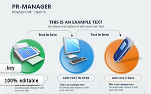
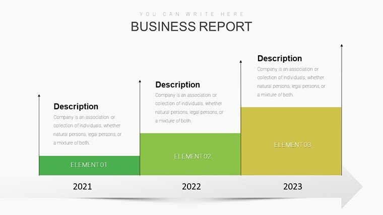
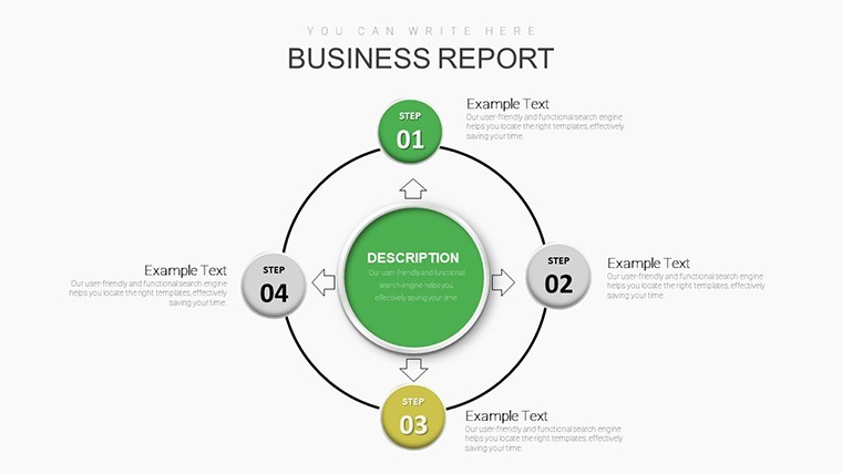
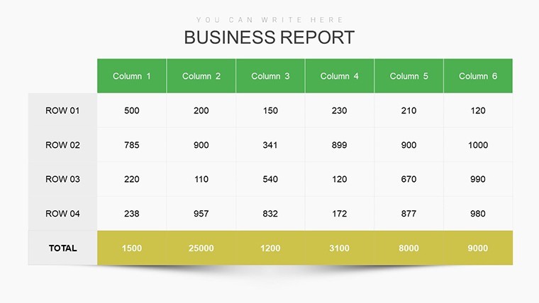
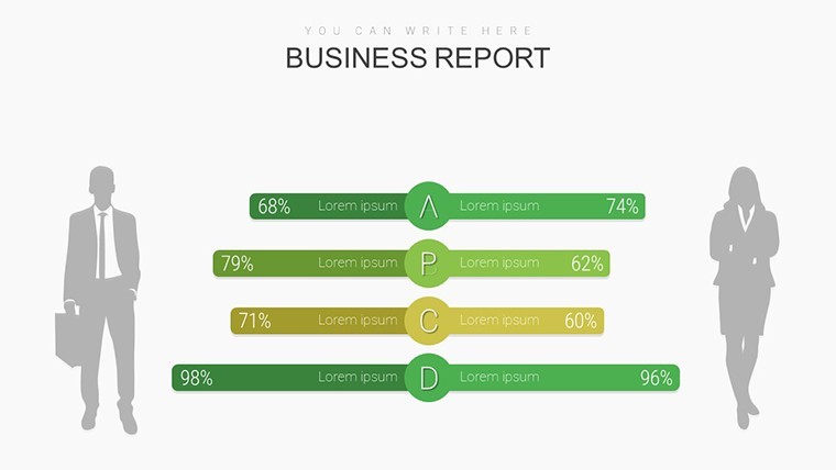
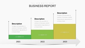
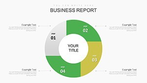
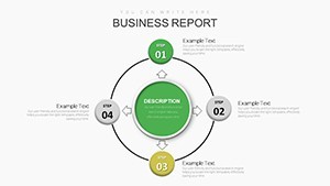
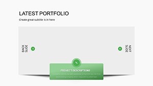
At the heart of this template lies a suite of versatile chart types, each optimized for managerial storytelling. Slide 1 kicks off with a customizable dashboard overview, aggregating KPIs into a single, at-a-glance view - ideal for executive summaries where time is gold. Progress to Slides 2-5, featuring Gantt-style timelines that map project phases with pinpoint accuracy; imagine illustrating a product launch from ideation to market entry, complete with milestone markers and progress bars that update automatically as you input dates.
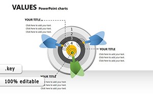
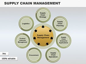
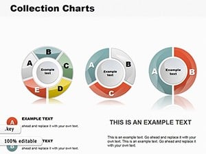
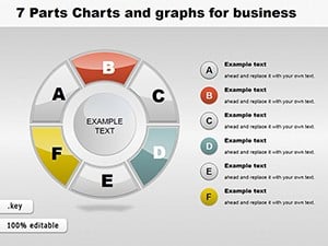
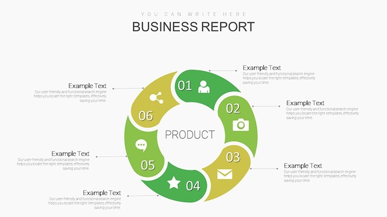
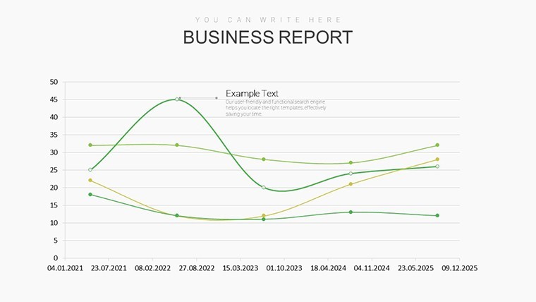
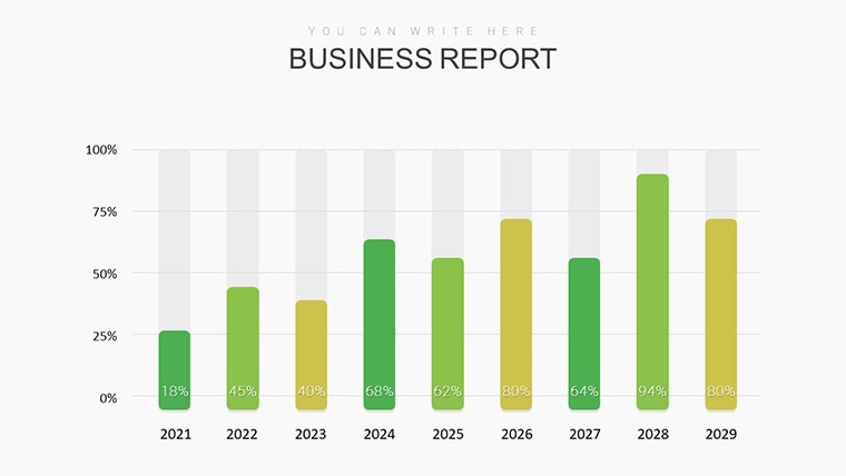
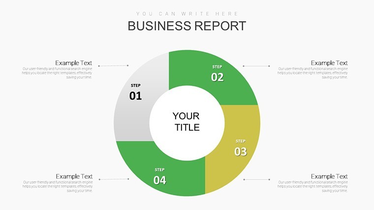
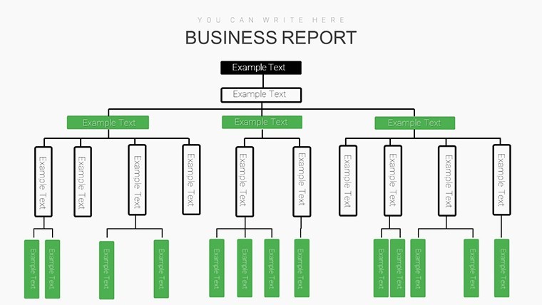
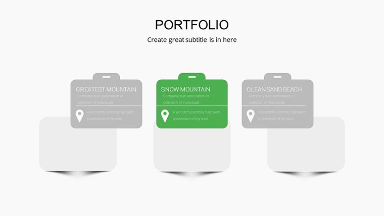
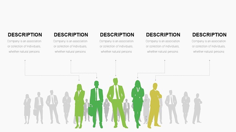
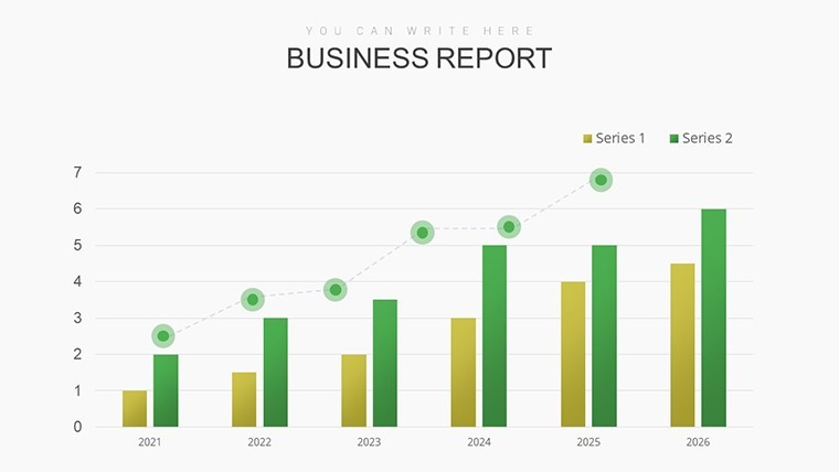
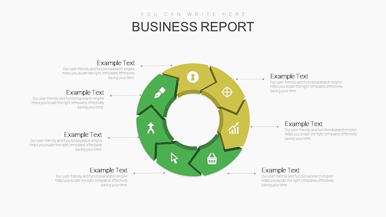
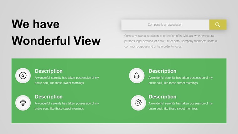
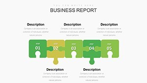
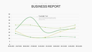
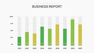
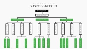
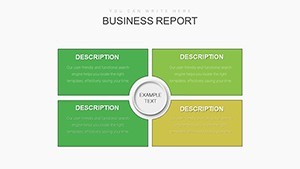
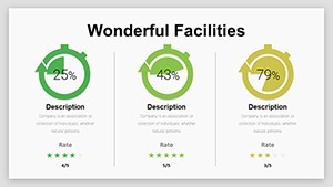
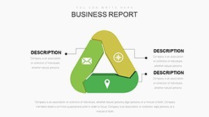
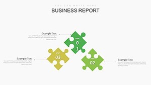
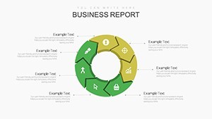
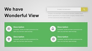
Further in, Slides 6-12 delve into relationship diagrams, perfect for org charts or stakeholder mappings. These aren't static boxes - they're interconnected nodes with hover effects in Keynote, revealing deeper details like role responsibilities or influence levels. For quantitative punch, Slides 13-20 offer bar and line graphs tailored to trend analysis, such as sales forecasts over quarters. Pro tip: Layer in conditional formatting to highlight variances, turning raw numbers into strategic alerts that prompt immediate discussion.
- Vector Icons & Graphics: Over 50 themed icons (gears for processes, arrows for flows) ensure visual consistency without copyright worries.
- Color Schemes: Five pre-set palettes, from corporate blues to vibrant energizers, all accessible via Keynote's master slides.
- Data Integration: Easy import from Excel or Google Sheets, preserving formulas for live updates during presentations.
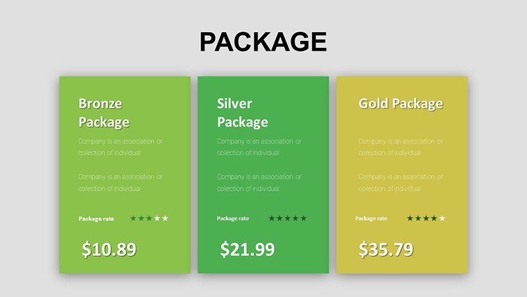
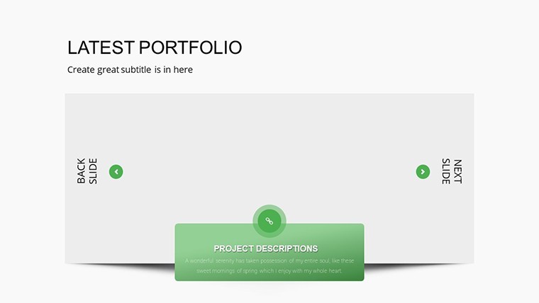
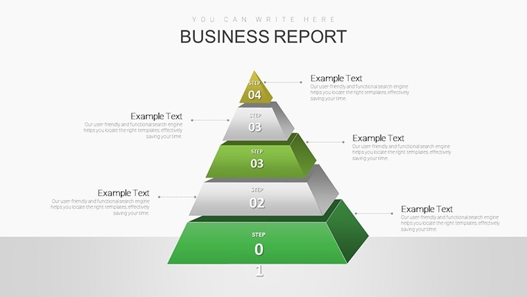
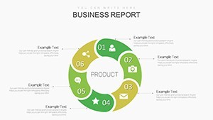
Slides 21-30 focus on qualitative insights, with mind maps and SWOT matrices that encourage collaborative brainstorming. Recall how a mid-sized tech firm used a similar setup to pivot their go-to-market strategy, boosting adoption by 25% - that's the kind of tangible outcome this template facilitates. Wrapping up in Slides 31-36 are summary infographics and Q&A prompts, ensuring your presentation ends on a high note with clear next steps.
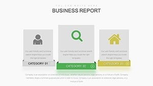
Real-World Applications: From Pitch to Performance
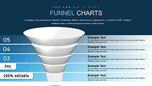
Envision a sales manager preparing for a regional summit. Using this template, they craft a 10-slide subset: starting with a funnel chart (Slide 7) to depict lead conversion rates, followed by a heatmap (Slide 15) revealing geographic performance hotspots. By animating transitions, the narrative flows from challenges to triumphs, culminating in a ROI projection that seals the deal. Or consider HR directors during talent reviews - org charts evolve into talent matrices, scoring employees on skills and potential, fostering data-driven promotions.
In consulting firms, where client trust is paramount, these charts build credibility. A case in point: Deloitte-inspired visuals for process audits, where flowcharts (Slides 8-10) dissect inefficiencies, leading to recommendations that save clients thousands. Unlike basic PowerPoint defaults, which often look dated, this Keynote-native design leverages Apple's fluid animations for a modern edge - think subtle fades that mimic data emergence, enhancing perceived expertise.
- Prep Phase: Import your dataset into Keynote; the template's smart placeholders auto-populate charts.
- Customize: Adjust fonts to sans-serif for readability (e.g., Helvetica at 24pt minimum) and align with AIGA design principles for professional polish.
- Rehearse: Use Keynote's presenter notes to embed talking points, turning slides into a seamless script.
- Deploy: Export to video for async sharing or present live with AirPlay for remote teams.
Integration tip: Pair with tools like Tableau for advanced exports, embedding interactive embeds that respond to audience queries in real-time. This isn't mere decoration; it's a catalyst for managerial mastery, helping you navigate from analysis to execution with flair.
Why Managers Swear by This Template for Peak Performance
Beyond the slides, the true value emerges in efficiency gains. Traditional chart creation can eat up 40% of prep time, per Harvard Business Review insights on presentation pitfalls - but this template slashes that to minutes. Its modular design means you can remix sections for recurring reports, like monthly dashboards, ensuring consistency that builds brand authority.
For global teams, multilingual placeholders support quick localization, while accessibility features like high-contrast modes comply with WCAG standards, making your content inclusive. Humorously, it's like giving your data a superpower - suddenly, that boring revenue dip becomes a heroic comeback story, complete with rising trend lines that rally the room.
Ready to level up? Grab the Manager Chart Keynote Template today and watch your presentations transform from informative to unforgettable. With lifetime updates included, it's an investment in your leadership toolkit.
Frequently Asked Questions
Is the Manager Chart Keynote Template fully editable?
Absolutely - every element, from charts to text boxes, is customizable in Keynote. Resize, recolor, or replace icons without losing quality.
How does it compare to PowerPoint versions?
While compatible via export, it's optimized for Keynote's animations and transitions, offering smoother performance on Mac ecosystems.
Can I use it for non-business presentations?
Yes, adapt it for educational or nonprofit reports; the versatile charts work across contexts like event planning timelines.
What's the file size and compatibility?
Compact at under 10MB, it works with Keynote 11+ on macOS and iPadOS for flexible creation on the go.
Does it include data sample files?
Starter datasets are bundled, plus guides for importing your own from CSV or direct entry.