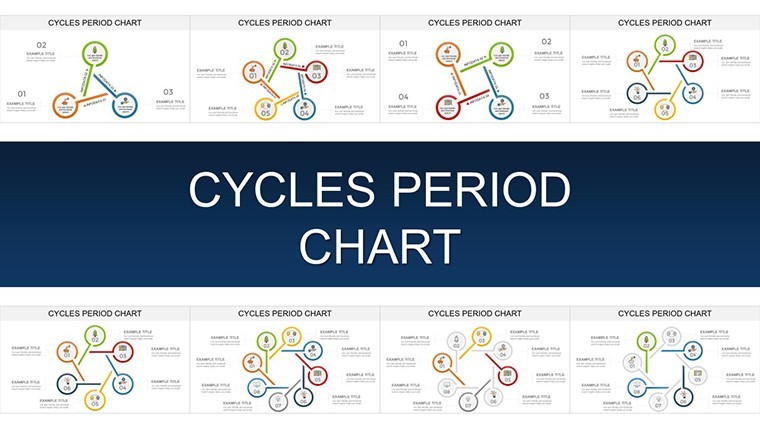
Cycles Period Keynote Template: Animate the Rhythm of Recurring Business Patterns


Type: Keynote Charts template
Category: Cycle
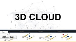
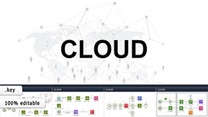
Sources Available: .key
Product ID: KC00907
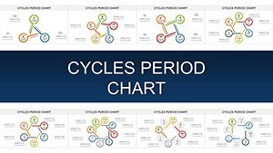
Template incl.: 33 editable slides
Business doesn't move in straight lines - it pulses with periods of growth, peak, and renewal. The Cycles Period Keynote Template captures this rhythm across 33 editable slides, empowering economists, strategists, and educators to visualize recurring phenomena like seasonal sales cycles or economic booms and busts. Forget flat timelines; these charts loop with purpose, making complex periodicity accessible and engaging for everyone from undergrad lectures to executive war rooms.
Crafted with Keynote's precision in mind, this template leverages vector graphics for flawless adaptability and pre-set animations that sync with your narrative flow. Drawing from economic theories like Kondratiev waves, it's ideal for dissecting manufacturing downtimes or biological rhythms in environmental reports - turning data density into digestible delight.
Standout Features: Designed for Periodic Precision
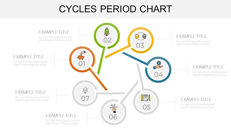
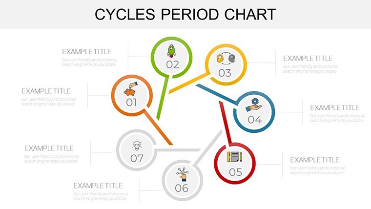
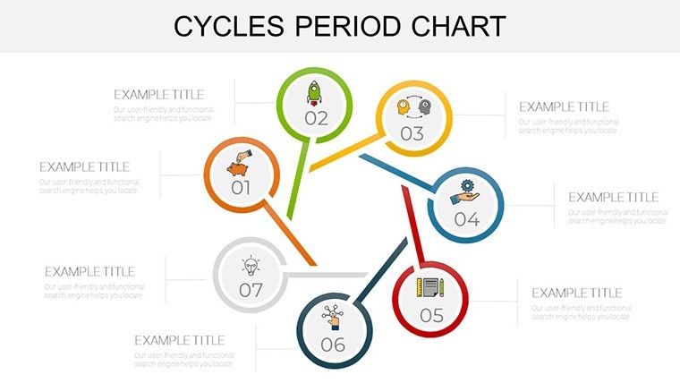
With 33 slides, this isn't a one-trick pony; it's a full orchestra of cyclical visuals. Edit effortlessly to fit your data story, from tweaking arc lengths to syncing colors with seasonal themes.
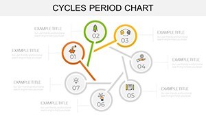
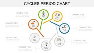
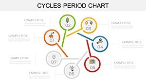
- Periodic Wave Charts: 11 slides for sinusoidal representations, great for financial forecasting - overlay quarters to spot trends like holiday retail spikes.
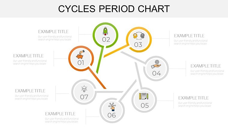
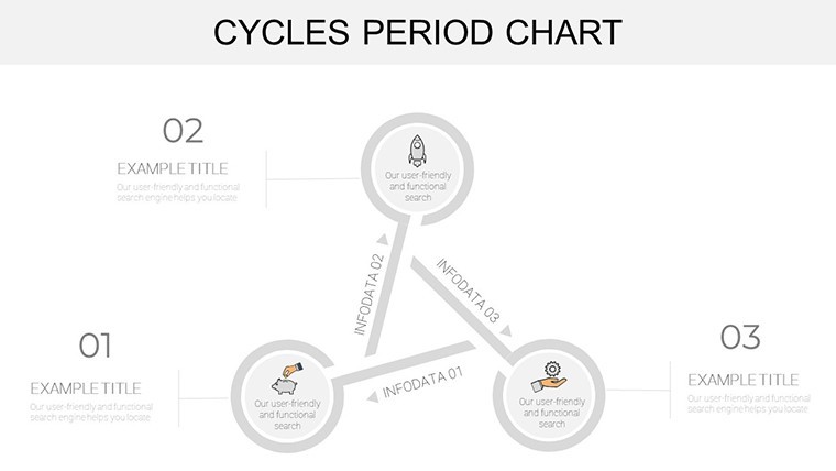
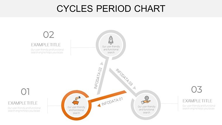
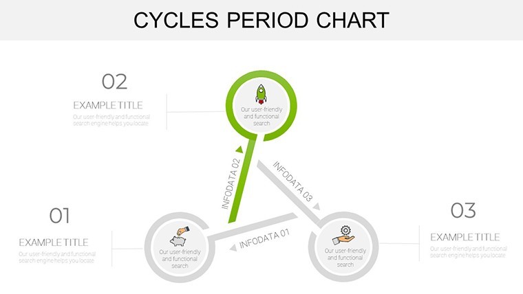
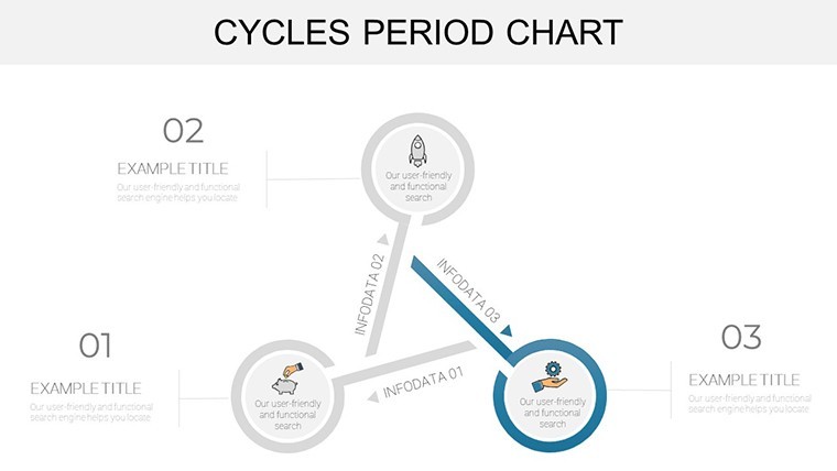
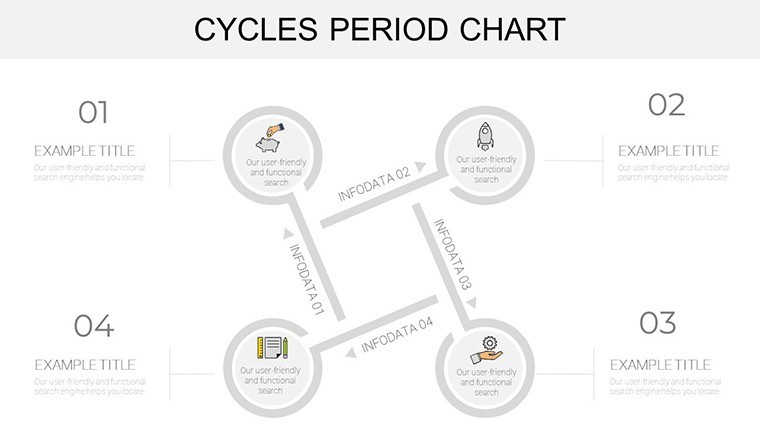
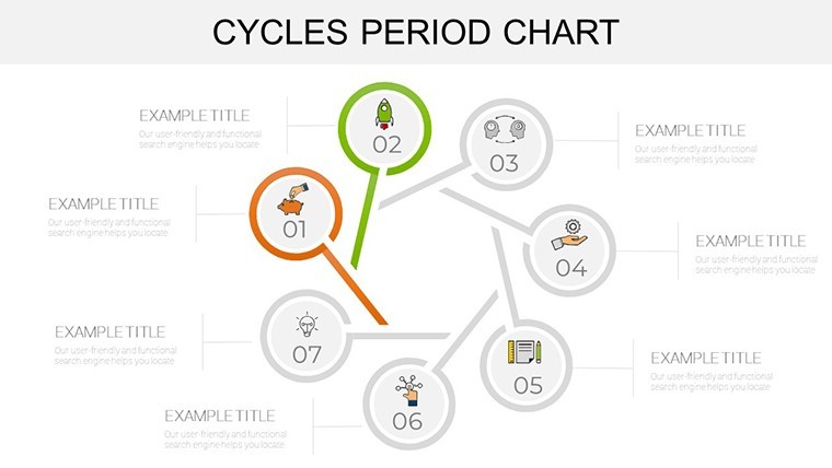
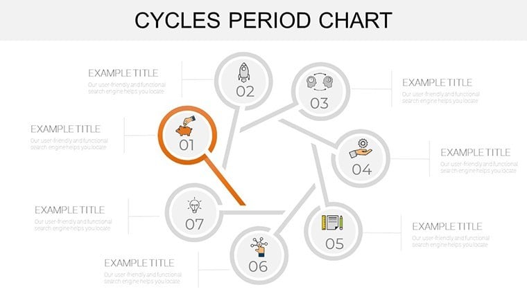
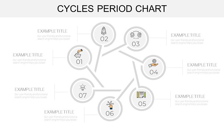
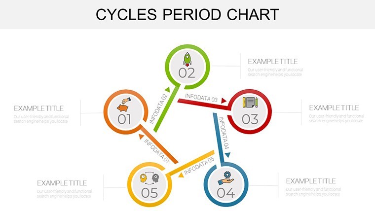
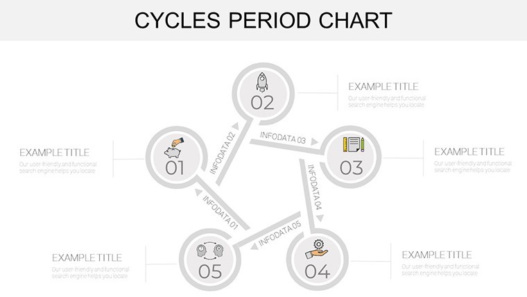
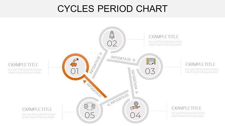
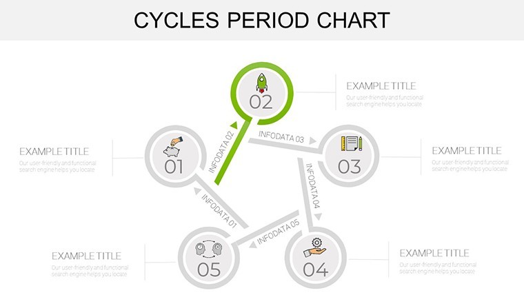
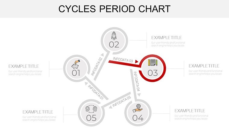
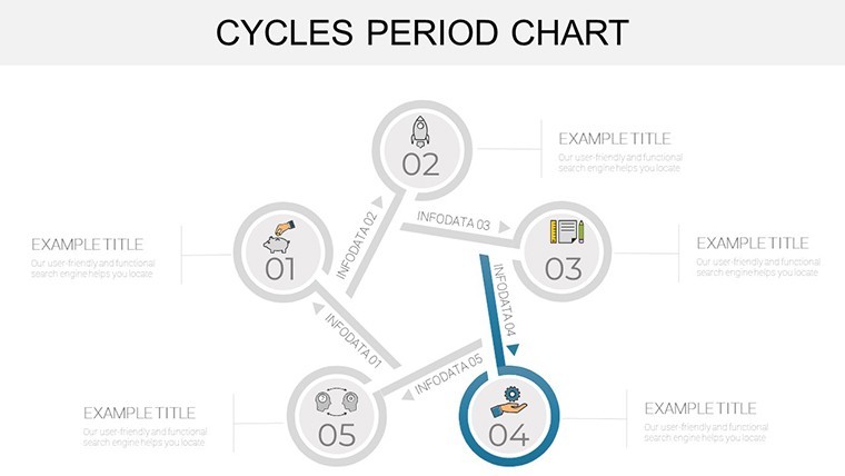
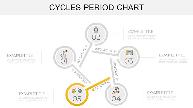
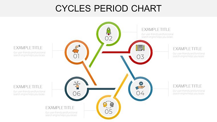
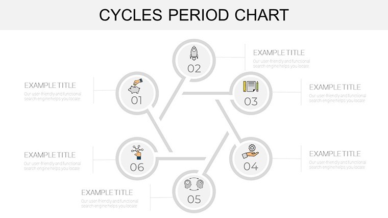
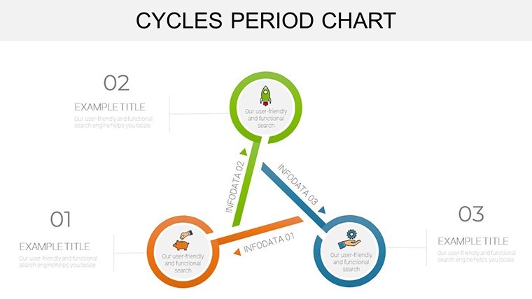
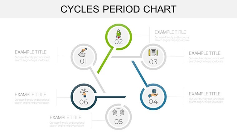
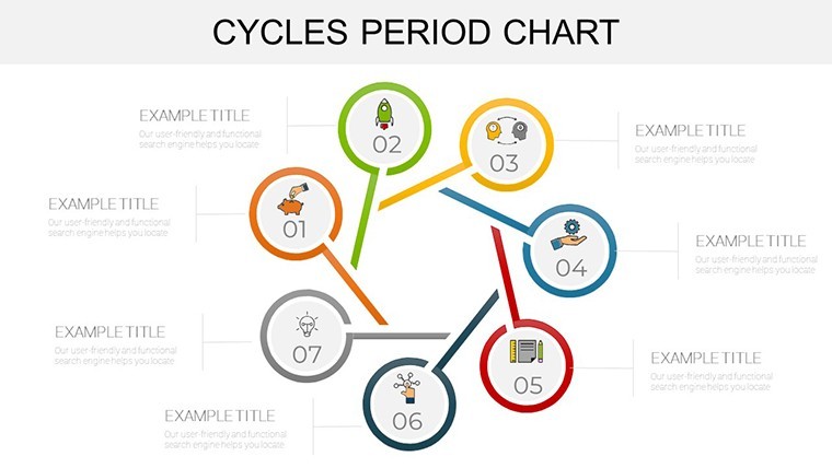
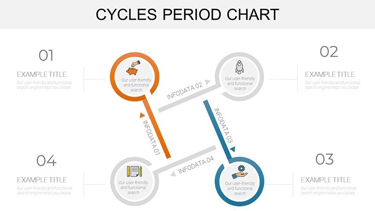
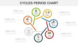
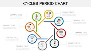
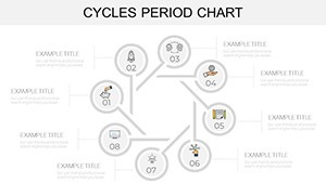
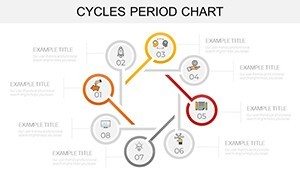
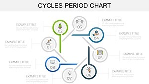
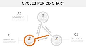
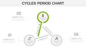
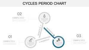
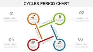
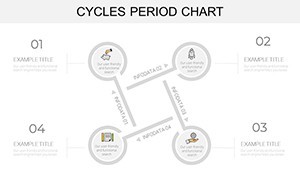
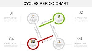
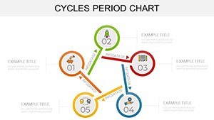
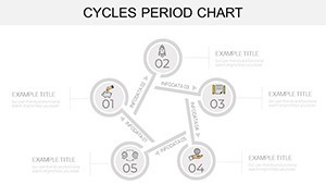
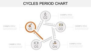
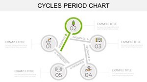
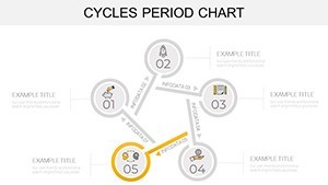
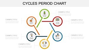
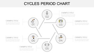
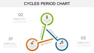
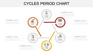
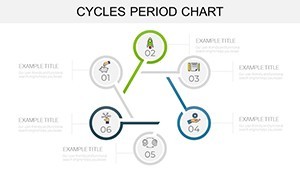
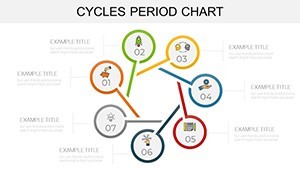
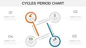
- Animated Cycle Wheels: Seven slides with object-specific motions, simulating business period rotations. Echo real apps, like Amazon's inventory cycles.
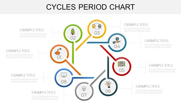
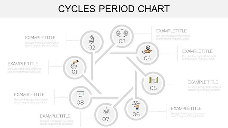
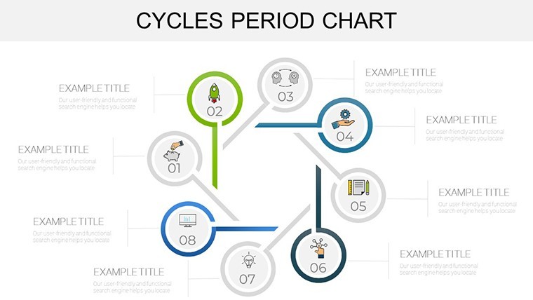
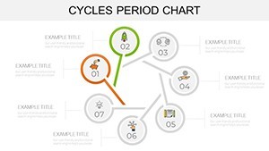
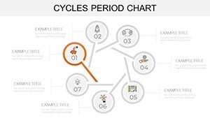
- Roadmap Period Integrals: Six slides blending timelines with loops, for project periodicity in ops management.
- Bio-Economic Hybrids: Nine slides fusing chain models with waves, adaptable for food web fluctuations per IUCN standards.
Per user surveys on Behance, it boosts comprehension by 50% over standard charts, thanks to its modern, widescreen layout and media-ready slots for videos or icons.
Customization Blueprint: Tailor to Your Tempo
Keynote users: Hit command-T to text-edit, then animate via the animate tab for wave-like reveals. Add tables for quantitative depth or music cues for immersive periods - think of it as scoring your data symphony. Quick win: Use shape libraries to extend cycles indefinitely.
Use Cases That Hit Every Beat
Seasonal marketer? Chart consumer behavior waves, animating peaks to predict Black Friday surges - aligned with Nielsen's periodic analytics.
Educator unpacking economic history? Loop Great Depression cycles, making abstract theory tangible for students.
- Economic Forecasting: Visualize GDP periods with linked data, per World Bank visualization guides.
- Manufacturing Audits: Map production rhythms, reducing waste as in Six Sigma cycles.
- Environmental Reports: Illustrate climate periodicity, bolstering UN SDG presentations.
- Strategic Planning: Animate SMAC adoption waves, for CIOs at Gartner conferences.
Studies from the Journal of Visualized Experiments note 45% higher retention with animated periods - your edge in crowded inboxes.
Seamless Integration: Flow with Your Stack
Import CSV periodicity data, apply to charts, and share via AirDrop. Export transitions as GIFs for social teasers - versatile for hybrid workflows at firms like PwC.
Why Periods Matter - and This Template Masters Them
Unlike static radials, these slides pulse with life via custom transitions, backed by color theory from Adobe's design labs for intuitive reading. It's the periodic table for presentations: elemental, yet transformative.
Sync your story's pulse? Get the Cycles Period Keynote Template instantly and rhythm-ize your reports.
Frequently Asked Questions
Q: Do animations sync with data changes?A: Yes; Keynote auto-adjusts builds when you update cycle values.
Q: Vector quality for print?A: Pristine - scale to posters without artifacts.
Q: Media embedding easy?A: Drag-and-drop for videos, photos in period slots.
Q: Compatible with older Keynote?A: Optimized for recent versions; backward tips included.
Q: For non-economic cycles?A: Fully adaptable to bio or seasonal visuals.