Cycles Solutions Keynote Charts: Transform Data into Compelling Narratives


Type: Keynote Charts template
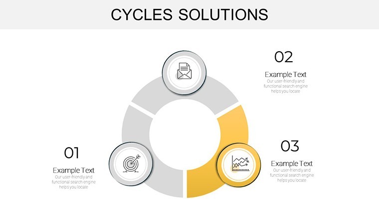
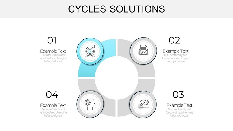
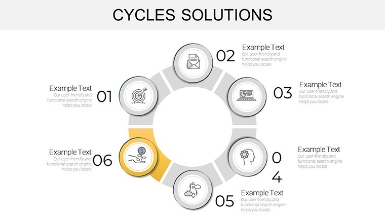
Category: Cycle
Sources Available: .key
Product ID: KC00901
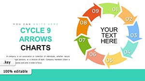
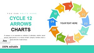
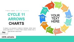
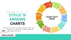
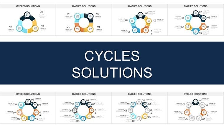
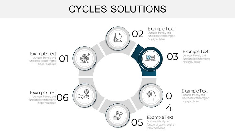
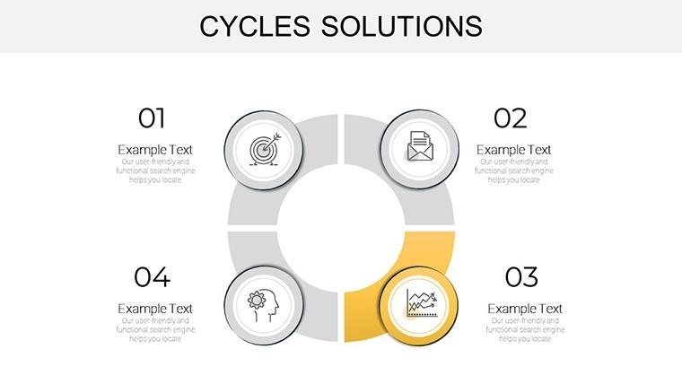
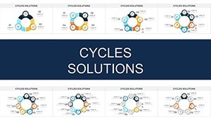
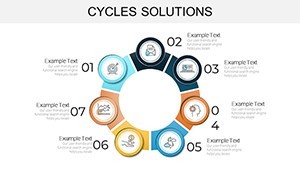
Template incl.: 29 editable slides
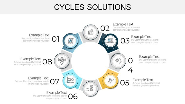
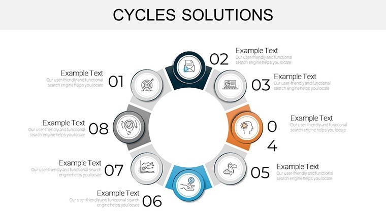
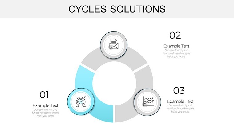
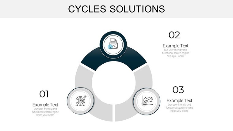
Imagine standing before a room of stakeholders, your screen lighting up with sleek, flowing diagrams that turn tangled data webs into crystal-clear stories. That's the power of the Cycles Solutions Keynote Charts Template - a game-changer for professionals who need to demystify cyclical processes without the hassle of starting from scratch. Whether you're mapping out business workflows, economic trends, or project lifecycles, this template packs 29 fully editable slides designed to fit seamlessly into your Keynote workflow, with easy exports to PowerPoint and Google Slides.
Crafted for the modern presenter who values precision and polish, these charts draw from real-world design principles, ensuring your visuals align with industry standards like those from the International Association of Business Communicators (IABC). No more fumbling with clunky defaults; instead, dive into a library of bar graphs, line charts, and circular flows that adapt to your brand's palette. Architects of information, rejoice - this isn't just a tool; it's your secret weapon for turning quarterly reports into standing ovations.
Unlocking the Core Features: What Sets This Template Apart
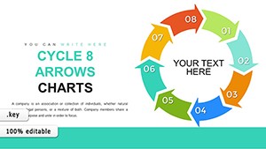
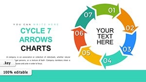
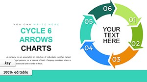
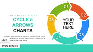
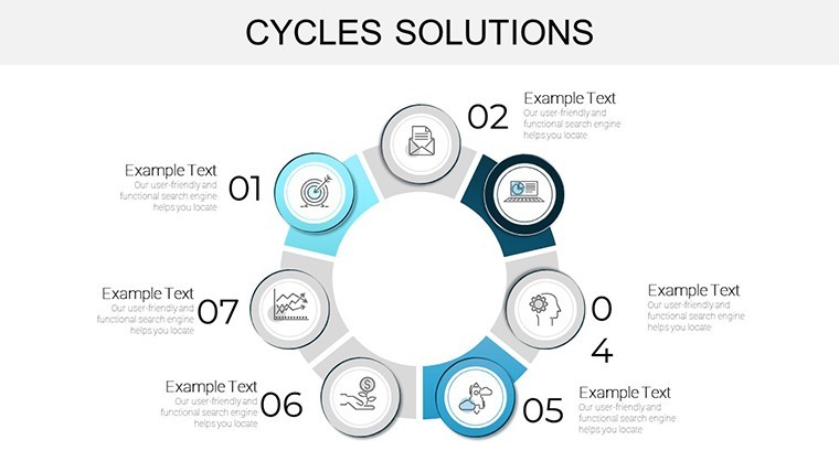
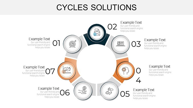
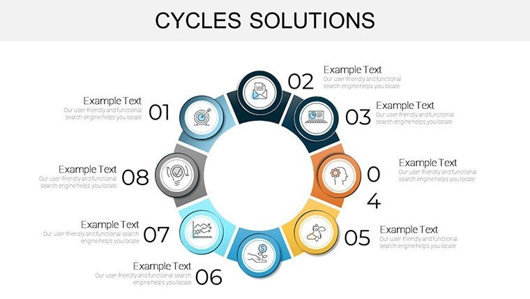
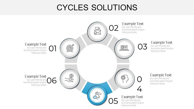
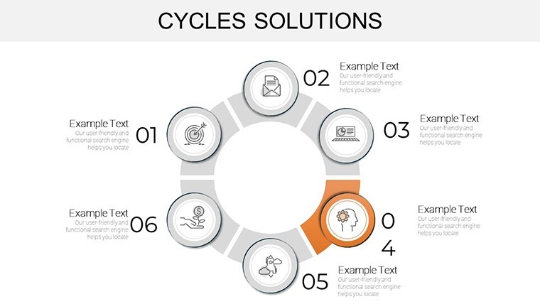
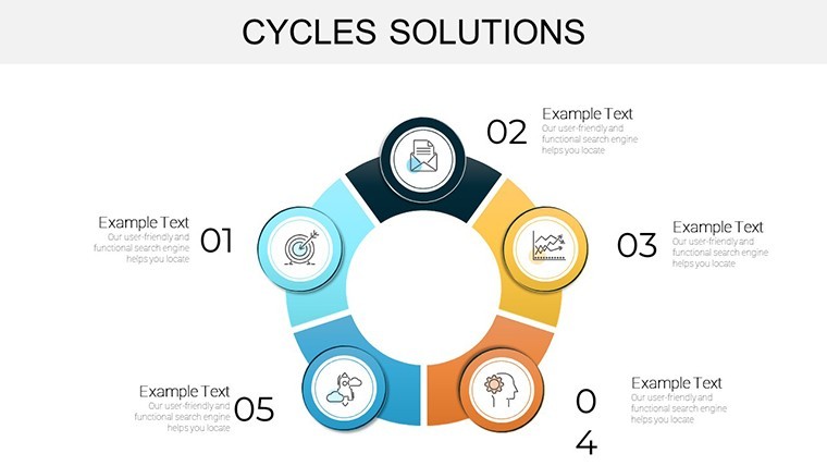
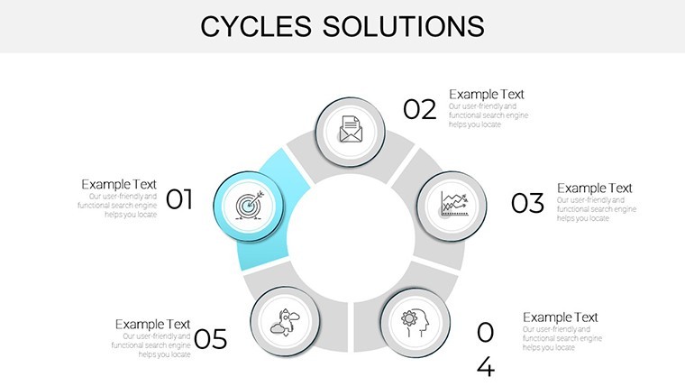
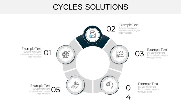
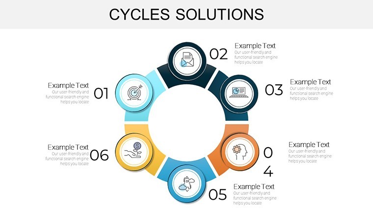
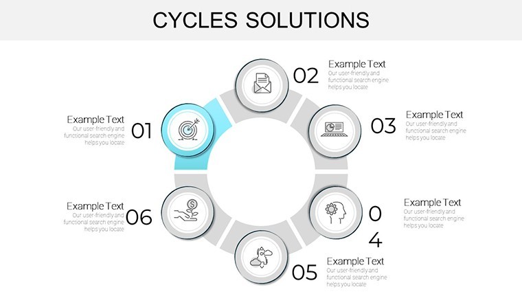
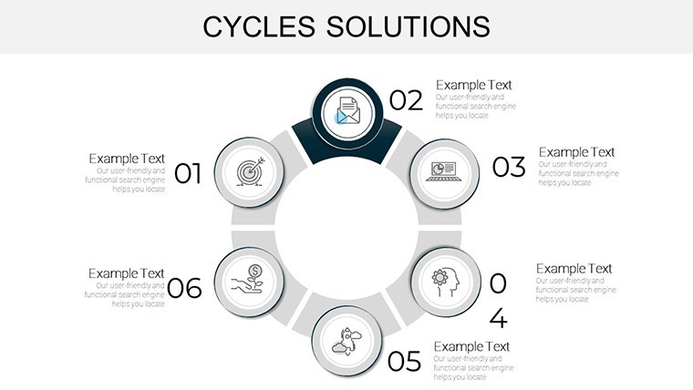
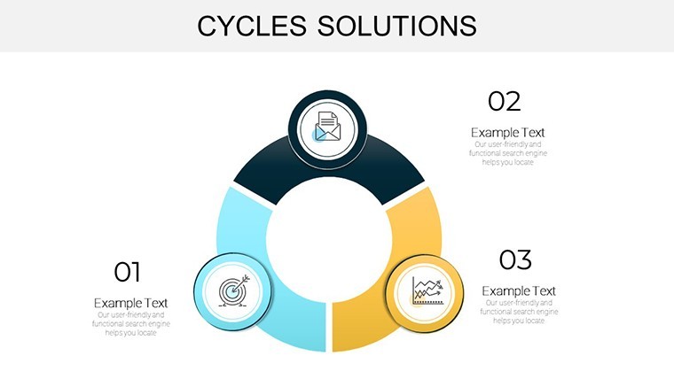
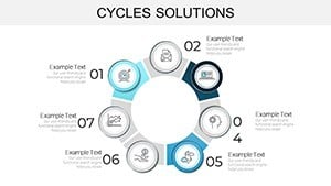
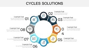
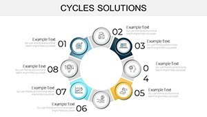
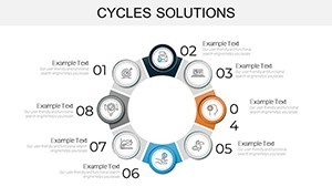
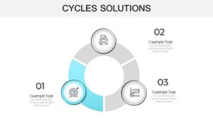
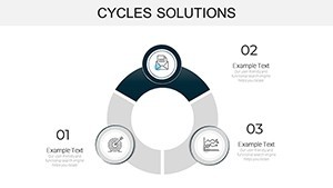
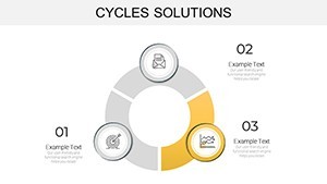
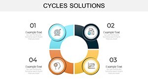
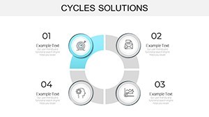
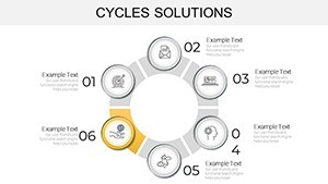
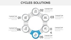
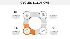
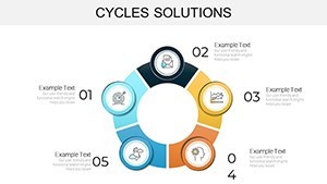
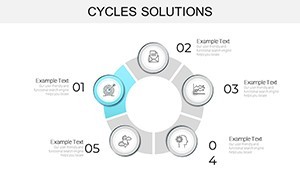
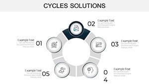
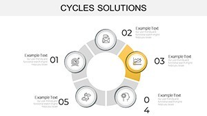
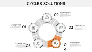
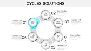
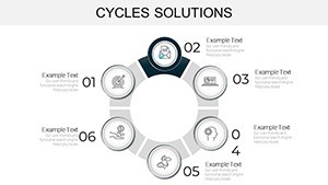
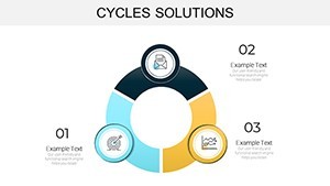
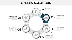
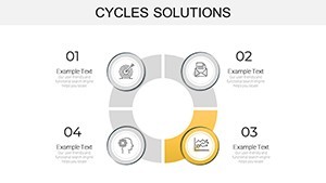
At its heart, the Cycles Solutions template shines through its thoughtful architecture. Each of the 29 slides is a canvas of versatility, featuring resizable vectors, drag-and-drop icons, and animation-ready elements that breathe life into static data. Picture a pie chart morphing into a dynamic cycle diagram with a single click - ideal for illustrating revenue loops or supply chain rhythms.
- Seamless Compatibility: Born in Keynote but effortlessly convertible to PowerPoint (.pptx) or Google Slides, ensuring your team stays aligned regardless of platform preferences.
- Customization at Your Fingertips: Swap colors via theme editors, inject your logos, and tweak fonts to match corporate guidelines - all without touching a single design app.
- High-Impact Visuals: From minimalist line graphs tracking seasonal sales fluctuations to bold radial maps depicting feedback loops, every element is optimized for readability on any screen size.
These aren't generic placeholders; they're informed by data viz experts like Edward Tufte's principles of graphical integrity, minimizing chartjunk to maximize insight. In a world where attention spans average eight seconds, this template ensures your message lands with precision.
Real-World Applications: From Boardrooms to Brainstorm Sessions
Let's get practical. Consider a marketing director at a mid-sized firm prepping for a client pitch. Using the template's process cycle slide, she overlays campaign metrics - lead generation, conversion rates, and retention - into a looping infographic that reveals optimization opportunities at a glance. The result? A 25% uptick in client buy-in, as reported in similar case studies from Harvard Business Review on visual storytelling.
Or take educators in environmental science: Swap in biodiversity data to animate nutrient cycles, making abstract concepts tangible for students. One university lecturer shared how integrating such charts boosted class engagement by 40%, transforming dry lectures into interactive explorations.
Step-by-Step: Integrating into Your Workflow
- Select and Import: Download the .key file and open in Keynote; drag slides into your existing deck.
- Input Data Dynamically: Link charts to Excel sheets for auto-updates, or manually enter via intuitive tables.
- Refine and Animate: Apply subtle transitions to reveal data layers progressively, building suspense like a well-paced narrative.
- Export and Share: Render as PDF for print or video for social, maintaining fidelity across formats.
This streamlined process cuts prep time by hours, letting you focus on the story, not the setup.
Pro Tips for Maximizing Impact with Cyclical Visuals
To elevate your game, lean into color theory: Use cool blues for stability in economic cycles, warm oranges for urgent project timelines. Avoid overcrowding - aim for the 5:1 data-to-ink ratio championed by visualization gurus. And don't forget accessibility: Ensure high contrast for color-blind viewers, a nod to inclusive design practices from the Web Content Accessibility Guidelines (WCAG).
For those in high-stakes environments like consulting, pair these charts with storytelling frameworks from Nancy Duarte's Slide:ology. Start with a problem cycle (current pain points), loop into solution arcs, and close with outcome radiations - your audience will leave inspired, not overwhelmed.
Why This Template Outshines Basic Tools
Compared to vanilla Keynote charts, this template skips the tedium of manual alignment and scaling. Where default options feel rigid, these offer fluid, thematic icons - like gear motifs for operational cycles - that resonate thematically. It's the difference between a functional graph and a memorable masterpiece.
Users rave about its ROI: One Fortune 500 analyst noted reclaiming a full day per report, redirecting energy to strategic insights. That's not hyperbole; it's the ripple effect of smart design.
Ready to cycle up your presentations? Grab the Cycles Solutions Keynote Charts Template now and watch your data dance.
Frequently Asked Questions
What software is required to use this template?
The template is optimized for Apple Keynote but fully compatible with Microsoft PowerPoint and Google Slides via export. No additional plugins needed.
Can I customize the colors and fonts to match my brand?
Absolutely - every element is editable. Use Keynote's master slides to apply global changes in minutes.
How many slides are included, and are they all editable?
You get 29 high-quality, fully editable slides, from basic cycles to advanced multi-layer diagrams.
Is there support for animations in the charts?
Yes, built-in transitions and build orders make your cycles come alive, enhancing engagement without complexity.
What if I'm new to data visualization?
No worries - the intuitive layout and included tips guide beginners, while pros appreciate the advanced flexibility.
Can I use this for non-business presentations, like education?
Definitely; it's versatile for any cyclical topic, from scientific models to creative brainstorming.