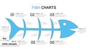
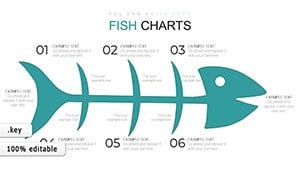
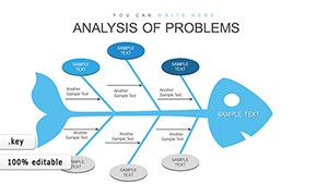
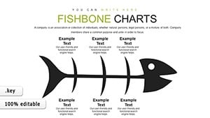
Fishbone Diagram Keynote Template: Root Cause Analysis


Type: Keynote Charts template
Category: Business Models
Sources Available: .key
Product ID: KC00889
Template incl.: 26 editable slides
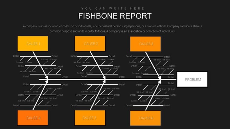
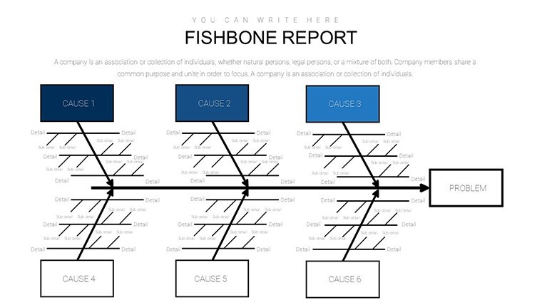
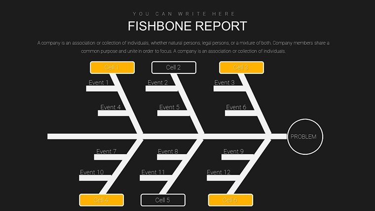
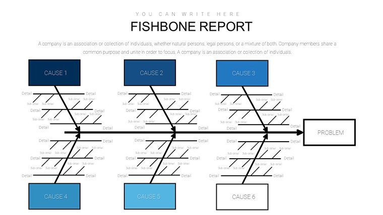
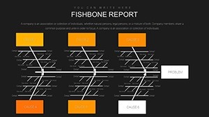
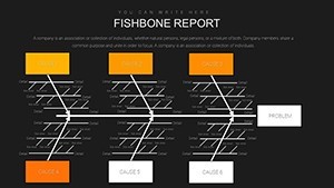
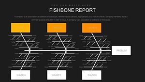
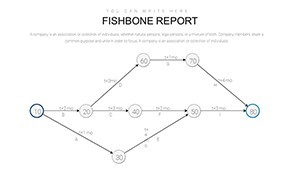
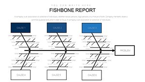
Imagine pinpointing the exact reasons behind a production delay or a patient care hiccup without endless meetings. That's the power of a well-crafted Fishbone Diagram, also known as an Ishikawa or cause-and-effect diagram. Our Fishbone Diagram Keynote Template brings this classic tool into the modern presentation world, offering 26 fully editable slides designed specifically for Keynote users who need to dissect problems with clarity and precision. Whether you're a project manager in manufacturing unraveling supply chain issues or a healthcare professional mapping out safety protocols, this template transforms complex data into intuitive visuals that spark actionable insights.
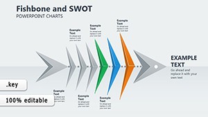
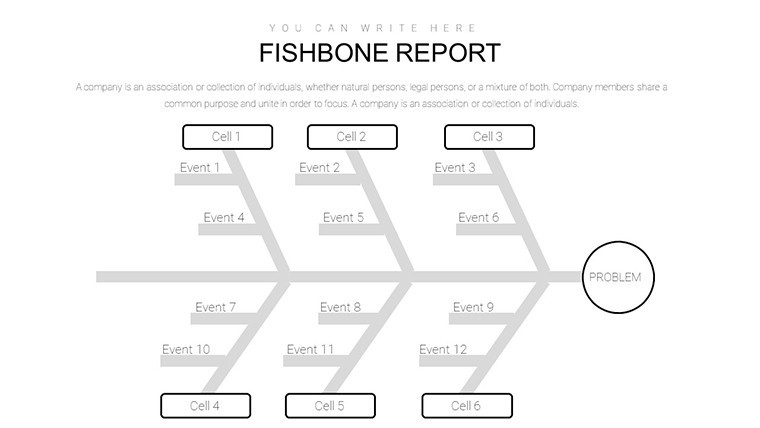
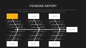
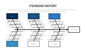
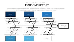
Rooted in the methodologies popularized by Kaoru Ishikawa in the 1960s at Toyota, Fishbone Diagrams categorize potential causes into key areas like people, processes, materials, machines, measurements, and environment. Our template adheres to these principles while infusing a clean, professional aesthetic with subtle gradients and icons that align with industry standards, such as those from the American Society for Quality (ASQ). You'll find it compatible not just with Keynote but also easily exportable to PowerPoint or Google Slides for broader team collaboration. The result? Presentations that don't just inform but inspire teams to collaborate and innovate.
What sets this template apart is its versatility across sectors. In manufacturing, use it to analyze defect rates by breaking down variables from raw material quality to operator training - think of a case like Ford's assembly line optimizations in the 1980s, where similar diagramming reduced errors by 30%. For healthcare, map out medication errors, drawing from real-world applications in hospitals following Joint Commission guidelines. Even in education, educators can illustrate student performance gaps, categorizing influences like curriculum design or resource availability. With editable text boxes, resizable arrows, and color-coded categories, customization takes minutes, allowing you to tailor it to your brand's palette without starting from scratch.
Key Features That Streamline Your Analysis
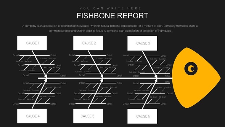
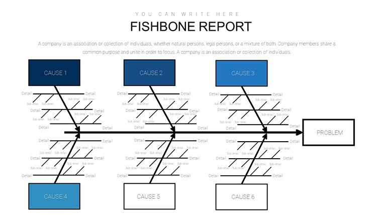
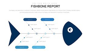
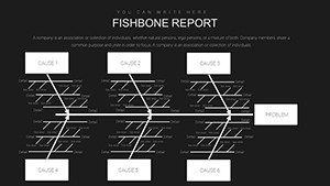
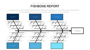
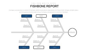
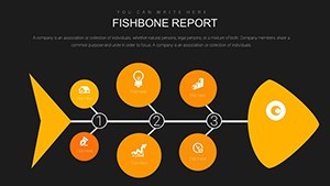
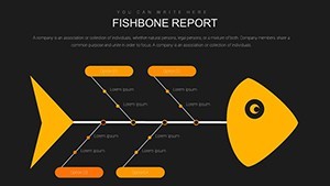
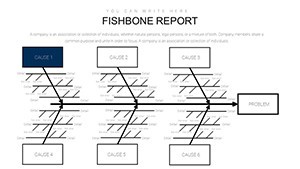
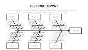
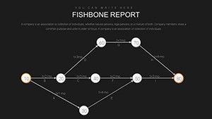
Dive deeper into the template's toolkit, and you'll discover features built for efficiency. Each of the 26 slides includes pre-built Fishbone structures in various layouts: horizontal for broad overviews, vertical for detailed breakdowns, and even 3D variants for added visual depth. Icons sourced from professional libraries - think gears for machines or stethoscopes for healthcare - ensure relevance and professionalism.
- Editable Elements Everywhere: Every line, shape, and label is fully customizable. Swap in your data via simple drag-and-drop, and watch animations bring causes to life during your pitch.
- Integrated Data Visualization: Beyond basic diagrams, incorporate linked charts like pie graphs for cause distribution or timelines for issue progression, making your analysis multifaceted.
- Theme Consistency: A cohesive blue-and-gray scheme evokes trust and focus, perfect for boardroom settings. Plus, master slides mean one change updates the entire deck.
- Collaboration-Ready: Share via Keynote's native format or export to PDF for stakeholder reviews, ensuring seamless workflow integration.
Compared to generic PowerPoint defaults, this template saves hours by providing ready-to-use frameworks that align with Lean Six Sigma principles, reducing the trial-and-error of DIY designs. Professionals who've used similar tools report up to 40% faster problem identification, as seen in case studies from McKinsey on operational excellence.
Step-by-Step: Building Your First Fishbone Presentation
- Identify the Problem: Start with Slide 1's central "head" to state your issue clearly, like "Declining Customer Satisfaction."
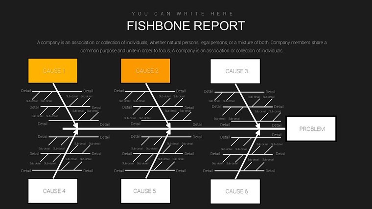
- Categorize Causes: Use Slides 2-10 for the six main bones, inputting sub-causes with bullet points or sub-charts.
- Add Evidence: Integrate data from Excel on Slides 11-15, linking metrics to each branch for evidence-based arguments.
- Propose Solutions: Transition to Slides 16-20 with action-oriented branches, prioritizing fixes based on impact.
- Review and Animate: Final slides (21-26) offer summary overviews; apply subtle transitions to guide the audience through your logic flow.
This structured approach not only clarifies your thought process but also engages viewers, turning passive listeners into active problem-solvers. For urban planning teams, envision applying it to traffic congestion analysis, categorizing causes from infrastructure to policy - much like how cities like Singapore use diagramming for sustainable development.
Real-World Applications and Success Stories
The beauty of this Fishbone Template lies in its adaptability. In business operations, a marketing team might dissect campaign underperformance, attributing issues to audience targeting (people), ad platforms (machines), or content strategy (processes). A real example: A mid-sized e-commerce firm used a similar diagram to identify logistics bottlenecks, boosting delivery times by 25% after reallocating resources.
For educators, it's a teaching aid par excellence. Craft lessons on environmental science by mapping pollution sources, helping students grasp interconnected factors. In quality control, align with ISO 9001 standards to document audits visually, ensuring compliance and continuous improvement.
Don't overlook its role in pitches. When seeking investor buy-in for process overhauls, this template's polished look conveys expertise, much like how AIA-accredited architects use visual aids in proposal defenses to highlight design flaws preemptively.
Tips for Maximum Impact
To elevate your presentations, pair the Fishbone with storytelling: Start with the "effect" to hook the audience, then peel back layers. Use high-contrast colors for key causes to draw eyes, and incorporate subtle humor - like labeling a "people" branch "Human Error (We're All Guilty!)" - to keep energy high without undermining seriousness. Always test on a small group for feedback, refining based on their takeaways.
Integrate with tools like MindMeister for brainstorming sessions, exporting ideas directly into the template. For remote teams, leverage Keynote's sharing features to co-edit in real-time, fostering distributed problem-solving.
Why This Template Outshines the Rest
In a sea of bland templates, ours stands out with its focus on usability and depth. Unlike free online generators that produce static images, this offers dynamic, presentation-ready slides with built-in scalability for large datasets. It's not just a tool; it's a strategic asset that demonstrates your command of analytical techniques, boosting your professional credibility.
Ready to tackle root causes head-on? Customize this Fishbone Diagram Keynote Template today and turn potential pitfalls into pathways for success. Your next presentation could be the one that solves it all - download now and start diagramming.
Frequently Asked Questions
How editable are the charts in this Fishbone Template?
All 26 slides are fully editable in Keynote, with vector-based elements that resize without quality loss. You can modify colors, text, and add data effortlessly.
Is this template compatible with PowerPoint or Google Slides?
Yes, export from Keynote to PowerPoint (.pptx) or Google Slides seamlessly, preserving most animations and layouts.
Can I use this for non-business presentations, like education?
Absolutely - it's versatile for teaching root cause analysis in classrooms, with examples adaptable to subjects like science or history.
What file formats are included?
Native .key files for Keynote, plus PDF previews and editable source files for flexibility.
How does it support team collaboration?
Keynote's iCloud integration allows real-time editing, perfect for distributed teams brainstorming causes together.
Are there animations included?
Yes, subtle build-in animations for branches ensure smooth reveals during your analysis walkthrough.