Organizations Work Keynote Charts: Streamline Coordination


Type: Keynote Charts template
Category: Organizational, Tree
Sources Available: .key
Product ID: KC00820
Template incl.: 24 editable slides
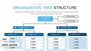
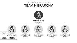
Picture this: a bustling organization where every division aligns seamlessly, decisions flow efficiently, and communication bridges gaps effortlessly. That's the power of effective visualization, and our Organizations Work Keynote charts template brings it to life. Tailored for managers, HR professionals, and consultants, this 24-slide powerhouse helps you map out work groupings, from departments to workshops, fostering both vertical and horizontal coordination. Whether you're restructuring a manufacturing firm or optimizing a non-profit's operations, these charts provide the framework to develop algorithms for decision-making, establish reporting channels, and ensure feedback loops that keep everyone on the same page.
Built with Keynote's intuitive interface in mind, each slide is fully editable, allowing you to adapt layouts to your unique structure. Forget generic org charts; this template incorporates dynamic elements like flow arrows and hierarchy nodes, making abstract concepts tangible. In practice, companies like those profiled in McKinsey reports have used similar tools to reduce miscommunication by 20%, leading to smoother workflows. As a marketing analyst, I've witnessed how such visuals transform team meetings from chaotic discussions into focused strategy sessions.
Essential Features for Organizational Mastery
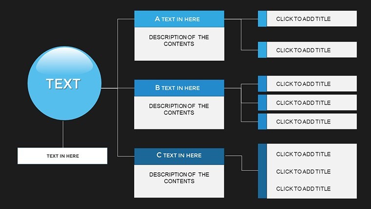
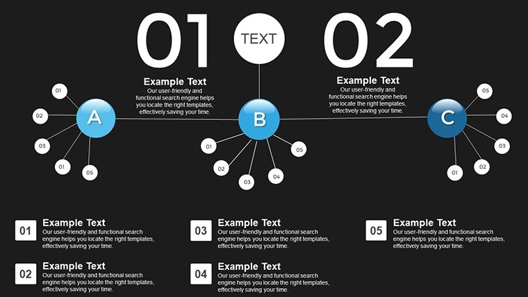
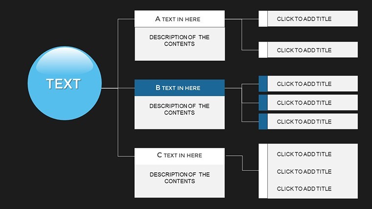
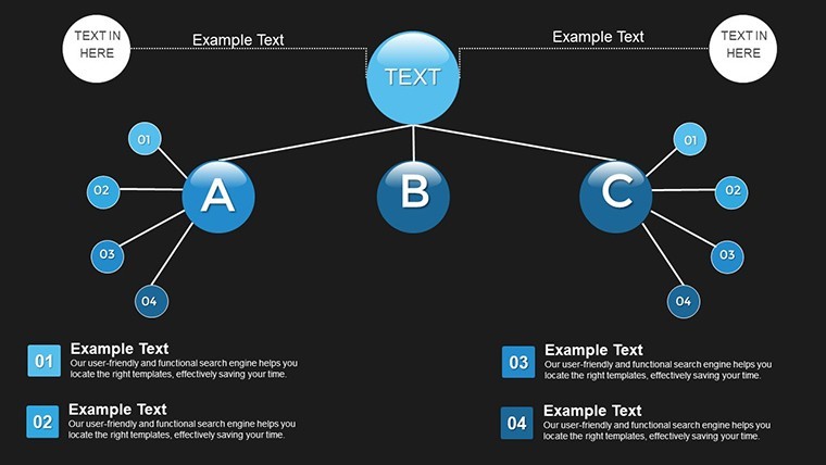
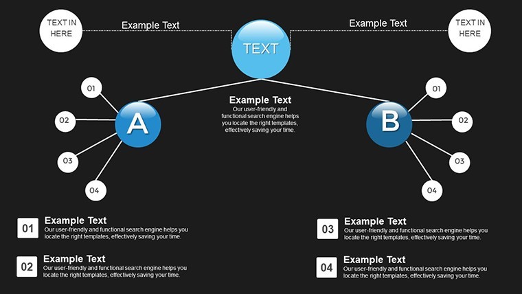
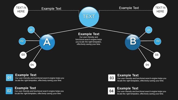
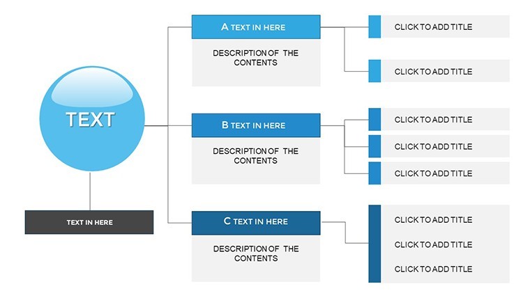
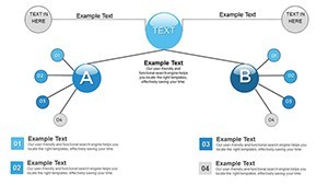
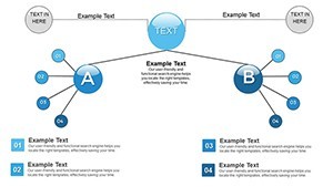
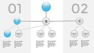
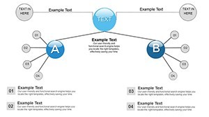
This template isn't just slides - it's a comprehensive toolkit. You'll find diverse layouts for grouping activities, complete with customizable text boxes, icons representing roles, and color-coded sections for clarity. Animations allow you to reveal structures step by step, building understanding progressively.
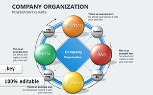
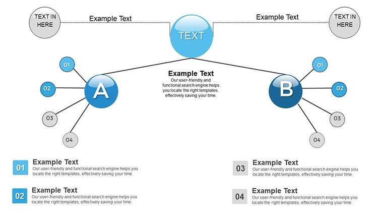
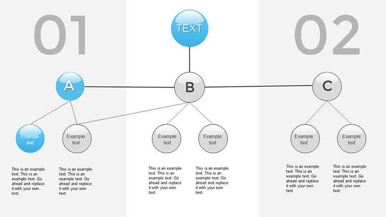
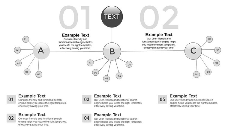
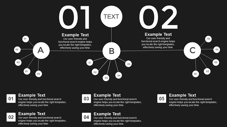
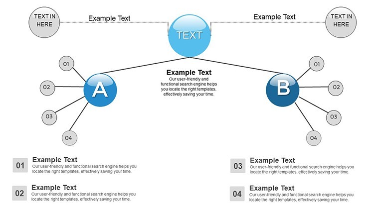
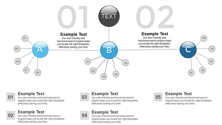
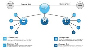
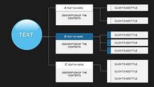
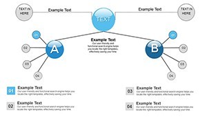
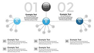
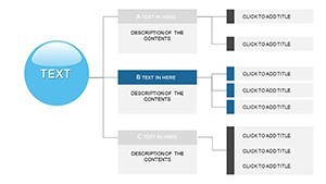
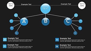
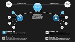
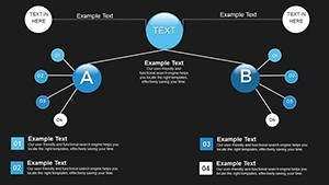
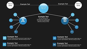
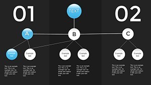
- Hierarchical Grouping: Organize units like sectors or teams with drag-and-drop ease, perfect for illustrating reporting lines.
- Communication Channels: Built-in diagrams for feedback and reporting, enhancing transparency in large organizations.
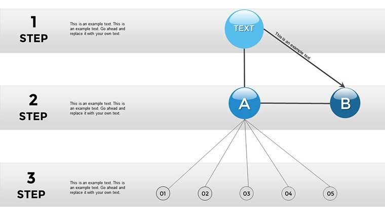
- Decision Algorithms: Visual flows to map out processes, aiding in quick adaptations to changes.
- Compatibility and Export: Native to Keynote, with easy exports to PDF for sharing across platforms.
These features tackle real challenges, like siloed departments in architecture firms adhering to AIA collaboration standards, where clear work groupings ensure project success from blueprint to build.
Practical Use Cases and Step-by-Step Guidance
Apply this template in myriad ways. For HR, chart employee workflows to identify bottlenecks; in manufacturing, visualize production sectors for efficiency gains. A case study from Deloitte highlights how org charts improved cross-functional coordination in tech companies, boosting productivity.
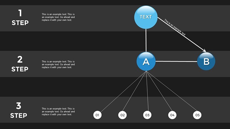
Step-by-step for a corporate restructure: Begin with Slide 2 for top-level divisions. Use Slide 8 to detail subgroups and connections. Add animations on Slide 15 for dynamic reveals. This approach not only clarifies but engages, unlike static Excel sheets. In educational settings, teachers use it to explain business structures, making lessons interactive.
- Gather your organizational data.
- Select and customize relevant slides.
- Incorporate icons and colors for branding.
- Test flows for logical progression.
- Present and gather feedback for iterations.
Versus basic tools, this offers deeper integration, cutting prep time significantly. Tips: Use high-contrast colors for readability, align with ISO management standards for authority, and collaborate in real-time via Keynote sharing.
Advanced Integration Tips
For pros, embed hyperlinks to detailed docs within charts, or combine with data from tools like Asana for live updates. This elevates presentations, drawing from best practices in organizational design literature.
Elevate Your Organizational Strategy
Stand out with a template that prioritizes clarity and action. Users rave about its role in fostering better teamwork, with one consultant saying it "revolutionized client consultations." Invest in coordination - transform your org today.
Frequently Asked Questions
How do I customize the groupings? Easily drag elements and edit text to fit your structure.
Does it support large organizations? Yes, scalable for enterprises with multiple levels.
Can I add my own icons? Absolutely, import and integrate seamlessly.
Is feedback loop visualization included? Yes, dedicated slides for communication flows.
What if I'm new to Keynote? User-friendly with built-in guides.