Cycle 5 Arrows Keynote Charts: Streamline Your Process Visualizations


Type: Keynote Charts template
Category: Cycle
Sources Available: .key
Slide size: widescreen (16:9)
Product ID: KC00779
Template incl.: 16 editable slides
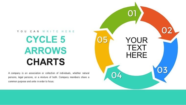
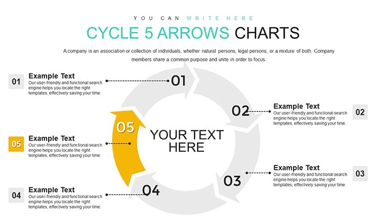
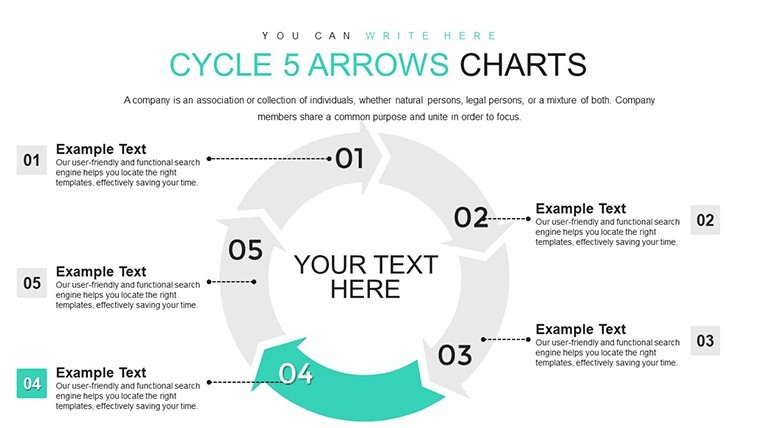
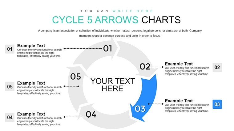
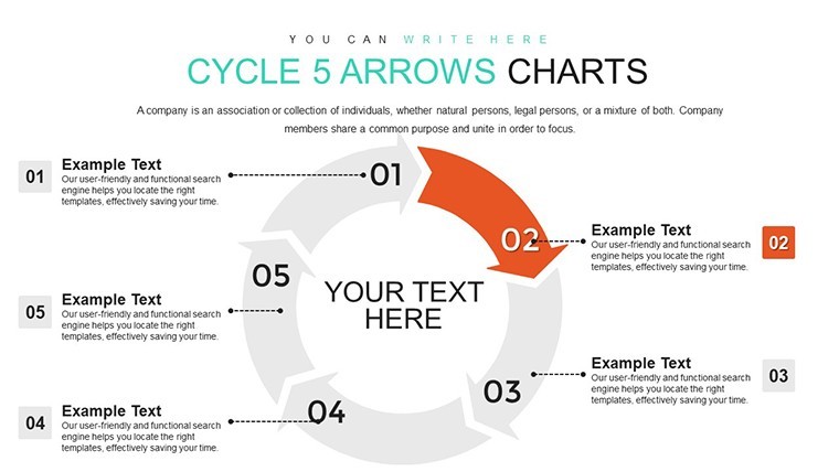
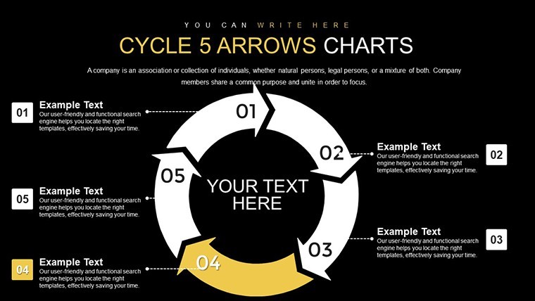
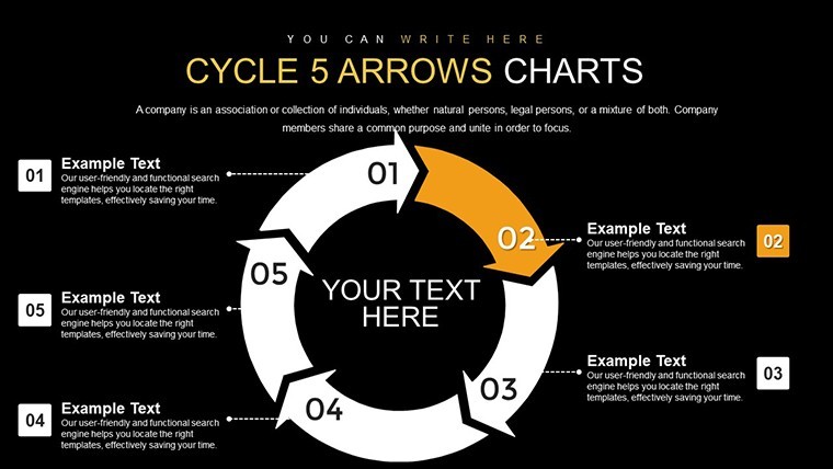
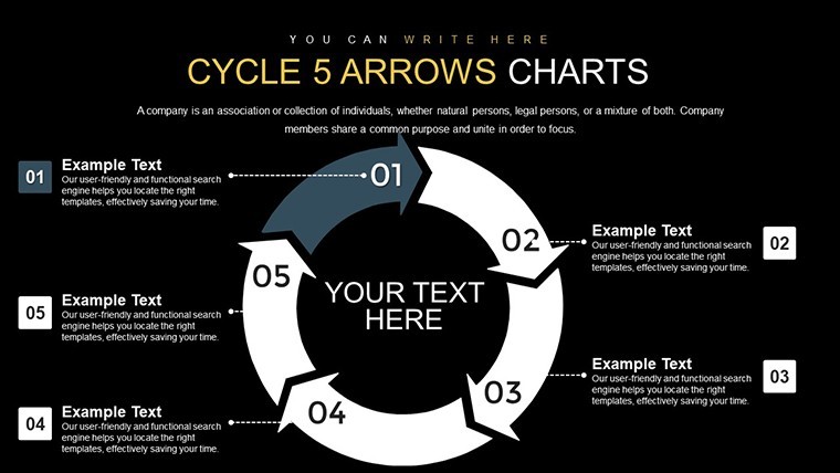
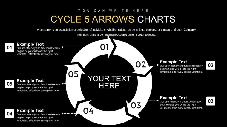
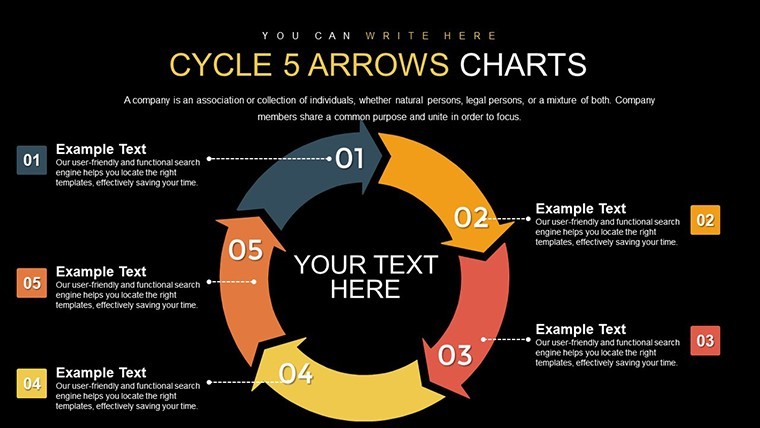
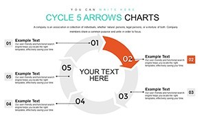
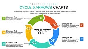
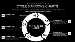
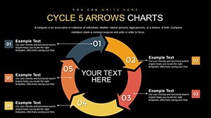
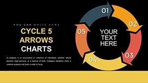
Processes in business often loop back on themselves, creating cycles that demand clear, cyclical representations to avoid confusion. Enter the Cycle 5 Arrows Keynote Charts Template - a robust set of 16 editable slides engineered for depicting five-step sequences in everything from product development to quality control. Ideal for project managers, educators, and consultants, this template uses arrow-based cycles to illustrate continuous flows, making abstract concepts tangible and actionable.
Think of mapping a software development cycle: ideation, design, implementation, testing, deployment - and back to ideation. Our arrows guide the eye through each phase, with room for icons like code snippets or bug fixes to add context. Built for Keynote's ecosystem, it offers swift edits, ensuring your visuals evolve as your processes do, all while maintaining a professional edge that outshines makeshift diagrams.
Standout Features for Cyclical Narratives
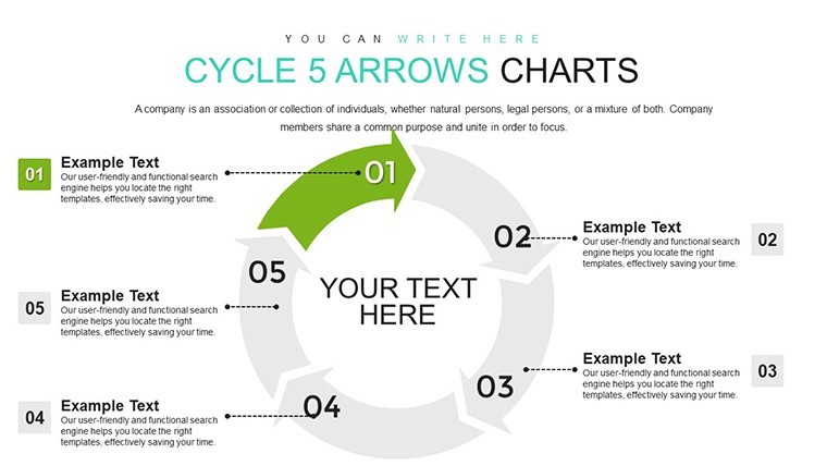
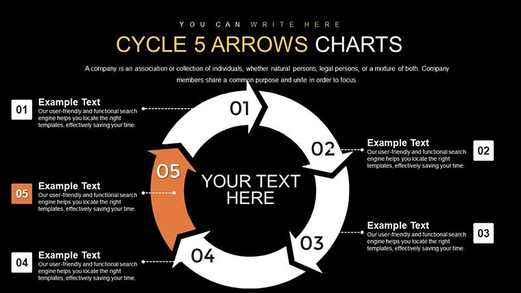
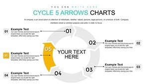
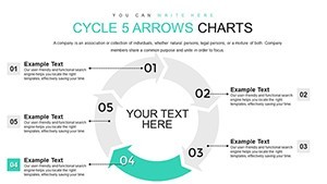
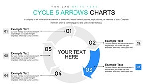
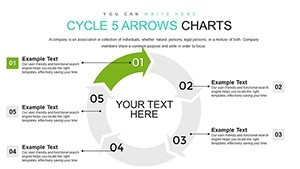
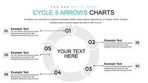
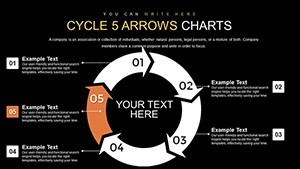
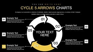
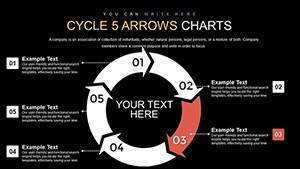
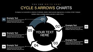
The template's core strength lies in its arrow configurations, where five interconnected arrows form a seamless loop, perfect for balanced processes. Each slide variant adjusts arrow sizes, colors, and labels, allowing emphasis on key steps - like highlighting 'testing' in red for caution. Widescreen formatting ensures legibility in team huddles or virtual calls, with editable elements that snap to grids for precision.
For those in agile environments, align with Scrum frameworks by customizing arrows to represent sprints, incorporating velocity metrics. The design draws from proven visualization principles, ensuring your cycles communicate efficiency without clutter.
- Loop Integrity: Arrows maintain directional flow, preventing misinterpretation of sequence.
- Variant Options: From simple outlines to filled gradients, suit your style needs.
- Icon Integration: Embed symbols for each step, enhancing memorability.
- Scalability: Resize without loss, ideal for detailed or overview slides.
Targeted Applications and Success Stories
In project management, use these cycles for PMBOK-aligned processes, like the five phases of project lifecycle, as seen in PMI case studies where visual aids reduced miscommunications by 25%. Educators might apply them to teaching feedback loops in systems thinking, drawing from MIT's system dynamics models. Consultants can showcase client workflows, such as a marketing agency's content creation cycle, leading to streamlined operations and higher client satisfaction.
A tech startup, for instance, utilized similar cycles to visualize their CI/CD pipeline, accelerating deployment times and impressing investors during funding rounds - echoing strategies from companies like Atlassian.
Implementation Steps for Optimal Use
- Acquire and Launch: Download .key and open in Keynote - slides load instantly.
- Map Your Process: Label arrows with your five steps, input descriptions.
- Tailor Visuals: Color-code for priority, add transitions for dynamic reveals.
- Enhance with Data: Incorporate metrics, like KPIs per arrow, from tools like Jira.
- Review and Present: Simulate flow, refine based on team input.
This method integrates with workflow software like Asana, turning static charts into living documents that evolve with your projects.
Superiority to Basic Cycle Tools
Outpacing default Keynote shapes, our template provides pre-aligned arrows that save setup time, with built-in harmony for color-blind friendly palettes. Research from Nielsen Norman Group highlights how such structured visuals improve user comprehension in process docs.
Structure your slides progressively: begin with a full cycle overview, then zoom into each arrow for details, fostering a build-up that engages audiences like in effective workshops.
Expert Advice for Cycle Mastery
Balance arrow text with brevity - aim for action verbs like 'Analyze' or 'Optimize'. Use shadows or glows sparingly to denote active phases. Reference Deming's PDCA cycle adaptations for quality management, ensuring your visuals align with industry benchmarks. In education, pair with real-time polls via Mentimeter for interactive sessions.
These insights, from visualization gurus like Edward Tufte, emphasize data ink efficiency, making your 5-arrow cycles not just informative but transformative.
Unlock the power of cyclical thinking with this template - turn repetitive processes into opportunities for innovation and clarity.
Frequently Asked Questions
- How do I edit the arrow directions?
- Simply select and rotate; the loop auto-adjusts to maintain continuity.
- Is it suitable for non-tech fields?
- Yes, adaptable for HR onboarding cycles or supply chain loops.
- Can I add more arrows?
- While designed for five, duplicate and modify for custom variations.
- What about export options?
- Export to PDF or images for sharing beyond Keynote.