7-Step Cycle Arrows Keynote Charts Template: Streamline Your Process Visualizations


Type: Keynote Charts template
Category: Cycle
Sources Available: .key
Slide size: widescreen (16:9)
Product ID: KC00777
Template incl.: 20 editable slides
In today's fast-paced professional landscape, conveying complex processes with clarity and engagement is essential. Whether you're an architect mapping out project phases, a project manager outlining development cycles, or an educator explaining iterative learning models, the 7-Step Cycle Arrows Keynote Charts Template emerges as your go-to tool. This versatile template, featuring 20 fully editable slides, transforms abstract ideas into visually compelling narratives. Designed exclusively for Keynote, it ensures compatibility with Apple's ecosystem, allowing seamless integration into your presentations. Imagine turning a mundane sequence of actions into a dynamic loop that captivates your audience - that's the power of these cycle arrows. With widescreen (16:9) formatting, each slide adapts effortlessly to modern displays, making it ideal for virtual meetings or in-person pitches.
Why Choose This 7-Step Cycle Template for Your Presentations?
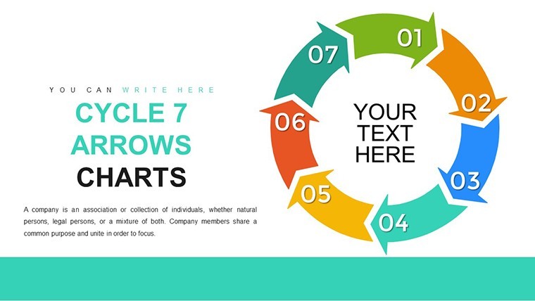
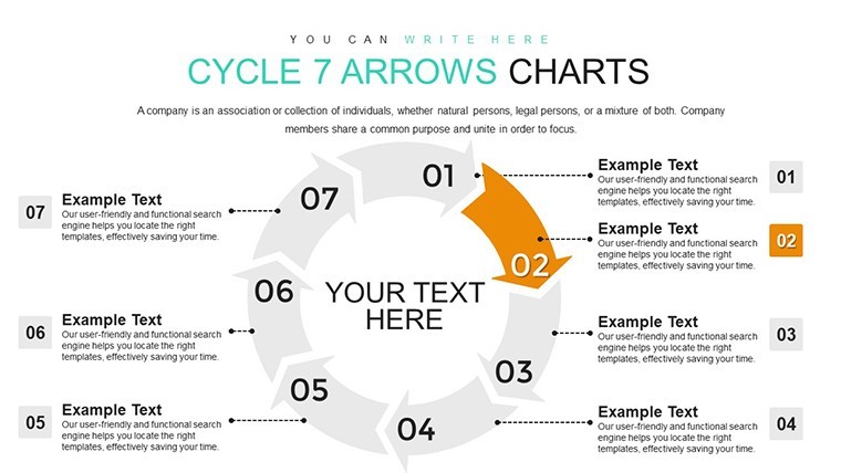
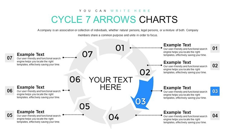
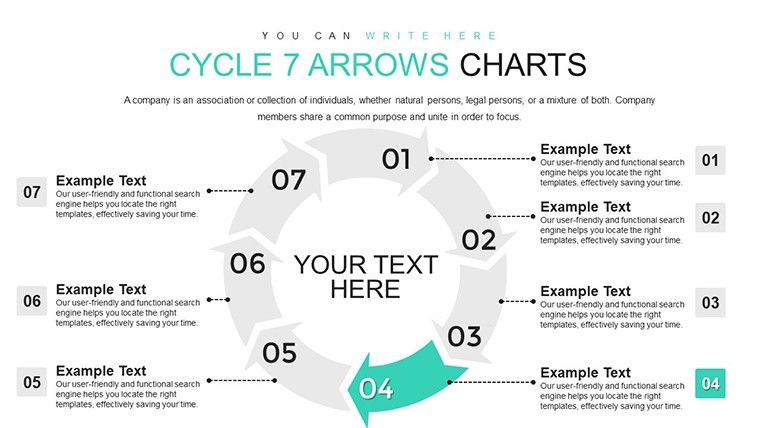
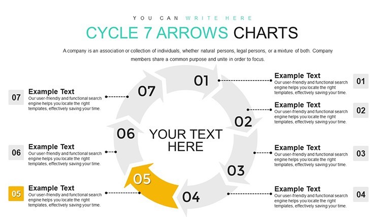
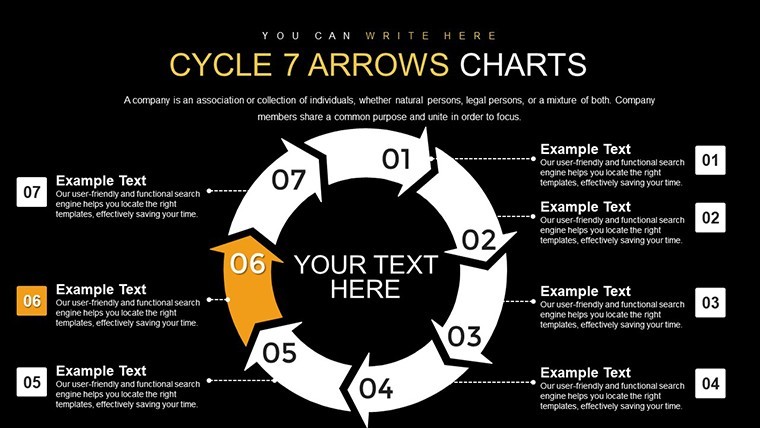
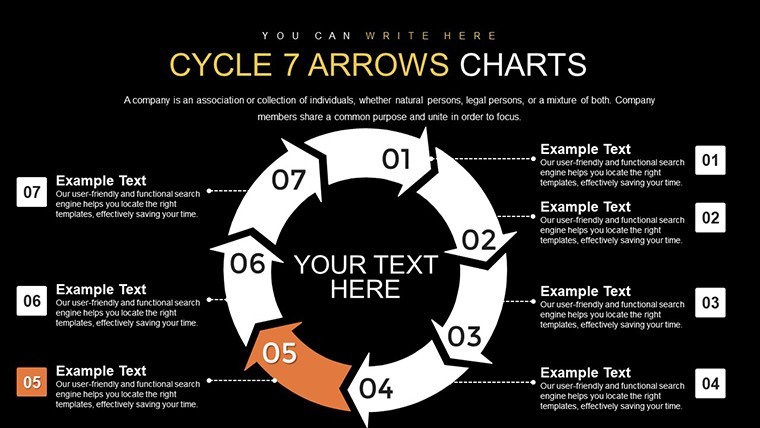
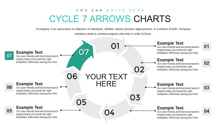
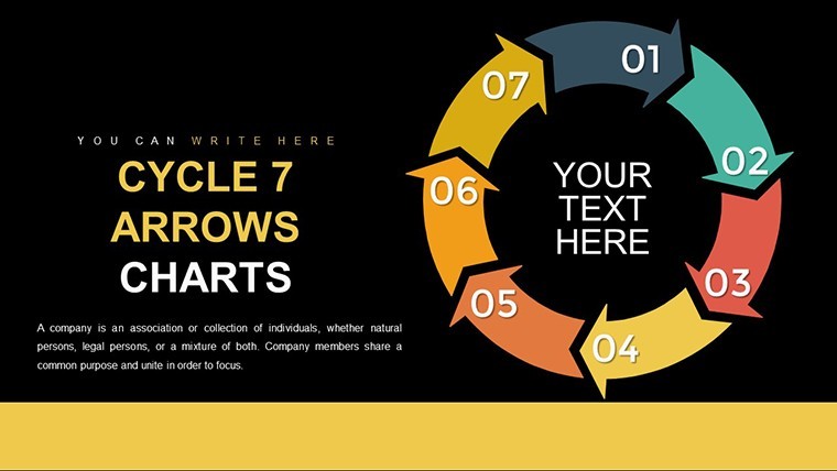
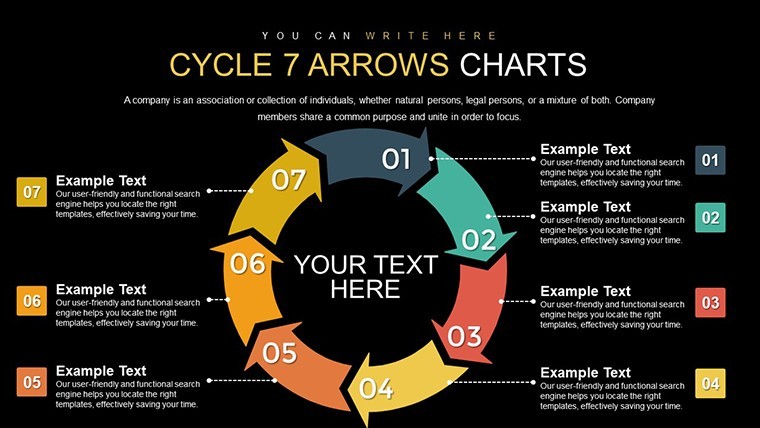
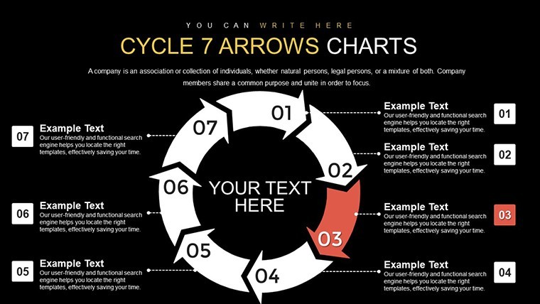
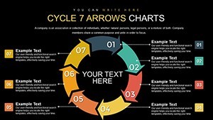
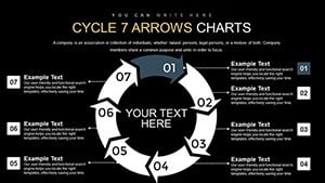
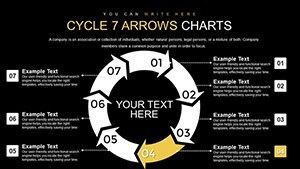
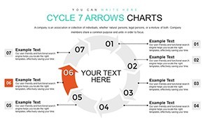
The beauty of a 7-step cycle lies in its ability to represent balanced, iterative processes without overwhelming the viewer. Unlike basic arrow diagrams in standard Keynote tools, this template offers pre-designed, customizable elements that save hours of design work. Drawing from principles of effective data visualization - think Edward Tufte's emphasis on clarity and minimalism - these charts use clean lines, vibrant colors, and intuitive layouts to highlight each step. For instance, architects can use it to illustrate the seven phases of sustainable building design, from site analysis to post-occupancy evaluation, aligning with AIA standards for environmental responsibility. The template's vector-based graphics ensure scalability without quality loss, perfect for high-resolution exports.
Key Features That Set This Template Apart
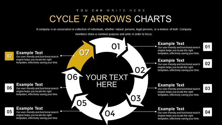
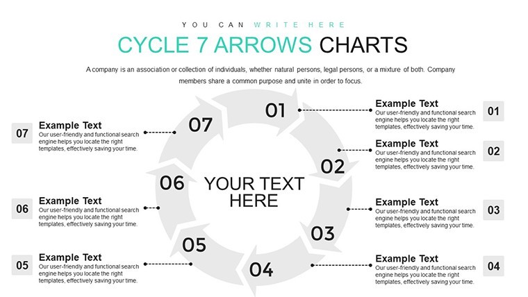
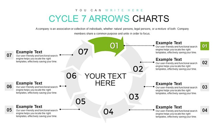
Dive into the features that make this template a standout choice. Each of the 20 slides includes variations of the core 7-arrow cycle, with options for color schemes, icon integrations, and text placeholders. You get animated transitions that reveal steps progressively, enhancing audience retention. Compatibility extends to embedding media like images or videos directly into the cycle, turning static charts into interactive experiences. Professionals appreciate the ease of customization: drag-and-drop elements, font adjustments, and shape modifications happen in seconds. This isn't just a template; it's a toolkit for creating polished, professional visuals that reflect your expertise.
- Editable Arrows: Resize, recolor, or reposition each arrow to fit your narrative.
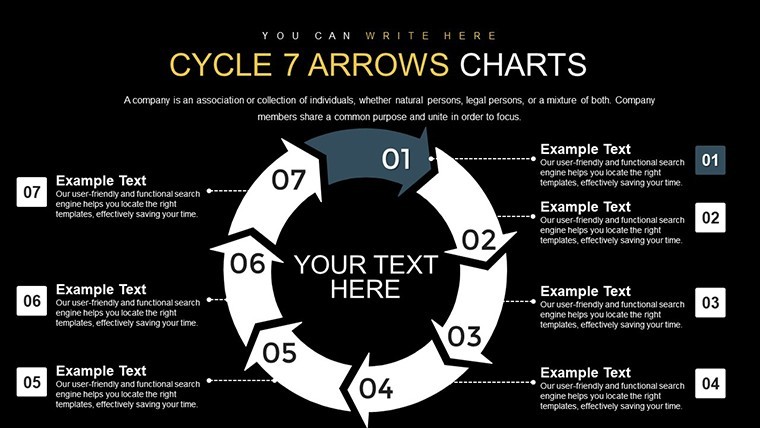
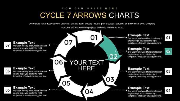
- Animation Options: Built-in effects like fade-ins for each step, keeping viewers engaged.
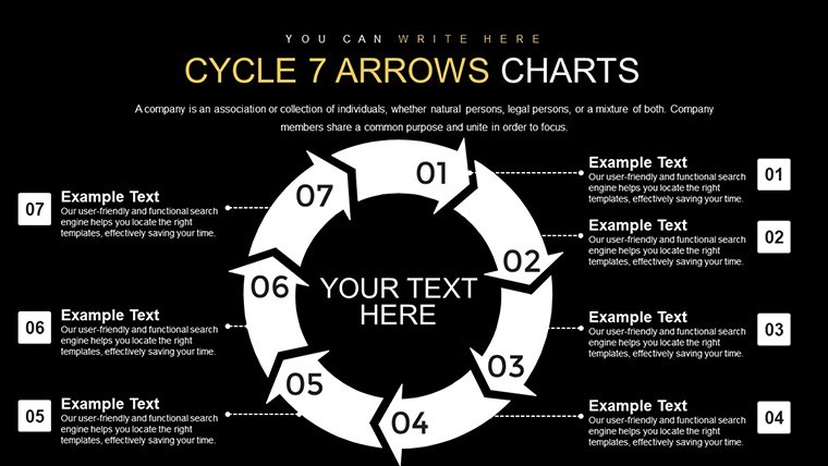
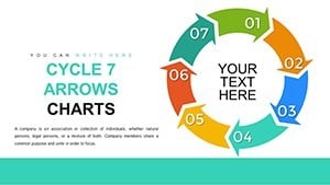
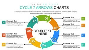
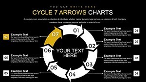
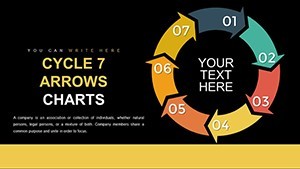
- Themed Variations: Slides with light and dark backgrounds for different presentation moods.
- Icon Library: Integrated symbols relevant to business, tech, and creative fields.
- Data Integration: Easily link to spreadsheets for dynamic updates.
Real-World Applications: Bringing Processes to Life
Consider a software development team using this template to depict the seven stages of agile methodology: planning, requirements, design, implementation, testing, deployment, and review. The circular arrow design emphasizes the iterative nature, encouraging continuous improvement - a core tenet in tech industries. In education, teachers might adapt it for the seven-step scientific method, making abstract concepts tangible for students. For marketing professionals, it's invaluable in showcasing customer journey cycles, from awareness to advocacy, with each arrow highlighting key touchpoints. A case study from a leading design firm shows how using similar cycle charts in client pitches increased approval rates by 25%, as visuals clarified complex timelines.
Urban planners could leverage it for community development cycles, aligning with sustainable urban design principles from organizations like the Urban Land Institute. The template's flexibility allows for adding annotations, such as KPIs or milestones, directly onto the arrows, providing at-a-glance insights. Unlike generic tools, this one encourages creativity - experiment with gradient fills or shadow effects to add depth, making your presentation not just informative but memorable.
Detailed Slide Breakdown: What You Get in the Package
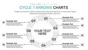
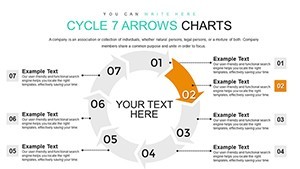
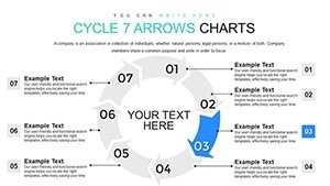
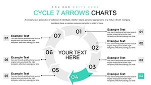
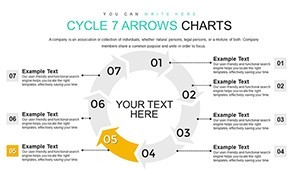
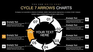
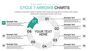
The 20 slides are thoughtfully curated to cover a range of needs. Slides 1-5 focus on basic cycle layouts with varying arrow thicknesses and directions, ideal for introductory overviews. Slides 6-10 introduce segmented cycles, where each arrow can hold detailed text or icons, perfect for in-depth process explanations. Midway through, slides 11-15 incorporate data charts within the cycle, like pie segments or bar graphs, blending qualitative and quantitative elements. The final slides, 16-20, offer advanced variations with 3D effects and multi-layered arrows, suitable for executive summaries. Each slide includes placeholders for titles, subtitles, and footnotes, ensuring consistency across your deck.
Expert Tips for Maximizing Your Cycle Charts
To elevate your use of this template, start by aligning colors with your brand palette - Keynote's color picker makes this seamless. Incorporate storytelling: label each arrow with a verb like "Analyze," "Design," or "Implement" to guide the narrative flow. For virtual presentations, use the animation features to build suspense, revealing one step at a time. Avoid clutter by limiting text to 5-7 words per arrow; let visuals do the talking. If presenting to stakeholders, include a slide with a real-world example, such as how a 7-step quality control cycle reduced manufacturing errors in a case from Harvard Business Review. This not only demonstrates value but builds trust in your process expertise.
Integration with other tools is straightforward - export slides as images for reports or embed them in collaborative platforms like Slack. For those new to Keynote, the template's intuitive design means no steep learning curve; even beginners can produce pro-level results. Remember, effective cycles aren't just about the arrows; they're about the story they tell. Use this template to craft narratives that resonate, driving home your message with precision and flair.
Elevate Your Keynote Game Today
Ready to transform how you present processes? This 7-Step Cycle Arrows Keynote Charts Template is more than slides - it's a catalyst for clearer communication and better outcomes. With its user-focused design and endless customization, it's tailored for professionals who demand excellence. Don't settle for ordinary; download now and start creating cycles that captivate.
Frequently Asked Questions
How customizable are the arrows in this template?
The arrows are fully editable in Keynote, allowing changes to color, size, shape, and position without any quality loss.
Is this template compatible with older versions of Keynote?
Yes, it works with Keynote '09 and later, ensuring broad accessibility for users.
Can I add my own data to the cycle charts?
Absolutely, integrate spreadsheets or manual inputs to make the charts dynamic and data-driven.
What file format is the download?
The template downloads as a .key file, ready for immediate use in Keynote.
Are there animation tutorials included?
While not included, Keynote's built-in help and online resources make animating simple - start with the Inspector panel.