11 Step Cycle Arrows Keynote - Fully Editable | ImagineLayout


Type: Keynote Charts template
Category: Cycle
Sources Available: .key
Product ID: KC00773
Template incl.: 28 editable slides
Package Contents
28 slides include timelines, budgets, Gantt-like elements, and arrow diagrams.
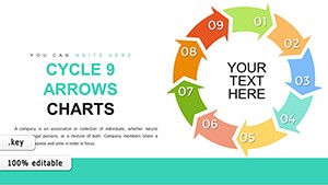
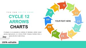
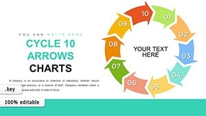
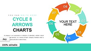
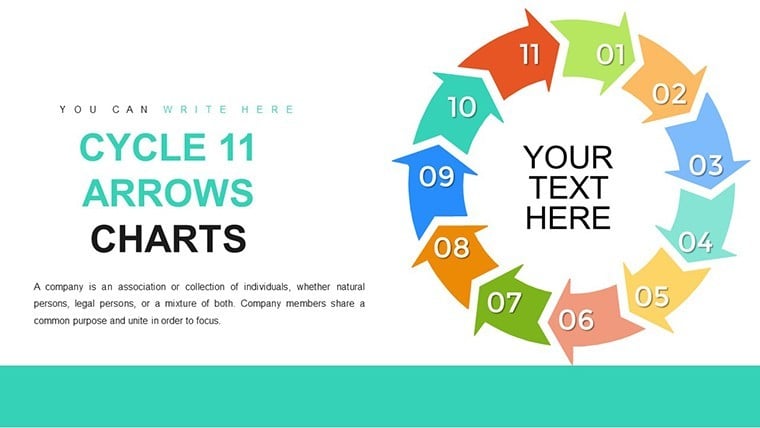
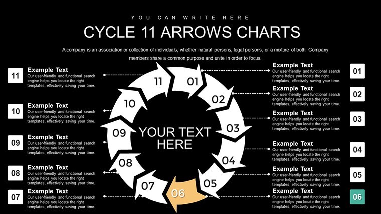
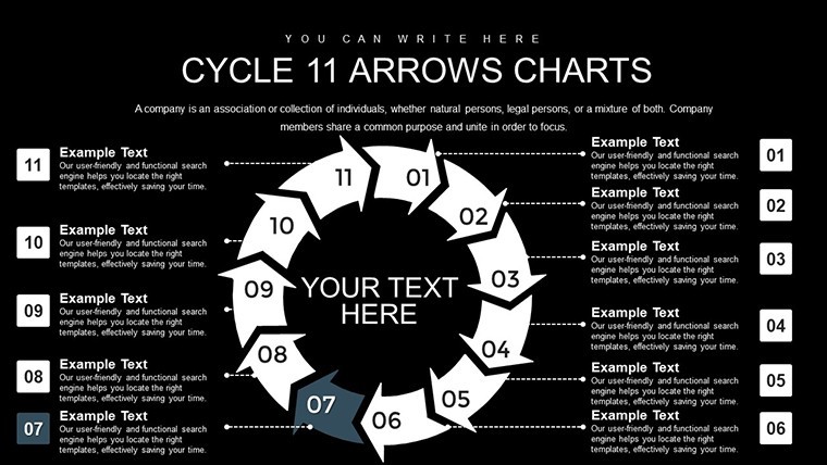
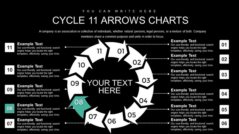
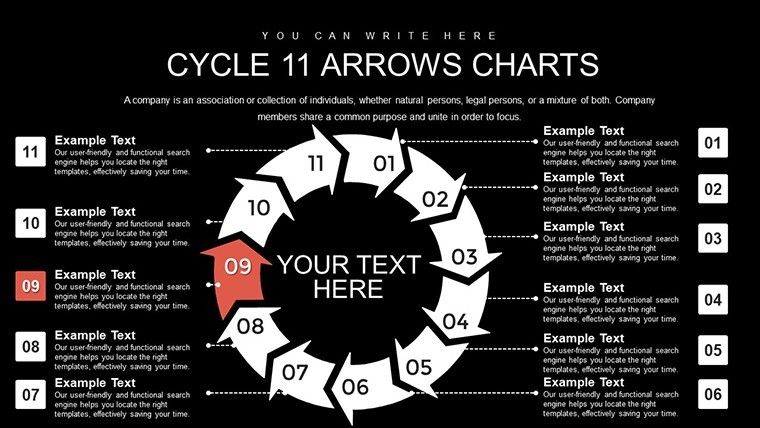
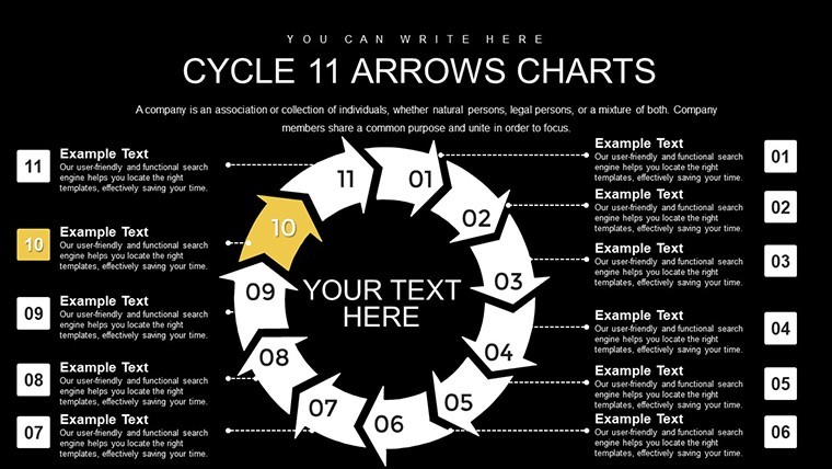
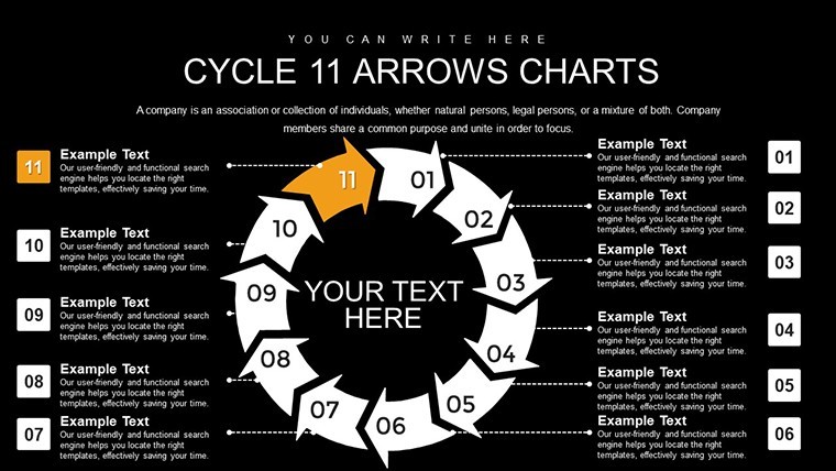
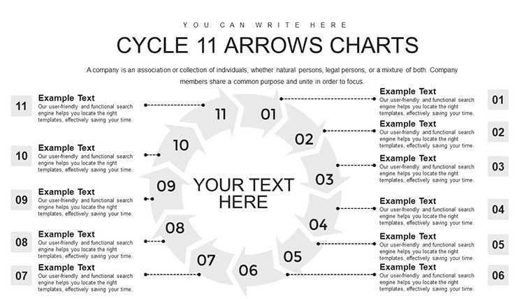
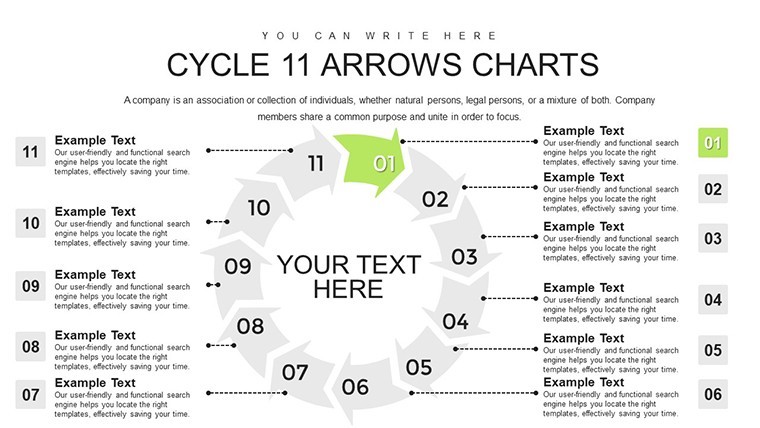
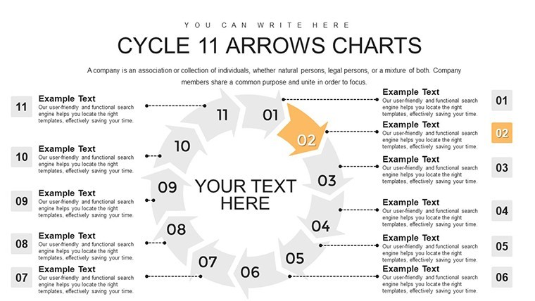
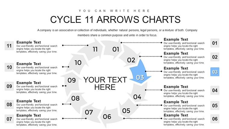
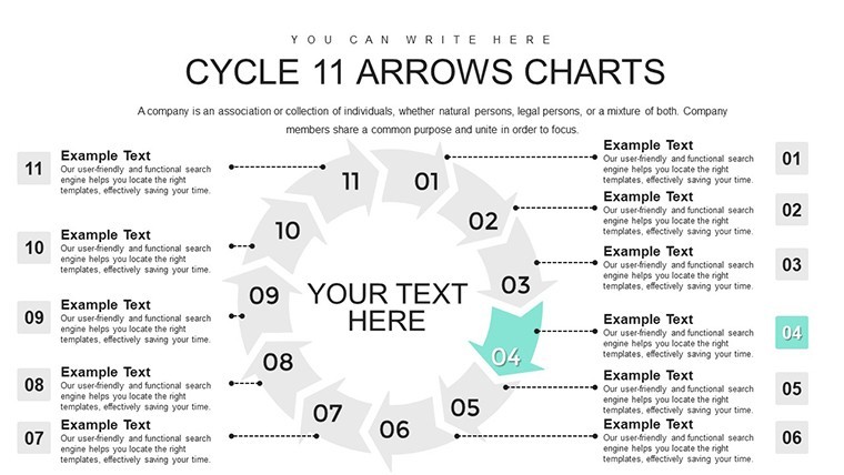
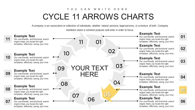
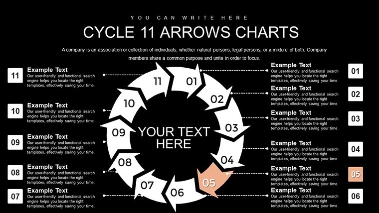
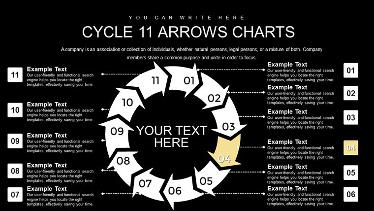
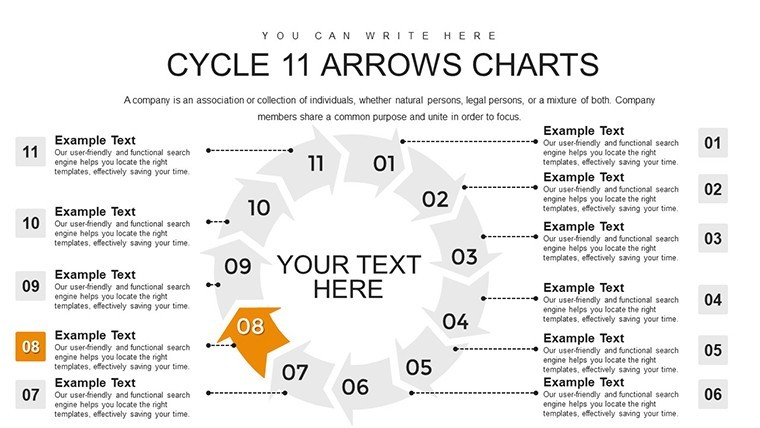
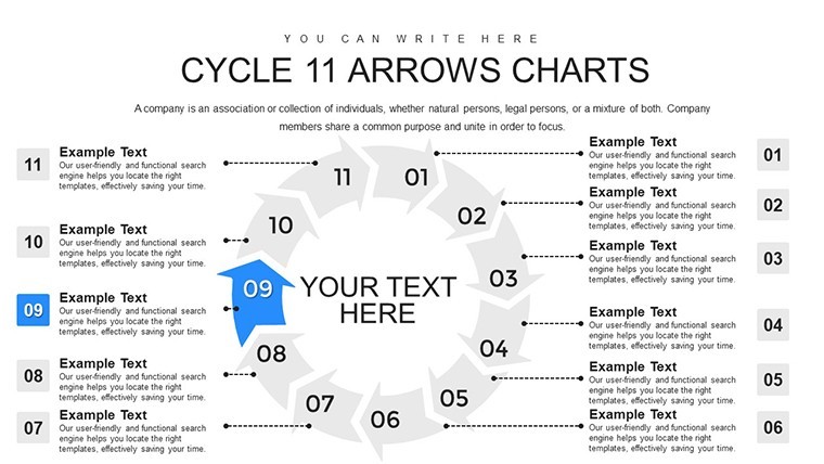
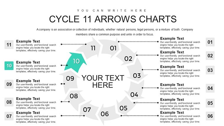
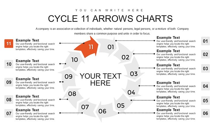
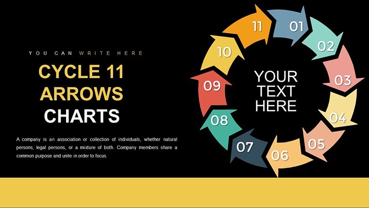
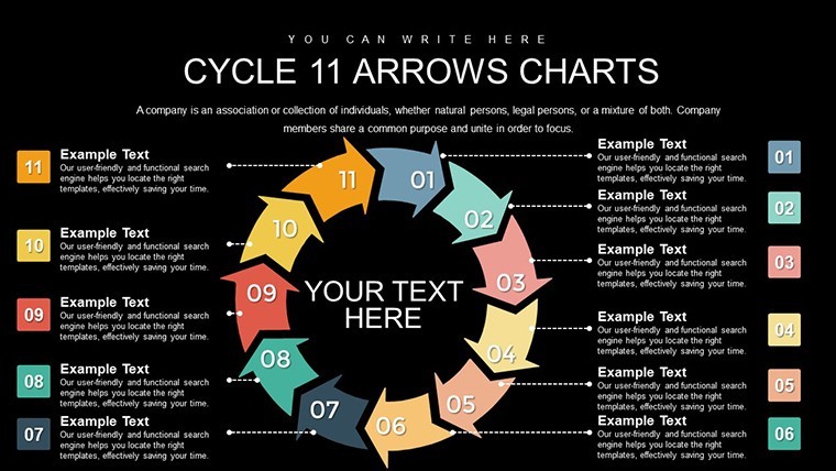
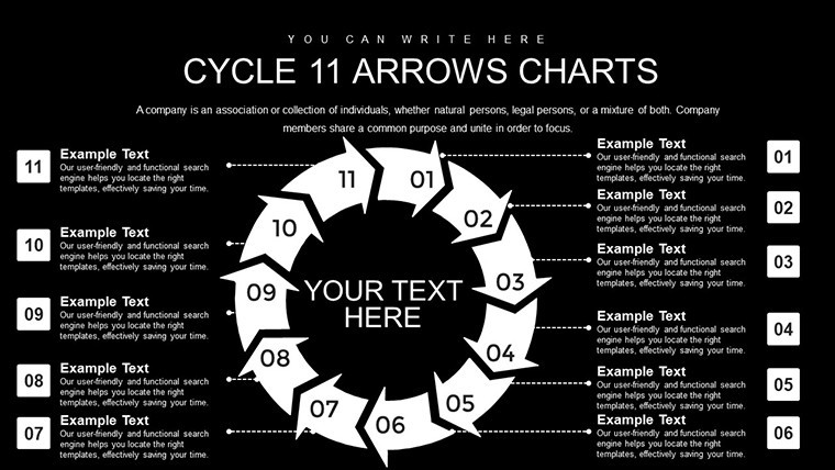
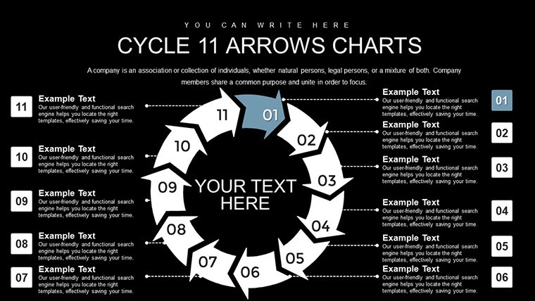
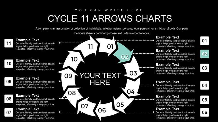
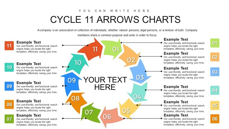
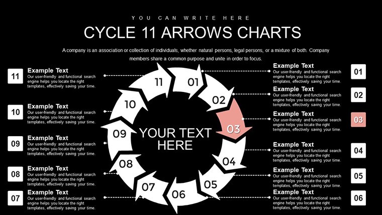
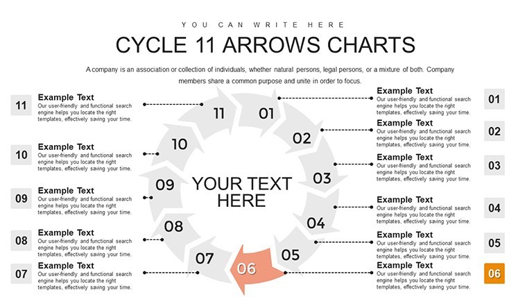
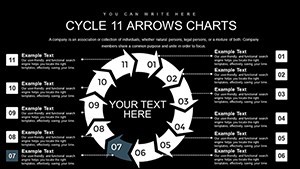
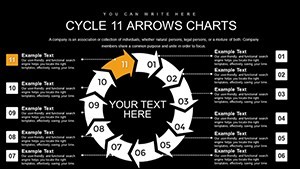
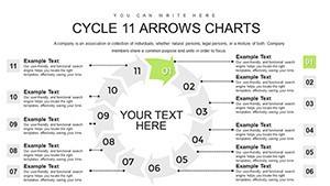
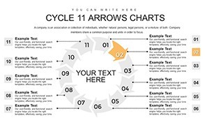
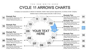
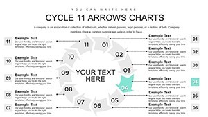
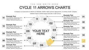
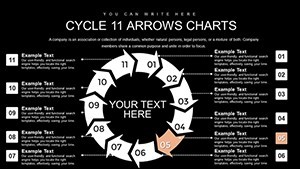
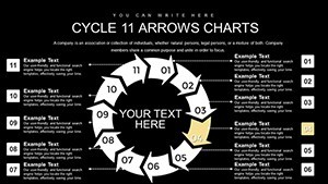
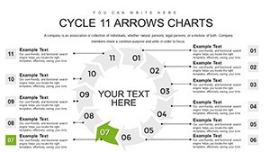
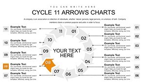
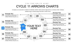
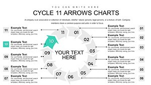
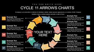
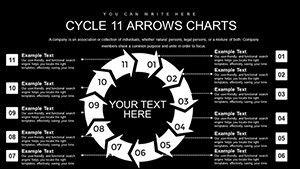
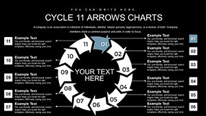
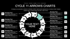
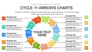
Unlike 12-Step Cycle Arrows Keynote Charts, 10-Step Cycle Arrows Keynote Template or 9 Step Cycle in related products this integrates 11 custom steps with comparative overlaps.
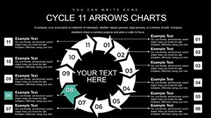
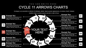
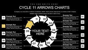
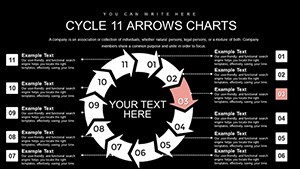
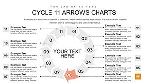
Vector-based arrows with direction control serve as the one specific visual characteristic that guides flow direction in cyclical processes.
It works best for sales presentations in regional teams because the arrow layout simplifies milestone tracking over generic cycle neighbors.
Paid version includes the full editable .key file with all diagrams while free previews remain static images only.
Editing Capabilities at a Glance
| Feature | Details |
|---|---|
| Editable shapes | diagram segments resize and recolor independently |
| Icon placeholders | icons replaceable or recolorable without affecting layout |
| Text labels | each label editable without unlocking grouped elements |
| Color themes | compatible with Keynote slide master palette |
| Diagram connectors | lines adjustable in direction and weight |
| Export options | PDF for distribution or Keynote for editing |
How to Make It Yours in Under 20 Minutes
Customization follows four steps in Keynote.
- Open the .key file (1 minute).
- Replace placeholder text and budgets (3 minutes).
- Adjust arrow directions via slide master (4 minutes).
- Add icons then export (2 minutes).
Difficulty: Moderate. Regional sales directors often pair this with 12-Step Cycle Arrows Keynote Charts for extended process narratives in client proposals.
Three Situations Where This Pays Off
Regional sales directors in manufacturing prepare performance reviews and cut deck preparation from 3 hours to 45 minutes by swapping color schemes.
Project leads in engineering update Gantt-like timelines for training sessions and reuse the file across three strategy workshops.
Download now and simplify your next sales presentation.
The Cost of Not Using a Template
Building 11-step arrows from scratch takes 4 hours and precise connector skills. The ready file avoids that.
Integrated timelines keep labels outside arrows for improved layout composition unlike crowded manual versions that lose clarity in board briefings.
Get the full file and save hours on your next client proposal.
Which Keynote versions does this file support?
The file opens in Keynote 12 and newer on Mac or iOS devices. Earlier versions may lack sequential quadrant reveal animations. Test the slide master immediately after download. Support requests remain available under license if compatibility problems appear.
How do I change the color scheme?
Switch to slide master view in Keynote. Update the palette for all quadrants and accents to propagate automatically across slides. Fine-tune individual highlights afterward if required. The process preserves diagram structure and flow direction in under five minutes.
What does the license permit?
Use is allowed for paid client work and internal business presentations or strategy meetings. Resale of the file itself or sublicensing remains prohibited. One user per purchase applies. Combine with other Keynote Charts templates like Gauge Charts Keynote Template for broader process narratives.
What is included in the paid version versus free?
Paid download supplies the complete editable .key file with 30 full slides and diagrams. Free previews show only static images without editability. All text placeholders and icon layers unlock only in the paid file. Export options and animation support activate exclusively after purchase.
What file formats and software are required?
The file arrives in .key format and requires Keynote on Mac or iOS. No other software opens it natively. PDF export works for distribution after editing. Compatible with latest Keynote versions only for full diagram connectors and color theme adjustments.
What is the refund policy?
Refunds process within 30 days if the file fails to open in your Keynote version. Provide proof of incompatibility for review. No refunds after successful editing or export. License terms remain binding post-refund request.