Collection Cycle Arrows Keynote Charts: Optimize Your Finance Flows


Type: Keynote Charts template
Category: Cycle
Sources Available: .key
Product ID: KC00771
Template incl.: 24 editable slides
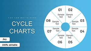
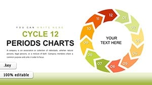
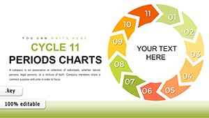
In the intricate realm of financial management, where every delay in collections can impact cash flow and bottom lines, having a clear visual aid is invaluable. Our Collection Cycle Arrows Keynote Charts template steps in as your ally, offering 24 editable slides designed exclusively for Keynote. Tailored for finance professionals, accountants, and business owners, this tool demystifies the collections process by mapping out stages with color-coded arrows that highlight progression and bottlenecks.
From pre-collection reminders to final write-offs, visualize the journey of accounts receivable in a way that sparks actionable insights. This template not only saves time on chart creation but also enhances reporting accuracy, as evidenced by users who align it with standards from the Financial Accounting Standards Board (FASB). Compatible across Apple devices, it's your key to presenting financial health with confidence and precision.
Essential Features for Financial Precision
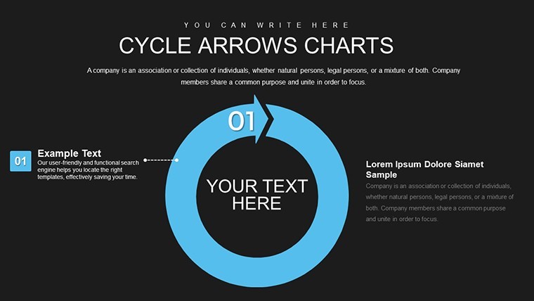
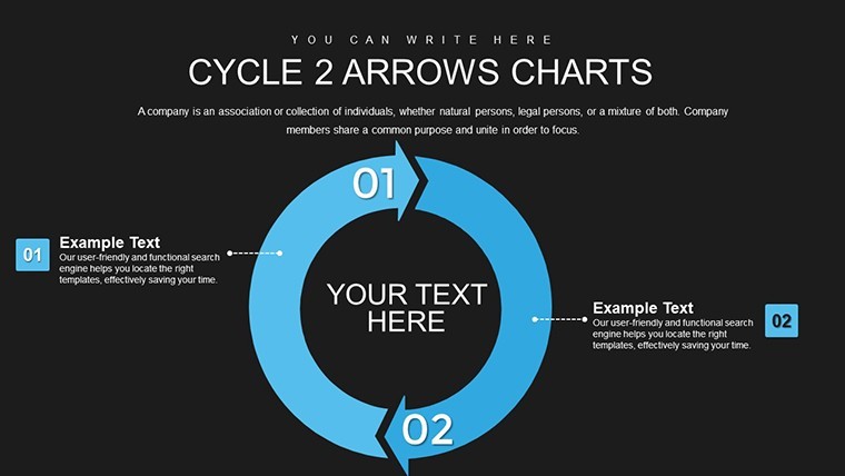
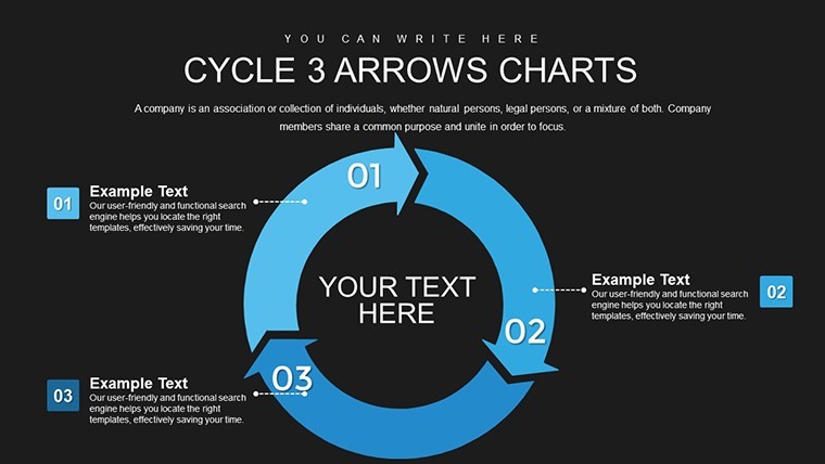
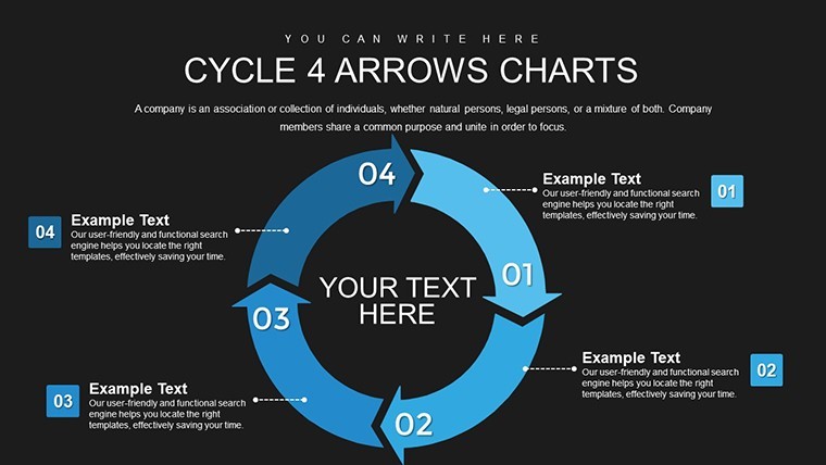
At its core, this template leverages intuitive design to make complex finance data accessible. Vector arrows ensure scalability, while color coding - greens for on-track, reds for delays - provides at-a-glance status updates.
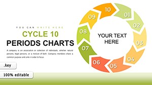
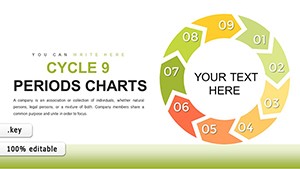
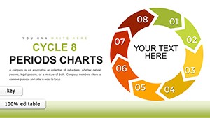
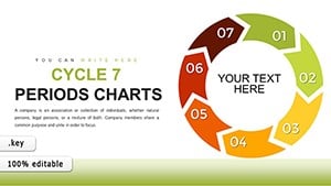
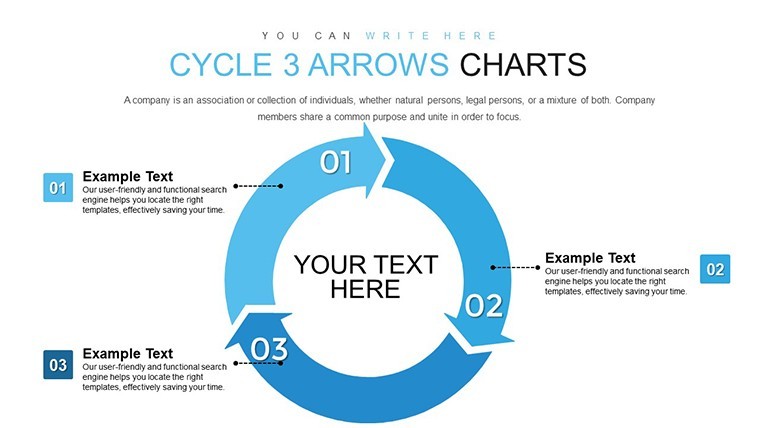
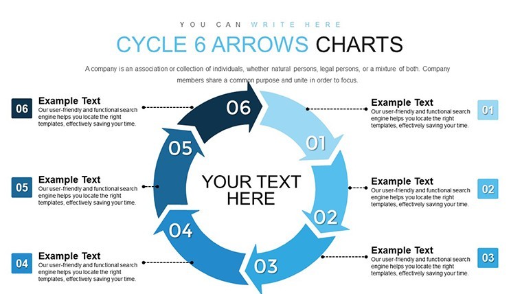
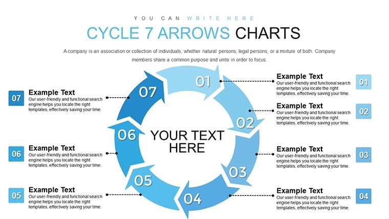
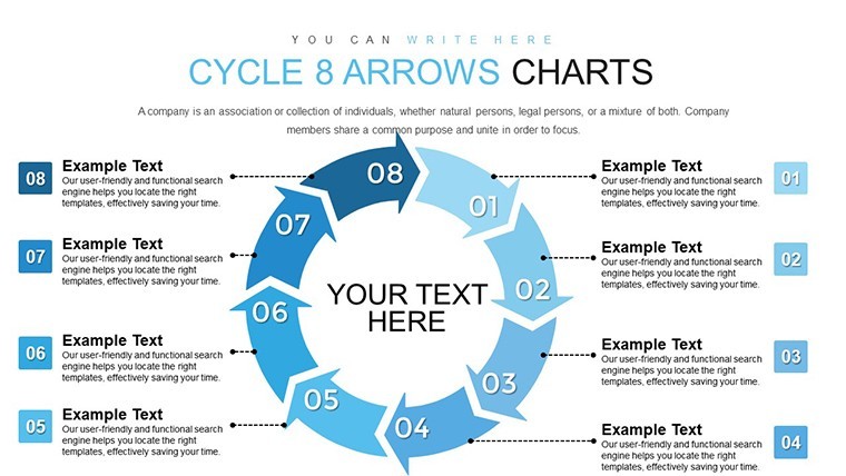
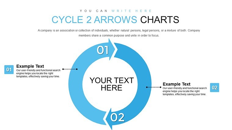
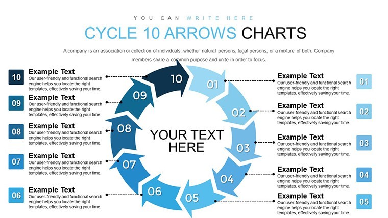
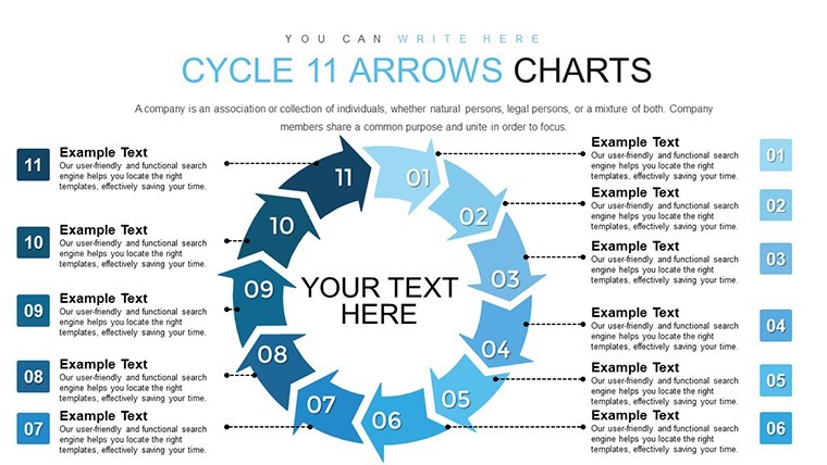
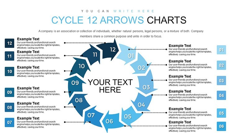
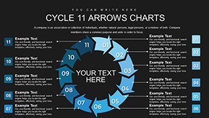
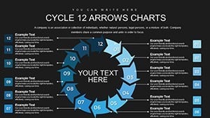
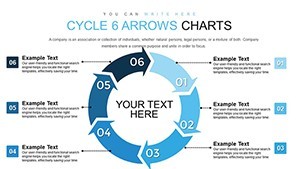
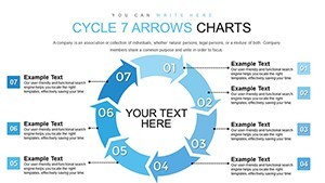
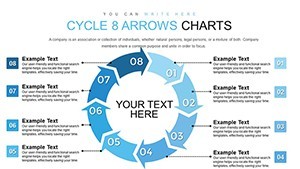
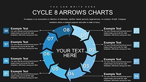
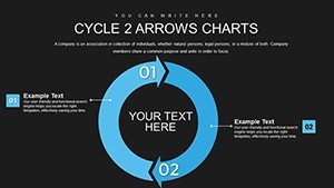
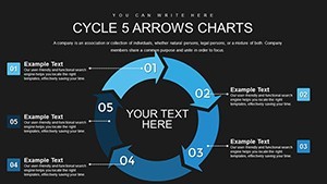
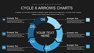
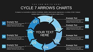
- Stage-Specific Arrows: Dedicated designs for pre-collection, active collection, and write-off phases, with room for custom metrics like aging buckets.
- Trend Identification Tools: Built-in elements to plot historical data, revealing patterns in collection efficiency.
- Editable Layouts: Adjust arrow flows, add annotations, or integrate charts like pie graphs for debt composition.
- Data-Driven Customization: Input real-time figures via Keynote's data editor for dynamic updates.
Grounded in best practices from the Association for Financial Professionals (AFP), these features promote thorough analysis without overwhelming visuals.
Slide-by-Slide Insights
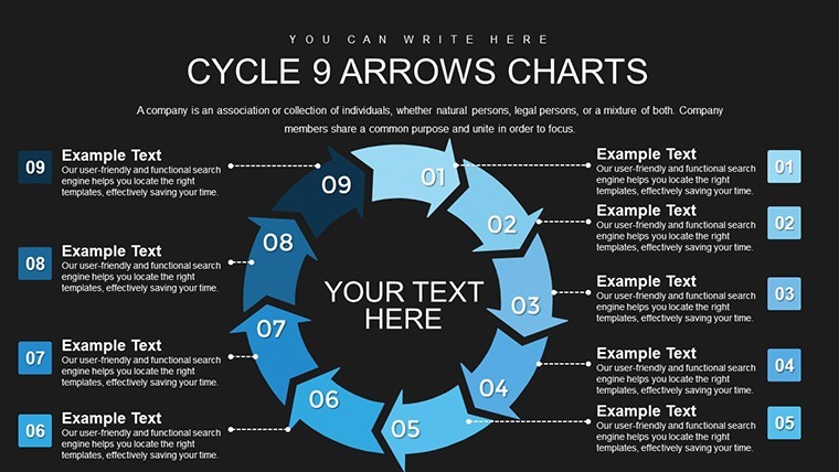
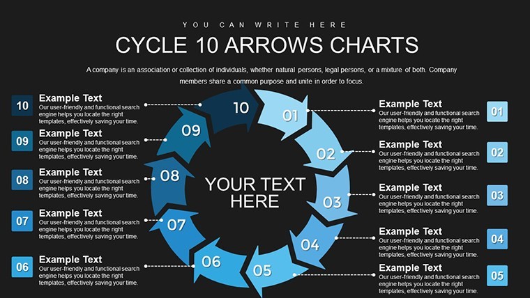
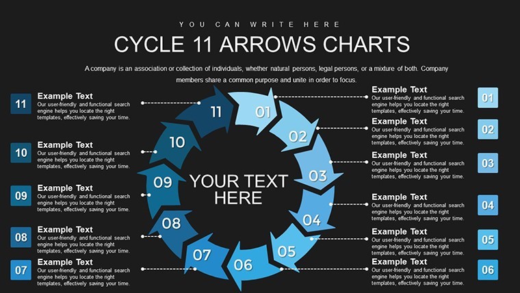
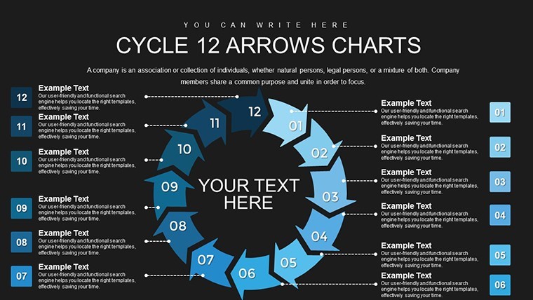
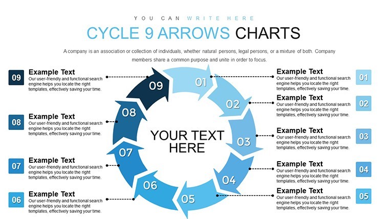
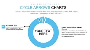
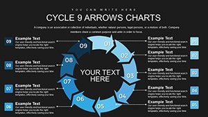
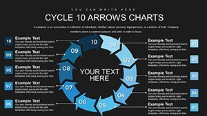
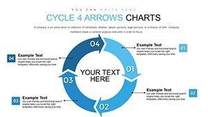
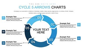
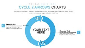
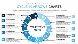
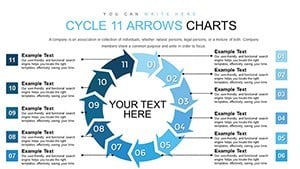
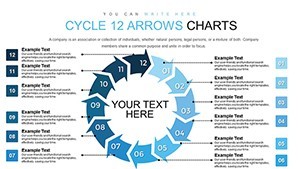
The 24 slides build a narrative arc: Early slides present holistic cycle overviews, with arrows encircling key stages. Mid-deck focuses on granular details - Slide 10, for instance, zooms into collection efforts with placeholders for call logs or letter templates.
Towards the end, analytical slides incorporate trend lines and comparative arrows for year-over-year reviews. Each slide features alignment guides and subtle backgrounds to maintain a clean, professional aesthetic.
Practical Use Cases in Finance
This template is a game-changer for financial teams. In small businesses, use it to track invoice cycles, pinpointing slow payers and adjusting strategies accordingly. Larger enterprises might employ it for departmental reports, aligning with GAAP principles for accurate bad debt provisioning.
Consider a retail chain that revamped its collections using similar visuals, cutting average collection periods by 15 days per a CFO Magazine case study. For consultants, it aids in client audits, visualizing improvement areas with embedded KPIs.
Step-by-step application: Load in Keynote, map your stages to arrows, populate with data from spreadsheets, color-code based on performance, and add notes for context. Present with confidence, using transitions to simulate flow.
Expert Tips for Financial Storytelling
Enhance with Keynote's charting tools to overlay bar graphs on arrows for dual visualization. Tip: Use conditional formatting in linked data to auto-update colors, reflecting real-time status. Collaborate via shared links for finance team input.
Avoid dense text; let arrows do the talking with icons for stages like envelopes for reminders. For depth, hyperlink to detailed spreadsheets, creating an interactive finance dashboard.
Advantages Over Generic Charts
Surpassing Keynote's default options, this template offers pre-configured finance-specific arrows that align with industry norms, unlike basic shapes that require extensive tweaking. It provides more targeted slides than broad competitors, focusing on collections for niche expertise.
In summary, it's a strategic enhancer for financial clarity, driving efficiency and informed decisions.
Frequently Asked Questions
- How do I customize the color coding?
- Use Keynote's color picker to assign hues based on stage status, with gradients for transitions.
- Is it suitable for international finance?
- Yes, adaptable for multi-currency metrics and global standards like IFRS.
- Can I integrate Excel data?
- Absolutely - link or import spreadsheets directly into charts for live updates.
- What if my cycle has more stages?
- Extend arrows or add slides; the vector design scales seamlessly.
- Are animations included?
- Basic transitions are pre-set; enhance with Keynote's effects for dynamic flows.