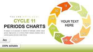
10-Period Infographic Cycle Keynote Charts: Captivate in Architectural Storytelling


Type: Keynote Charts template
Category: Cycle
Sources Available: .key
Product ID: KC00763
Template incl.: 26 editable slides
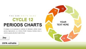
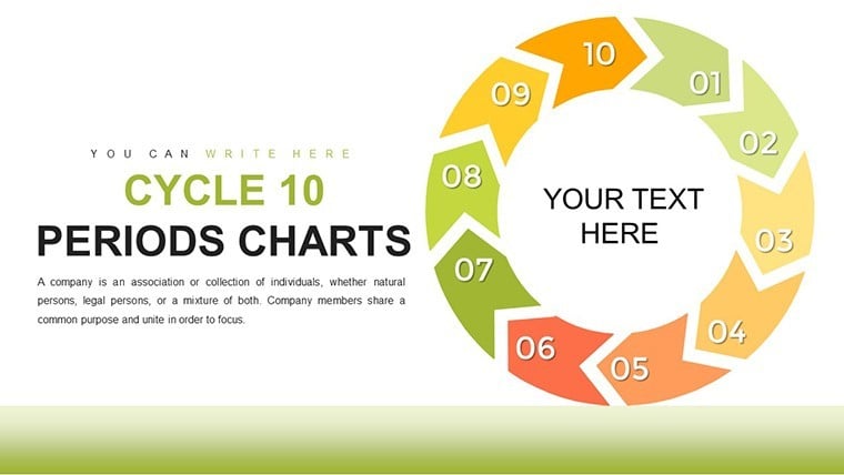
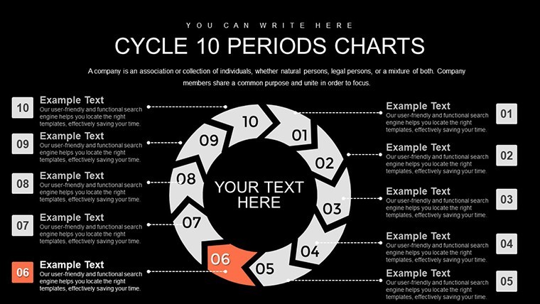
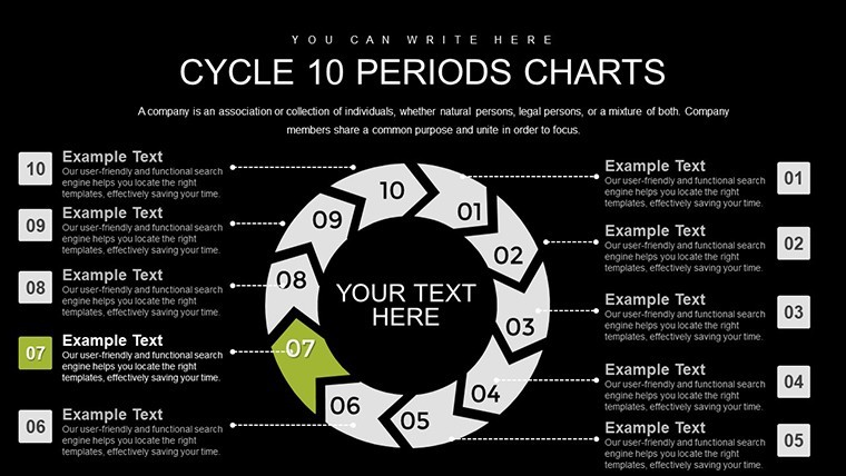
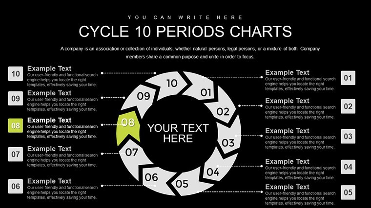
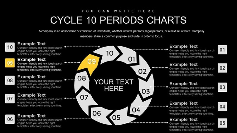
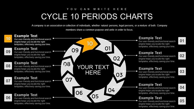
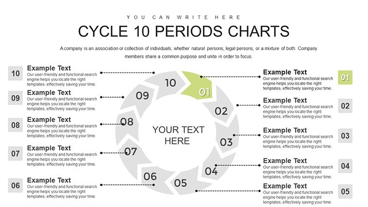
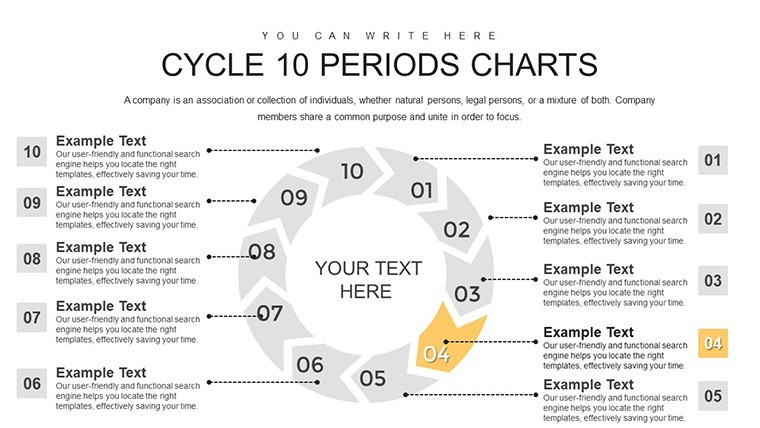
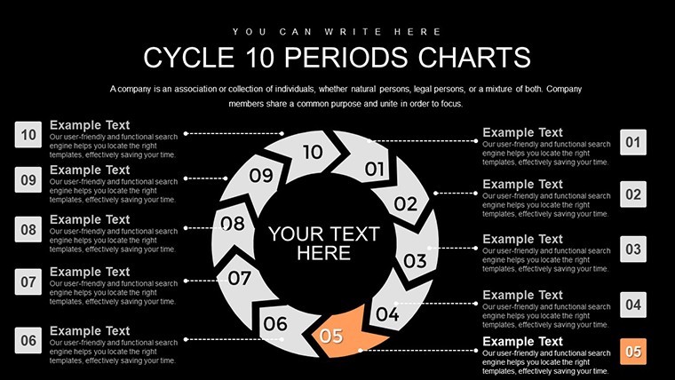
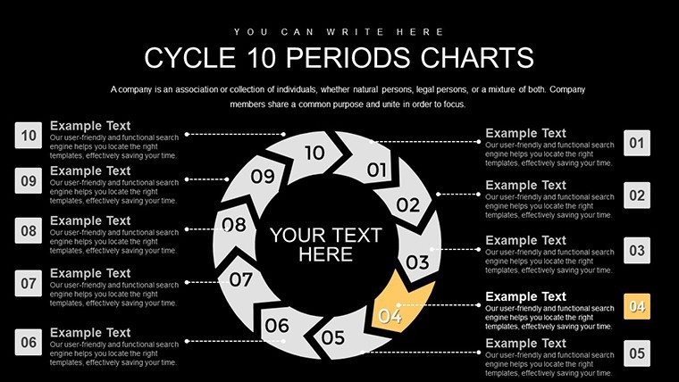
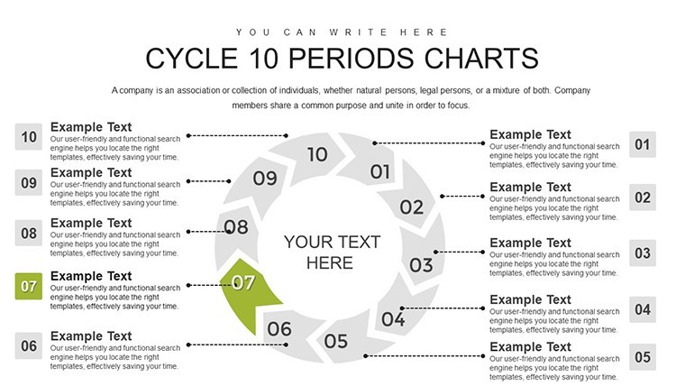
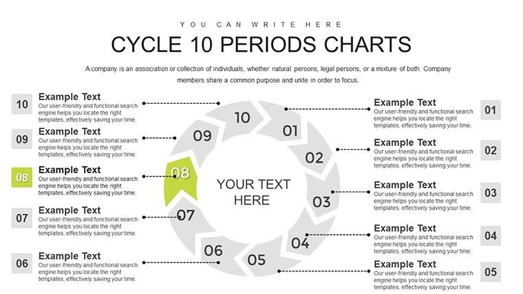
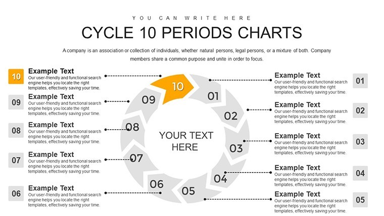
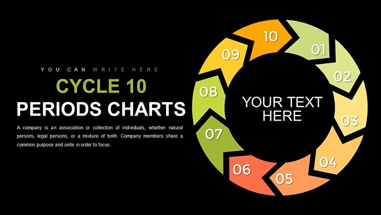
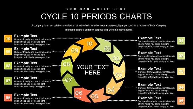
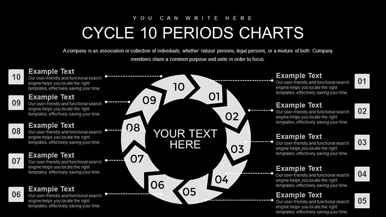
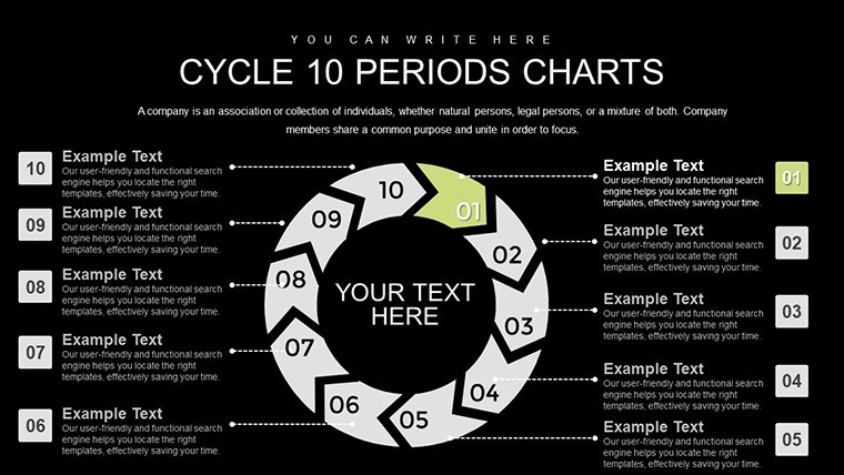
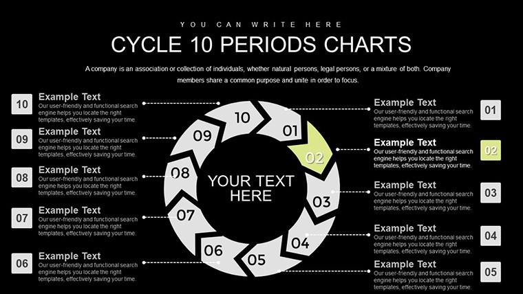
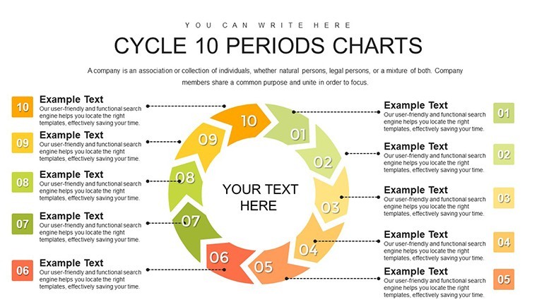
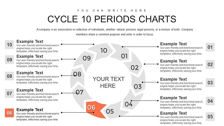
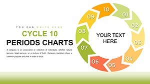
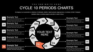
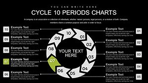
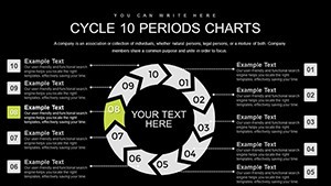
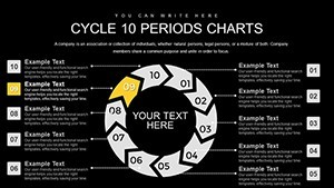
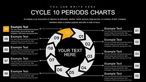
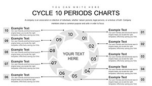
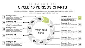
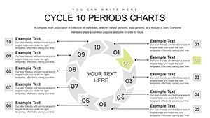
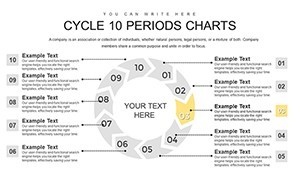
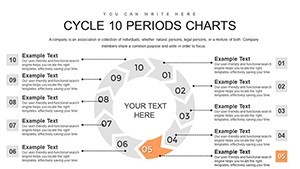
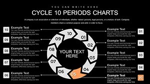
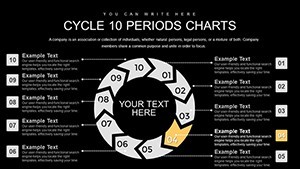
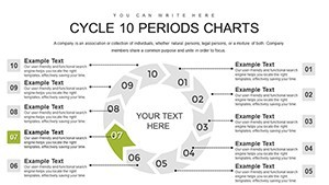
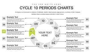
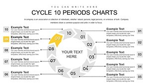
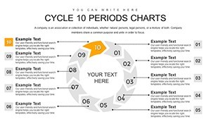
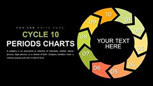
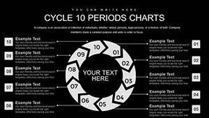
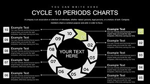
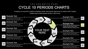
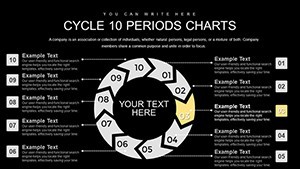
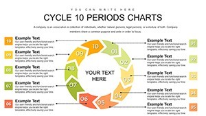
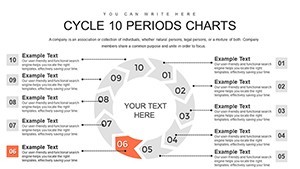
Architecture isn't just about structures; it's about narratives that unfold over time. Our 10-Period Infographic Cycle Keynote Charts template brings those stories to life with 26 editable slides, perfect for illustrating multi-phase projects like high-rise developments or landscape masterplans. Designed for architects and educators, these vibrant infographics use circular designs to convey 10 interconnected periods, from ideation to legacy impacts, making complex ideas accessible and memorable.
Think of unveiling a waterfront regeneration scheme: Arrows guide viewers through 10 stages, incorporating data on ecological assessments and community integrations, all while adhering to principles from the Royal Institute of British Architects for ethical design communication.
Essential Features for Visual Mastery
Each slide is a canvas of possibility, with scalable vectors and intuitive editing tools that integrate flawlessly into Keynote workflows.
- Vibrant Infographic Styles: Bold colors and icons to depict periods like material selection or post-construction audits in engaging cycles.
- Concise Data Presentation: Break down intricate metrics, such as cost overruns in 10-quarter forecasts, without clutter.
- Personalization Suite: Adapt to your aesthetic, whether echoing Frank Lloyd Wright's organic forms or contemporary minimalism.
- Educational Enhancements: Ideal for seminars, with notes sections for speaker cues on topics like seismic retrofitting cycles.
Backed by insights from design pros at firms like Zaha Hadid Architects, these elements ensure your presentations meet high standards, building authority in every slide.
Diverse Applications for Design Innovators
Harness this for heritage conservation pitches, cycling through 10 periods of assessment, restoration, and monitoring. In educational contexts, it's transformative for teaching sustainable urbanism, as in MIT's architecture curricula where cycles visualize policy impacts.
Professionally, use it in RFP submissions for infrastructure like transit hubs, where 10-period infographics clarify phased implementations, drawing from successful cases like Singapore's Marina Bay developments.
Streamlined Usage Steps
- Open in Keynote and select your base cycle.
- Label 10 periods with project milestones, e.g., "Site Acquisition" to "Sustainability Certification."
- Infuse with custom graphics, like topographic icons for terrain analysis.
- Apply effects for interactive reveals in virtual meetings.
- Finalize and distribute, confident in its professional edge.
Outshining default Keynote options, this template's infographic depth provides superior engagement, akin to how BIM visualizations outperform 2D drawings.
Delivering Impactful Benefits
Experience elevated audience interaction, with visuals that simplify 10-period trends in market analyses for real estate architecture. Benefits extend to trustworthiness, as clear cycles align with ISO standards for project management, fostering client confidence.
Naturally incorporate terms like visual workflows, phased diagrams, or loop infographics to enrich context without forcing keywords.
Don't just present - mesmerize. Secure your 10-period infographics now and redefine architectural communication.
Frequently Asked Questions
How do the infographics enhance engagement?
Through vibrant designs and concise layouts that make 10-period data intuitive and captivating.
Are customization options user-friendly?
Yes, drag-and-drop edits make tailoring to architectural themes straightforward.
Suitable for educational use?
Perfectly, with features supporting seminars and student projects.
What makes it different from standard charts?
Infographic focus on visual storytelling over plain data display.
Includes export options?
Yes, to various formats for versatile sharing.