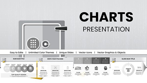
Six Sigma Analysis Keynote Charts: Infographics for Process Excellence


Type: Keynote Charts template
Category: Cycle
Sources Available: .key
Product ID: KC00747
Template incl.: 24 editable slides
Embark on a journey to operational perfection with our Six Sigma Analysis Keynote Charts Template, featuring 24 editable slides packed with specialized infographics. Tailored for quality managers, consultants, and students, it demystifies DMAIC methodologies through visual tools like control charts, Pareto diagrams, and process flows. Visualize defect reductions or efficiency gains with data-driven designs that turn statistics into stories. Whether analyzing manufacturing variances or service bottlenecks, this template integrates seamlessly into Keynote, offering customization that aligns with ASQ (American Society for Quality) standards. Save time on setups and focus on insights, delivering presentations that drive continuous improvement and impress decision-makers.
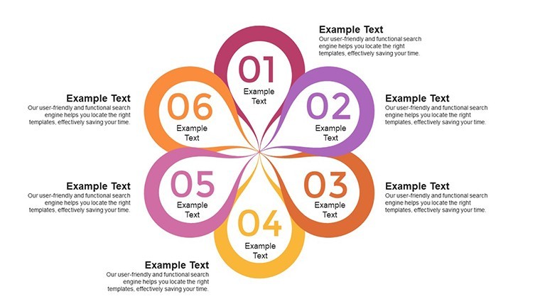
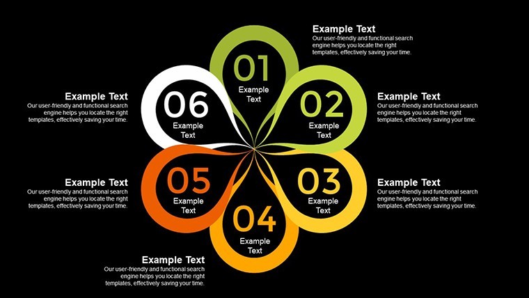
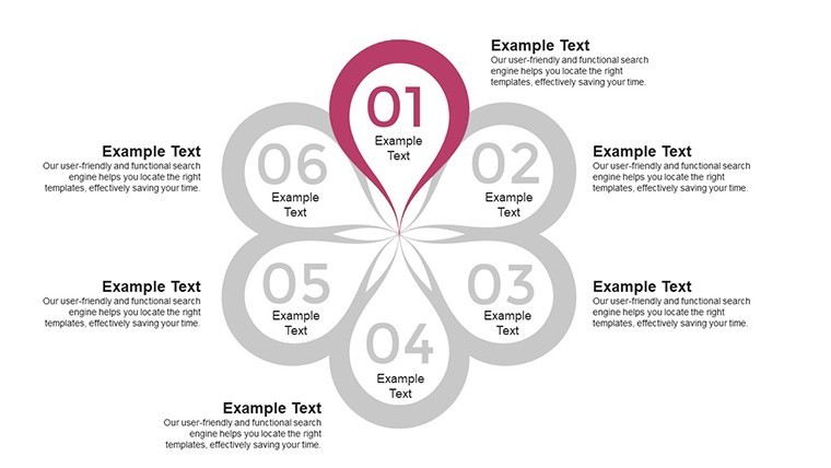
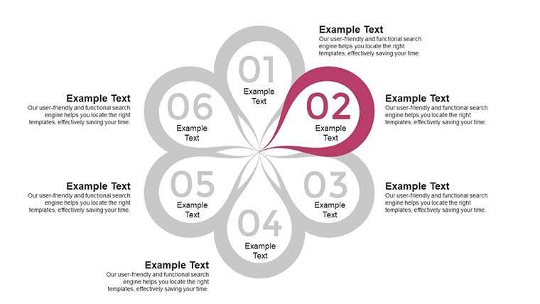
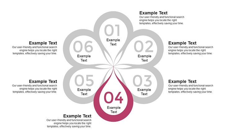
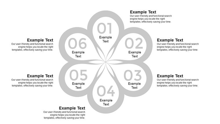
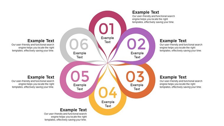
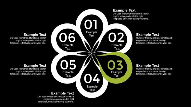
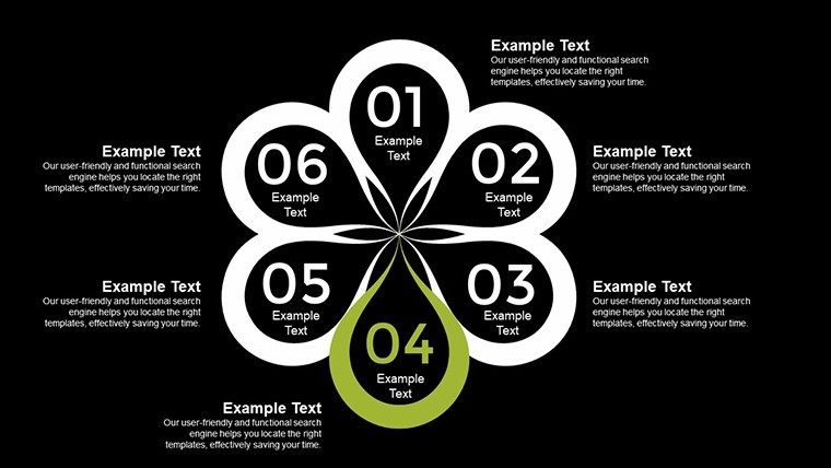
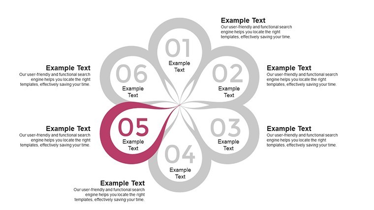
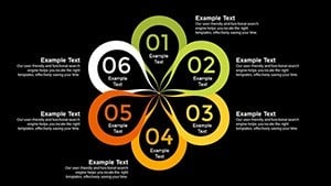
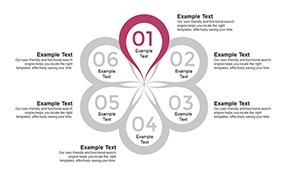
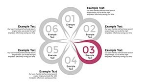
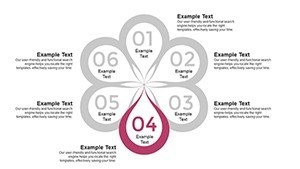
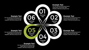
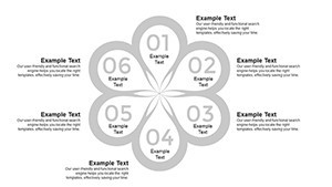
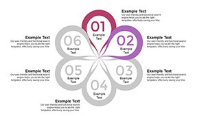
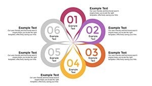
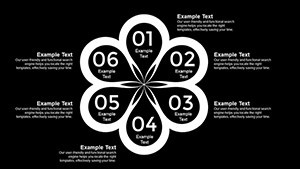
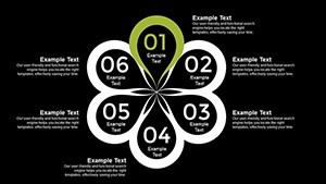
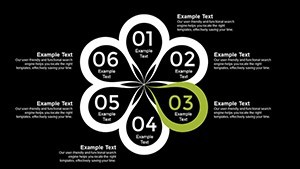
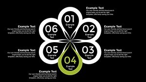
Core Components of Six Sigma Visualization
Six Sigma thrives on data, and this template provides the canvas: Pareto charts prioritize issues by the 80/20 rule, control charts monitor variations, and flowcharts map processes. Each slide is data-linked, updating graphs as you input figures - ideal for real-time analysis. Unlike generic tools, these are tuned for Sigma calculations, including Cp/Cpk indices for process capability.
Customization options abound: Modify scales, add annotations, or blend charts for hybrid views, such as combining histograms with run charts for trend spotting. This reflects Lean Six Sigma principles, minimizing waste in presentation prep.
Highlighted Features for Quality Experts
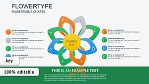
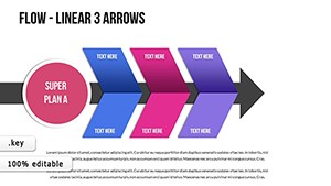
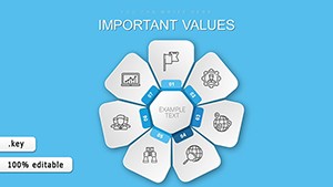
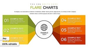
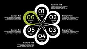
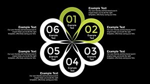
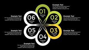
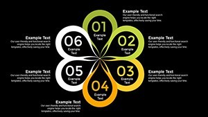
- Specialized Chart Types: 24 slides with Pareto, fishbone, SIPOC, and more for full DMAIC coverage.
- Data-Driven Dynamics: Input values to auto-generate visuals, ensuring accuracy.
- Professional Aesthetics: Clean, color-coded designs for quick comprehension.
- Customization Depth: Fonts, layouts, and elements fully adjustable.
- Consistency Tools: Themes maintain brand alignment across slides.
These draw authority from Six Sigma certifications, enhancing your in deliverables.
Applications in Quality Management
For manufacturers, use control charts to track assembly line metrics, identifying outliers per ISO 9001 guidelines. Consultants apply Pareto for client audits, focusing efforts on high-impact defects - a strategy that cut costs by 35% in a GE case study. Students simulate projects with flowcharts, learning root cause analysis through visual scenarios.
In healthcare, map patient flows to reduce wait times, aligning with Joint Commission standards. Service sectors benefit from value stream maps, spotlighting non-value adds for leaner operations, as seen in Amazon's efficiency models.
Implementation Guide: Building Your Analysis Deck
- Define Your Focus: Select charts based on DMAIC phase - Pareto for Measure, control for Control.
- Enter Data Sets: Use placeholders for stats; validate with built-in formulas.
- Refine Visuals: Adjust colors for emphasis, add legends for clarity.
- Incorporate Narratives: Embed notes or hyperlinks to supporting docs.
- Validate and Share: Run simulations, then export for team reviews.
This structured approach accelerates mastery, per Black Belt training curricula.
Edge Over Standard Analysis Tools
Basic Keynote lacks Sigma-specific templates, but this offers pre-calibrated axes and error-proofing. It's more efficient than Excel add-ins, with visual appeal that sustains attention - vital for workshops. Trusted by users, it integrates with Minitab exports for advanced stats.
Tips from pros: Normalize data before charting to avoid skews, and use animations sparingly to focus on insights, boosting effectiveness as per quality journals.
Achieve Sigma-Level Presentations
Elevate your process game with this Six Sigma Analysis Keynote Charts Template. Download and customize to unlock efficiencies that matter. Start your improvement cycle today.
FAQ
What Six Sigma tools are included?
Key ones like Pareto, control charts, flowcharts, and histograms for comprehensive analysis.
Can I customize for specific industries?
Yes, adapt layouts and add sector icons for relevance.
Is data calculation built-in?
Basic stats yes; link to external tools for complex formulas.
How editable are the infographics?
Fully - change every element without quality loss.
Suitable for beginners?
Yes, with intuitive designs and tips for entry-level use.
Does it support team collaboration?
Absolutely, via Keynote's sharing features.