7 Market Phases Keynote Charts - Fully Editable | ImagineLayout


Type: Keynote Charts template
Category: Cycle, Business Models
Sources Available: .key
Product ID: KC00718
Template incl.: 20 editable slides
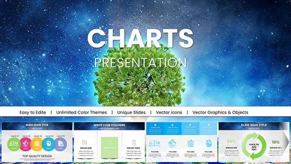
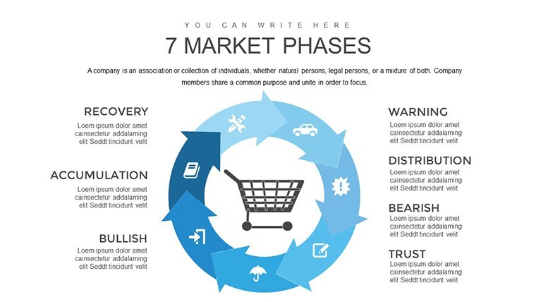
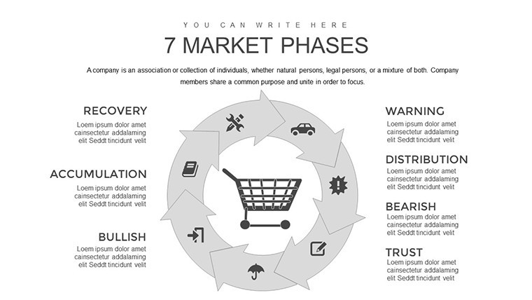
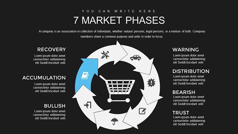
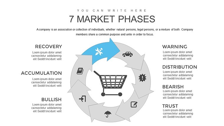
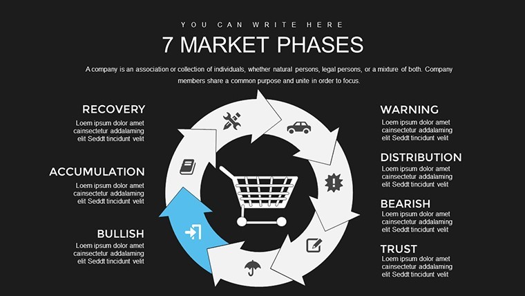
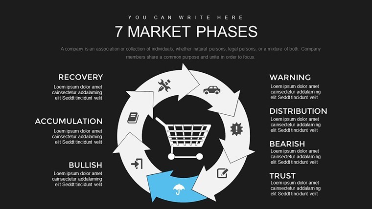
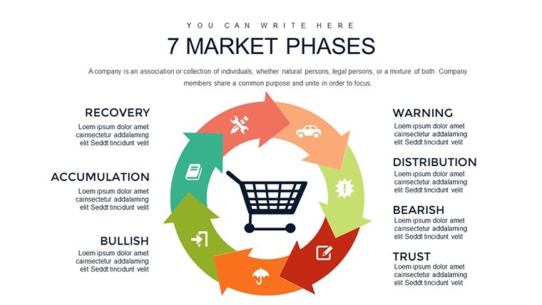
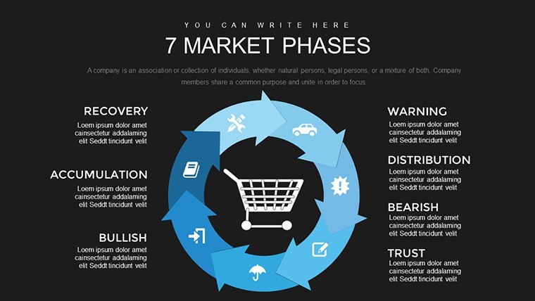
No photo placeholders no gradients - just phase diagrams for market evolution in Keynote.
Ready to go.
When you need to show market development stages to strategy teams these 20 slides handle the cycle breakdown without manual arrangement.
The paid version includes 20 editable slides and you duplicate blocks to fit your exact timeline data while the file stays compatible with current Keynote installations.
In most cases you only replace text and adjust colors via the slide master.
Color changes via slide master let you switch the entire deck palette in under two minutes and this Keynote chart template prevents overcrowded layouts.
Typically teams reuse the same file across recurring presentations and it is not designed for open brainstorming sessions.
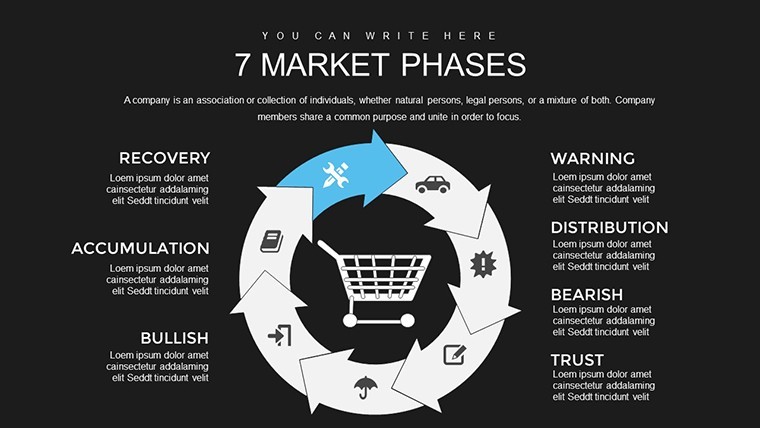
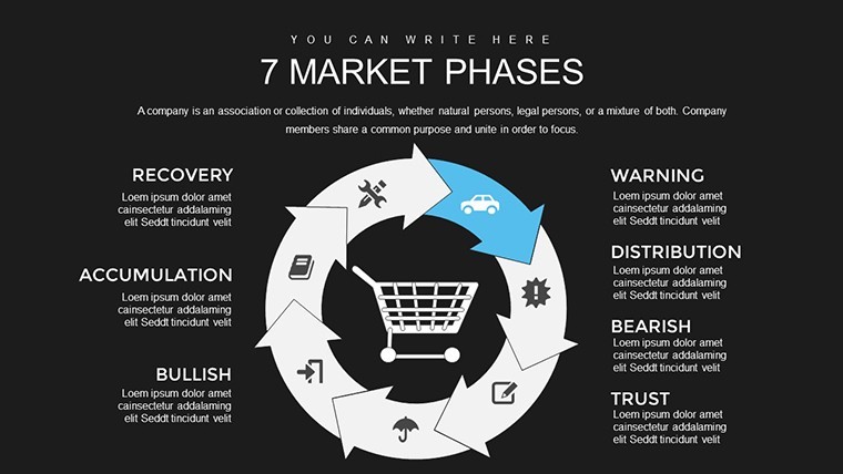
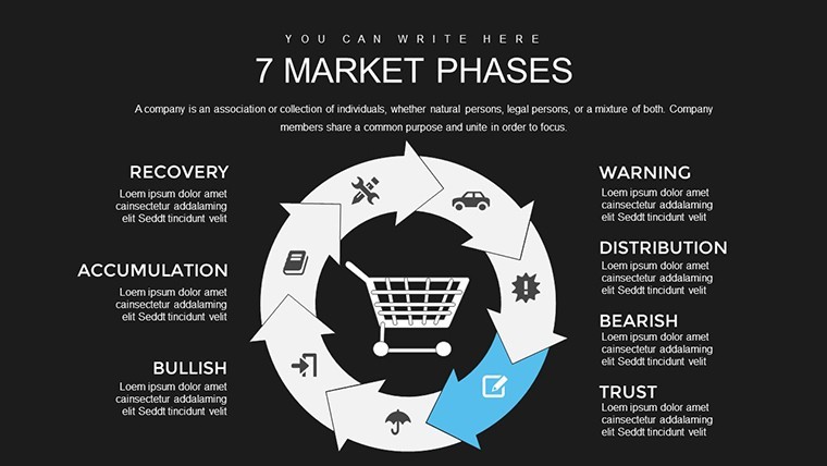
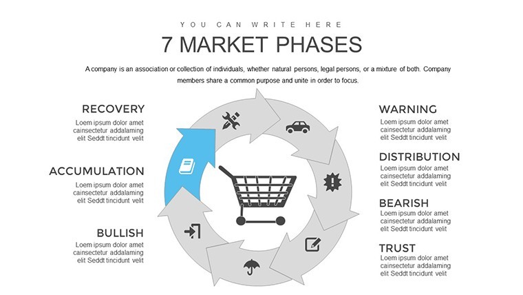
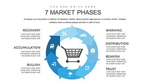
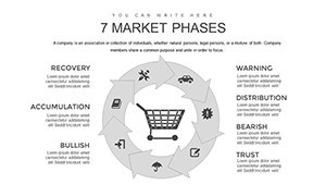
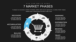
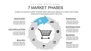
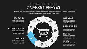
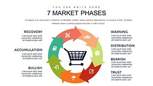
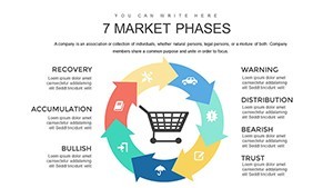
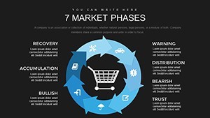
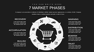
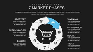
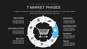
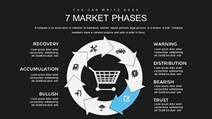
This supports prioritization analysis so you can identify the current market phase and decide next actions after the review.
Use this instead of building from scratch for marketing overviews and see the Ecology Charts Keynote Template - Save the Planet and 9 Step Cycle Keynote Template - Fully Editable | ImagineLayout for related tools.
The paid version includes 20 editable slides while free details are not listed on the page.
Specifications
| Feature | Details |
|---|---|
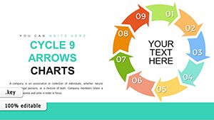
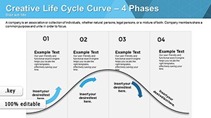
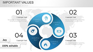
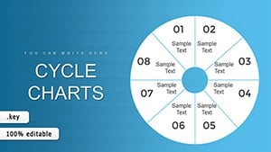
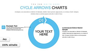
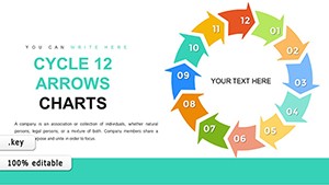
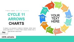
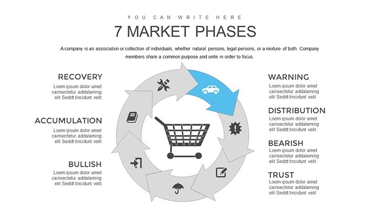
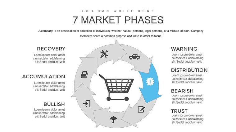
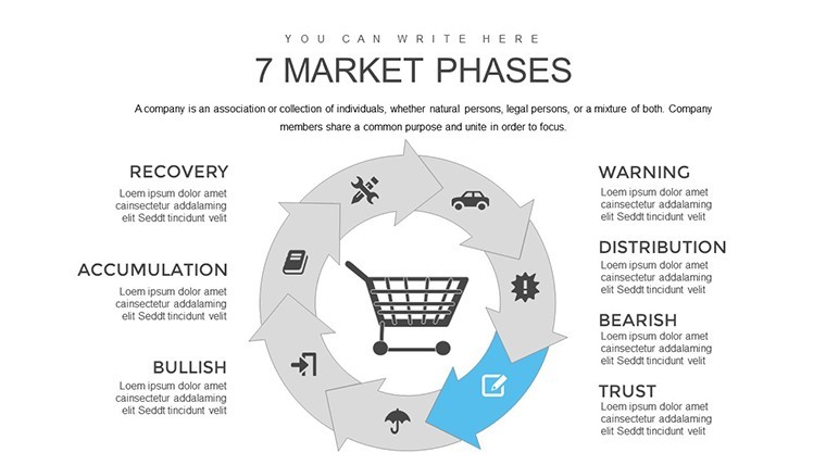
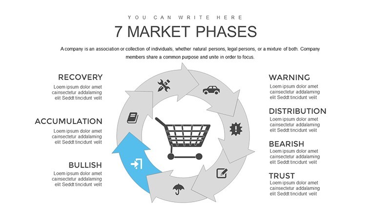
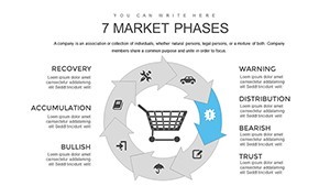
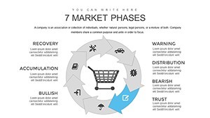
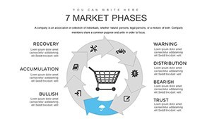
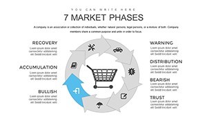
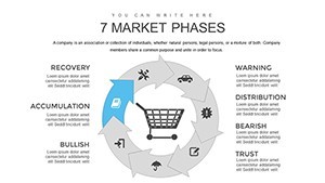
| Slides / diagrams | 20 editable charts on 7 market phases |
| File format | KEY |
| Software version | Keynote 10+ |
| Color schemes | Fully editable via master slides |
| Editable elements | Text icons and colors resize independently |
| Aspect ratio | 16:9 |
| Free vs Paid | Paid includes all 20 slides |
| Masters / Backgrounds | One master for quick updates |
Everything is already structured.
Download and start editing immediately
How do I change colors via slide master?
The template uses slide masters for quick updates. Open View > Master Slides in Keynote select the master and modify the color scheme. It applies to all slides instantly. In most cases this is the fastest way to rebrand the deck.
Can I use this for client work?
Yes the license allows use in client projects as long as the template is not resold or distributed as is. You can deliver the customized presentation to clients.
What is the difference between free and paid?
The paid version includes the full 20 editable slides. The page does not specify exact free version contents but the paid gives the complete file ready for editing.
What are the refund conditions?
If the file does not open in your Keynote version contact support within 7 days for a full refund. The license is non-refundable after successful download and use.
What Keynote version is required?
It works with Keynote 10 and later on macOS. The files follow standard KEY formats compatible with current installations.