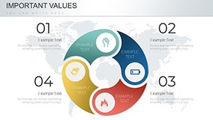
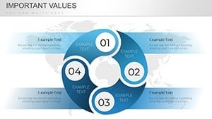
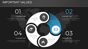
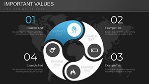
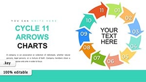
Economic Cycle Keynote Charts Template - Customizable Insights
Type: Keynote Charts template
Category: Cycle
Sources Available: .key
Product ID: KC00694
Template incl.: 21 editable slides
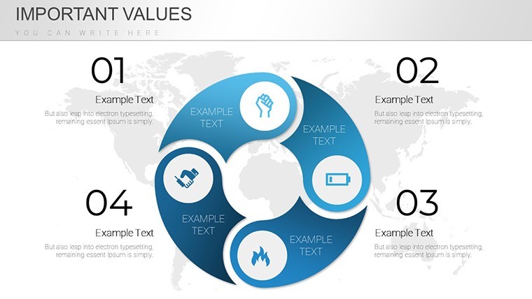
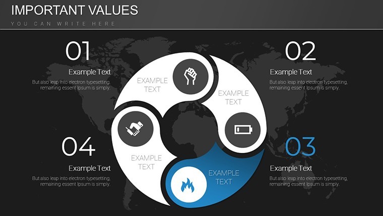
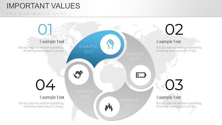
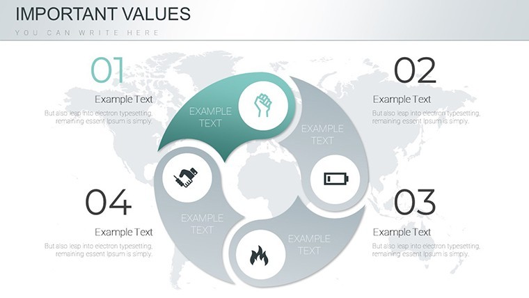
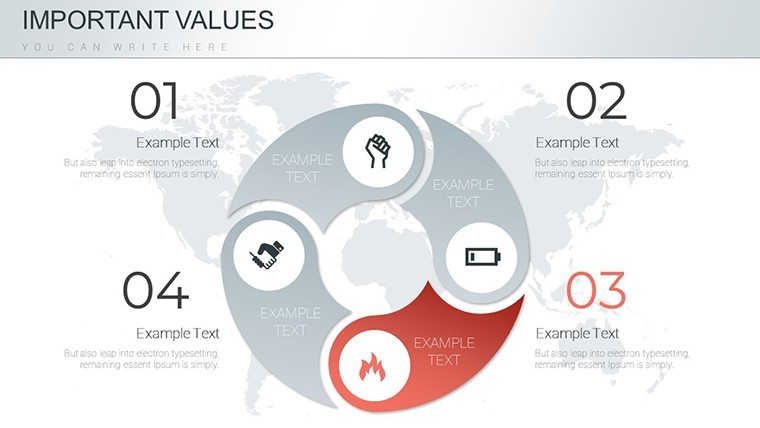
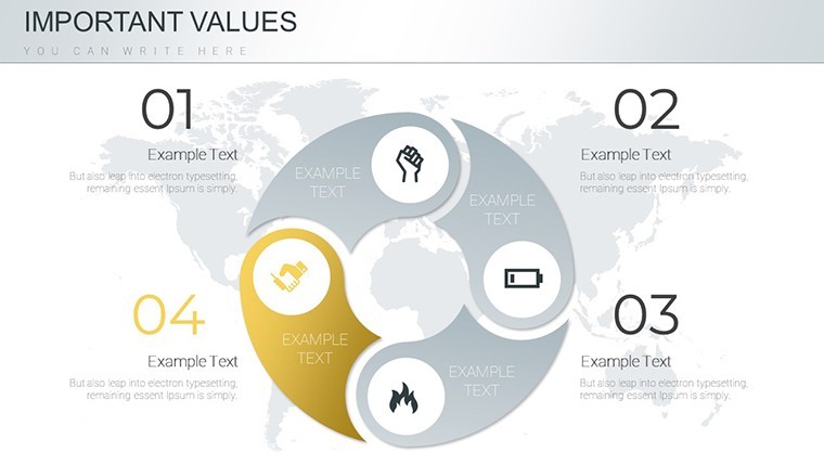
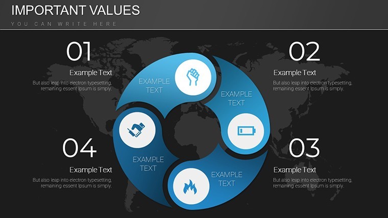
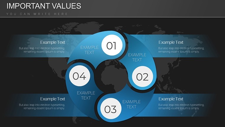
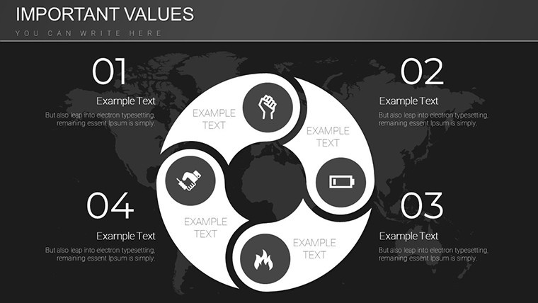
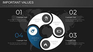
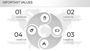
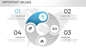
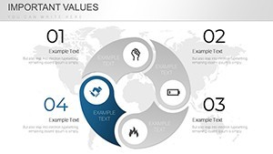
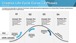
Navigating the ups and downs of economic cycles demands more than raw data - it requires visuals that illuminate patterns and predict trends. Our Economic Cycle Keynote charts template is crafted for business strategists, economists, and educators who need to convey complex concepts simply. With 21 editable slides, this tool lets you map out expansion, peak, contraction, and trough phases using intuitive diagrams. Whether analyzing global markets or company performance, these charts transform abstract ideas into actionable insights, helping your audience grasp the bigger picture.
Inspired by economic theories from thinkers like Joseph Schumpeter, this template emphasizes clarity in visualization. For example, financial advisors have leveraged similar designs to explain recession risks to clients, fostering informed investment decisions. Fully compatible with Keynote 6.0+ on Mac or Windows, it's user-friendly and export-ready. Say goodbye to generic slides and hello to tailored presentations that resonate in boardrooms or classrooms.
Mastering Economic Narratives Through Visuals
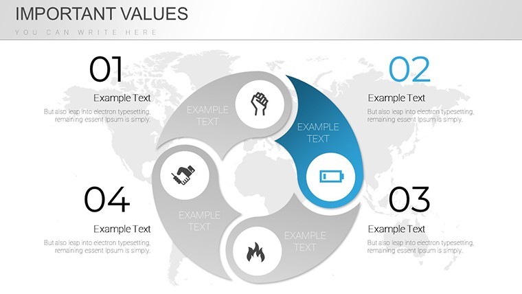
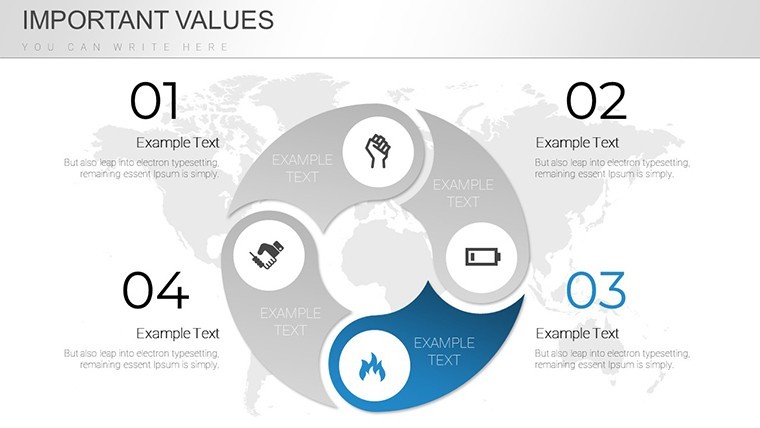
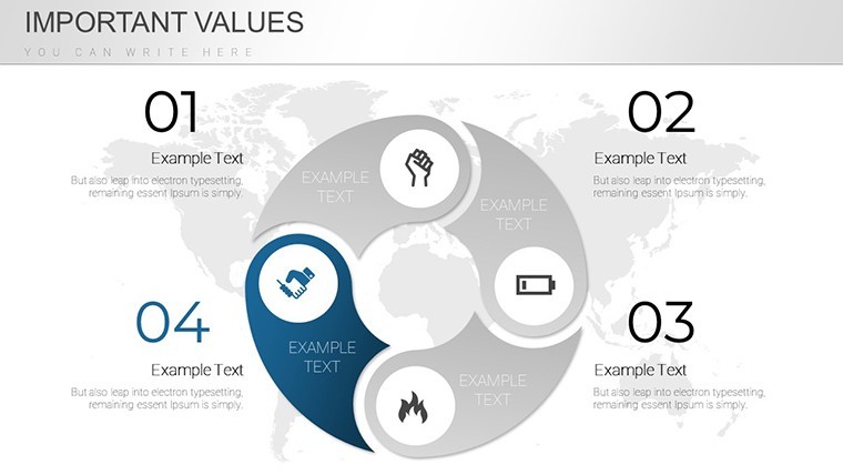
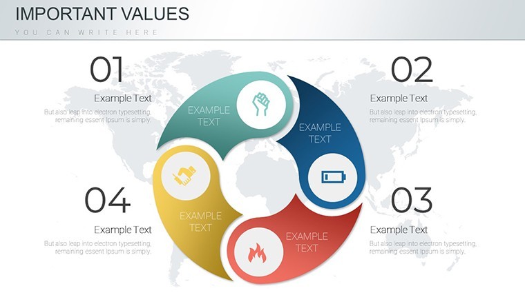
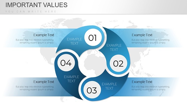
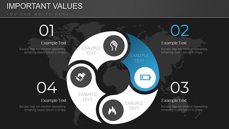
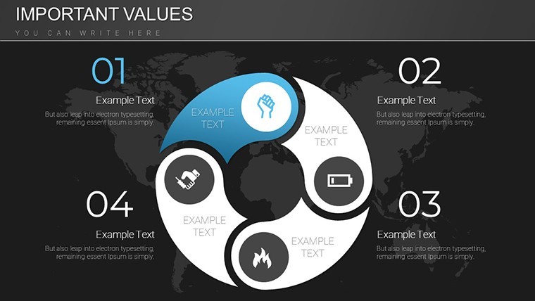
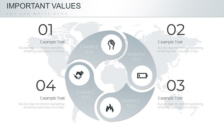
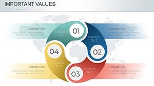
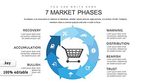
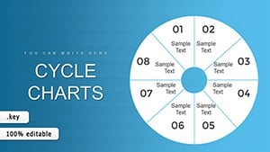
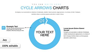
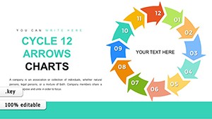
Economic cycles are rhythmic, and so should your presentations be. This template provides a suite of charts depicting periods of growth and decline, with color-coded elements for easy differentiation - greens for booms, reds for busts. Use cycle diagrams to show interconnected factors like inflation and unemployment, making your analysis more holistic.
Customization unlocks endless possibilities. Resize elements to fit dense data sets, switch fonts for a modern vibe, or add grids for precise alignments. This adaptability ensures your charts evolve with your narrative, whether for quarterly forecasts or academic lectures. It's not just about displaying data; it's about sparking discussions on sustainable growth.
Essential Features for Economic Analysis
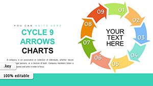
- 21 Editable Slides: Focused on cycle visuals, including phased timelines and looped diagrams.
- Color and Font Flexibility: Match your branding or emphasize key phases with thematic palettes.
- Axis Customization: Adjust tick marks and scales to handle varying data ranges accurately.
- Grid Support: For meticulous layouts that enhance readability.
- Seamless Integration: Pull in data from Excel or other sources effortlessly.
These tools draw from real-world applications, like how economists at think tanks use cycle charts to model policy impacts, leading to more robust strategies.
Practical Use Cases in Business and Beyond
Apply this template to forecast business expansions or educate on historical recessions. In corporate settings, visualize supply chain disruptions during contractions. For educators, break down Keynesian theories with phased illustrations that make learning interactive.
Workflow integration is straightforward: Import your economic indicators, tweak the visuals, and animate transitions for emphasis. Unlike standard Keynote options, this template offers pre-optimized designs, cutting preparation time significantly. It's your shortcut to professional-grade economics communication.
Step-by-Step Customization Workflow
- Open the template in Keynote.
- Input your cycle data into the placeholders.
- Modify colors and sizes to suit your theme.
- Incorporate additional elements like annotations.
- Review and export for distribution.
Enhance with tips from economic visualization experts, such as using animations to simulate cycle progression, keeping viewers hooked.
Superior to Basic Alternatives
Free cycle charts often lack depth, but this $18 template delivers specialized features like dynamic interconnections. It's an affordable edge for those analyzing market volatility, with 1077 ratings attesting to its value.
Chart Your Economic Future Now
Empower your analyses with this versatile template. Dive into economic cycles with confidence and clarity. Grab it today and elevate your insights.
FAQ
What types of economic cycles can I visualize?
From business to Juglar cycles, adapt the slides for various models.
How customizable are the axes and grids?
Fully - change tick marks, scales, and add grids as needed.
Is it suitable for non-economic topics?
Yes, repurpose for project lifecycles or product development phases.
What Keynote versions are supported?
Keynote 6.0 and above on Mac/Windows.
Can I add my own data sources?
Easily import from spreadsheets or databases.

