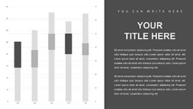
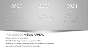
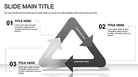
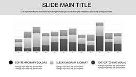
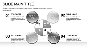
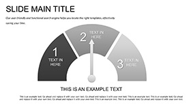
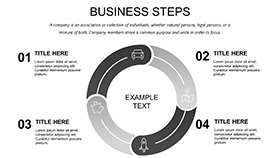
Picture this: You`re an associate analyst, buried in spreadsheets, racing against a deadline to make sense of market fluctuations for the executive board. Suddenly, your slides transform from bland tables into a symphony of insights - curves rising like stock trends, clusters revealing hidden patterns. Welcome to the Associate Analyst Keynote Template, a lifeline for data enthusiasts in consulting, finance, and strategy roles. With 28 diagrams spanning three masters and backgrounds, plus seven color schemes that evoke boardroom confidence, this template turns raw numbers into narratives that drive decisions.
It tackles the analyst`s eternal bind: presenting volumes of data without losing the thread of the story. Ditch the monotony of default charts; these pre-vetted visuals - from funnel analyses to heatmap correlations - let you plug in quarterly figures and watch coherence emerge. A junior consultant might use it to dissect competitor benchmarks, the bar graphs stacking advantages like building blocks. Or in a strategy huddle, timeline slides map project milestones, aligning teams on pivots with visual clarity.
Dissecting the Template`s Analytical Arsenal
Rooted in the precision of data work, the three masters include a dashboard-style for overviews, a segmented one for breakdowns, and a narrative flow for conclusions. Backgrounds range from neutral grids for metrics to subtle waveforms hinting at trend undulations.
- 28 Insightful Diagrams: Scatter plots for regression lines, Sankey flows for resource allocations - each primed for your datasets.
- Seven Palette Options: Corporate grays for reports, vibrant accents for pitches - balancing professionalism with punch.
- Adaptive Editing: Reshape nodes in org charts or filter data in dynamic tables, all Keynote-native.
Geared for Keynote 2016 onward, it meshes with Excel imports, ensuring seamless updates for live sessions.
Building Your Analysis Deck: A Guided Path
- Lay the Groundwork: Import into Keynote, picking a master like the dashboard for executive summaries.
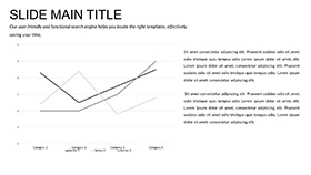
- Feed the Visuals: Link CSV data to line charts; auto-formatting handles volatility spikes.
- Refine Insights: Annotate outliers in bubble diagrams, drawing arrows to causal links.
- Color and Animate Strategically: Opt for a scheme of ascending blues, sequencing reveals to build tension like a market rally.
- Validate Delivery: Mirror display to simulate board views, tweaking for emphasis.
Analysts report this approach sharpens focus, much like a veteran who revamped client recaps, earning kudos for clarity over complexity.
Strategic Deployments in Analyst Workflows
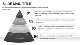
In a market study, employ radar charts to profile SWOT elements, spotlighting opportunities in vector precision. For quarterly reviews, Gantt variants track KPI progress, forecasting with shaded projections. Training sessions benefit from pyramid hierarchies, layering analyst roles from entry to lead.
The template shines in cross-functional pitches too - infographics bridge finance jargon with ops realities, fostering buy-in.
Targeted Tactics for Analyst Scenarios
- Client Reports: Use area charts to trend revenue streams, highlighting seasonal ebbs.
- Internal Audits: Matrix diagrams cross-reference risks and mitigations.
- Forecasting Forums: Exponential curves predict growth, with confidence bands for realism.
Eclipsing basic tools, it offers relational depth - linked datasets update holistically, unlike isolated edits.
Analyst Hacks for Maximum Resonance
Weave in context like Warren Buffett`s value tenets to frame metrics, keeping slides lean with pivotal phrases like "ROI threshold." Boost interaction via clickable legends that drill down, turning static views dynamic.
For equity, scalable fonts and scheme toggles accommodate varied venues, from Zoom calls to conference halls.
Amplify Your Analytical Edge
For the associate analyst navigating data deluges, this Keynote Template is the compass - guiding you to presentations that illuminate paths forward.
Grab it for $22 and decode success.
Frequently Asked Questions
How does it handle large datasets?
Smart charts link externally, refreshing without bloating files - ideal for big analytics pulls.
Are there templates for specific industries?
While general, diagrams adapt easily; tweak for finance funnels or tech metrics.
Can animations sync with data changes?
Yes, builds tie to values, revealing progressions as numbers update.
Does it export well to PDF for reports?
Flawlessly, preserving vectors and colors for print-ready professionalism.
What`s the learning curve for new users?
Minimal; intuitive drags and presets get you charting in minutes.
