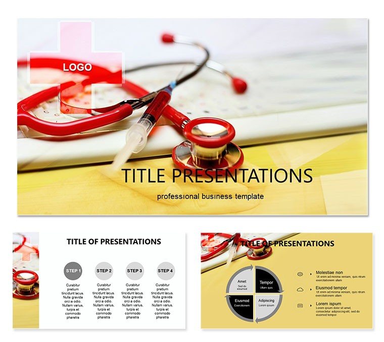
Imagine standing before a room of fellow healthcare professionals, armed with visuals that cut through the complexity of chronic pain discussions. That`s the power of the Pain Clinicians Keynote Template, crafted specifically for medical experts navigating the nuances of pain management. This template isn`t just a collection of slides - it`s a strategic tool to illuminate patient journeys, highlight treatment obstacles, and foster collaborative insights. With 28 meticulously designed diagrams, three versatile master layouts, and three background options, you can tailor every presentation to resonate with precision and empathy.
Whether you`re preparing for a departmental review, a patient education seminar, or a research symposium, this template transforms dense medical data into compelling narratives. Picture a flowchart that maps out why pain lingers despite interventions, or an infographic that breaks down psychological and physiological barriers - each element draws from real-world clinical scenarios to ensure relevance. Compatible with Keynote on macOS Ventura and later, it supports seamless edits, letting you swap in your latest case studies or imaging without missing a beat. And with seven color schemes ranging from calming blues for empathy-focused talks to stark reds for urgent alerts, your message lands with the right emotional tone.
Start by selecting a master layout that aligns with your session`s flow: the clean grid for data-heavy overviews, the asymmetric flow for storytelling arcs, or the centered focus for key takeaways. From there, dive into the diagrams - each one editable down to vector shapes and text placeholders. For instance, adapt the persistence timeline to showcase a patient`s six-month progression, layering in icons for medication adherence or therapy milestones. This isn`t about flashy effects; it`s about clarity that empowers decisions, much like how leading pain specialists at institutions like the Mayo Clinic emphasize visual aids in multidisciplinary rounds.
Core Features That Drive Clinical Clarity
At the heart of this template lies its diagram library, a powerhouse of 28 visuals engineered for pain clinicians. These aren`t generic charts; they`re purpose-built for scenarios like evaluating opioid tapering strategies or exploring neuromodulation outcomes. Take the barrier analysis wheel: a radial diagram that segments factors such as socioeconomic hurdles, comorbid conditions, and access issues. Customize it by resizing segments or recoloring to match your institution`s branding, ensuring it feels like an extension of your practice.
- Versatile Masters: Three options to set the stage - minimalist for evidence reviews, illustrative for patient-facing content, or hybrid for mixed audiences.
- Background Variety: Subtle textures evoking medical precision, from soft gradients to faint anatomical motifs, keeping focus on your content.
- Color Schemes Galore: Seven palettes, including monochromatic for formal settings and vibrant contrasts for interactive workshops.
- Full Editability: Drag-and-drop elements, with smart guides for alignment and resizable assets that maintain quality across devices.
Integration is effortless: import your data via Keynote`s built-in tools or copy-paste from Excel for quantitative slides. A pro tip from design-savvy clinicians - pair the cycle diagram with animated builds to reveal layers progressively, mimicking the diagnostic process and holding attention during those pivotal "aha" moments.
Real-World Applications in Pain Management
Envision using this template in a weekly pain clinic huddle. Slide one: an overview infographic recapping referral trends, pulling from your EHR exports. Transition to the root cause pyramid, where you stack environmental, genetic, and lifestyle contributors, inviting team input on interventions. By the end, a SWOT analysis slide - strengths of current protocols, weaknesses in follow-up - sparks actionable plans. This structure not only saves prep time but elevates discourse, turning routine meetings into catalysts for better patient care.
For broader outreach, adapt it for community health fairs. The empathy map diagram becomes a bridge to lay audiences, visualizing how pain affects daily life through relatable icons like sleep disruptions or mobility limits. Add your voiceover notes in Keynote`s presenter view for guided delivery, ensuring even non-experts grasp the stakes. Or, in academic settings, leverage the comparison matrix to juxtapose pharmacological versus non-pharmacological approaches, citing guidelines from bodies like the American Pain Society without cluttering the slide.
Step-by-step, here`s how to deploy it for a treatment barrier workshop: First, outline objectives on a mind-map slide. Second, populate the funnel diagram with dropout stats at each stage - from initial consult to long-term management. Third, use the intervention roadmap to propose tailored solutions, with hyperlinks to resources. Finally, wrap with a feedback loop graphic, encouraging post-session surveys. This workflow mirrors evidence-based practices, making your presentations as reliable as the care you deliver.
Enhancing Patient Engagement Through Visuals
Beyond colleagues, this template shines in direct patient interactions. Craft a personalized pain diary slide using the timeline variant, where patients plot flare-ups against triggers. During reviews, animate entries to reveal patterns, fostering ownership and adherence. It`s a subtle nod to motivational interviewing techniques, where visuals reinforce dialogue over dictation.
Compared to starting from scratch in Keynote, this template shaves hours off design while amplifying impact - think polished outputs that rival agency work, minus the cost. Users in similar fields report smoother transitions from concept to delivery, with room for creative flourishes like embedding QuickTime clips of therapy demos.
Tailored Tips for Seamless Customization
To maximize value, begin with theme selection: neutral tones for conservative audiences, warmer hues for holistic discussions. Layer in your logos via the master slide editor, ensuring consistency across all 28 diagrams. For data viz, the built-in pie and bar variants auto-scale, but for precision, tweak via the format panel - adjust opacity for overlays that highlight correlations without overwhelming.
- Import assets: Drag photos of anatomical models into placeholders, resizing with aspect-lock.
- Animate strategically: Subtle fades on build orders to pace revelations, avoiding distractions.
- Test exports: Render to PDF for handouts, preserving vectors for sharp prints.
- Collaborate: Share via iCloud for real-time tweaks in team prep.
These steps integrate the template into your routine, whether solo or in a group practice. Download this Keynote template for $22 and unlock presentations that not only inform but inspire action in pain relief efforts.
Frequently Asked Questions
What Keynote versions are compatible with this template?
This template works with Keynote 11.0 and later on macOS, ensuring smooth performance on recent systems.
How many diagrams does the Pain Clinicians Keynote Template include?
It features 28 specialized diagrams, plus three masters and backgrounds for flexible layouts.
Can I change the color schemes easily?
Yes, with seven pre-set schemes, you can switch via the master editor in seconds, maintaining harmony.
Is the template suitable for patient education sessions?
Absolutely - its clear visuals and editable elements make complex topics accessible for non-experts.
Does it support adding custom images?
Definitely; placeholders allow drag-and-drop integration of your photos or scans without quality loss.