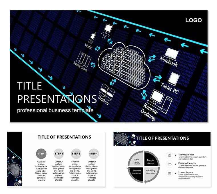
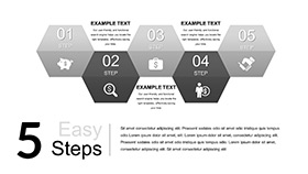
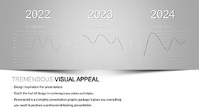
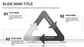
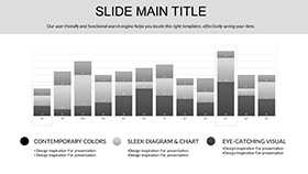
Imagine transforming complex ideas about vast data centers into clear, visually striking narratives that resonate with your audience. The IT Cloud Keynote Template is crafted for IT professionals, architects, and tech leaders who need to illustrate the power of concentrated computing resources and seamless global connectivity. With 28 meticulously designed diagrams across seven versatile color schemes, this template turns abstract concepts like server clusters spanning continents into accessible stories. Whether you`re pitching a cloud migration strategy to executives or educating teams on infrastructure scalability, these slides help you highlight how modern software bridges distant hardware into unified systems.
Compatible with Keynote 2016 and later versions, the template includes three master slides and three background options, ensuring your presentations align with brand guidelines effortlessly. Start by selecting a master layout that matches your theme - perhaps a sleek blue-toned background evoking digital skies - and layer in diagrams that depict data flow from edge servers to core hubs. This isn`t just about visuals; it`s about empowering you to convey reliability and innovation without getting lost in technical jargon.
Unlocking the Core Features of Your Cloud Presentations
Dive deeper into what makes this template a go-to for IT storytelling. Each of the 28 diagrams is fully editable, from reshaping flowcharts to swapping icons for custom assets. For instance, slide 7`s network topology diagram lets you drag and drop nodes to represent your specific hybrid cloud setup, while maintaining crisp vector graphics that scale perfectly on any screen.
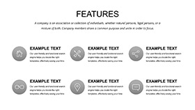
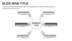
- Modular Diagrams: From radial cloud access maps to layered stack illustrations, adapt them to fit AWS, Azure, or on-prem integrations.
- Color Harmony: Seven schemes, including monochromatic grays for formal reports or vibrant gradients for dynamic demos, all optimized for both light and dark modes.
- Icon Library: Over 50 built-in icons for servers, firewalls, and data streams - resize or recolor without losing quality.
One standout is the global connectivity slide (diagram 15), which uses animated transitions to show real-time data syncing across time zones. In a recent workshop for a fintech firm, a presenter used this to demonstrate latency reductions, turning a dry spec sheet into an engaging demo that secured buy-in from stakeholders.
Streamlining Your Workflow with Built-in Masters
The three master slides serve as your foundation: one for title intros with subtle cloud motifs, another for content-heavy sections featuring grid layouts, and a third for summary pages with key metric callouts. Switch between backgrounds - a minimalist wireframe for technical deep dives or a textured ether for high-level overviews - to keep energy high. Editing is intuitive; select a diagram, tweak text via the inspector panel, and preview animations that reveal layers progressively, mimicking data buildup.
Real-World Applications: From Boardrooms to Briefings
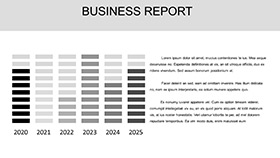
For IT directors facing quarterly reviews, this template shines in breaking down infrastructure costs. Use the cost allocation pie chart (diagram 22) to segment expenses across storage, compute, and bandwidth - simply input your figures, and the smart labels adjust automatically. A systems engineer might leverage the scalability timeline (slide 10) to forecast growth, plotting milestones like node additions or bandwidth upgrades with drag-and-drop ease.
In educational settings, professors teaching distributed systems can populate the fault tolerance diagram (diagram 18) with case studies, such as how redundant routing prevented outages in major cloud providers. Step by step: Open the template in Keynote, navigate to the slide, replace placeholder text with your examples, apply a fade-in animation to reveal failure points, then export as a video clip for hybrid classes.
Tailoring for Hybrid Cloud Pitches
When pitching hybrid environments, combine the integration bridge diagram (slide 5) with custom annotations. Start with an overview of on-prem assets, transition to cloud extensions via connector lines, and end with ROI projections. This visual flow mirrors the logical progression of your argument, making it easier for non-technical audiences to grasp the "why" behind the migration.
- Import your data via CSV for auto-populating charts.
- Align elements using Keynote`s alignment tools for pixel-perfect layouts.
- Test on multiple devices to ensure responsiveness.
Beyond pitches, use it for internal audits: The security perimeter map (diagram 25) allows layering in compliance icons, helping compliance officers visualize access controls without starting from scratch.
Why This Template Elevates Your IT Narratives
Compared to stock PowerPoint charts, these Keynote-optimized visuals offer smoother animations and higher fidelity icons, reducing prep time from hours to minutes. They`re not generic placeholders; each diagram draws from real-world topologies, like those in enterprise data center blueprints, ensuring authenticity. For teams collaborating remotely, the .key format enables seamless sharing and version control via iCloud.
Envision a scenario where your cloud strategy deck needs to stand out in a sea of spreadsheets. By weaving in these diagrams, you create a cohesive thread that ties technical specs to business outcomes, fostering discussions rather than dictating facts.
Pro Tips for Maximum Impact
To amplify engagement, pair diagrams with subtle sound effects on transitions - Keynote`s library has ethereal chimes that evoke digital expanses. For accessibility, add alt text to images via the inspector: "Interactive cloud network diagram showing multi-region data flow." And remember, consistency is key; stick to one color scheme per deck to reinforce branding.
Download the IT Cloud Keynote Template now for $22 and start architecting presentations that connect the dots between hardware and horizons.
Frequently Asked Questions
What formats are included with the IT Cloud Keynote Template?
The template provides .key files for direct Keynote editing, plus .jpg exports for previews or backups.
Can I customize the diagrams for specific cloud providers?
Yes, all 28 diagrams are vector-based, so you can resize, recolor, and add provider-specific logos effortlessly.
Is this template suitable for large-scale enterprise presentations?
Absolutely - widescreen formats (16:9 and 16:10) ensure compatibility with projectors and large screens.
How do the color schemes work?
Seven schemes are pre-applied; switch via the master slide selector to match your company`s palette.
Does it support animations for data flows?
Built-in transitions like build-in and fade allow animating paths and reveals for dynamic storytelling.
