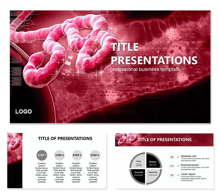
Imagine standing before a room of fellow researchers, armed with visuals that not only inform but captivate, turning complex virology into a narrative that sticks. That`s the power of our Ebola Virus Keynote template, designed specifically for those in the medical field who need to convey the urgency of this deadly pathogen without overwhelming their audience. With 28 meticulously crafted diagrams, this template goes beyond basic slides - it`s a toolkit for educators, clinicians, and public health advocates to dissect the Ebola`s spread, symptoms, and containment strategies in West Africa and beyond.
Crafted for Keynote users on Mac, this template ensures smooth animations and high-resolution outputs, compatible with Keynote 2016 and later versions. Whether you`re preparing for a conference on infectious diseases or an internal briefing on outbreak response, these slides transform raw data into persuasive visuals. Picture a timeline slide mapping the virus`s 2014 resurgence, or an infographic breaking down transmission routes - each element is fully editable, allowing you to swap in your latest CDC updates or WHO statistics effortlessly.
Unlocking the Core Features of This Template
At its heart, this template shines through its thoughtful design elements tailored for medical storytelling. Start with the three master layouts: a clean title slide for introducing the virus`s history, a data-heavy master for charts on mortality rates, and a narrative master for case studies. Paired with three background options - from subtle gradients evoking biohazard motifs to stark white for clinical precision - you can match any presentation style.
- 28 Editable Diagrams: From filovirus illustrations to epidemic curve graphs, every diagram is vector-based for crisp scaling.
- 7 Color Schemes: Choose from pathogen-red accents for urgency or calming blues for educational tones, ensuring accessibility in dim conference halls.
- Seamless Integration: Built-in hyperlinks for quick jumps between sections, like from symptoms to prevention slides.
- High-Resolution Exports: Optimized for PDF or video export, ideal for sharing via secure health portals.
These features aren`t just add-ons; they`re built to address the pain points of medical presenters, like condensing dense epidemiology reports into digestible formats. A virologist might use the process flow diagram to outline the virus`s lifecycle, dragging and dropping icons to highlight RNA replication stages without starting from scratch.
Step-by-Step: Bringing Your Ebola Presentation to Life
Getting started is as straightforward as opening Keynote. First, import the .key file and select your preferred master - say, the one with a faint world map overlay for global context. Next, dive into the diagrams: Slide 5`s pie chart on demographic impacts is pre-populated with placeholders; simply input your data from recent outbreaks and watch the animations reveal sector-by-sector breakdowns.
- Customize Colors: Head to the color scheme panel and apply a scheme that aligns with your institution`s branding - perhaps greens for hope amid crisis narratives.
- Edit Text and Icons: All fonts are sans-serif for readability, and icons like petri dishes or quarantine symbols are SVG for infinite resizing.
- Add Transitions: Apply subtle fades between slides to mimic the virus`s insidious progression, keeping viewers engaged without distraction.
- Preview and Refine: Use Keynote`s presenter notes for speaker cues, like reminding yourself to pause at the immunity slide for questions.
This workflow saves hours compared to piecing together generic shapes, letting you focus on the science. For instance, in a university lecture, you could adapt Slide 12`s comparison chart to contrast Ebola`s fatality with other filoviruses, pulling in real-time data for relevance.
Real-World Applications: From Lecture Halls to Crisis Briefings
This template finds its stride in scenarios where clarity can save lives - or at least inform policy. Consider a public health officer briefing NGOs on containment: The radial diagram on Slide 18 visualizes contact tracing webs, making abstract networks tangible. Or, in an academic setting, a professor might leverage the timeline on Slide 7 to walk students through the 1976 discovery in Sudan and Zaire, fostering deeper understanding without rote memorization.
Break down a few standout slides for inspiration. Slide 3`s layered anatomy view details the filovirus structure - edit the labels to emphasize glycoprotein spikes, drawing from electron microscope imagery you`ve sourced. Slide 22`s flowchart maps post-exposure protocols, a boon for training sessions where step clarity is paramount. And don`t overlook Slide 28`s summary infographic, which consolidates key takeaways into a one-slide closer, perfect for Q&A transitions.
Compared to stock PowerPoint builds, this template`s medical-specific icons - like vial clusters or outbreak maps - elevate professionalism, ensuring your deck stands out in grant proposals or journal club discussions. It`s not about flashy effects; it`s about precision that resonates with peers who value evidence over embellishment.
Tailoring for Diverse Audiences
For global health NGOs, emphasize the prevention-focused slides to advocate for vaccine trials. In contrast, a hospital administrator might prioritize the resource allocation charts, tweaking vectors to reflect bed occupancy during surges. This adaptability stems from the template`s modular design, where swapping backgrounds alone can shift tones from alarming to analytical.
Integrate it into your routine: Pair with tools like MindMeister for brainstorming slide flows, then export mind maps as images into placeholders. The result? Decks that not only educate but inspire action, much like how early responders used visuals to rally international aid in past epidemics.
Ready to transform your next talk? Download this Ebola Virus Keynote template for $22 and start building slides that inform and impact.
Frequently Asked Questions
Is this template fully editable in Keynote?
Yes, all diagrams, texts, and colors are fully customizable using Keynote`s native tools, ensuring quick adjustments.
What file formats are included?
You`ll receive .key for direct Keynote use, plus .jpg previews and .kth themes for backups.
Can I use it for commercial medical training?
Absolutely, the license covers professional use in presentations, trainings, and reports.
Does it support animations for virus lifecycle slides?
Built-in subtle animations highlight processes like replication, fully adjustable per slide.
How many backgrounds and masters are there?
Three of each, offering variety from minimalist to thematic designs.