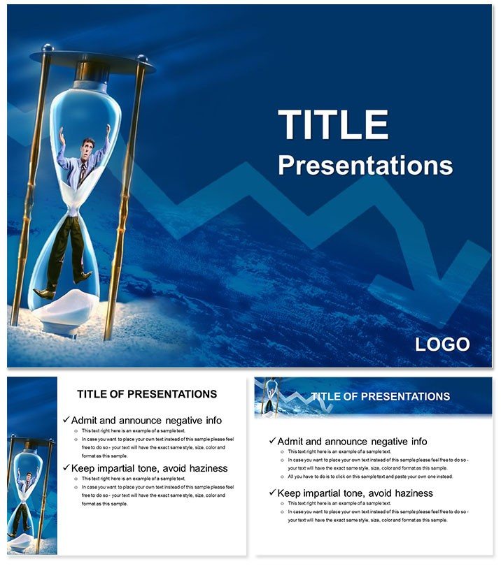
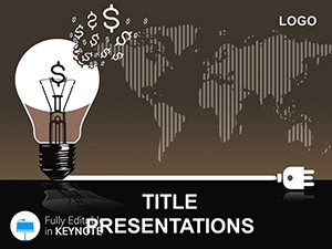
Step onto the stage for a board update, your slides dissecting cost overruns with the sharpness of a scalpel, turning potential pitfalls into proactive plans. The Material Losses Keynote template is engineered for financial analysts, consultants, and executives navigating the intricacies of resource management in business. It packs 28 diagram slides that illuminate waste streams, from inventory discrepancies to supply chain leaks, empowering you to present solutions with undeniable clarity.
This addresses the drag of convoluted spreadsheets in reports, offering a sleek scaffold with three masters for uniform styling and three backgrounds in minimalist grids or subtle waveforms. Seven color schemes - steely grays to alert reds - highlight risks without alarmism. Formats include .jpg snapshots and .key/.kth for Keynote on macOS, compatible from 2016 equivalents onward, facilitating quick iterations in high-pressure cycles.
Consultants echo its utility in audit summaries, where flow diagrams trace loss points, sparking efficiency dialogues. For project leads, it`s a beacon in status meetings. Set to sharpen your analytics? Customize this and lead with foresight.
Core Components for Strategic Clarity
Its strength? A balanced architecture that prioritizes data over decoration, yet engages visually.
Masters and Backgrounds: Foundation of Focus
Three masters enforce hierarchy - bold headers for KPIs, fine lines for annotations. Backgrounds range from clean whites to tonal maps, suiting virtual or in-person delivers. .kth themes export easily for consistency.
28 Diagrams: Mapping the Metrics
- Loss Audits: Funnel charts narrowing from input to output wastes.
- Trend Trackers: Line graphs plotting quarterly variances.
- Cause Maps: Fishbone diagrams rooting out operational flaws.
- Recovery Plans: Step pyramids building mitigation layers.
Keynote transitions like builds reveal layers logically, mirroring analysis depth.
Schemes for Subtle Emphasis
Seven palettes flag urgencies: cool blues for baselines, warms for alerts, all WCAG-compliant for broad access.
Boardroom Applications: From Analysis to Action
Ideal for turning data dumps into decision drivers, like a CFO visualizing scrap reductions.
Workflow: Constructing a Loss Report
- Base Layer: Choose master for report format, apply grid background.
- Data Load: Feed ERP exports into funnel slides.
- Reveal Logic: Animate cause trees to branch on cue.
- Validate View: Cycle schemes for stakeholder prefs.
- Execute: Share via Keynote Live for real-time notes.
Trims hours from manual charting, freeing for strategic dives.
Tailored for Pros
Analysts chart project overruns; execs overview supplier audits. Trainers simulate scenarios in workshops with interactive builds.
Insight: Tag slides to appendices for drill-downs without clutter.
Superior to Spreadsheet Screenshots
Native vectors scale crisply, unlike pixelated imports. Sync with Numbers for auto-updates, or Pages for narrative embeds.
Blend with ImagineLayout business sets for comprehensive audits.
Fine-Tuning for Impact
Keynote`s magic move for diagram zooms. Tip: Opacity gradients on backgrounds for depth without distraction.
Purpose: Insights that illuminate paths forward.
Invest in Informed Decisions
Minimize misses - acquire the Material Losses template for $22 and fortify your forecasts.
Frequently Asked Questions
Keynote version requirements?
2016+, seamless in current macOS builds.
Color adaptability?
Seven options, editable via color wells.
Diagram editability?
Full, with shape tools and data links.
Finance icons?
Included: charts, arrows, tailored motifs.
Slide count details?
28 diagrams, plus expandable masters.
PowerPoint cross-use?
Exports to PPTX with feature retention.