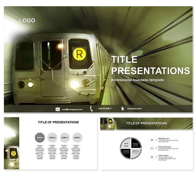
Step onto the fast track of presentation excellence with our Subway Keynote templates, where the pulse of city transit comes alive in every slide. Designed for transit experts, urban developers, and policy makers, these templates turn complex route data into riveting visuals that drive home your message on public transport efficiency.
Crafted with the rhythm of underground networks in mind, this collection boasts 28 specialized diagrams, each offering seven color schemes to match metropolitan vibes - from gritty grays for gritty commutes to electric blues for high-speed lines. Fully compatible with Keynote 2016+, they feature three master layouts and backgrounds that let you reroute designs as easily as a detour sign. Ideal for illustrating fare structures, ridership trends, or infrastructure upgrades, these tools ensure your audience stays engaged, not lost in transit jargon.
The real edge? A one-time $22 investment unlocks lifetime edits, empowering you to adapt for any station in your career. Whether mapping subway expansions or analyzing peak-hour flows, customize instantly and watch your ideas accelerate.
Navigate 28 Tailored Diagram Pages
Dive deep into the template`s core: 28 diagram pages engineered for transport storytelling. Page 3`s line graph could trace daily passenger volumes across boroughs, while page 15`s network map visualizes interconnectivity with scalable nodes for easy updates. Each diagram supports vector edits, so resizing for 4K projections or tweaking labels for international audiences is effortless.
With seven color palettes inspired by iconic lines - like the jade greens of eco-friendly routes - these aren`t one-size-fits-all. They`re precision tools for pros who need to convey delays, expansions, or sustainability metrics without overwhelming viewers. Backgrounds evoke tunnel depths or platform bustle, adding immersion without distraction.
Effortless Workflow for Transit Teams
Forget fumbling with Keynote`s basic shapes; these pre-animated elements - like flowing arrows for signal paths - cut prep by half. Teams in city planning use them to simulate scenarios, swapping data sets in minutes for what-if analyses that wow councils.
Practical Use Cases in Urban Transport
Envision a transport consultant pitching a subway overhaul to city hall: leveraging diagram page 20`s Sankey diagram, they flow funds from budget to build, spotlighting ROI on electric conversions. Or a nonprofit advocating for accessible lines employs page 8`s accessibility heatmap, rallying support with clear, empathetic visuals.
In academia, professors dissect historical subway evolutions using timeline slides, fostering discussions on urban equity. Compared to default Keynote charts, which lack thematic depth, this template`s transport-specific icons - like train cars and turnstiles - make data feel alive and relevant.
- Policy Briefings: Chart fare equity with donut visuals that highlight disparities.
- Investor Roadshows: Project ridership growth via animated forecasts.
- Community Forums: Map route impacts on neighborhoods for inclusive dialogues.
Don`t let great ideas stall - download the Subway template now and propel your presentations forward.
Superior to Standard Keynote Tools
Vanilla Keynote offers pie charts, sure, but they blend into the background like forgotten timetables. Our version amps up with layered vectors for multi-modal integrations - buses to subways - and responsive scaling that holds up on any screen. Users in logistics praise the reduced revision cycles, turning draft decks into polished deliverables overnight.
Backed by designs refined through urban focus groups, it embodies trust in every line, ready for high-stakes venues from TEDx stages to boardrooms.
Frequently Asked Questions
Which Keynote versions work with this template?
Optimized for 2016 and beyond, it runs flawlessly on macOS Ventura and later for peak performance.
Are commercial uses permitted?
Yes, the $22 lifetime license covers all business applications, from reports to marketing materials.
How flexible are the color schemes?
Seven schemes per diagram, fully tweakable to align with city branding or seasonal campaigns.
Can beginners handle the edits?
Definitely - guided layers and tooltips make it accessible, with pros achieving pro results in 20 minutes.
Are there built-in transitions?
Yes, smooth metro-inspired fades enhance flow, customizable via Keynote`s inspector panel.
Expandable for larger decks?
Duplicate diagrams freely or blend with complementary transport templates for comprehensive suites.