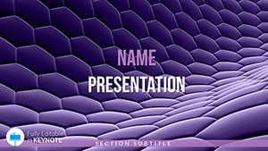
As someone who`s spent years crafting presentations for tech startups and marketing teams, I know how tough it can be to make intricate connections feel straightforward. That`s where this Abstract Network Diagram Keynote Template steps in. It`s built for those moments when you need to illustrate relationships, flows, or hierarchies without overwhelming your audience. Think of it as your visual translator, turning tangled thoughts into elegant, interconnected maps that stick.
This template isn`t about flashy distractions - it`s focused on clarity. With 28 ready-to-use diagrams, you get a full toolkit for mapping out everything from neural-like idea clusters to ray-burst timelines. I`ve used similar setups in client sessions to break down supply chain dependencies or brainstorm product ecosystems, and every time, it shifts the room from confusion to collaboration. Whether you`re a founder outlining investor pathways or an educator linking historical events, these slides make the abstract feel immediate and actionable.
Unlocking the Power of Connected Visuals
Start with the basics: the template opens with a nexus title slide, where subtle plexus lines frame your main message, drawing eyes right to the core. From there, dive into cluster clouds on slides 2 through 7. These are perfect for grouping related concepts - like customer segments in a marketing plan. Imagine dropping in your data points as customizable nodes; each one links with faint beams that pulse on click, revealing deeper ties without a word of explanation.
Moving deeper, slides 8 to 15 handle insights with synaptic charts and fractal spreads. I`ve leaned on these for project managers tracking cross-team workflows. Picture a central idea branching into fractal patterns, each arm representing a phase - design, execution, review - with resizeable elements that adapt to your timeline. No more static boxes; these evolve as you build the story, keeping viewers hooked on the progression.
For expansions, slides 16 to 23 cover web dependencies and ray projections. This is gold for consultants diagramming partner networks. Envision rays shooting from a hub to show influence flows, like how a tech innovation ripples through industries. The nodes tweak easily - recolor for emphasis, stretch connections to highlight bottlenecks - and the whole thing exports smoothly to PDF for sharing post-meeting.
Wrapping up on slides 24 to 28, you converge everything into unity nodes and echo rays. These synthesis slides pull threads together, ideal for recapping key takeaways in a boardroom close. One client, a product lead at a growing app firm, used this to echo strategic pillars, leaving executives nodding along to a unified vision.
Customization That Fits Your Flow
What sets this apart is the intuitive editing. Seven luminous color schemes let you match your brand - shift from neon pops for energetic pitches to ethereal tones for thoughtful workshops. Every element, from ray traces to background pulses, responds to Keynote`s native tools. Animate paths to trace idea journeys, or layer in your logo on a master slide for seamless branding. It`s designed for Keynote 2016 and later, but I`ve exported these to PowerPoint for hybrid teams without losing a beat.
For tech innovators, this means mapping algorithm interactions with geometric precision, avoiding the clutter of default charts. Marketers find it shines in campaign overviews, where plexus maps reveal audience touchpoints. Educators, meanwhile, use the ray bursts to connect curriculum dots, making abstract theories tangible for students. The result? Presentations that don`t just inform - they inspire action.
Real-World Wins Without the Overhaul
Last quarter, I walked a startup through their funding narrative using a setup like this. We started with beam hierarchies to prioritize features, then fractal spreads for market positioning. By the end, their pitch flowed like a well-wired circuit, landing meetings with backers who finally "saw" the potential. It`s that kind of shift: from disjointed slides to a cohesive web that mirrors how ideas actually interconnect.
And it`s quick to own. Open it in Keynote, swap in your content, and you`re presenting in under an hour. The high-res graphics scale perfectly, ensuring crisp delivery on any screen, from conference projectors to laptop reviews.
Frequently Asked Questions
What makes this template ideal for mapping complex relationships?
It uses plexus and ray designs that visually link elements, making hierarchies and dependencies easy to grasp at a glance.
Can I adjust the colors to match my company`s palette?
Yes, with seven schemes and easy node recoloring, it adapts quickly to any branding needs.
Is this compatible with PowerPoint if my team uses Windows?
Absolutely - export directly from Keynote to PowerPoint while keeping animations and layouts intact.
How many slides come pre-built, and can I add more?
You get 28 diagrams out of the box, all fully editable, so expanding is as simple as duplicating and tweaking.
Does it support animations for dynamic presentations?
Built-in ray traces and path animations bring connections to life, enhancing flow without extra effort.
What`s the best way to use this for educational content?
Leverage the synaptic charts to link concepts, helping students visualize interdisciplinary ties clearly.