In the fast-paced realm of tech, where code meets canvas, your slides must compute at first glance. The IT Technology Professional Keynote Template equips developers, consultants, and IT leads with a robust framework to decode complexities into compelling visuals. From circuit-like flowcharts to network node maps, it's crafted to bridge the gap between binary details and boardroom buy-in.
Ideal for software rollouts, cybersecurity briefings, or data dives, it prioritizes precision without the pixel-push. Optimized for Keynote 2016+, it facilitates quick iterations on your setup, embedding scripts or stats seamlessly. The edge? Presentations that not only explain but excite, turning tech jargon into strategic symphonies.
Circuitry of Clarity: Standout Technical Features
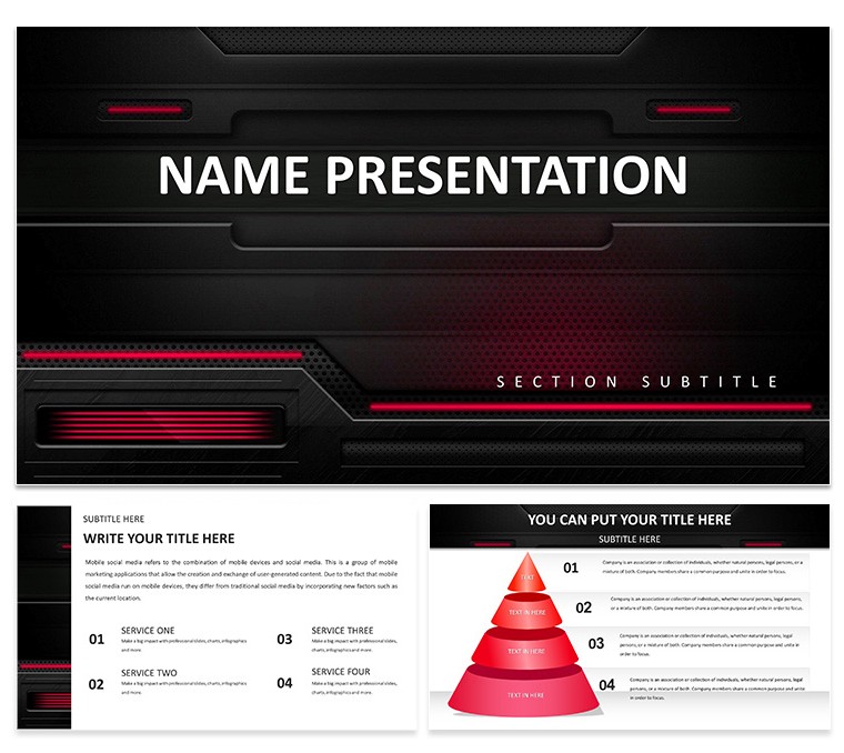
Powered by three master variants - think grid-aligned for data density or node-centric for connectivity - the template houses 28 specialized diagrams: UML sequences as threaded wires, or heatmap matrices evoking server racks, tunable across seven tech-toned schemes from metallic grays to electric blues.
Surpassing basic builds, the vector icon set - gears, clouds, APIs - snaps into place with alignment aids, scalable for retina displays. An IT architect once wired the dependency graph for a cloud migration pitch, pulsing nodes to simulate data flows, demystifying integrations for execs. Packaged in .key and .kth, it supports plugin exports like to Figma for hybrid workflows.
- Precision Placement: Magnetic guides for pixel-perfect tech diagrams.
- Scalable Symbols: Over 40 IT-specific icons, from firewalls to blockchain links.
- Integration Ready: Embed code snippets or live charts via hyperlinks.
Byte-Sized Breakthroughs: Deploying It in Tech Scenarios
Scenario: Debugging a legacy system upgrade. Launch with the overview slide - a central hub radiating spokes to modules - detailing scope with torque-like bars. Animate spokes to extend, unveiling risk assessments, making abstract audits tangible.
Consultants deploy it for API showcases: The endpoint mapper, styled as circuit boards, plots calls and responses, color-coding latencies for quick scans. In a fintech demo, this visualized transaction pipelines, clarifying compliance paths to regulators. Its modularity shines in agile sprints - from daily standups to quarterly audits.
- Wire Your Framework: Define tech stack, map to diagram types.
- Debug Dynamics: Test animations for logical sequence, like cascading errors.
- Deploy Feedback: Share previews via AirDrop for peer code reviews.
For educators in coding bootcamps, algorithm trees branch into recursive visuals, pruning paths to optimize. This mirrors how platforms like those in DevOps toolkits use flow viz to streamline, ensuring your tech tales transmit without static.
From Schematic to Showcase: Optimization Hacks
Initiate: Load .key, navigate to schematic starter - a blank board with trace lines. Input your thesis, then circuit to core: Sankey diagrams for resource flows, bending bands to throughput metrics, with opacity for bottlenecks.
Pro protocol: Version via iCloud for branch merges, akin to git commits. Align with accessibility - high-contrast modes for color-blind teams. It dovetails with tools like Draw.io imports, enriching your tech tapestry.
This template powers your protocol - download for $22 and engineer engagement.
Frequently Asked Questions
Editable for custom tech diagrams?
Fully - paths, nodes, and labels adjust via shape tools for bespoke visuals.
Good for cybersecurity presentations?
Yes, with threat model layouts perfect for vulnerability mappings.
Supported formats?
.key for core work, .kth for styling, plus export options.
Animation for data flows?
Built-in paths simulate movements, like packet routing.
Scheme count?
Seven, tailored for dark/light modes and brand sync.
Cross-device?
Seamless on all Apple gear with Keynote.