Imagine stepping into a conference room where your slides don't just inform - they inspire trust and clarity in the face of complex health data. That's the power of the Medical Health Keynote Template, crafted specifically for healthcare professionals who need to turn dense medical insights into visual narratives that resonate. Whether you're a physician outlining treatment plans, a researcher unveiling study findings, or an educator breaking down anatomical concepts, this template equips you with 59 fully editable slides designed to elevate your message. With its clean, modern aesthetic and intuitive layout, it ensures every detail - from vital signs charts to patient journey timelines - lands with precision and professionalism.
At its core, this Keynote template streamlines your workflow by offering three master slides and three versatile backgrounds, allowing you to switch themes effortlessly to match your session's tone. Dive into the 28 included diagrams, each backed by seven color schemes that adapt to your branding or data emphasis, whether you're highlighting epidemiology trends or procedural flows. Forget the frustration of starting from scratch; here, every element is drag-and-drop ready, compatible with Keynote on macOS, so you can focus on what matters: connecting with your audience and driving better health outcomes.
Unlocking the Core Features for Seamless Medical Presentations
The beauty of this template lies in its thoughtful design, tailored to the unique demands of medical communication. Start with the title slide, where a subtle waveform graphic evokes the rhythm of a heartbeat, setting an immediate tone of empathy and expertise. As you progress, content slides feature ample space for bullet points alongside integrated icons - like stethoscopes or DNA helices - that reinforce your points without overwhelming the viewer.
Mastering Data Visualization with Built-In Diagrams
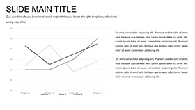
One standout section is the diagram library, where you'll find bar graphs for comparing treatment efficacy, pie charts for demographic breakdowns, and flowcharts mapping diagnostic pathways. Take the histological diagram slide: it layers tissue structures with editable labels, ideal for pathology reviews. Customize the colors to differentiate healthy versus affected areas, ensuring your audience grasps nuances at a glance. For instance, in a seminar on infectious diseases, swap the default blues for alert reds to underscore outbreak risks, making your case as compelling as it is clear.
Beyond basics, these diagrams support layered animations - reveal statistics sequentially to build suspense, much like unfolding a case study in rounds. This isn't just visual flair; it's a strategic tool to maintain engagement during long sessions, helping colleagues or students retain key takeaways like vaccination rates or recovery timelines.
Flexible Layouts for Every Healthcare Scenario
Adaptability defines this template. The three backgrounds - a pristine white for clinical sterility, a soft gradient for patient-facing warmth, and a textured one mimicking medical charts - let you pivot from boardroom briefings to community workshops. Fonts are sans-serif for readability on projectors, with sizes scaling automatically for accessibility. Add your logo to the master slide, and it appears consistently, reinforcing your institution's identity without manual tweaks each time.
Integration is effortless: import data from Excel for auto-updating charts, or embed hyperlinks to reference studies directly in slides. This forward-thinking setup means your presentation evolves with new research, keeping it relevant for ongoing projects like public health campaigns.
Real-World Applications: Bringing Health Stories to Life
Consider a cardiologist preparing for a grand rounds talk. Using this template, they layer ECG readings over a timeline slide, animating peaks to simulate arrhythmias - transforming abstract data into a heartbeat your audience feels. The result? Attendees not only understand the diagnosis but visualize the urgency, sparking collaborative discussions on interventions.
Or picture a pharmaceutical rep pitching to investors. The SWOT analysis slide, with its quadrant diagrams, becomes a canvas for market positioning: strengths in a vibrant green, threats in cautionary orange. By the close, stakeholders see not risks, but opportunities, thanks to the template's balanced visuals that mirror strategic thinking.
Step-by-Step Guide to Customizing for Your Next Pitch
- Select Your Base: Choose a master slide that aligns with your topic - clinical for data-heavy talks, empathetic for patient education.
- Populate Diagrams: Drag in your dataset; the template auto-adjusts scales and labels for accuracy.
- Theme It Up: Apply one of the seven color schemes, testing on a sample slide to ensure contrast meets WCAG standards for inclusivity.
- Add Interactivity: Link icons to supplemental notes or videos, turning passive slides into exploratory tools.
- Rehearse and Refine: Use Keynote's presenter notes for speaker cues, syncing with slide transitions for flawless delivery.
This process, honed from designs used in settings like Mayo Clinic-inspired decks, cuts prep time while amplifying impact - letting you shine as the expert.
Why This Template Outshines Standard Options
Unlike generic PowerPoint defaults, which often feel cluttered for specialized fields, this Keynote version prioritizes whitespace and hierarchy. Basic tools might offer charts, but they lack the medical-themed icons - like syringes or lab vials - that intuitively guide viewers. Here, every asset ties back to healthcare realities, fostering quicker comprehension and stronger recall. Plus, with sources in .key and .kth formats, you're set for both quick edits and deeper customizations.
For educators training the next generation of nurses, the infographic slides shine: build a process map for wound care, with arrows flowing logically and callouts for best practices. Students interact during reviews, dragging elements to test sequences - bridging theory to practice in ways rote lectures can't.
Elevate Patient Engagement and Team Alignment
Beyond conferences, this template excels in internal uses. Craft a quarterly report on hospital metrics: use the dashboard slide to overlay KPIs like readmission rates, with sparklines showing trends over months. Colors differentiate departments, making it easy for admins to spot efficiencies or gaps.
In community health fairs, simplify nutrition advice with radial diagrams portioning food groups - visually digestible for all ages. The template's scalability ensures it works on tablets for one-on-one consultations, where a quick swipe reveals layered info without jargon overload.
Workflow tip: Pair it with Keynote's export to PDF for handouts, preserving hyperlinks so attendees access resources post-event. This closed-loop approach builds lasting relationships, turning one presentation into ongoing dialogue.
Ready to Transform Your Health Narratives?
With its blend of sophistication and simplicity, the Medical Health Keynote Template isn't just slides - it's a catalyst for clearer communication and inspired action in healthcare. Download now for $22 and watch your presentations become the benchmark for precision and persuasion.
Frequently Asked Questions
What software is required to use this template?
This template is optimized for Apple Keynote on macOS and iOS devices, ensuring smooth performance across platforms.
Can I customize the colors and fonts?
Yes, all elements including the seven color schemes and fonts are fully editable to match your branding.
Are the diagrams resizable without losing quality?
Absolutely, vector-based diagrams maintain crispness at any size, perfect for various screen resolutions.
Does it include animations?
Built-in subtle animations enhance transitions, with options to add or remove for your preferred pace.
Is it suitable for both Mac and iPad?
Yes, seamless compatibility allows editing on the go with iPad's touch interface.
How many total slides are included?
The pack features 59 editable slides, encompassing titles, content, and the 28 specialized diagrams.
