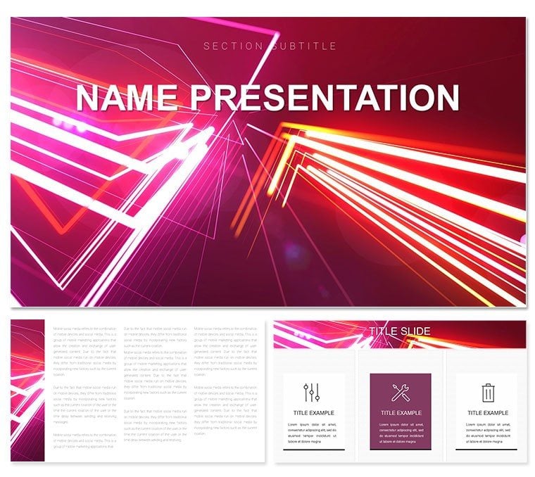
In a world drowning in data, clarity emerges from elegant abstraction - like the sinuous dance of vector lines weaving through chaos. The Abstract Vector Lines Keynote template embodies this, offering a canvas where curls and waves guide your audience through intricate ideas with effortless grace. Designed for analysts dissecting market trends or teachers unraveling scientific principles, this template boasts 28 versatile diagrams across three masters and backgrounds, illuminated by seven dynamic color schemes from electric blues to fiery oranges. Whether you're condensing a lengthy research paper into bite-sized visuals or contrasting viewpoints in a debate, these slides turn tangles into trails. Fully editable in Keynote 2019 onward, it supports vector scaling for pristine prints or zooms, ensuring your message lands sharp. Envision a project manager using the wave chart to illustrate workflow ebbs and flows, transforming a routine update into a mesmerizing motion - that's the power here, where form meets function in perfect harmony.
Navigating Complexity with Curved Precision
At its core, this template thrives on the artistry of lines: think swirling infographics that mimic ocean currents for process mapping or interlocking curls for relationship diagrams. The three background variants - subtle gradients to bold patterns - set the stage without stealing it, allowing your content to curve into focus. For medical educators, a helix-style diagram could spiral through DNA structures, making abstract biology tangible. Business pros might layer survey data onto radial bursts, highlighting consensus points like fireworks in the night sky.
Step-by-Step Customization Guide
- Pick Your Palette: Dive into seven schemes; opt for cool tones to soothe analytical minds or warms for energetic pitches.
- Refine the Flow: Adjust line weights and curvatures via Keynote's shape tools, ensuring paths align with your data arcs.
- Infuse Interactivity: Add hyperlinks to line endpoints for drill-down details, turning static slides into explorable maps.
Such tweaks not only personalize but propel engagement, as one researcher noted when her vector timelines clarified evolutionary timelines, sparking post-presentation discussions.
Versatile Uses That Curve Around Your Goals
This template's adaptability shines in diverse arenas. In educational realms, employ the comparison matrix with diverging lines to pit theories head-to-head, aiding student comprehension without rote lists. For business, the process flow diagram, with its undulating paths, demystifies supply chains, much like a logistics coordinator who visualized bottlenecks as knots in a rope - untying them live for stakeholders. Even in creative brainstorming, scatter plots with trailing vectors can capture idea trajectories, fostering innovation sessions that feel alive.
- Research Summaries: Curl timelines to condense years of findings into narrative arcs.
- Problem-Solution Frameworks: Use intersecting lines to spotlight challenges and resolutions at their crux.
- Opinion Polls: Wave charts to undulate through sentiment shifts, revealing trends at a glance.
Each use case leverages the template's strength in abstraction, proving lines can lead where words wander.
Elevating Beyond Basic Builds
Unlike Keynote's stock shapes, which often straighten ideas into boredom, these vectors bend with intention, offering scalability and editability that preserve intent across formats. The multifunctional infographics adapt to touchscreens or projectors, with alt-text friendly labels for inclusivity. Integration is a breeze: copy-paste data from spreadsheets into placeholders, then animate paths to reveal sequentially, building suspense like a story unfolding.
Pro Tips for Line Mastery
Experiment with opacity on overlapping curls to denote depth in hierarchies, or mirror waves for symmetry in balanced arguments. This level of control empowers you to craft slides that not only inform but inspire, turning viewers into advocates for your vision.
Curve your way to compelling content - secure the Abstract Vector Lines template for $22 and let your ideas flow freely.
Frequently Asked Questions
How do the vector lines enhance data visualization?
They provide smooth, scalable paths that guide the eye through complex relationships, making abstract concepts visually intuitive.
Are the diagrams fully resizable without quality loss?
Yes, as true vectors, they maintain sharpness at any size, ideal for varied presentation formats.
What Keynote versions support this template best?
Optimized for 2019 and later, with core features backward-compatible to 2016.
Can I adapt the color schemes for branding?
Absolutely, each of the seven schemes allows individual hue adjustments to match your palette.
Does it include options for animated transitions?
Placeholders are set for Keynote's build effects, letting lines draw themselves for dramatic reveals.
Is this template suitable for non-designers?
Definitely, with intuitive drag-and-drop editing, even beginners can achieve pro-level results.