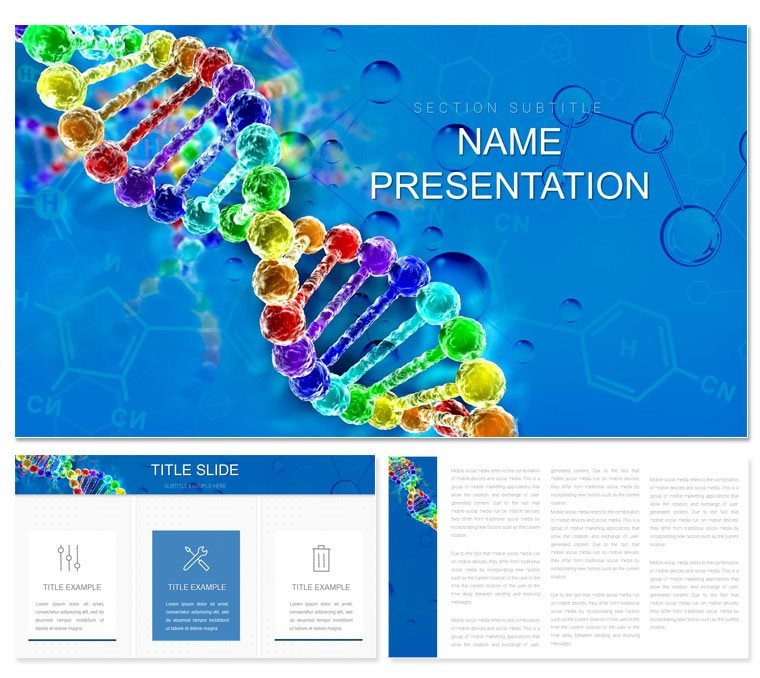
Imagine standing before a room of fellow scientists, unraveling the mysteries of gene editing with visuals that don't just inform but captivate. That's the power of this Gene Therapy and Universal Genetic Code Keynote template, crafted specifically for those diving into the frontiers of molecular biology. Whether you're a researcher preparing to pitch CRISPR innovations to funding panels or an educator breaking down DNA replication for undergrads, this template turns dense scientific data into accessible stories. With 28 meticulously designed diagrams, three versatile master layouts, and seven adaptable color schemes, it equips you to highlight breakthroughs like universal genetic codes without the hassle of starting from scratch in Keynote.
Picture this: instead of wrestling with clunky default slides, you drag and drop your data into pre-built helices and flowcharts that echo the elegance of actual DNA strands. This isn't just a set of slides - it's a toolkit for making your work resonate. For molecular engineers showcasing therapy prototypes or microbiology students illustrating viral vectors, the benefits are immediate: sharper focus on your message, smoother transitions between concepts, and an audience hooked from the first double helix. Ready to encode success into your next presentation? Let's explore how this template fits seamlessly into your workflow.
Unlocking the Core Features of Your Genetic Presentation Toolkit
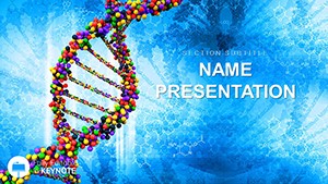
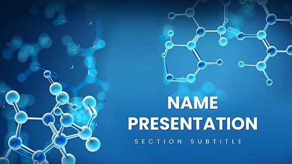
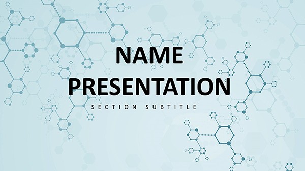
At its heart, this template shines through its thoughtful construction, ensuring every element serves your narrative. Start with the three master slides, each tailored to different presentation phases - an opening splash for grabbing attention with a swirling gene sequence, a body master for data-heavy dives, and a closer for synthesizing insights with a clean, impactful recap. Paired with three background options - from subtle gradient blues evoking lab sterility to vibrant pulses mimicking cellular energy - these let you set the tone without overriding your content.
The real stars, though, are the 28 diagrams, each a ready-to-populate canvas for your ideas. Think of timelines tracing therapy development stages, from discovery to clinical trials, or Venn diagrams overlapping ethical considerations with technical feasibility. And with seven color schemes, you can align visuals to your institution's branding or the mood of your talk - cool tones for analytical depth, warms for hopeful futures in gene editing. All files come in .key and .kth formats, compatible with Keynote 2016 and later, so integration is effortless.
- Master Variety: Three options to structure your flow, saving hours on layout tweaks.
- Background Flexibility: Three styles to match any venue, from conference halls to virtual webinars.
- Diagram Depth: 28 specialized visuals, from sequence maps to therapy outcome matrices.
- Color Customization: Seven schemes for precise, professional polish.
Step-by-Step: Building a Compelling Gene Therapy Deck
Getting started is as straightforward as a primer binding to its strand. Open Keynote and import the template - your canvas awaits. Begin with the intro slide: swap the placeholder helix for your research abstract, adjusting the arc text to spotlight key terms like "CRISPR-Cas9 delivery." Next, layer in data using the process flow diagram on slide 7; populate nodes with trial phases, linking arrows to success metrics you've pulled from recent publications.
For deeper dives, head to the comparison charts around slide 15. Here, pit traditional therapies against your gene-based approach - use the built-in icons for syringes and vectors to visually contrast efficacy without overwhelming text. A pro tip: leverage the animation presets to reveal elements sequentially, mimicking the step-wise nature of genetic repairs, keeping viewers engaged as revelations unfold. If you're presenting virtually, test the backgrounds against screen shares; the subtle texture on option two reduces eye strain during long sessions.
- Import and select your master - align it to your outline for cohesion.
- Populate diagrams: Start with high-level overviews, then drill into specifics.
- Fine-tune colors: Match to your slides' palette for a unified look.
- Add media: Embed short clips of lab simulations directly into video-ready frames.
- Rehearse: Use Keynote's presenter notes to jot reminders on ethical nuances.
This methodical approach not only streamlines prep but ensures your deck feels alive, much like the dynamic processes it depicts.
Real-World Applications: From Lab Benches to Lecture Halls
Envision a molecular engineering team at a biotech symposium, using slide 22's network diagram to map gene interactions in a universal code framework. The radial layout radiates connections, making abstract interdependencies tangible - colleagues nod in recognition as pathways light up. Or consider a university microbiology course where the timeline on slide 10 chronicles therapy evolution; students grasp milestones faster, sparking questions on real-time applications like treating rare disorders.
In research pitches, the infographic on slide 18 proves invaluable for budgeting breakdowns - segment costs with pie charts themed around DNA bases, turning fiscal dry spells into strategic visuals. For educators, the modular icons in later slides let you remix content yearly, adapting to new findings without redesigning everything. These aren't hypotheticals; they're drawn from how pros like those in synthetic biology circles streamline their storytelling, focusing energy on innovation rather than illustration.
Diving Deeper: Spotlight on Key Diagram Types
Slide 1-5: Introductory visuals - genetic spirals and code breakdowns to hook your audience early.Slide 6-12: Process flows - ideal for therapy pipelines, with editable arrows for customization.Slide 13-20: Data viz masters - bar graphs for trial results, scatter plots for correlation studies.Slide 21-28: Synthesis tools - mind maps for future implications, closing with a call-to-action frame.
Each type integrates seamlessly, with vector-based elements that scale crisply on any display. A quick workflow hack: duplicate a favored diagram and tweak for variations, cutting prep time while maintaining thematic consistency.
Pro Tips for Maximizing Impact in Genetic Presentations
To elevate beyond basics, pair diagrams with subtle transitions - fade-ins on sequence builds prevent overload. For hybrid events, optimize backgrounds for both light and dark modes; the neutral option three works wonders. Always embed alt text in images for accessibility, describing elements like "Double helix illustrating base pairing" to aid screen readers. And remember, less is more: cap text per slide at 30 words, letting diagrams do the heavy lifting.
If collaborating, share via .kth files for theme consistency across team edits. For archiving, export sections as PDFs to reference in grant proposals. These tweaks, rooted in practical Keynote use, ensure your presentations not only educate but inspire action in the gene therapy arena.
As you gear up for your next breakthrough reveal, this template stands ready to amplify your voice. Download it today for $22 and start weaving genetics into gold-standard slides.
Frequently Asked Questions
How many diagrams are included in this Gene Therapy Keynote template?
This template features 28 specialized diagrams, each designed for different aspects of genetic code and therapy presentations.
Is the template fully editable in Keynote?
Yes, all elements including text, shapes, colors, and layouts are fully editable, allowing complete customization to fit your needs.
What versions of Keynote does it support?
It's compatible with Keynote 2016 and later versions, ensuring broad accessibility for most users.
Can I add my own images and videos?
Absolutely - the slides include designated placeholders for seamless integration of photos, charts, and video clips.
Are there multiple color options available?
Seven distinct color schemes are provided, giving you flexibility to match branding or thematic preferences.