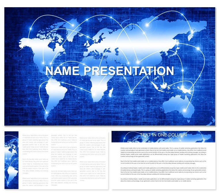
Navigating the intricate web of global economies, power structures, and cultural exchanges demands more than words - it requires visuals that unravel complexity into clarity. Enter the World-Systems Analysis Keynote Template, a specialized toolkit for sociologists, policymakers, and international relations scholars eager to dissect Wallerstein's frameworks or modern iterations. This deck, with its 28 targeted diagrams, three thematic masters, and seven adaptable color schemes, bridges theoretical depth with practical presentation prowess, all within Keynote's intuitive environment from version 2016 up.
Envision transforming dense dependency theory models into flowing Sankey diagrams that trace resource flows across core-periphery divides, or mapping semi-peripheral dynamics with interactive bubble charts. Researchers preparing for journal club discussions or conference panels have leveraged these slides to foster deeper debates, turning passive listeners into engaged collaborators. It's not merely a template; it's a lens that sharpens your arguments, ensuring your analysis lands with the precision of a well-calibrated scope.
Essential Features Tailored for Analytical Depth
Built for those who live in the intersections of history and geopolitics, this template's foundation rests on three master slides: a scholarly title page with subtle world-map overlays, content masters for layered data visuals, and a synthesis slide for drawing conclusions. The seven color schemes evoke everything from imperial reds for dominance themes to oceanic blues for fluid migrations, letting you align aesthetics with your narrative's tone.
The 28 diagrams form the core arsenal, each honed for Keynote's vector editing. A standout is the hierarchical pyramid for core-semi-periphery breakdowns, where you can stack editable blocks to reflect shifting alliances. Or deploy the cycle diagram for long-cycle hegemony shifts, animating phases to mimic Kondratieff waves. Versus vanilla Keynote shapes, these pre-built assets eliminate guesswork, freeing you to iterate on interpretations rather than formatting.
- Diagram Diversity: Sankey flows for trade imbalances, network graphs for alliance webs, and timeline arcs for historical epochs - all scalable and theme-consistent.
- Edit-Friendly Assets: Drag icons from the library to symbolize labor divisions, recolor paths without losing gradients, and embed equations via text boxes for quantitative edges.
- Export-Ready: High-fidelity outputs for PDF handouts or screen recordings, preserving nuance in academic archives.
Guided Workflow: From Theory to Slide
Launch the .key file and choose your master to ground the deck - opt for the data-centric one for empirical heavy-lifts. Populate the overview slide with a world-systems infographic, inputting key texts like "core exploitation" into callout bubbles that auto-align. For core sections, slot in a dependency chain diagram: link nodes with arrows representing capital flows, then animate reveals to pace your exposition.
Fine-tune by grouping elements for batch edits, like unifying periphery icons under a single style. Conclude with a reflective mind-map slide, branching outcomes from your analysis to provoke Q&A. This process, inspired by seminar formats at institutions like Yale's global affairs programs, streamlines what could be a week's labor into an afternoon's polish. A policy analyst once adapted the balance-of-power chart for a UN briefing, sparking revisions to draft reports on the spot.
Targeted Use Cases in Academic and Policy Arenas
This template excels where global narratives demand visual rigor. For graduate seminars on imperialism, the radial dependency wheel visualizes extractive relations, inviting students to annotate with case studies like Latin American commodity chains. International development consultants use the growth trajectory lines to project semi-peripheral ascents, tailoring curves to client data for bespoke advisories.
In corporate strategy sessions exploring market dominances, swap academic jargon for business lingo on the same monopoly breakdown slide. Even journalists covering geopolitical shifts benefit, as the template's modularity supports rapid repurposing for op-eds turned slideshows. It outpaces basic tools by embedding LSI visuals - like migration vectors - that intuitively cover terms from "world division of labor" to "hegemonic cycles."
Expert Hacks for Sharper Insights
- Animate Logically: Sequence diagram reveals to mirror theoretical progression, e.g., build periphery layers before unveiling core influences.
- Incorporate Sources: Hyperlink diagram footnotes to seminal works, turning slides into interactive bibliographies.
- Balance Density: Use opacity fades on background maps to foreground key metrics without clutter.
Such refinements, echoing approaches in peer-reviewed visuals from Social Forces journal, amplify your authority without overwhelming viewers.
Elevate Your Global Discourse
In a world of fragmented analyses, the World-Systems Analysis Keynote Template unifies your vision with elegant precision. Academics and analysts alike value its ability to humanize abstract systems, fostering dialogues that extend beyond the room. Grab yours for $22 and start mapping the interconnections that shape our shared future.
Frequently Asked Questions
Are the diagrams suitable for academic citations?
Yes, all diagrams include editable placeholders for sources, ensuring seamless integration of references in your scholarly work.
Can I adjust the color schemes for publication?
Certainly, the seven schemes are fully tweakable, with CMYK-compatible options for print-ready outputs in journals or reports.
Does it support data import from spreadsheets?
Indeed, many charts allow direct pasting from Excel or Numbers, auto-updating visuals as you refine your datasets.
What's included beyond the diagrams?
Alongside 28 diagrams, you'll get three masters and three backgrounds, providing a complete framework for full presentations.
Is it optimized for large audiences?
Yes, elements are designed for projection, with bold lines and high contrast to maintain clarity in lecture halls.