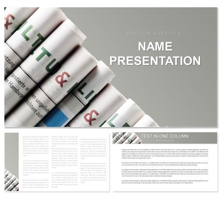
Imagine transforming dry publishing reports into vibrant visual stories that hook your audience from the first slide. The Media Publications Keynote template is crafted precisely for that - tailored for publishers, editors, and media professionals who need to showcase news trends, print strategies, or information flows with polish and precision. With 28 meticulously designed diagrams, three versatile masters, and three background options, this template turns complex data into digestible, eye-catching visuals. Whether you're pitching a new magazine layout to stakeholders or analyzing circulation metrics in a board meeting, these slides adapt seamlessly to your narrative.
At its core, this template shines in its modern, bright aesthetic that mirrors the dynamic world of media. Fully compatible with Keynote on macOS and iOS devices running iWork versions from 2016 onward, it ensures your presentations look sharp on any screen size. Swap colors effortlessly across seven schemes to match your brand - think crisp blues for digital news or warm inks for print heritage. And because every element is editable, from text placeholders to photo frames, you spend less time formatting and more time refining your message. Download this template for just $22 and start building decks that not only inform but inspire action in the fast-paced publishing landscape.
Unlock the Core Features of This Media-Focused Design
Diving deeper, the template's structure is built around flexibility without overwhelming choices. The three masters provide a solid foundation: one for title slides with bold headline placements, another for content-heavy pages optimized for bullet points and subheads, and a third for data-driven sections where diagrams take center stage. Pair these with the three backgrounds - a clean white for minimalist reports, a subtle newsprint texture for thematic depth, and a gradient overlay for contemporary flair - and you've got endless combinations to suit your session's tone.
The real powerhouse here is the 28 diagrams, each purpose-built for publishing scenarios. From flowchart timelines tracking editorial calendars to pie charts breaking down ad revenue shares, these aren't generic shapes - they're infused with media motifs like ink quills or headline icons. Editing is straightforward: select a diagram, tweak the data in the build-order animations, and watch it animate smoothly during your presentation. Pro tip from design veterans: layer in subtle transitions like fade-ins for quote pulls to mimic a newspaper reveal, keeping viewers engaged without distraction.
- Seven Color Schemes: Ranging from monochromatic grays evoking classic broadsheets to vibrant primaries for lifestyle mags - each scheme applies globally with one click.
- Fully Layered Elements: Masks and groups make photo integrations a breeze; drop in your latest issue cover and resize without pixel loss.
- Responsive Layouts: Tested across 16:9 widescreen and 4:3 standard ratios, ensuring no awkward cropping during exports to PDF or video.
How These Features Solve Real Publishing Challenges
Consider a scenario where you're prepping a quarterly review for your team. Basic Keynote tools might leave you wrestling with alignment issues or bland charts that fail to convey urgency. This template sidesteps that: its pre-aligned grids snap elements into place, while the themed icons - like a magnifying glass for investigative pieces - add context without extra effort. Users in similar roles, such as those at independent presses, often share how swapping default fonts for serif styles (included in the kit) instantly elevates perceived professionalism, much like a well-chosen byline.
Practical Use Cases: From Newsroom Briefs to Print Strategy Sessions
This template excels in high-stakes environments where clarity trumps complexity. For journalists wrapping up a beat summary, use the timeline diagram on slide 12 to map story arcs from pitch to publication, inserting milestones with drag-and-drop ease. Editors pitching ad expansions? Slide 18's bar graph variant lets you stack revenue streams side-by-side, with customizable labels that pull from your spreadsheet via Keynote's data import.
In broader applications, like association conferences on media ethics, the infographic-heavy slides (pages 20-25) allow for mind-map explorations of topic interconnections. Step-by-step: Start by outlining your key points in the master text boxes, then populate the central node with a core thesis - say, "Shifting from Print to Pixels" - and branch out with linked bubbles for pros and cons. Animate outward for a reveal that builds suspense, turning passive listeners into active discussants.
- News Cycle Overviews: Leverage the cycle diagram (slide 5) to visualize 24-hour workflows, color-coding phases like research (yellow) and distribution (green).
- Content Audits: Employ the matrix layout on slide 22 for SWOT analyses, where quadrants auto-adjust as you input engagement metrics.
- Stakeholder Pitches: Combine photo placeholders with overlay stats on slide 9 to showcase before-and-after redesigns, proving ROI with visual punch.
Beyond these, integrate it into hybrid workflows: Export sections to Pages for collaborative reviews, then refine back in Keynote. It's a seamless loop that respects the iterative nature of publishing, ensuring your visuals evolve as your ideas do.
Customization Tips to Make It Your Own
To truly own this template, begin with the color picker - match your publication's palette by sampling from a logo file, then apply via the scheme selector for instant cohesion. For text, the bundled fonts (sans-serif for body, slab-serif for headers) offer readability at any zoom, but feel free to embed custom ones like those from Adobe Fonts for a bespoke touch.
Advanced users might experiment with the build tools: Set sequential appearances for multi-part diagrams, so elements like connector lines draw in after data points, mimicking a story unfolding. If you're presenting remotely, test hyperlinks embedded in callout boxes - they jump to source articles flawlessly, adding credibility without breaking flow. And for accessibility, always run Keynote's built-in checker post-edits to confirm alt text on images, like describing a chart as "Annual print circulation trends, 2020-2025."
One understated gem: The photo frames on content slides use non-destructive crops, preserving originals while letting you experiment with aspect ratios. A media coordinator once adapted this for a photo essay deck, framing shots of printing presses to evoke the tactile joy of ink on paper - proving the template's range beyond data alone.
Why This Template Stands Out in a Sea of Options
Compared to stock Keynote themes, which often feel generic and rigid, this one breathes life into media-specific storytelling. No more fighting clashing colors or resizing mismatched icons; everything scales intuitively. It's like having a junior designer on call - efficient, thematic, and ready to iterate. For publishers juggling deadlines, that reliability translates to confidence on stage, whether in a sunlit conference hall or a virtual Zoom grid.
Ready to script your next hit presentation? Download the Media Publications Keynote template today for $22 and watch your ideas print off the page - literally.
Frequently Asked Questions
What versions of Keynote does this template support?
It works with Keynote in iWork 2016 and later, across macOS and iOS for full editing capabilities.
Can I change the color schemes easily?
Yes, select from seven pre-set schemes or create your own by adjusting the master slide colors, which propagate throughout.
Are the diagrams vector-based for scalability?
Absolutely - all shapes and icons are vector, ensuring crisp quality at any resolution, from slides to printed handouts.
How do I add my own images?
Simply drag photos into the designated placeholders; the template auto-fits them with options to adjust opacity or add borders.
Is there support for animations?
Each diagram includes build-in animations you can customize or disable via the Animate tab for tailored pacing.
Can this template be used for non-publishing topics?
While optimized for media, its flexible layouts adapt well to any data-driven presentation, like marketing reports.