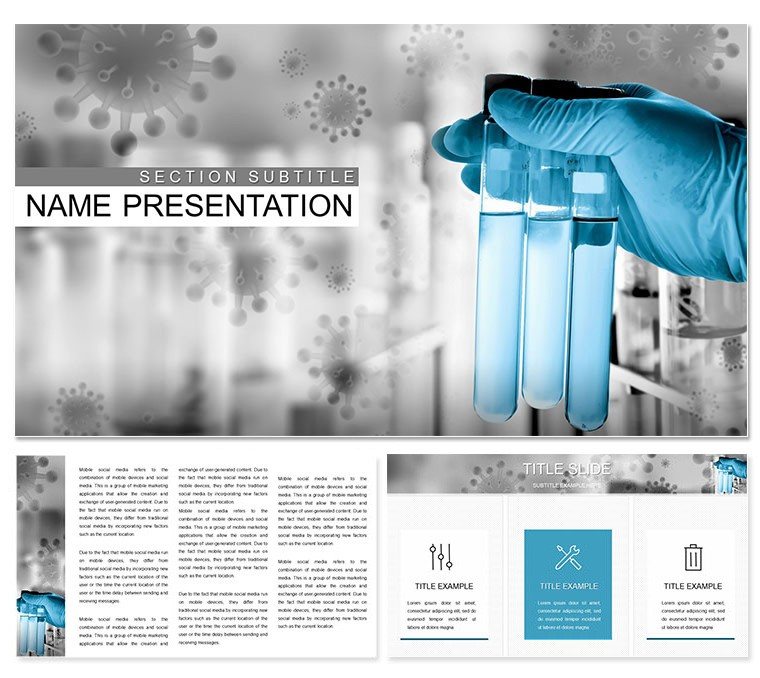
Imagine standing in front of a room full of colleagues or clients, armed with slides that don't just dump data but tell a compelling story about your latest lab findings. That's the power of the Laboratory Tests Keynote Template - a thoughtfully designed tool that turns dense medical information into clear, visually striking narratives. Tailored for pharmacists, healthcare professionals, and lab managers, this template includes 3 master slides, 3 background options, and 28 versatile diagrams across 7 distinct color schemes. Whether you're breaking down test results for a team meeting or pitching new diagnostic services to investors, these slides help you focus on what matters: delivering insights that stick.
At its core, this Keynote template shines in its ability to handle the nuances of laboratory work without overwhelming your audience. Think of it as your reliable lab assistant in presentation form - ready to adapt to your brand's palette while keeping the focus on key metrics like enzyme levels or patient outcomes. No more wrestling with bland defaults in Keynote; instead, you get pre-built layouts that guide the eye naturally from problem to solution. For instance, a simple blood test overview slide can evolve into a full diagnostic timeline, all editable with a few clicks. And since it's built for Keynote's seamless ecosystem, animations flow smoothly, ensuring your message lands with precision.
Unlocking the Core Features of This Medical Keynote Design
Diving deeper, the template's features are what set it apart for anyone in the medical field. Start with the 28 diagrams: these aren't generic shapes but purpose-built visuals for lab scenarios. You'll find pie charts for reagent distributions, flowcharts for testing protocols, and bar graphs for comparative analysis - each one scalable and theme-consistent. The 7 color schemes range from clinical blues for trust to vibrant greens for growth metrics, letting you match your hospital's branding or the tone of your talk.
- Master Slide Flexibility: With 3 masters, switch between layouts for title slides, data-heavy sections, or wrap-up summaries without losing cohesion.
- Background Variety: Choose from subtle gradients or textured patterns that evoke a sterile yet approachable lab environment, keeping distractions at bay.
- Customization Ease: Drag-and-drop your logos, tweak fonts to align with medical journals, or swap in real patient anonymized images for that personal touch.
One standout is how these elements integrate animations - subtle fades for revealing test results step-by-step, mimicking the methodical pace of lab work. It's like having a co-presenter who knows exactly when to highlight the next variable, making your delivery feel polished and expert.
How These Diagrams Elevate Your Lab Reports
Consider the timeline diagram for tracking multi-phase tests: it starts with sample collection icons, flows through analysis nodes, and ends with result icons, all connected by clean lines that you can recolor to emphasize delays or successes. Or take the infographic for pathology breakdowns - layered circles that expand to show correlations between symptoms and findings. These aren't just pretty; they're functional, helping you spot trends in your data faster during prep and communicate them effortlessly on stage.
Real-World Applications: From Pharmacy Pitches to Team Briefings
In a bustling pharmacy setting, where time is as precious as prescriptions, this template proves invaluable. Picture a startup pharmacist unveiling a new testing service: use the contact slide to weave in team bios with lab certification badges, then transition to a services overview with bullet-point diagrams that outline quick-turnaround benefits. It's not about flashy effects but about building credibility - your audience leaves understanding not just the what, but the why behind your recommendations.
For larger healthcare networks, apply it to quarterly reviews. A lab director might populate the scatter plot diagram with throughput data, using the color schemes to differentiate departments. This visual clarity turns potential finger-pointing sessions into collaborative strategy talks. And for educational workshops, educators can adapt the backgrounds for virtual formats, ensuring diagrams remain crisp on any screen size.
- Prepare Your Content: Outline your key lab points - tests, results, implications - then map them to the 28 diagrams.
- Customize Visually: Select a color scheme that resonates (e.g., neutrals for formal audits), insert your data, and adjust scales for accuracy.
- Rehearse Flow: Test animations to ensure they reveal info progressively, like unveiling a compound under a microscope.
- Present with Confidence: Let the template's structure guide you, freeing your mind for Q&A.
Users often share how this shifts their workflow: what used to take hours of tweaking now wraps in under 30 minutes, leaving room for refining your spoken narrative. It's that blend of efficiency and elegance that makes medical presentations feel less like a chore and more like a conversation.
Seamless Integration and Pro Tips for Keynote Mastery
Built for Keynote 2016 and later, this template plays nicely with iCloud syncing, so edits on your MacBook flow to iPad for on-the-go tweaks. Pair it with Keynote's built-in exporter for PDF handouts, ensuring your lab visuals print as sharply as they display. A pro tip: layer in hyperlinks on diagram hotspots - click a test result to jump to methodology slides, turning static reports into interactive explorations.
Compared to starting from scratch in Keynote, this template saves not just time but creative energy. Basic slides might suffice for internal memos, but for client-facing pitches, the themed icons (think pipette droppers or vial silhouettes) add that layer of professionalism. It's like upgrading from a notepad to a digital lab bench - everything's organized, accessible, and ready to experiment with.
Tailoring for Your Unique Lab Narrative
Every lab has its story, and this template adapts without resistance. For a research-focused group, emphasize the process flow diagrams to illustrate hypotheses. In clinical settings, lean on comparison charts to highlight variances in test norms. The key is starting small: pick one diagram, fully customize it, then replicate patterns across others. Before long, your entire deck hums with consistency.
As you build, remember the audience's perspective - keep text concise, visuals dominant. This template encourages that balance, with ample white space around diagrams to let data breathe. It's a subtle nod to good design principles, ensuring your lab tests don't just inform but inspire action, whether that's approving a budget or scheduling follow-ups.
Why This Template Stands Out in Healthcare Presentations
In an era where medical communication can make or break trust, tools like this Keynote template bridge the gap between jargon and clarity. It's not merely a slide pack; it's a framework for storytelling that resonates in boardrooms or classrooms. Professionals who've used similar designs note how it transforms routine updates into memorable sessions - think a department head recapping seasonal flu trends with animated bar growths that mirror viral spread patterns.
Ready to bring your lab insights to life? Download the Laboratory Tests Keynote Template today for just $22 and start crafting presentations that diagnose success.
Frequently Asked Questions
How editable are the diagrams in this Keynote template?
Every diagram is fully editable in Keynote, allowing you to adjust shapes, colors, and data points directly within the software for quick adaptations to your lab specifics.
What Keynote versions does this template support?
It's compatible with Keynote 2016 and newer versions, ensuring smooth performance on macOS and iOS devices.
Can I use this for non-medical presentations?
While optimized for lab and pharmacy topics, the versatile layouts work well for any data-driven talk, like research overviews in biotech.
How do the color schemes enhance medical visuals?
The 7 schemes use calming tones like blues and greens to convey trust and accuracy, making complex test data more approachable without distracting from key insights.
Is there support for adding animations?
Yes, pre-set subtle animations are included, and you can add or modify them using Keynote's tools to reveal information progressively.