28 Diagrams Across 7 Color Schemes: Full Contents
What is a Keynote diagram template? A Keynote diagram template is a pre-built .key file with editable diagrams, master slides, and color palettes - structured for Apple Keynote and ready to use without building layouts from scratch.
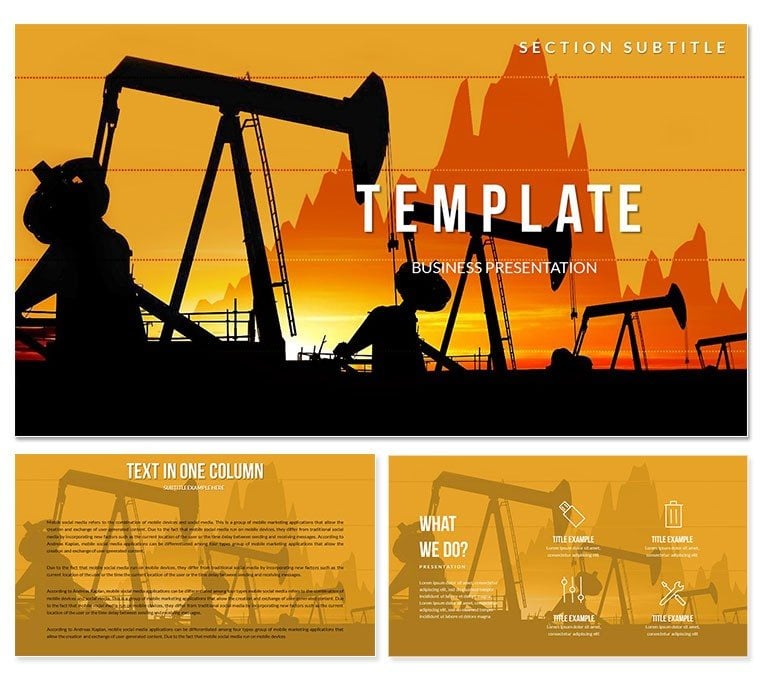
28 diagrams are available in the $27 paid tier, distributed across 7 color scheme variations with 3 master slide layouts and 3 backgrounds. The $12 base tier covers only the 3 masters and 3 backgrounds. File formats are .key and .kth - no .jpg is included, meaning both files require Keynote to open. The product is categorized under Industry - Production, which shapes the visual design direction: this is an energy and commodity-sector template, not a generic business deck.
The diagram visual style reflects industrial and commodity market aesthetics: dark or neutral base backgrounds, high-contrast fills that suggest price movement and volume data, and diagram structures suited to time-series and trend analysis. Bar charts and line-based diagrams dominate, with segmented layouts that can represent price bands, futures curve shapes (contango vs backwardation), and supply-demand zone comparisons. Unlike workflow-focused diagram sets, the layouts here are data-dense: multiple data series can occupy the same slide without visual conflict because the color segmentation is designed to distinguish overlapping data categories rather than separate sequential process steps.
Format and Compatibility Details
| Feature | Details |
|---|
| Diagrams included (paid tier) | 28 diagrams across 7 color scheme variations |
| Masters and backgrounds | 3 master layouts, 3 backgrounds |
| Editable chart/diagram shapes | Bar segments, line indicators, zone fills resize and recolor independently |
| Text placeholders | Price labels, date markers, and annotations update without unlocking grouped shapes |
| Color theme adjustment | Edit via Keynote master slides; apply brand or sector colors globally from one panel |
| File formats | .key for editing, .kth for Keynote theme application - no .jpg static export in this product |
| Keynote compatibility | macOS iWork Keynote (all current versions); Keynote for iOS on iPad |
| Free vs paid difference | Base $12: masters and backgrounds only. Full $27: all 28 diagrams + 7 color schemes |
Who Reaches for This Template
A commodities analyst at an energy trading firm needed to build a quarterly futures briefing covering Brent crude price curves, supply surplus projections, and refinery margin data. Each chart type requires a different diagram structure - price curves use line-over-bar hybrids, supply-demand gaps use stacked area segments, margin data uses horizontal comparison bars. Finding three structurally different diagram types in one consistent visual system across 28 slides saves significant layout work across a multi-section deck.
A regional sales director for an oil and gas equipment supplier uses the template for client pipeline presentations. The diagram structures support showing volume estimates by region, delivery schedule comparisons, and contract tier breakdowns - all within the same Keynote file without visual inconsistency between sections. Adapting the color scheme to match the client company's brand palette takes under 10 minutes via the Keynote master slide editor, and the file has been reused across four consecutive quarterly client meetings with only data label updates between sessions.
Strategy consultants covering the energy transition sector use the industrial-themed diagram set alongside data on renewable capacity versus fossil fuel output. The visual weight of the design - dense fills, sharp segment boundaries - holds up well when comparing large numbers across long time horizons, which lighter pastel-palette templates struggle with at projection scale.
Download the full diagram pack and start building your energy sector presentation today.
From Download to Final Deck
How do you adapt this Keynote diagram template to a specific presentation? Open the .key file in Keynote, choose a color scheme, update master slide colors, replace text labels, and export. The full workflow takes under 20 minutes for most users.
- Step 1 - Open the .key file in Keynote (1 minute). The file loads with all 28 diagram slides pre-formatted. Masters are applied automatically.
- Step 2 - Choose a color scheme and remove unused variants (2 minutes). Seven scheme groups appear in the slide panel. Delete the groups you will not use to simplify the working file before editing.
- Step 3 - Apply sector or brand colors via master slides (3 minutes). View > Edit Master Slides. Replace dominant fills with your brand palette or the energy company's color standards. Changes propagate across all slides using that master.
- Step 4 - Replace price data, date labels, and annotations (6-9 minutes). Click any text placeholder and type updated values. For bar and line chart shapes with embedded Keynote data tables, access the Chart Data Editor via Format > Chart to update the underlying numbers.
- Step 5 - Export as .key for live presentation or PDF for distribution (1 minute).
Editing difficulty: Beginner to Moderate. Label and color updates require no design skills. Editing native Keynote chart data via the Chart Data Editor is straightforward but requires locating the editor panel, which first-time Keynote users may need a moment to find.
What You'd Need to Replicate This Yourself
Energy sector diagrams built from scratch in Keynote require deliberate decisions about data density - specifically, how many data series can share a single slide before the layout becomes unreadable. Templates designed for oil, commodities, or industrial data typically use darker fills and higher-contrast segment colors than generic business decks because the data being compared spans larger numerical ranges, and the visual separation needs to be stronger to prevent misreading.
Building 28 of these from scratch - coordinating fill contrast, line weight, label positioning, and time-axis alignment across chart types - takes between 8 and 12 hours for someone with intermediate Keynote skills. The time estimate climbs when multiple color schemes are involved, because each scheme requires retesting contrast ratios for each diagram type independently.
The 7 pre-built color schemes here were constructed to work across the diagram range. That means each scheme was tested against all 28 diagram types - a verification step most presenters skip when building manually, and the source of most inconsistency in manually assembled commodity decks.
Download now and bypass 8+ hours of layout and color work for your next energy presentation.
Frequently Asked Questions
Which Keynote versions open this template without issues?
The .key and .kth files are compatible with macOS iWork Keynote - all current versions including Keynote 12 and 13. Keynote for iOS on iPad also opens .key files for full editing. This product is macOS and iOS only; there is no Windows or PowerPoint version. If you are working exclusively on Windows, this template cannot be used without access to a Mac or iPad running Keynote. Font rendering may vary on older macOS versions - using Keynote 12 or later ensures the most accurate output.
What is the difference between the $12 and $27 versions?
The $12 base tier includes 3 master slide layouts and 3 backgrounds - no diagram content is included. The $27 paid tier adds all 28 diagrams across 7 color scheme variations. For anyone needing pre-built energy sector diagram slides, the $27 version is the required purchase. The base tier is appropriate if you want the master and background design framework to build your own slides within. There is no upgrade path between tiers - they are separate product SKUs.
Can I change the oil industry visuals to represent a different commodity sector?
The diagram structures - bar charts, line indicators, zone comparison layouts - are general data visualization formats that work for any commodity or industrial dataset, not just oil. Replacing the background imagery and text labels repurposes the diagrams for natural gas, mining, agriculture, or renewable energy data without structural changes. The thematic visual cues (industrial color palettes, high-contrast fills) carry across commodity sectors broadly. Color scheme adjustments via master slides allow a full visual rebrand from one color identity to another in under 5 minutes.
Is this licensed for use in commercially distributed research reports?
The standard license covers internal and client-facing presentations, including commercially delivered consulting work and briefings where the template is used to present your own content and data. Redistribution of the .key or .kth template files themselves - to clients, colleagues outside your organization, or through any distribution channel - is not permitted. For use cases where the template design is embedded in a product that is sold or distributed to end users (such as a branded research report product), contact ImagineLayout about an extended license.
Are animations pre-configured in the diagram slides?
No animations are pre-applied to diagram elements. The template ships without pre-set build effects so that presenters retain full control over reveal timing and animation style. To add animations in Keynote, select a shape or group, open the Animate panel on the right side, and choose a build-in effect. For data charts, Keynote supports chart build animations (building by series or by element) accessible through the Animate panel with the chart selected. Starting without pre-set animations avoids the time cost of removing or reconfiguring animations that do not match your preferred presentation style.
What is the refund policy?
Technical refunds are available if the downloaded file fails to open in a supported version of macOS Keynote. Contact ImagineLayout support with your order number and a description of the issue. Refunds are not available for change-of-mind requests after download. Before purchasing, verify that your device runs macOS with Keynote installed, and confirm that .key format matches your workflow - this template does not include a PowerPoint version.
Energy sector analysts building multi-topic briefings often pair commodity price diagrams with mining industry Keynote slides for broader industrial coverage across a single deck. Teams working on production and operations topics browse the full Industry - Production Keynote category for additional sector-specific visual sets. Presenters covering industrial supply chains alongside market data sometimes add automotive and transport-themed Keynote slides to round out a cross-sector strategy section.