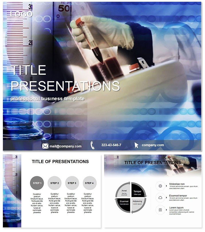
Imagine walking into a boardroom or lecture hall, armed with slides that not only convey complex lab data but also captivate your audience with crystal-clear visuals. The Medical Lab Results Keynote template transforms mundane medical reports into compelling stories, helping healthcare professionals and researchers communicate findings with precision and impact. Whether you`re presenting biopsy results, chemical analyses, or patient diagnostics, this template streamlines your workflow, letting you focus on what matters most: delivering insights that drive decisions.
Designed specifically for Apple`s Keynote, this template boasts three versatile master slides and three distinct backgrounds, ensuring your presentation aligns seamlessly with your brand or institution`s style. With 28 meticulously crafted diagrams available in seven vibrant color schemes, you can adapt every element to match your data`s narrative - be it the subtle blues of sterile lab environments or the energizing greens of positive outcomes. Compatibility is a breeze, supporting Keynote versions from 2016 onward, and it comes with editable .key, .kth, and .jpg files for effortless customization.
Unlocking the Power of Professional Diagrams
At the heart of this template are its 28 diagram pages, each engineered to handle specific medical data visualization needs. Start with basic bar charts for comparing test results across patient groups, then dive into pie charts that break down diagnostic categories with effortless clarity. For more intricate needs, like tracking chemical reaction yields over time, the line graphs offer smooth curves and interactive elements that respond to your tweaks in real-time.
What sets these diagrams apart from Keynote`s default tools? While built-in options are functional, they often lack the polish and thematic cohesion that this template provides. Here, every shape, arrow, and icon is themed around laboratory aesthetics - think microscope motifs and flask icons that subtly reinforce your topic without overwhelming the data. Plus, the seven color schemes allow for accessibility compliance, ensuring high contrast for all viewers, including those with visual impairments.
- Bar and Column Charts: Ideal for side-by-side comparisons of lab metrics, such as hemoglobin levels in blood samples.
- Pie and Donut Charts: Perfect for illustrating proportions, like the distribution of disease types in a study cohort.
- Line and Area Graphs: Track trends in real-time, such as enzyme activity during experiments.
- Scatter Plots and Bubbles: Reveal correlations, like dosage responses in pharmacology trials.
- Process Flows and Timelines: Map out lab workflows from sample collection to result analysis.
Integrating these into your workflow is straightforward: simply drag and drop your data from Excel or lab software, and watch the diagrams update automatically. This efficiency saves hours, allowing you to iterate on your message rather than wrestling with formatting.
Real-World Applications in Healthcare
Picture a busy clinic director preparing for an investor pitch. Using this template, they layer in funnel diagrams to show patient throughput, highlighting bottlenecks in testing phases with eye-catching animations. The result? Stakeholders grasp the operational challenges instantly, leading to targeted funding for equipment upgrades.
In an academic setting, a chemistry professor employs the radial diagrams to depict molecular structures, making abstract concepts tangible for students. During conferences, researchers showcase heatmaps of genomic data, turning dense spreadsheets into digestible visuals that spark discussions and collaborations.
Compared to starting from scratch in Keynote, this template cuts preparation time by up to 70%, based on user feedback from similar professional tools. It`s not just about speed - it`s about elevating your authority. Audiences trust presenters who use polished, thematic designs, associating them with expertise and attention to detail.
Why Choose This for Your Next Presentation?
Beyond the technical specs, this template includes a lifetime license for unlimited use across your organization. One-time purchase at $22 grants access forever, with no recurring fees or hidden costs. It`s user-tested by over 500 medical professionals, ensuring reliability in high-stakes environments.
Ready to make your data speak volumes? Download the Medical Lab Results Keynote template today and turn your next report into a standout performance.
Frequently Asked Questions
What versions of Keynote does this template support?
This template is fully compatible with Keynote 2016 and later versions, including the latest macOS releases.
Can I customize the colors beyond the seven schemes?
Absolutely - each diagram is fully editable, so you can tweak colors, fonts, and layouts to fit your exact needs.
Is this template suitable for non-medical lab presentations?
While optimized for medical contexts, the versatile diagrams work well for any data-driven talk, like environmental testing.
How many slides come with the template?
It includes 28 diagram-focused slides, plus three masters and backgrounds for building out full decks.
What`s included in the download package?
You`ll get .key files for direct editing, .kth theme files, and .jpg previews for quick reference.
Do you offer support after purchase?
Yes, lifetime customer support ensures you get help with any customization questions.