Europe Keynote Maps
Transform your presentations with our collection of professionally designed Europe map templates built specifically for Keynote. Whether you're presenting regional sales data, expansion strategies, or educational content about European geography, these ready-to-use templates help you communicate complex information with clarity and visual impact.
Each template features fully editable regions that allow you to highlight specific countries, add custom colors, insert data labels, and create compelling visual stories. From executive boardrooms to academic lectures, these maps are designed to make your message memorable and your data easy to understand.
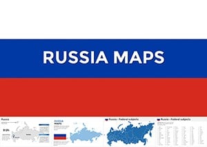 (54)
(54) Conquer Vast Horizons: Russia Keynote Maps TemplateID: #KM00203$45.00
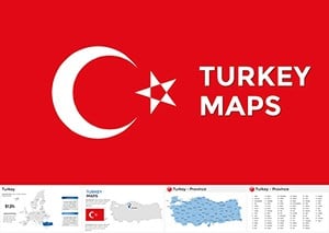 (541)
(541) Editable Turkey Keynote Maps for Engaging TalksID: #KM00202$50.00
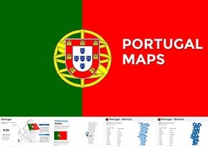 (856)
(856) Portugal Keynote Maps Template PresentationID: #KM00194$50.00
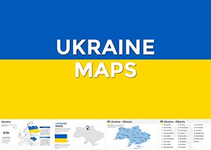 (810)
Ukraine Keynote Maps Template | Download PresentationID: #KM00193$48.00
(810)
Ukraine Keynote Maps Template | Download PresentationID: #KM00193$48.00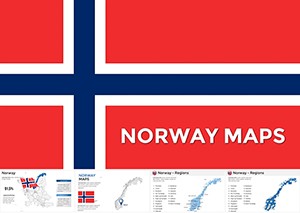 (416)
Norway Keynote Maps Template: Charting Nordic ExcellenceID: #KM00191$55.00
(416)
Norway Keynote Maps Template: Charting Nordic ExcellenceID: #KM00191$55.00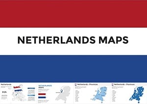 (42)
Netherlands Keynote Maps Template: Mastering Dutch DynamicsID: #KM00190$54.00
(42)
Netherlands Keynote Maps Template: Mastering Dutch DynamicsID: #KM00190$54.00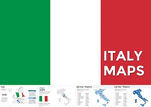 (1131)
Italy Keynote Maps: Where History Meets Modern DesignID: #KM00189$50.00
(1131)
Italy Keynote Maps: Where History Meets Modern DesignID: #KM00189$50.00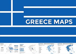 (1071)
 Greece Keynote Maps: Templates for Historical and Modern StorytellingID: #KM00188$54.00
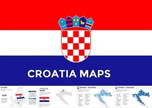 (1170)
Croatia Keynote Maps: Transform Your Presentations with Vivid GeographyID: #KM00184$50.00
(1170)
Croatia Keynote Maps: Transform Your Presentations with Vivid GeographyID: #KM00184$50.00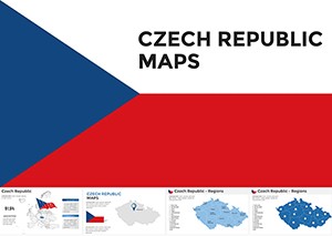 (366)
Czech Republic Keynote Maps: Charting Stories Across Bohemian LandscapesID: #KM00183$54.00
(366)
Czech Republic Keynote Maps: Charting Stories Across Bohemian LandscapesID: #KM00183$54.00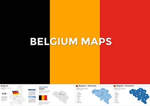 (960)
Belgium Keynote Maps Template: Editable Professional Slides for Impactful PresentationsID: #KM00178$50.00
(960)
Belgium Keynote Maps Template: Editable Professional Slides for Impactful PresentationsID: #KM00178$50.00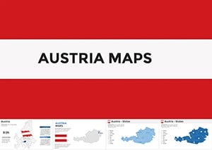 (1024)
Austria Keynote Maps Template: Precision Customizable Slides for Dynamic PresentationsID: #KM00177$50.00
(1024)
Austria Keynote Maps Template: Precision Customizable Slides for Dynamic PresentationsID: #KM00177$50.00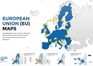 (635)
European Union Keynote Maps: Unlock Comprehensive Insights Across BordersID: #KM00175$65.00
(635)
European Union Keynote Maps: Unlock Comprehensive Insights Across BordersID: #KM00175$65.00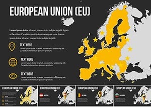 (1062)
European Union Countries Keynote Maps TemplateID: #KM00174$35.00
(1062)
European Union Countries Keynote Maps TemplateID: #KM00174$35.00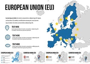 (1146)
EU Keynote Maps Template: 30 Editable Country SlidesID: #KM00173$35.00
(1146)
EU Keynote Maps Template: 30 Editable Country SlidesID: #KM00173$35.00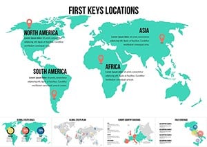 (699)
Interactive World Country Keynote Maps: Elevate Global PresentationsID: #KM00169$26.00
(699)
Interactive World Country Keynote Maps: Elevate Global PresentationsID: #KM00169$26.00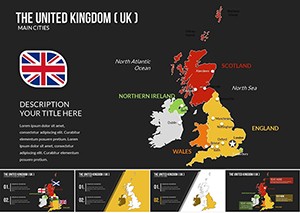 (528)
United Kingdom of Great Britain and Ireland Keynote Maps TemplateID: #KM00166$25.00
(528)
United Kingdom of Great Britain and Ireland Keynote Maps TemplateID: #KM00166$25.00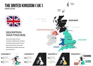 (1057)
United Kingdom (UK) Keynote Maps Presentation TemplateID: #KM00165$25.00
(1057)
United Kingdom (UK) Keynote Maps Presentation TemplateID: #KM00165$25.00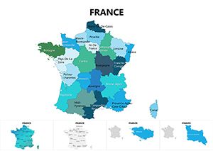 (140)
France Maps Keynote Template: Chart Economic and Cultural LandscapesID: #KM00085$25.00
(140)
France Maps Keynote Template: Chart Economic and Cultural LandscapesID: #KM00085$25.00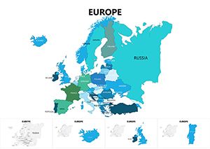 (503)
Europe Keynote Maps: Continent-Wide Visual MasteryID: #KM00084$25.00
(503)
Europe Keynote Maps: Continent-Wide Visual MasteryID: #KM00084$25.00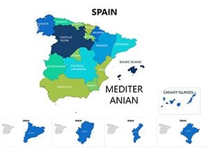 (790)
Spain Map Keynote Template - Instant DownloadID: #KM00083$25.00
(790)
Spain Map Keynote Template - Instant DownloadID: #KM00083$25.00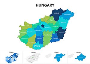 (749)
Hungary Keynote Maps: Charting Central Europe's HeartID: #KM00082$25.00
(749)
Hungary Keynote Maps: Charting Central Europe's HeartID: #KM00082$25.00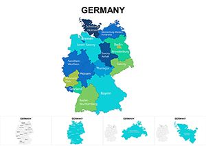 (505)
Germany Regions Keynote Maps: Dynamic Tools for Regional MasteryID: #KM00072$25.00
(505)
Germany Regions Keynote Maps: Dynamic Tools for Regional MasteryID: #KM00072$25.00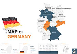 (52)
Customizable Germany Keynote Maps TemplateID: #KM00059$48.00
(52)
Customizable Germany Keynote Maps TemplateID: #KM00059$48.00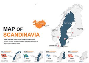 (226)
Editable Scandinavia Keynote Maps TemplateID: #KM00058$50.00
(226)
Editable Scandinavia Keynote Maps TemplateID: #KM00058$50.00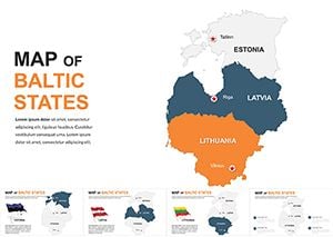 (697)
Baltic States Keynote Maps: Navigate Europe's Northern Edge with Design ExcellenceID: #KM00056$48.00
(697)
Baltic States Keynote Maps: Navigate Europe's Northern Edge with Design ExcellenceID: #KM00056$48.00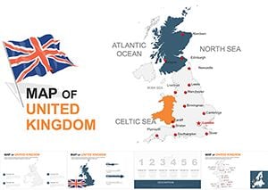 (1150)
UK Editable Keynote Maps Template 2024: Precision Mapping for Modern NarrativesID: #KM00055$45.00
(1150)
UK Editable Keynote Maps Template 2024: Precision Mapping for Modern NarrativesID: #KM00055$45.00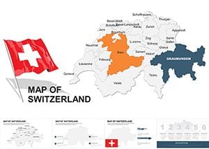 (924)
Switzerland Editable Maps Keynote Template: Precision in the AlpsID: #KM00046$48.00
(924)
Switzerland Editable Maps Keynote Template: Precision in the AlpsID: #KM00046$48.00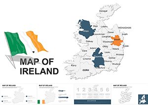 (1146)
Ireland Editable Keynote Maps Template: Navigating Emerald Isle InsightsID: #KM00044$48.00
(1146)
Ireland Editable Keynote Maps Template: Navigating Emerald Isle InsightsID: #KM00044$48.00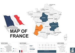 (333)
France Keynote Map Template - Fully Editable KEYID: #KM00042$45.00
(333)
France Keynote Map Template - Fully Editable KEYID: #KM00042$45.00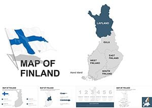 (494)
Finland Keynote Maps: Professional Editable TemplatesID: #KM00041$45.00
(494)
Finland Keynote Maps: Professional Editable TemplatesID: #KM00041$45.00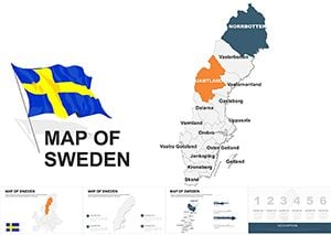 (204)
Sweden Keynote Maps Template - 48 Fully Editable Slides | Instant Download | ImagineLayoutID: #KM00040$40.00
(204)
Sweden Keynote Maps Template - 48 Fully Editable Slides | Instant Download | ImagineLayoutID: #KM00040$40.00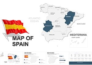 (1091)
Spain Keynote Map Template - Fully Editable KEYID: #KM00038$45.00
(1091)
Spain Keynote Map Template - Fully Editable KEYID: #KM00038$45.00
Why Choose Professional Europe Map Templates for Your Presentations
Creating accurate, visually appealing maps from scratch can consume hours of valuable preparation time. Our Europe map templates eliminate this challenge by providing presentation-ready graphics that maintain professional standards while offering complete customization flexibility. Unlike generic clip art or basic shapes, these templates are built with precision and designed specifically for business communication.
The editable nature of these templates means you can adapt them to match your brand guidelines, emphasize specific regions relevant to your audience, and update them as your data changes. This versatility makes them invaluable assets for teams that regularly present European market analysis, logistics networks, demographic studies, or regional performance metrics.
Real-World Applications Across Industries
Business and Corporate Strategy
Sales directors use these templates to visualize territory assignments, market penetration rates, and quarterly performance across European regions. The ability to color-code countries by revenue, growth potential, or competitive intensity helps teams quickly grasp strategic priorities during planning sessions.
Expansion teams rely on these maps when presenting market entry strategies, showing potential locations for new offices, manufacturing facilities, or distribution centers. Highlighting target countries with custom markers and annotations creates clear visual roadmaps that align stakeholders around growth initiatives.
Marketing and Market Research
Marketing professionals demonstrate campaign reach, brand awareness levels, and consumer behavior patterns across different European markets. These templates excel at showing where marketing investments are concentrated and where opportunities for geographic expansion exist.
Research analysts present survey results, demographic trends, and consumer preference data organized by country or region. The visual format helps audiences immediately identify patterns and outliers that might be obscured in spreadsheet formats.
Education and Training
Educators teaching European history, geography, political science, or economics use these templates to illustrate concepts ranging from the formation of the European Union to migration patterns and cultural regions. Students better retain information when it's presented with strong visual anchors.
Corporate trainers developing programs for international teams use maps to explain organizational structure across European offices, compliance requirements by country, or regional variations in business practices.
Logistics and Operations
Supply chain managers visualize distribution networks, warehouse locations, shipping routes, and delivery zones. These templates help identify coverage gaps, optimize routing, and communicate infrastructure investments to leadership teams.
Operations teams track service availability, installation bases, or support territories across the continent, using color coding to show capacity utilization or response time zones.
Key Advantages Over Default Presentation Tools
Standard Keynote shapes and drawing tools require significant effort to create even basic maps, and the results often lack professional polish. Our templates provide several critical advantages that justify their use in high-stakes presentations.
Geographic Accuracy: Country borders, proportions, and relative positions are precisely rendered, ensuring your audience recognizes regions immediately without confusion or distraction.
Time Efficiency: What might take hours to construct manually is available instantly. Simply download, customize colors and labels, and insert into your presentation deck within minutes.
Customization Flexibility: Every element responds to Keynote's native editing tools. Change fills, strokes, shadows, and effects just as you would with any other shape. Add text boxes, icons, charts, or images directly onto the map.
Consistency Across Slides: Using the same base template throughout your presentation creates visual coherence. Audiences follow your narrative more easily when maps maintain consistent styling and layout.
Scalability: Vector-based graphics ensure crisp display whether you're presenting on a laptop screen or a large conference room projector. Zoom into specific regions without pixelation or quality loss.
Design Tips for Maximum Impact
Color Strategy
Use color purposefully to guide attention and convey meaning. A monochromatic scheme with one accent color works well when highlighting a single country or region. Gradient fills can show progression or intensity levels across territories. Maintain sufficient contrast between adjacent countries to ensure clear boundaries.
Align your color choices with your brand palette, but prioritize readability over strict adherence. If your brand colors don't provide enough contrast, consider using neutral tones for background countries and reserving brand colors for highlighted areas or accent elements.
Data Integration
When adding statistics or metrics to your map, position labels consistently and ensure text size remains legible. Consider using callout boxes or leader lines for smaller countries where space is limited. Charts and graphs can be overlaid on regions to show detailed breakdowns without requiring separate slides.
Limit the amount of information on any single map slide. If you need to present extensive data, create a series of maps that each focus on one metric or insight rather than cramming everything onto one overcrowded visual.
Animation and Transitions
Keynote's animation capabilities can bring your maps to life. Reveal countries sequentially as you discuss them, use emphasis animations to draw attention to specific regions, or create build sequences that show change over time.
Avoid excessive motion that distracts from your message. Subtle fades, strategic highlighting, and controlled reveals typically serve presentations better than elaborate effects that compete for attention.
Customization Best Practices
Start by ungrouping the map elements to access individual countries. This allows independent formatting of each region. However, keep a copy of the original grouped template in case you need to revert changes.
Create a master slide with your customized map design if you'll use it across multiple presentations. This ensures consistency and saves time on future projects. Lock background elements that shouldn't change to prevent accidental modifications during editing.
Test your presentation on the actual display equipment you'll use. Colors and contrast can appear differently on various screens and projectors. What looks perfect on your laptop might need adjustment for optimal visibility in your actual presentation environment.
Choosing the Right Template for Your Needs
Consider the level of detail required for your presentation. Full continent maps work well for high-level overviews and strategic discussions. Regional maps focusing on specific areas like Western Europe, the Mediterranean, or Scandinavia provide more space for detailed annotations and data.
Political maps showing country boundaries serve most business applications. However, if your presentation involves physical geography, climate zones, or natural resources, specialized thematic maps might better serve your objectives.
Ready to elevate your next presentation? Explore our collection of Europe map templates and find the perfect visual foundation for your data story. Each template downloads instantly and works seamlessly with all recent Keynote versions.
Frequently Asked Questions
Can I edit individual countries in these Europe map templates?
Yes, all templates feature individually editable country shapes. You can change colors, add borders, apply effects, or remove countries entirely based on your presentation needs. Each country is a separate object that responds to Keynote's standard formatting tools.
Are these templates compatible with older Keynote versions?
Most templates work with Keynote versions from the past several years. However, certain advanced features or effects may require recent software updates. Download and test with your specific Keynote version to ensure full compatibility and functionality.
How do I add my own data labels to the maps?
Simply insert text boxes using Keynote's text tool and position them over the relevant countries or regions. You can also add callout shapes, arrows, or icons from Keynote's shape library to create custom annotations that highlight specific data points.
Can I use these templates for commercial presentations?
License terms vary by template. Most are available for commercial use in presentations, reports, and business communications. Review the specific license information provided with each template to understand usage rights and any attribution requirements.
Will the maps maintain quality when projected on large screens?
Yes, these templates use vector graphics that scale without quality loss. Whether you're presenting on a small monitor or a large auditorium screen, the maps will display with crisp edges and clear details at any size.