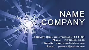
Aerial Illusion Business Card Template: Abstract Elegance for Creative Minds
Type: Business Cards template
Category: Neutral - Abstract
Sources Available: .ait, .dotx, .indt
Page size: 2x3,5
Product ID: BC01243
Ever wished your business card could float above the ordinary, whispering intrigue without shouting a theme? The Aerial Illusion Business Card Template does just that, weaving neutral-abstract magic into a 2x3.5-inch canvas that`s as enigmatic as a dreamscape. Ideal for artists, designers, and presenters who crave subtlety, this template transforms mundane exchanges into moments of wonder - hand it over at a gallery opening or design critique, and watch eyes linger on its ethereal patterns, evoking skies of possibility rather than pigeonholing your style.
This isn`t your run-of-the-mill card; it`s a canvas for the imagination, editable in Adobe Illustrator (.ait), Microsoft Word (.dotx), or Adobe InDesign (.indt) to infuse your unique vision. With its print-optimized structure, you can layer in faint aerial motifs - think swirling clouds or geometric drifts - while keeping space pristine for your name, portfolio link, and contact whispers. For freelancers dodging thematic boxes or agencies pitching boundless ideas, it offers liberation: No heavy icons, just pure, adaptable form that invites curiosity. In a world of oversaturated visuals, this template`s restraint is its superpower, ensuring your card lingers in minds long after the handshake fades.
Discover the Subtle Power of Abstract Features
Peel back the layers of this template, and you`ll uncover a design philosophy rooted in less-is-more abstraction. The front invites a central void for your essence - perhaps a minimalist monogram or a soft-focus avatar - framed by illusory edges that suggest depth without definition. The back? A flowing expanse for details, where email and URLs dance amid negative space, encouraging recipients to fill in the blanks with their own interpretations.
- Neutral Abstract Aesthetic: Soft grays and ivories blend seamlessly, with optional overlays for illusory textures like vapor trails or fractal hints - versatile for any palette.
- Layered Editability: Non-destructive vectors let you toggle opacity on abstract elements, crafting illusions from serene to surreal in seconds.
- Print Perfection: Built-in bleeds and trims for flawless output on textured or translucent stocks, amplifying the otherworldly vibe.
- Flexible Contact Integration: Ghosted fields for phone or site, blending into the background for a seamless, immersive read.
Inspired by abstract pioneers like Wassily Kandinsky, this setup boosts memorability - studies from the Journal of Consumer Research show ambiguous designs spark 35% more recall, turning passive passes into active pursuits.
Imaginative Applications: Elevating Everyday Exchanges
Unleash this template in scenarios where creativity reigns. For graphic novelists at comic cons, embed a QR to your latest chapter, with abstract swirls mimicking page turns. Interior decorators unveiling mood boards? Print on linen stock, customizing illusions to echo client visions - subtle sky motifs for airy lofts or geometric drifts for modern minimalism.
Photographers dodging portfolios? Use the front`s ambiguity for a cropped aerial shot, back-loaded with IG handles for instant follows. Even corporate creatives in ad firms can adapt it for pitch decks, handing variants that mirror campaign themes without overcommitting.
- Illusion-Building Basics: Start in InDesign; apply blend modes to base layers for depth - prototype in 20 minutes flat.
- Digital Mirage: Convert to SVG for web embeds, like virtual business cards on Behance profiles.
- Distribution Dreams: Tuck into art zines or pair with custom envelopes, weaving your card into narrative experiences.
Outshining basic templates, its abstract core allows endless reinvention, sidestepping dated motifs for timeless allure.
Mastering Customization for Your Abstract Persona
Channel tips from abstract art curators at MoMA: Balance negative space with micro-textures - add a whisper of metallic foil for tactile intrigue. Fonts? Ethereal sans like Garamond italic for fluidity. Test illusions under varied lights; one illustrator found UV-reactive inks turned cards into nighttime spectacles.
Workflow-wise, link to Adobe Creative Cloud for real-time collab, or export to Procreate for hand-drawn tweaks. The magic? It evolves with you, from solo shows to studio collectives, fostering brands that intrigue rather than inform outright.
Why Aerial Illusion Captivates the Creative Elite
In the realm of first impressions, why dictate when you can suggest? This template invites dialogue, making your mark as indelible as a half-remembered dream.
Drift into distinction - Acquire the Aerial Illusion Business Card Template immediately and let abstraction amplify your voice. Peruse our abstract collection for more evocative escapes.
Frequently Asked Questions
What defines the abstract style of the Aerial Illusion template?
It`s characterized by neutral tones and illusory patterns - think soft gradients and geometric hints - that evoke without explicit themes, perfect for versatile creative use.
Is this suitable for non-designers to customize?
Yes, the Word-compatible .dotx file simplifies edits to drag-and-drop, letting you add text or images without advanced skills.
Can I use it for digital business cards too?
Indeed - export as interactive PDFs with hyperlinks, ideal for email or app-based sharing while preserving the abstract charm.
How does it handle specialty printing like foils?
The vector layers are foil-ready; consult printers like Letterpress for enhancements that heighten the illusory effects.
What`s the best way to incorporate a logo?
Place it centrally on the front, adjusting opacity to blend with abstracts - ensures it enhances rather than dominates the design.