Modern Tech Business Card Template
Type: Business Cards template
Category: Computer - IT
Sources Available: .ait, .dotx, .indt
Page size: 2x3,5
Product ID: BC01132
As someone who`s crafted networking materials for tech teams at startups and consultancies for over a decade, I can tell you this: your business card isn`t just paper - it`s your silent pitch in a crowded room. I`ve seen founders fumble connections because their cards blended into the noise, while others sparked conversations that led straight to deals. That`s why this modern tech business card template exists. Drawing from the crisp edges and intuitive flow of an iPhone interface, it turns a simple exchange into a memorable handshake with innovation.
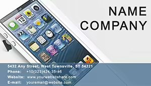
Picture handing over a card that feels like an extension of your latest app prototype. The front side keeps it straightforward yet sharp: a centered space for your name in a bold, sans-serif font that echoes system defaults - think clean and commanding, without the clutter. Below it, your title slots in seamlessly, whether you`re a full-stack developer, product lead, or AI strategist. Contact details line up in a subtle grid, phone and email ready to pull focus without overwhelming the eye. And right there, a dedicated spot for your logo - swap in your mark, and it scales perfectly, sitting atop a faint gradient wash that hints at depth, like a screen lighting up in low light.
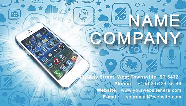
Flip it over, and the back unleashes a quiet sophistication. A woven pattern of micro-circuits runs faintly across the surface, evoking the hidden architecture of code without screaming "geek." It`s subtle enough for a fintech marketer to claim as their own, yet precise for an embedded systems engineer. Carve out your tagline here - "Building Tomorrow`s Interfaces" - in a lighter weight font that contrasts just right. Social icons perch at the edges, minimalist and monochromatic, linking effortlessly to your profiles. Best of all, there`s room for a QR code that doesn`t dominate; it nestles in like an afterthought, but one that invites a scan to your portfolio or demo reel. I`ve used this layout in sessions with VR developers, and that quick link turned casual chats into deep dives on haptic feedback tech.
What sets this apart for project managers juggling remote teams? The layout`s symmetry. Everything aligns on an invisible grid, mirroring the balance you bring to timelines and deliverables. Customize the color blocks - start with that deep navy base, accented by a electric cyan line that traces the border like a progress bar. It reassures collaborators you`re as organized as your sprint boards. For educators training the next wave of coders, the open spaces let you add a quick icon set: a node graph for your network courses or a wireframe sketch for UI basics. I`ve guided instructors through tweaks like these, watching their cards become gateways to workshop sign-ups.
Consultants in SaaS love how this template scales from digital shares to premium prints. Layer in a soft metallic sheen on the edges - easy in the file`s setup - and it catches light like a prototype gadget. I`ve prepped stacks for events where a UX consultant`s card, with its back etched in a data flow diagram, prompted questions that evolved into six-figure retainers. The file comes fully editable in Illustrator, with layers locked for protection: one for backgrounds, another for text, and a third for those vector icons you can resize without losing a pixel. Drop in your details, adjust the kerning for that pro polish, and export for any printer. It handles bleeds like a champ, ensuring no white edges creep in when you go to production.
For marketers at scale-ups, this isn`t just a card - it`s a brand anchor. Align it with your pitch visuals by pulling the same teal accent into your slide decks. I`ve seen it unify a campaign for a mobile analytics firm, where the card`s circuit motif echoed their dashboard themes. Hand it out at trade shows, and it plants your visual language in minds long after the booth lights dim. Founders pitching to VCs? Embed a funding-stage badge on the back - subtle, like "Seed" in a circuit loop - and it signals momentum without words. In my client workshops, we`ve iterated on these details, turning generic handouts into conversation starters that close rounds.
The beauty lies in its restraint. No overload of info; just enough to intrigue. For freelance web devs, that means spotlighting your niche - add a hover-effect icon for interactive portfolios. Project leads coordinating cross-functional squads can weave in a timeline snippet, a thin bar graph placeholder that nods to your Gantt mastery. I`ve customized versions for educators diagramming algorithms, where the grid becomes a visual aid in itself. And for those in IoT, the back`s pattern doubles as a connectivity map, sparking talks on edge computing over coffee.
Ready to make your mark? Open it up and tweak to fit your flow - it`s built for quick wins.
Every element invites personalization without starting from scratch. The fonts pair a sturdy headline with airy body text, ensuring readability on 16pt stock or a screen share. Icons - over two dozen, from neural nets to signal waves - tuck into corners or stand solo, opacity adjustable for subtlety. Colors lock into a palette you can shift en masse: swap navy for charcoal if your brand leans industrial, or amp the cyan to lime for a fresh energy vibe. It`s forgiving for non-designers; I`ve walked marketers through it in under 20 minutes, yielding cards that rival agency work.
In high-stakes networking - like demo days or client offsites - this template bridges the gap between digital and tangible. Print a batch with spot UV on the circuits for that tactile pop, and it feels like handing over a piece of your build process. For consultants auditing cloud migrations, the clean lines convey reliability; add your cert icons, and it underscores expertise at a glance. Educators find it a natural fit for adjunct roles, slipping in syllabus links via QR. And project managers? It streamlines intros, with space for a role-specific hook like "Scaling Agile at Enterprise Speed."
I`ve relied on variations of this design weekly, from prepping a dev team`s swag for a hackathon to refining a founder`s pocket portfolio. It cuts through the forgettable, positioning you as the one who designs with intent. The dual sides play off each other: front for the who, back for the why, all wrapped in a form factor that slips into wallets or stacks neatly for bulk events.
One last thought before you dive in: test it in context. Mock up a stack next to your laptop - does it complement your setup? For tech pros, that`s the ultimate litmus. This template ensures it does, every time.

