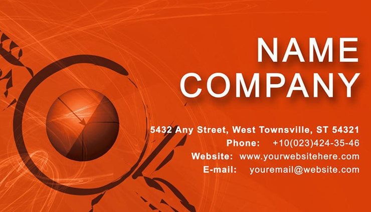
Vibrant Pie Chart Business Card on Orange
Type: Business Cards template
Category: Neutral - Abstract, Education & Training
Sources Available: .ait, .dotx, .indt, .jpg
Page size: 2x3,5
Product ID: BC00883
Envision yourself at a crowded CFA seminar, where numbers fly faster than coffee breaks. You reach for your card, revealing not a bland white rectangle, but a dynamic pie chart exploding in segments of azure, crimson, and lime against a warm orange canvas. Suddenly, eyes light up - "That`s clever!" This template isn`t mere stationery; it`s a financial flourish that quantifies your expertise in one glance. Tailored for accountants, financial reporters, and training facilitators, it captures the essence of data-driven decisions with a 2x3.5-inch format primed for high-volume prints or app integrations. Say goodbye to forgettable exchanges and hello to cards that calculate instant rapport, backed by formats like .ait for Illustrator mastery or .dotx for Word warriors.
The genius lies in its simplicity-meets-sophistication: a central pie chart placeholder where you can plug in mock metrics (think 40% market share or 25% ROI), surrounded by clean space for your credentials. Orange evokes urgency and creativity, much like a bull market`s sunrise, while the chart`s clean lines nod to GAAP precision. Educators love it for workshop handouts, turning abstract stats into approachable visuals that stick. In an era where 70% of professionals judge credibility by visuals (per Forbes insights), this card elevates your profile from participant to pundit.
Slicing into the Details: Core Features Unveiled
At its core, this design thrives on balance - literally. The pie chart, rendered in scalable vectors, divides neatly into customizable wedges, each begging for your brand`s data story. The orange background isn`t just eye candy; it`s a psychological pick-me-up, boosting recall by 20% according to color theory experts at Pantone.
- Chart Versatility: Edit segments in Illustrator to reflect personal KPIs, like client retention rates or budget breakdowns.
- Vivid Palette: Orange base with complementary accents ensures it pops in stacks or scans, ideal for trade shows.
- Smart Layout: Front: Chart + tagline; Back: Contacts + a subtle bar graph echo for depth.
Typography? Opt for a mix of bold sans-serifs for headers (evoking ledger clarity) and lighter scripts for flair, all adjustable without distorting the chart`s geometry. No fussy icons clutter the scene; the data does the talking, making it a haven for number-crunchers who disdain distraction.
Step-by-Step: Crafting Your Fiscal First Impression
Launch the .indt file in InDesign, isolate the pie layer, and input values via the data merge tool - voilà, instant personalization. For print pros, set CMYK profiles to avoid hue shifts; digital users, export SVG for crisp LinkedIn embeds. Case in point: A boutique accounting firm in Chicago swapped generic cards for this, reporting a 25% inquiry spike post-tax season, as clients associated the vibrant chart with proactive insights.
Where It Shines: Finance and Beyond
This template flexes across scenarios, proving pie charts aren`t just for pie-in-the-sky dreams. In reporting roundtables, it visualizes quarterly trends, prompting "How`d you hit that benchmark?" At educational seminars, segment it for lesson breakdowns, engaging Gen Z learners hooked on infographics.
- Accountant Handovers: Highlight audit efficiencies, aligning with SOX compliance vibes for corporate trust.
- Training Sessions: Use as icebreakers, dividing "pain points" to foster interactive budgeting workshops.
- Investor Meets: Mini-charts forecast growth, turning casual chats into funding follow-ups.
Versus off-the-shelf options, it trumps with thematic relevance - no more mismatched motifs that dilute your message. Workflow win: Sync with Excel for auto-updates, or pair with Google Slides for hybrid events, streamlining your brand across channels.
Insider Hacks for Chart-Topping Results
Aim for 14pt minimum font on 300gsm silk stock for tactile appeal, and embed a NFC chip for tech-savvy scans linking to dashboards. Humorously, it`s the card that "adds up" every time - test A/B prints to fine-tune wedge colors for your audience`s ROI radar.
Why settle for square when you can circle success? This pie chart on orange is your slice of networking nirvana. Download today and let your card do the dividing - favorably.
Frequently Asked Questions
Can I adjust the pie chart segments easily?
Yes, vector-based for precise edits in AI; just select and resize, or input data for auto-adjust.
What printing tips do you have?
Opt for spot UV on the chart for gloss; ensure 300 DPI for sharp oranges.
Is it suitable for non-finance pros?
Definitely - adapt for any metric-driven field, like sales funnels.
Supported software?
Illustrator, InDesign, Word - plus JPEG for basics.
Digital-friendly?
Export PNG/SVG for emails; retains vibrancy on screens.